A Preview Of My Summer Project by Ben Jones
Screenshots of the new admissions site.
So here’s a sneak peek at what I’ve been working on all summer… the new admissions site. I can’t wait for this baby to launch!
IMAGE #1: the new homepage. It will provide you with the latest 10 blog entries, regardless of author. You will no longer have to check each blogger’s box to see if he/she has posted recently. You’ll also get streamlined admissions bulletins, deadlines, and faq’s. New top navigation will take the guesswork out of what’s in each section by providing drop down menus with entire subnav – one click from the homepage will take you to any other section of the site.
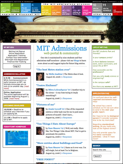
IMAGE #2: Don’t worry – if you happen to like certain bloggers, you can still bookmark their homepages and go there directly. Blogger homepages will provide a bio, the latest three entries (with descriptions), and also a complete archive at the bottom. No longer will the blogs be separate from the admissions site and pumped in through RSS feeds. It’s all one big happy site now (thus the main nav appears on the blogs too!).
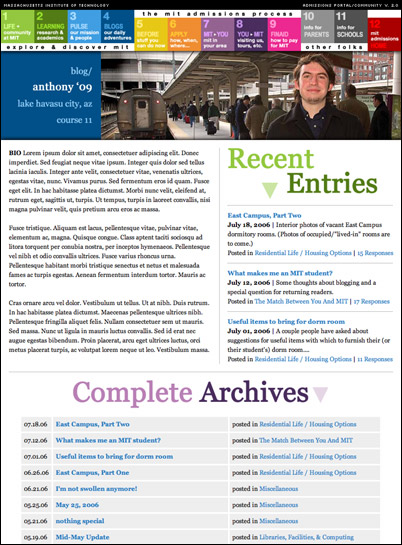
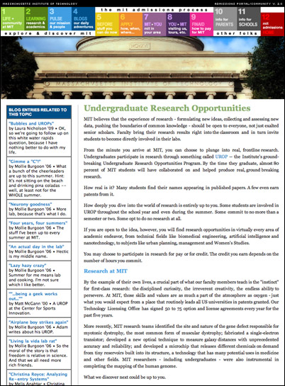
IMAGE #3: One of my favorite things about the new site is that the blog content is seamlessly integrated with the admissions site informational content. The current site provides you with the official admissions office take on things, but if you want the primary source stuff you need to go dig through all the blogs for it. The new site will automatically pull all blog entries related to a given topic into the left-hand column (see below). This improves usability tremendously – no longer will the blogs be a purely linear, chronological experience.
There’s lots more to tell, but I have to go play a show at the middle east. Look for the official site launch in early september!
(Special thanks to Mollie, who has spent much of her August sitting on my couch and assigning almost 1400 blog entries to the correct topical pages.)
Sweet
Great Job! This is an awesome work!
Keep it great!
Looks wonderful!
That looks great!
I love it!! I’m jealous that I didn’t get to use it when I applied!
gosh ben, i wonder if you’re gay because you have such impeccable taste!!!
That is SO sexy.
*squees*
I love it. Great job, Ben. That you VERY MUCH! It is definitely going to make my application process so much easier. Thank you!
scrap what i said on Mollie’s site, this is the best *___*
“gosh ben, i wonder if you’re gay because you have such impeccable taste!!!”
Is it politically incorrect for me to mention that that statement made me snort?
If so, delete this comment.
PS – Love love love the new site. Really. If US News were to take into account awesomeness of websites next year, MIT would ne numba 1 fo sho.
Thanks everyone! I really appreciate it; so glad you guys like the design.
Christina, it’s okay, nghi makes me snort often. <3 nghi, my heart is still broken that he chose stanford over ME.
Borski: oh, I have some ideas for YOU big boy. lol
Wow the new site looks wonderful! I can’t wait to see it all after its launched!
I AM SO EXCITED. It’s like applying to college all over again. Except for all the pain and stuff.
Yay! It’s like the admissions process for the class of ’07 has started! Which means pain and suffering and those college essays, but also perhaps some good stuff in December and March.
See now…I would’ve thought about topicizing (not a word, shut up, I’m tired) it a different way, but that may just be by AI/CS training talking. We should talk sometime about this. Actually, seriously, I have some ideas. And not just about topicizing pages. Expect a visit when I’m back on campus for some serious chit-chat.
the borsk.
OMG SEXXXXXXXXXXXXXX
Yay! No more horror vacui! And the yellow on the 5 block looks nice.
haha wow, im almost jealous! =P these blogs really work ben! and gets even better.
Wow. Looks awesome Ben. great work
SWEET!
Great work !
looks supa!
The layout is well thought out. Very easy to find info and navigate. The photo of the main building makes the page look very attractive.
It’s good that the website is more user friendly, but aesthetically, I think the page is too busy, maybe something more streamlined and clean looking would be nice. There’s too many colors all around, and do you really need everything to be boxed in?
-just a comment.
Nice work.
Wow so hot.
I’m pretty sure I left another comment apologizing for my initial outburst and explaining that in a more lucid time slot than 3:30 AM, I would have said something like, “that is an extraordinarily nice layout you have chosen, and I will be sure to peruse its myriad features all hidden beneath a brilliant, tasteful, and colorful design reminiscent of fruit loops.”
really great design…
good work BEN!!!
good that I got rejeted last year! NOw I can use the new website to apply!!!!! LOL!!!!
It looks really cool Ben! Especially the building!
But I would like to see a wider shot, where I could see the whole building!
Ankit Chandra
Gaborone, Botswana
good that I got *rejected…
*DROOL*
Looks awesome! Neat & trendy design. Lets hope there wont be any technical difficulties when upgrading (Im thinking about my application..)
The new site looks so beautiful and certainly more effective than before. I wish you did this a year earlier.
I absolutely agree with Christina that MIT is going to have the no. 1 site. At least its the best among ALL the college sites I have visited.
You have done a great job Ben. CONGRATS !!!!
And, when would you launch it ?
This is really neat!
You know, you guys should try Podcast next. Heheh
MIT is supposed to be at the cutting edge of technology, yet the site does not reflect that.
Have you considered why you chose that font? that font size? that color(s)? that location?… and the answer shouldn’t be- “because I liked it.” What are you trying to translate?
There’s too many elements on the page, making it look very busy and everything looks very rectilinear. Also, I think you should keep things consistent, for example, in the box under MY.MIT.EDU, you got text that’s centered align, yet the rest is flushed left. (And there’s some other details too.)
Clean, simple, elegant & easy to use is always nice.
Yet; however, you are almost done with the site… so.. these are just some suggestions for next time you update.
WOW
Lovely. Should be fun using it.
Hi Ben — this is kind of unrelated to the post, but I was just wondering when your next Q&A entry would be. I have a couple questions about applying this fall that I would like to get to you if possible.
Nice work, that will make my application easyer.
hi ben,
i like you. lovely and nice work. but i have reget that you didnot admit me at mit for computer science and engineering.
with love, bye
{hi ben,
i like you. lovely and nice work. but i have reget that you didnot admit me at mit for computer science and engineering.
with love, bye}
lol, i LOVE BEN. colin is pretty funny too. this is my first time “perusing” the blogs and it’s 3:29 am and i’m still freaking hooked. and baby doll, maybe he wanted to admit you, but the other group didn’t…cheers