Curiosity, Part 2 by Anna H. '14
How your laptop screen works
Disclaimer 1: It was very difficult to know how to pitch this. If it’s overkill for you, don’t torture yourself; just skim, or skip to the end.
Disclaimer 2: This description is the product of 2-3 hours of Google-ing and discussion, between me and one of my friends. We’re nerds who like to stay up late discussing nerdy things, not experts. EVERYTHING BELOW could be false. Believe at your own risk.
The Question: A couple of weeks ago, I looked at my computer screen from a bunch of different angles, and noticed the following:
From above, some (but not all) colors invert: red to cyan, blue to yellow, etc*. This seemed to depend on the shade of the original color.
*If you’re not familiar with this color opponency thing, an explanation is in the next section. If you ARE familiar with it, skip ahead.
From the sides, the colors do not change.
From below, the colors merge: all shades of red become one red, all shades of blue become one blue, etc.
In my last blog post, I said that I would write up an explanation of this phenomenon if people expressed interest. So, here it is.
The basics of color opponency
To understand this, you will need a color wheel:
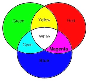
The first thing you should notice is that red + green + blue = white; white is the sum of all the colors, and all colors can be described by some combination of red, green, and blue.
Also note that:
Yellow + Blue = White
Cyan + Red = White
Magenta + Green = White
Yellow + Blue = White
Cyan + Red = White
Magenta + Green = White
These can be rearranged to show that:
White – Yellow = Blue
White – Cyan = Red
White – Magenta = Green
White – Yellow = Blue
White – Cyan = Red
White – Magenta = Green
In other words, blue is the absence of yellow, red is the absence of cyan, and green is the absence of magenta. We call these color pairs (blue-yellow, red-cyan, green-magenta) “color opponents”, because having more of one automatically means having less of the other. That’s why I say that red “inverted” to become cyan.
How your visual system registers brightness
Here’s a quick and dirty explanation of how you see: light from a source (the sun, or the lamp in your room) travels through the air, bounces off the object that you’re looking at, and enters your eye. What does it mean, then, for one object to appear “twice as bright” as another? You might be tempted to suggest that twice the amount of light has hit that object, and reached your eye. More specifically, since light is carried in particles called photons, twice the number of photons entered your eye.
If this were true, the following statement would also be true:
If DarkColor 2 consists of twice the amount of light as DarkColor 1, and BrightColor 2 consists of twice the amount of light as BrightColor 1, then you should perceive the same difference in brightness between the two DarkColors as you should between the two BrightColors.
This is not how your eyes are wired. Instead, your eyes see brightness on a logarithmic (log) scale, which is a fancy way of saying that “twice the amount of raw light does not mean twice the brightness.” Your eyes are actually more sensitive to distinctions between dark tones than to distinctions between light tones. To continue with this example: you would perceive a much more significant difference between DarkColor 2 and DarkColor 1 than you would between BrightColor 2 and BrightColor 1.
Another way to think about this log scale thing is to draw an analogy to age. The difference between being 0 years old and 1 year old is huge, developmentally. Ditto between 1 and 2. Same between 2 and 3. Between 17 aand 18? A bit. Between 40 and 41? 82 and 83? Not so much. You might argue that the developmental difference between two consecutive ages gets smaller and smaller and less significant with greater age. Similarly, the brightness difference between two consecutive “amounts of light’ gets smaller and smaller and less significant with greater amounts of light. Your eye works this way because being very sensitive to subtle differences in bright objects would be overwhelming; it’s more important to be sensitive to subtle differences in dark objects. And if your development from 30 to 31 was of the same order of magnitude as your development from 1 to 2? Your body and brain would freak the heck out.
Cool fact (not at all important to understanding this)
You may be familiar with the way astronomers talk about how bright a star is: magnitude -1 or -25 or 1 or 10 or 0 or whatever. A linear increase of one magnitude corresponds to a change in brightness by a factor of ten. The reason for this weird system is that magnitudes were initially assigned by eye, before the computer age; our eyes work logarithmically, so the astronomy magnitude system does as well.
All this determines…
How your computer registers brightness
Your digital camera receives the same light that your eyes do. A camera is more sensitive to brights than to darks, so if it stored the image exactly as it captured it, it would devote more memory (more bits) to brights than to darks. That would be silly, though, since your eyes make FEWER distinctions between brights; devoting all that memory to brights is spending bits on information that your eyes won’t use. Therefore, to make the best use of limited bits, your computer stores the image on the log scale I described earlier. It faces a problem, though, when it comes to actually displaying the image: your eyes expect the image to be just like light sources in nature, which are NOT on log scales. Therefore, the computer has to convert back from the log to the natural scale before displaying. This conversion is done by applying…
The gamma correction
The gamma correction is what your computer applies to an image, in order to put it in the form that your eye expects. To recap, your eye sees more distinctions in the darks than in the brights. If the gamma correction is too big, you end up TOO sensitive to darks, and not sensitive enough to brights; the images look dark and shadowy. On the flip side, if the gamma correction is too small, then you’re not sensitive enough to darks, and overly sensitive to brights. Either way, the image looks weird to your eye. Here’s a visual example from this website (which I recommend reading for an explanation of all this):
Normal image:

Too much gamma correction:

Not enough gamma correction:

Hopefully you’re still with me. If so, we’re ready to talk about…
How the gamma correction changes with viewing angle
The gamma correction is perfect for one particular viewing angle. If you go too high (look down at the screen from above) then the gamma correction is too small; the images are bleached out, like that third face. If you go too low (look up at the screen from below) then the gamma correction is too big: the images are dark, like that second face. Look at each of those faces from above and below, and you’ll see what I mean; it’s pretty cool.
This says nothing about colors, though, or why they may or may not invert. To discuss colors, we first have to talk about…
How light works
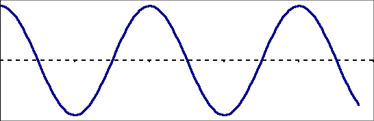
Light can be thought of as a wave, like this:
Now, imagine that you’re generating this wave shape by taking a piece of string, and flapping one end up and down – just like this cheerful little guy:

From http://scienceprojectideasforkids.com/
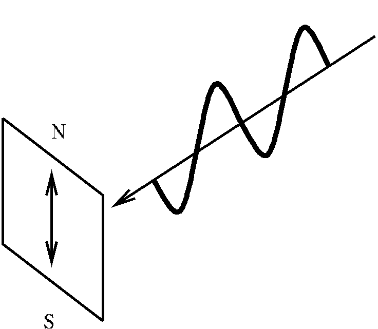
All he’s doing is moving his hand in a straight line: up and down, up and down. He could also move it in a straight line from left to right, or from the top left to the bottom right: regardless of the “angle” of this straight line, we say that the wave is “linearly polarized.” Polarization is just a fancy word for “direction.” Another way to understand this “linear” stuff: if you looked at the string from the boy’s angle, all you would see is a black vertical line. Another visual:
From http://www.cfht.hawaii.edu/
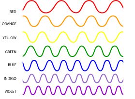
The color of the light is determined by the distance between two peaks. As you can see below, that distance is bigger for red waves than for purple waves.
Now that you have some basic theory on light, it’s time to apply it to…
How your screen displays lots of different colors
Your screen is made up of a whole buttload of pixels, arranged in a 2D array. Each pixel is made up of three subpixels: one for red light, one for green light, and one for blue light.
Think of each subpixel as a little gatekeeper: it controls how much of its respective color is able to pass through the gate, and be displayed on the screen. The result is some combination of red, green, and blue. A few examples:
-If each subpixel lets ALL its light through, then we get 100% red, 100% green, and 100% blue, which results in white.
-If each subpixel lets NONE of its light through, then we get 0% red, 0% green, and 0% blue, which results in black.
-If the red subpixel lets all its light through, but neither the green nor the blue lets any light through, then we get 100% red, 0% green, and 0% blue, which results in (obviously) red.
-If the red subpixel lets none of its light through, but both the green and the blue let all of their light through, then we get 0% red, 100% green, and 100% blue, which result in what happens when you take white light and “subtract” red: you get red’s color opponent, cyan. Note in the color wheel that green + blue = cyan, so this makes sense from the RGB perspective.
If you go to this website, you can play around with different combinations (instead of 0% – 100%, this website deals with a scale of 0 as 0% and 255 as 100%. Same thing, though.)
Once you feel comfortable with this RGB pixel scheme, read on to learn…
How the little gatekeeper subpixel controls the amount of light that gets through it
First, we need to describe what a polarization filter is. It is analogous to anything with a series of slits that go in one direction. To aid your imagination, here is a picket fence:
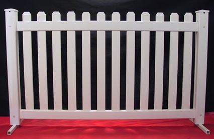
All the slits are vertical.
Imagine this: we stand ten feet away, and take turns throwing a Frisbee at the fence, trying to get it to pass through the gaps. How are we going to orient the Frisbee? Not flat, obviously – it will almost certainly just bounce back. We’ll orient it sideways, so that it lines up with the gaps. If we orient it diagonally, there’s a higher chance of it going through than if we oriented it flat, but it’s still not great. Eventually, we get bored with the Frisbee, and turn to trying to beam linearly polarized light through the fence using a LIGHT GUN. Same strategy! Just like the Frisbee, light can be oriented vertically, horizontally, diagonally, whatever. We want to orient our light such that it lines up with the slits. In this case, that means lining it up vertically. If we line it up horizontally, none passes through. If we line it up diagonally, some passes through, but not all.
Take the game up a notch. Add a second fence ten feet behind the first one, that’s oriented like this:
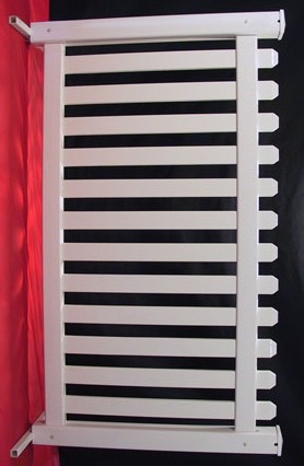
Now, we have a problem; the strategy for getting the light through the first fence is not the same as the strategy for getting the light through the second fence. If we shoot it vertically, for example, it’ll make it through the first one, but not the second one. Something needs to happen between the fences: we need a friend to stand in there, and somehow change the direction of the light. That way, we can shoot it vertically, and get it through the first fence – our friend will then (really quickly) change its orientation to horizontal, so that it can pass through the second fence.
This is…not exactly how computer subpixels work, since there is a distinct lack of Frisbees and picket fences in there. HOWEVER, this is a good way of understanding what’s actually going on. Instead of two picket fences separated by ten feet, a subpixel has two tiny “polarization filters” (fancy science talk for “very tiny picket fences”). The filter at the back of the screen, where the light first enters, has vertical slits, just like the first fence. The filter at the front of the screen, where the light exits to travel to your eye, has horizontal slits, just like the second fence. Instead of a helpful friend standing between the fences, you have a tiny layer of molecules between the filters; these molecules are oriented a bit like a spiral staircase, and rotate the light, like this:
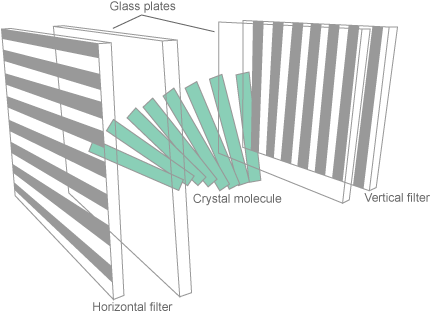
In their rest positions, these molecules do a perfect job: they rotate the light wave 90 degrees, so that all the light that enters the first filter manages to leave the second filter. If your screen is completely white, that means that each subpixel is at rest, because light from R, G, and B subpixels is getting through. If your screen is displaying black, that means that each subpixel is at maximum energy; the molecules have re-oriented themselves in order to make sure that the light doesn’t rotate at all, and is therefore unable to get through the second filter.
If a subpixel has some medium amount of energy, the molecules do a half-hearted job; they orient themselves in such a way that the light is rotated a bit, but not the full 90 degrees required for all of it to get through. That’s how we get values like 50% red, or 4% blue, or whatever. Remember that each dot on your screen is one pixel, the color of which is determined by the three subpixels. We get such a huge variety of colors because each subpixel works independently to determine how much red, green, and blue make it through the second filter.
Basically, the color of a pixel = some amount of red, as determined by the red subpixel’s molecules + some amount of green, as determined by the green subpixel’s molecules + some amount of blue, as determined by the blue subpixel’s molecules.
If this makes sense, then you’re ready for…
Why the angle at which you look at the screen matters
We’re going to use this color as our example:

It’s basically a shade of red: it’s mostly red, but there’s some green and some blue in there as well. More specifically, all of the pixels within that little pink box have a subpixel RGB distribution as follows:
R: 100% (all of the red subpixels are letting 100% of their light through. In other words, their molecules are rotating the linearly polarized light the full 90 degrees.)
G: 50% (all of the green subpixels are letting SOME of their light through. In other words, their molecules are rotating the light, but not the full 90 degrees.)
B: 50% (same as green)
Now, look at it from above. If your screen is LCD, then it should look cyan: red’s color opponent. Woah! Let’s use what we discussed previously to understand this.
First of all, the red subpixels let 100% of their light through. That means that their light is perfectly parallel to the exit slits, which are horizontal on your screen. So, the red light that comes to meet your eye is traveling horizontally, perpendicular to the surface of your screen. Picture a fan, held parallel to the ground: it extends in all directions to the left and the right, but not up or down. So, if you move your head so that you’re above or below the screen, you dramatically reduce the amount of red light that reaches you.
This is NOT true for the green or the blue subpixels. They didn’t let all their light through: their molecules didn’t rotate the light the full 90 degrees. So, the green and blue light that comes to meet your eye is NOT traveling horizontally: it’s at some other angle. If you put your head above or below the screen, you don’t necessarily reduce the amount of green or blue that you see.
Essentially:
-when you look at your screen from above or below, you see MORE green + blue, and less red. The ratios are flipped from what you saw face-on: more intensity face-on = more horizontally polarized = less intensity above or below the screen.
It makes sense, then, that you see cyan from above.
“BUT WAIT!” you say. “This should mean that if I look at the screen from below, I would also see cyan. But actually, when I look at that pink box from below, it looks red. What happened to the green and the blue?”
Excellent question; I think that it has to do with the gamma correction. Remember – when you look at the screen from below, there’s TOO MUCH gamma correction, which means that there’s too much sensitivity to darks.When you look at the screen from above, there’s NOT ENOUGH gamma correction: there’s too much sensitivity to brights.
What is “dark” and what is “bright”? This is determined by the amount of light. From both above and below, we see less red, and more cyan. Therefore, red = dark and cyan = light.
Essentially: because of the gamma factor,
-when you look from above, you’re extra sensitive to the cyan, and less sensitive to the red. The result: cyan.
-when you look from below, you’re extra sensitive to the red, and less sensitive to the cyan. The result: red.
Both are consistent with what you can see with that pink square. The whole light polarization thing determines which colors are “brighter” and which colors are “darker”, and the gamma correction decides which of those to make stronger.
Hopefully that made some sense. If you have any questions or corrections (like I said, this could very well be wrong) then comment away. The more important part of this post is how much fun it was to logic all of this out with my friend; if you ever find yourself confused about some effect you observe, I highly recommend grabbing a nerdy companion and working it through together.
Even if it’s 2am and you have work the next day.
Speaking of work: here’s something else that’s awesome, and related. One of my projects this summer, at the National Radio Astronomy Observatory, was to study what happens to the signal from a pulsar as it travels to Earth from space.
Guess what kind of light wave we get from pulsars.
Linearly polarized light.
Guess what happens to the light wave as it travels through space.
It rotates.
Why does it rotate?
Because of the Milky Way’s magnetic field, instead of a layer of spiral staircase molecules. This is called Faraday rotation.
Here’s a schematic, from Wikipedia:
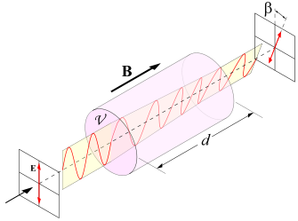
You see that the final polarization direction of the light is different from the initial polarization direction; it becomes a bit diagonal, instead of purely vertical. We call this a change in “position angle”, and we see it in our data. My job was to measure this effect to very high precision, because from it we can glean information about the galaxy’s magnetic field.
In conclusion:
http://xkcd.com/54/