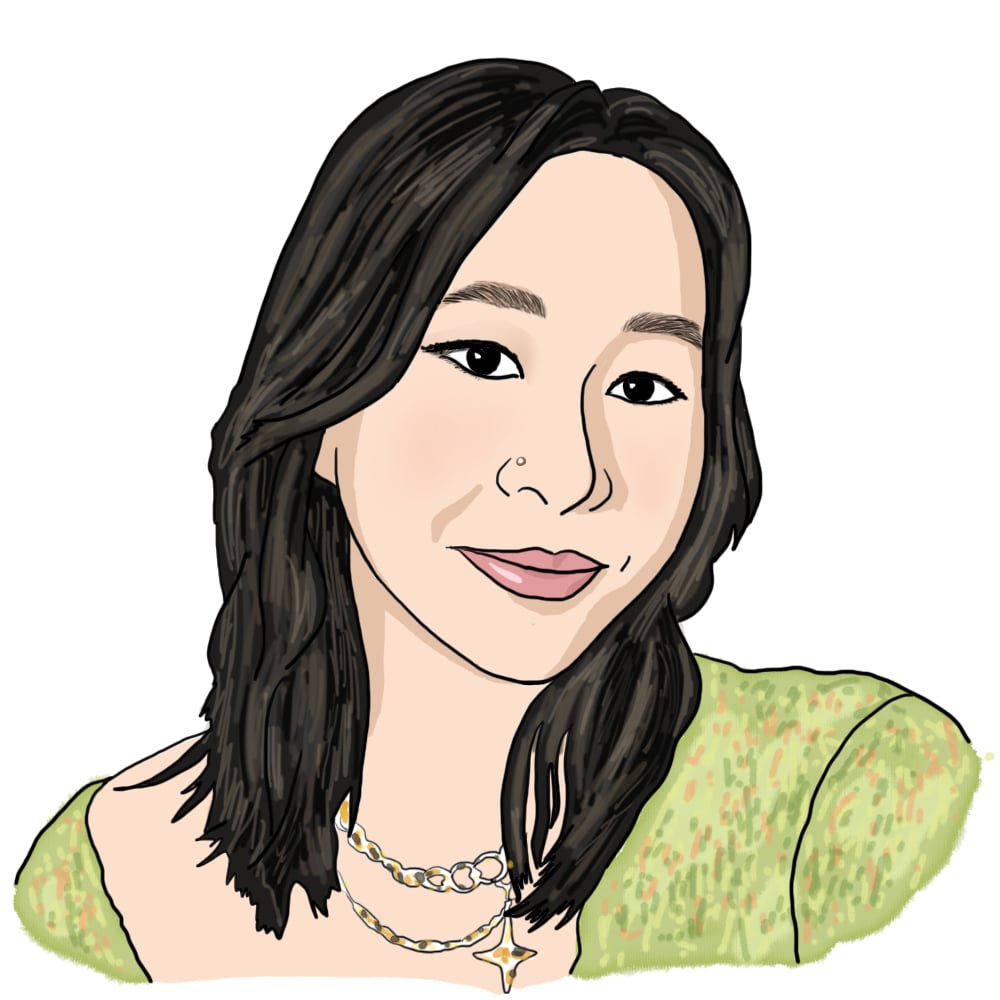
art things #1 by Gloria Z. '26
illustration, graphic design, ceramics, and photography
Although it may not be as apparent as other aspects of MIT, the visual arts presence here (and in the greater Boston area) is super vibrant! There are a ton of resources on campus for making and enjoying artwork, and clubs like Infinite (fashion/design magazine), DAAMIT (digital art), and Borderline (murals) are easy ways to meet other people interested in making stuff. Instead of attempting to provide an expansive overview of the arts at MIT, though, this post will just serve as a log of art-related things I’ve been enjoying in the past few months (numbered #1 because I might make it a series).
One of my biggest goals this semester was to make more and better artwork; I have mixed opinions on whether or not I’ve reached this target (and the semester isn’t over yet anyway), but regardless, here are some things I’ve been making:
illustration
All drawn on Procreate on my iPad! I wish I had more time and energy to draw, but alas. Most of these are from September and early October, before classes and exams really started piling on top of each other… there’s nothing like looming deadlines and assignments to really get the procrastination-art going.

I made this as a semi self portrait after dying my hair orange! the tram design is based on the iconic cable cars of San Francisco, which I grew up 30 minutes away from.
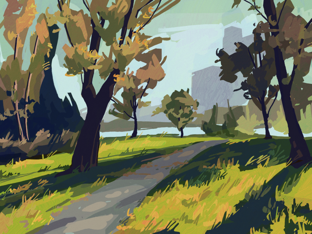
a drawing of Magazine Beach, a nearby park facing the Charles River. I took the reference picture on my way to Trader Joe’s :)
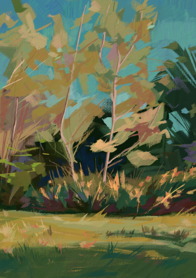
Magazine Beach again, with a different color palette and painting style
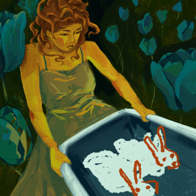
based on the poem “You Guys” by Ocean Vuong
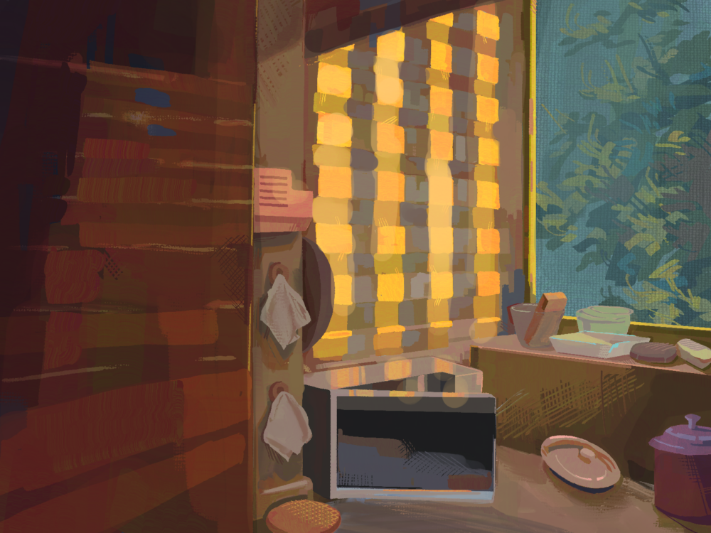
from a picture of my grandparent’s kitchen circa 2018
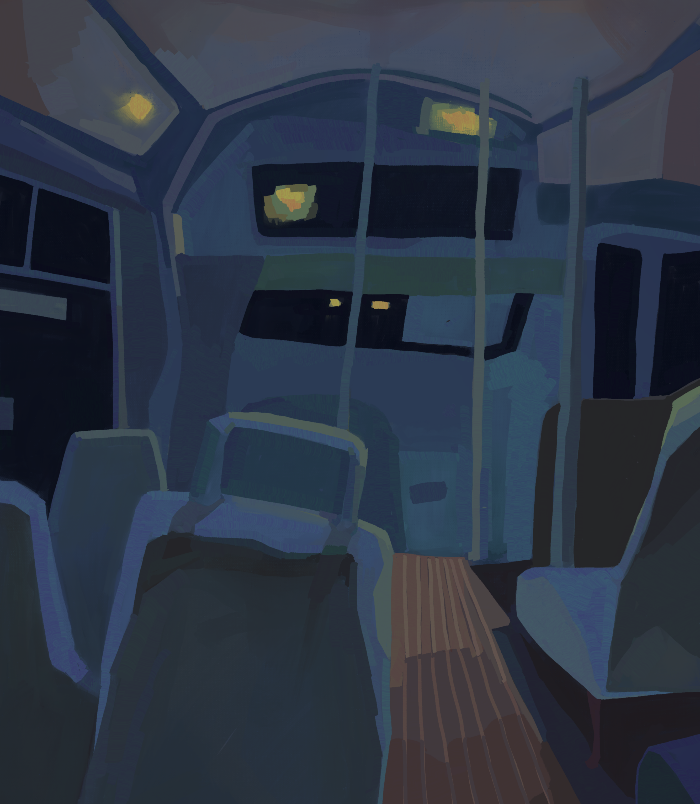
interior of the MIT shuttle at night
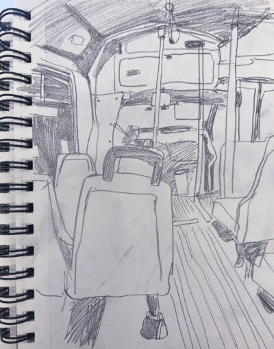
sketch that the above was based on
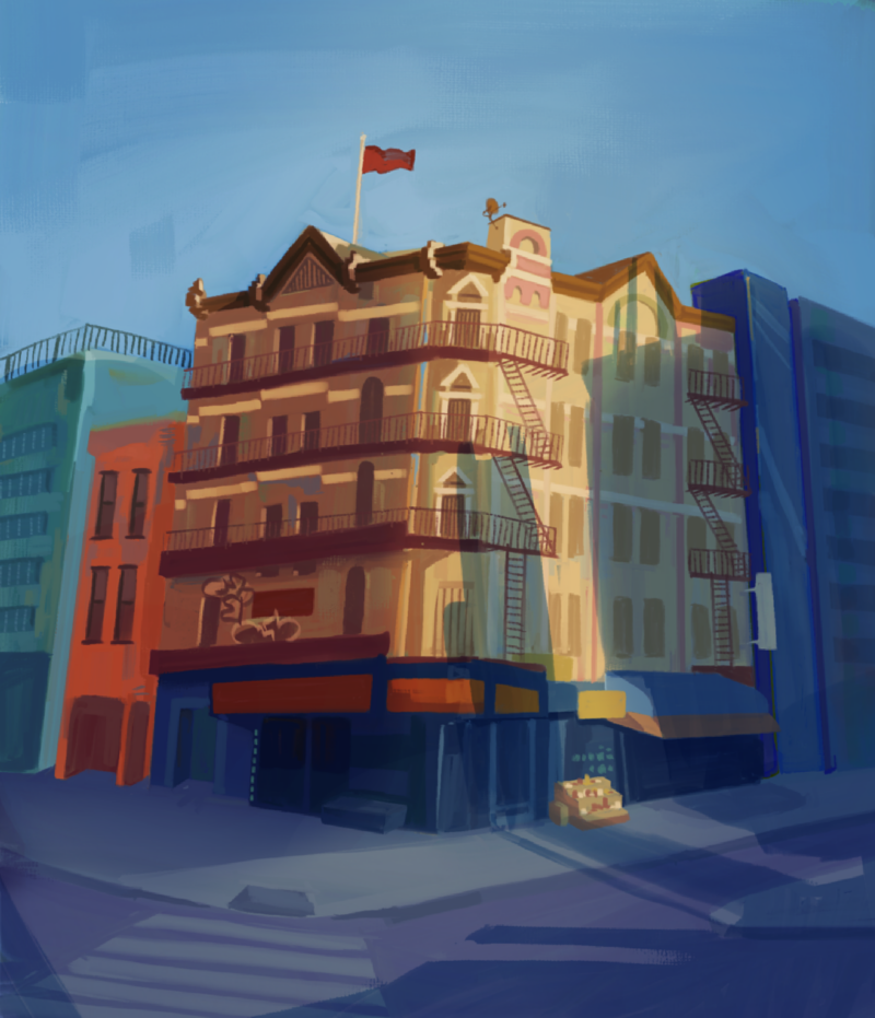
some random building in nyc, I liked the way the light fell on its facade
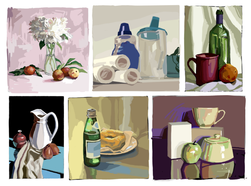
some still lifes, drawn exclusively during lectures
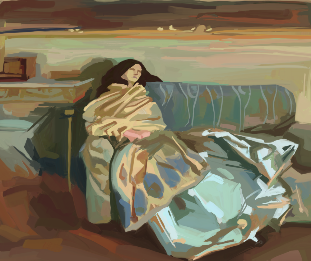
a study of John Singer Sargent’s oil painting “Nonchaloir”. I made this as a homework assignment for 21M.601 before dropping the class due to lack of time. I actually got to see the original painting in person :O!
I’ve really been trying to push myself in terms of color and brushwork with my digital paintings, inspired by the visual style of plein air painters. When Spider-Man: Across the Spider-Verse came out earlier this year, I was absolutely blown away (I watched it three times in theaters in two weeks), and I feel like it filled me with renewed vigor to get better.
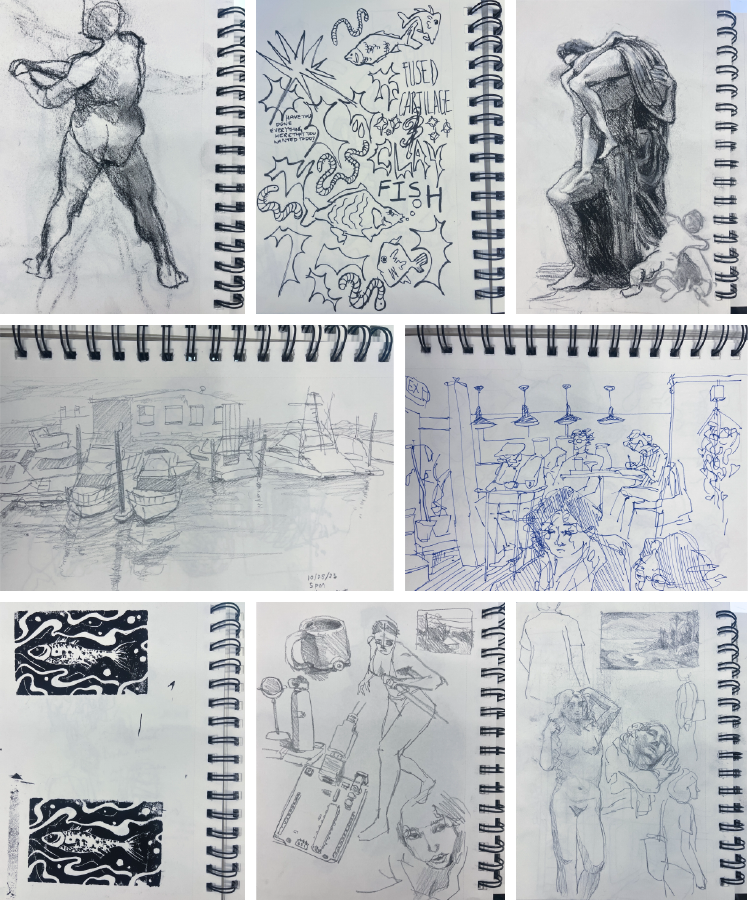
some pages from my sketchbook
I used to sketch a lot, almost every day! My first art teacher, an elderly Chinese man who taught oil painting out of his garage, instilled in me the importance of sketching from life as often as possible–he would say time and time again that the eye-hand connection is a muscle that has to be strengthened continually. So my high school sketchbooks became visual diaries of my life: I could flip back a few pages and see pencil outlines of strangers at Peet’s, or crack open an old notebook and see marker doodles of cars on top of last year’s algebra notes.
Thus, it’s a little sad to me now that for the past year, I’ve been making very slow progress through the same 100-page Strathmore pad of paper. Weeks slip by without any drawings, and its first few pages date all the way back to my freshman fall. When I do crack open its worn pages, though, I always remember again just how fun it is to draw; there’s something so straightforward and playful about putting pen to paper and just making loose, sweeping lines with abandon.
graphic design
I spend an unholy amount of time looking at poster art on Pinterest, so I’m glad I actually sat down and made a few designs this semester! I think the cool thing about graphic design is that you get to actually see your work in use, especially when it comes to merch like hoodies and tote bags. It’s kind of crazy to see people actually wearing and carrying your design around, and clubs and dorms on campus are always making new merch and publicizing events, so there’s no shortage of opportunities to do design work.
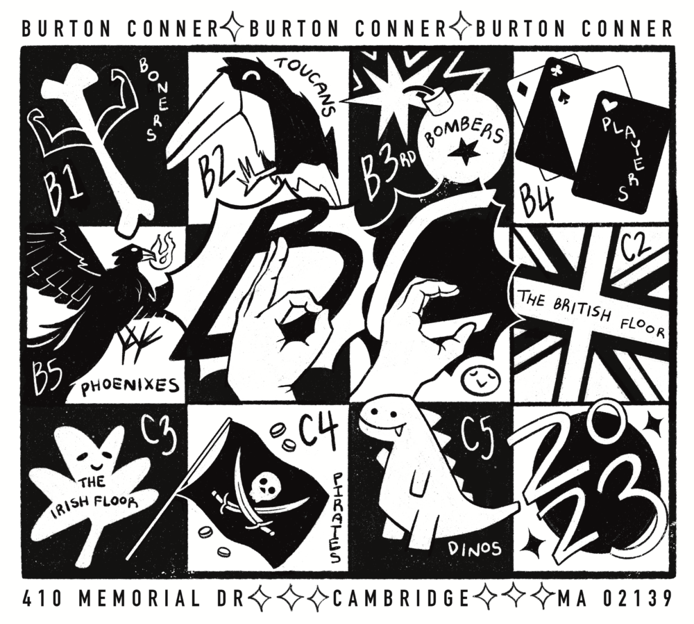
design I made for Burton-Conner dorm hoodies
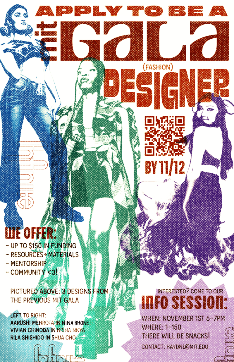
a poster I made for MIT Gala, Infinite’s end-of-year launch event
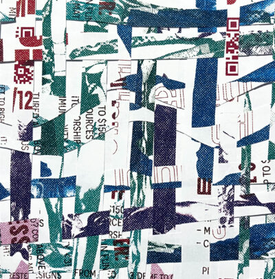
one of the mit gala posters, cut into strips and woven to make some funky patterns
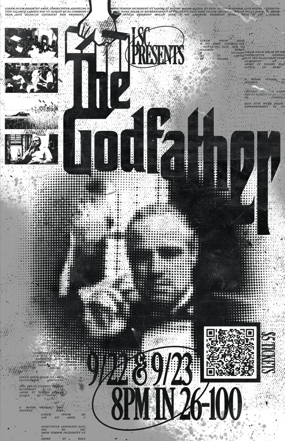
a poster for LSC, a club on campus that screens movies. they were showing The Godfather this week on 35mm film!
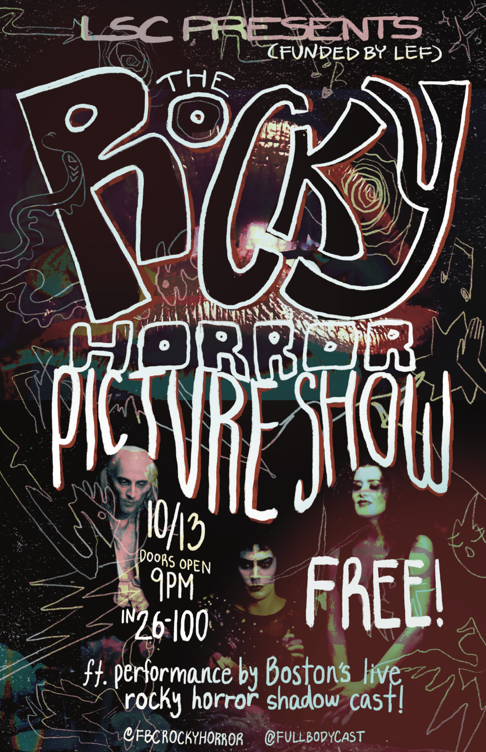
another poster for LSC, for their annual showing of The Rocky Horror Picture Show
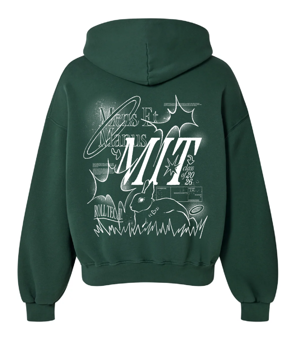
my submission for the class of 2026 hoodie design contest
ceramics (all WIPs because I haven’t glaze fired them yet)
This has been one of the coolest parts of my semester so far! I’m taking 4.301 Intro to Artistic Experimentation, which takes place in the Mars Lab makerspace. The space includes a mini ceramics studio, outfitted with tools for sculpting clay, a wheel for throwing pottery, various chemical powders for mixing glaze, and a kiln for firing.
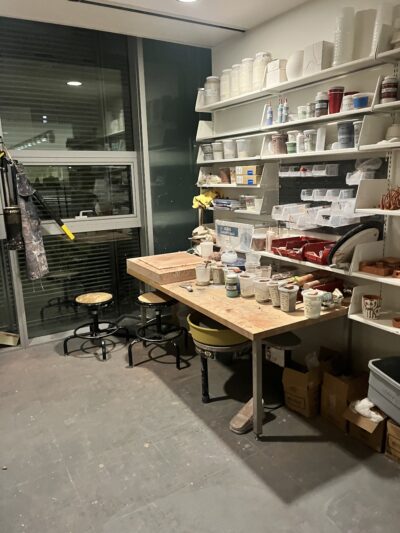
the ceramics studio
We started off our clay unit with making little pinch pots, then moved onto different handbuilding techniques like slab and coil building. The steps of making a clay body are as follows: the piece needs to be shaped/ sculpted out of wet clay, left out for a day or two until it’s bone-dry, fired into hardened ceramic (this is called bisque-firing), painted with underglaze and glaze, then fired again in order for the glaze to melt and solidify into glass. I just got trained on the last two steps–mixing my own glazes and loading/running the kiln–so I’m excited to finally finish up my pieces! In the meantime, here are some process pictures:
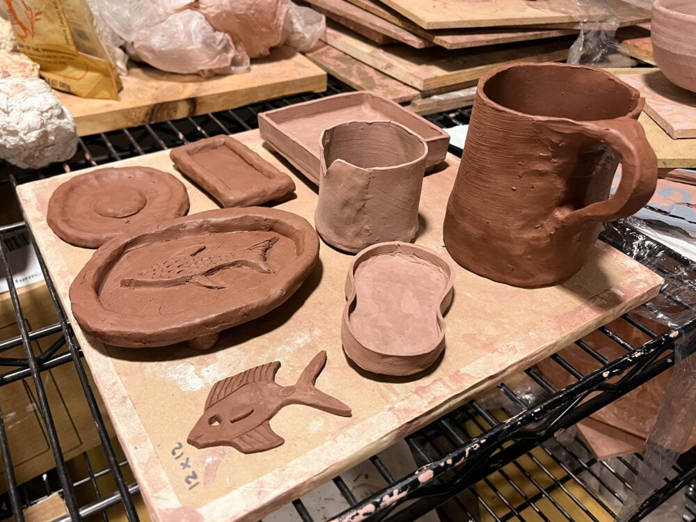
some freshly built clay things, drying
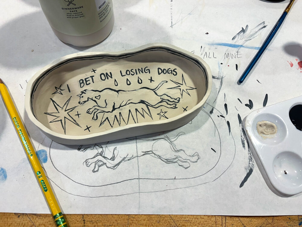
a tray with a Mitski lyric + dog design. graphite burns away in the kiln, so you can use a pencil to sketch the design directly on the piece for reference
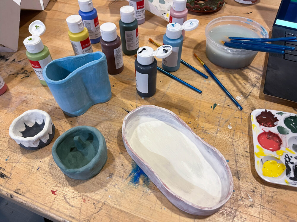
trays in the process of being underglazed. after drying, they’ll be coated with a clear glaze and fired to give them a glassy sheen and make them food safe.
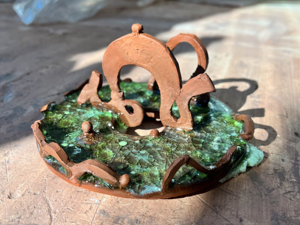
a dragon-themed ring holder. I embedded some broken pieces of stained glass into it before bisque-firing, and the glass melted and crackled into these cool patterns. (some of the glass was from a broken beer bottle I picked up off the street oops)
photography
I’m also taking 4.341 (Intro to Photography) this semester, and we’re currently in the middle of our film unit. To shoot our first rolls of 35mm B&W film, Joanna C. ‘24 and I thought it would be fun to go to a nearby scenic location and walk around in search of cool photos. Due to scheduling conflicts, however, the only time that worked for us both was 7AM on a Wednesday–so, one Wednesday morning, we woke up bright and early and took the blue line train an hour up to Revere Beach, strategically getting off at the stop closest to Dunkin. Two bagels and one iced latte later, we made our way down the beach, buffeted by winds and the occasional ray of sun.
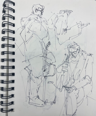
strangers on the blue line
Our film rolls filled slowly with pictures of fat fearless seagulls, frothy seafoam in the sand, and worn buildings facing the horizon. As we stood in front of an old restaurant, squinting into crusted windows, a grizzled man stepped past and remarked to us that they were planning to bulldoze the plot. “They’re going to build more apartments,” he muttered, before plodding on. I squinted into the viewfinder and took my 36th and final shot.
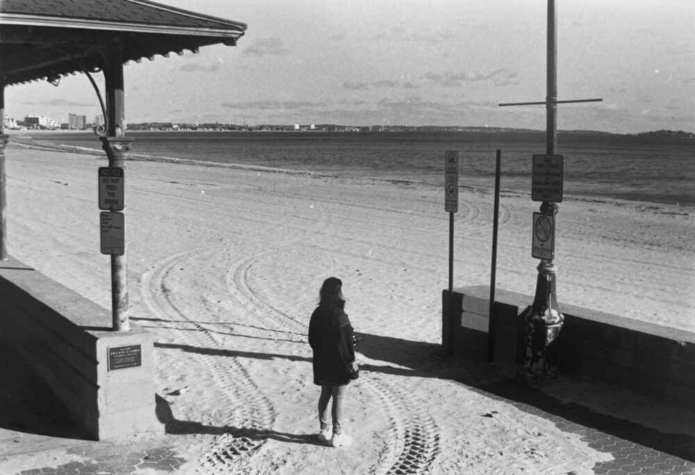
one of my photos: joanna, facing the sea
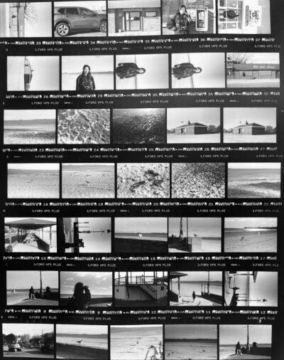
a “contact sheet” of the images on my roll
The coolest part about working with film is actually developing and enlarging the photos ourselves in the darkroom! It’s such a precise and meticulous process: since the rolls are light-sensitive, they first have to be unwound and respooled in complete darkness, so you have to feel about with your hands for scissors, spools, and other tools. Then, once the spooled film is tightly sealed in a light-safe plastic tank, it undergoes seven washes of various chemicals for various amounts of time, and then is hung in a tall dryer for ten minutes.
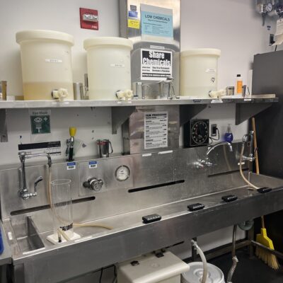
the (very well organized and labeled) film developing station
If I were more chemically inclined, I’d include an explanation of what’s actually going on under the hood. All I know is that after the chemical baths, the film is no longer light-sensitive, and we’re left with the negatives of the photos! We then cut the negatives into rows of five and slot them into clear plastic sheets so that they’re nice and visible on top of a lightboard.
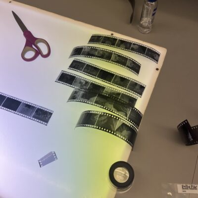
cutting the strips of negatives
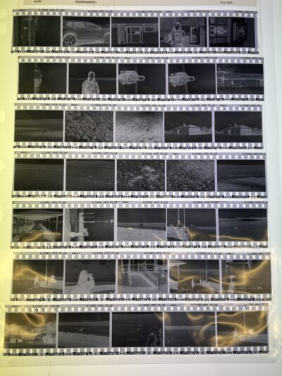
the plastic sheet
To actually enlarge and “print” the photos, there’s a whole separate process of projecting light through the negatives onto light-sensitive paper, which undergoes its own chemical baths. It’s honestly so cool, and the limitations of shooting with a finite number of shots and having such a long gestation period make each image feel almost like a miracle. I really like the physicality of it all, from having to wind the camera spool between every shot to using your fingers to squeegee water off the roll after it’s developed.
I also got the chance to take pictures at one of Mince‘s popups; they’re a club on campus that hosts fine dining popups for students.
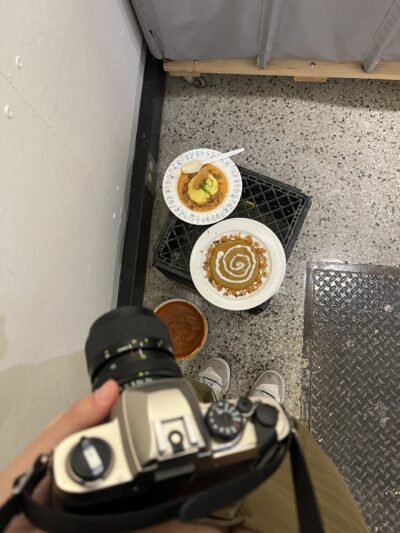
my camera and two of their dishes
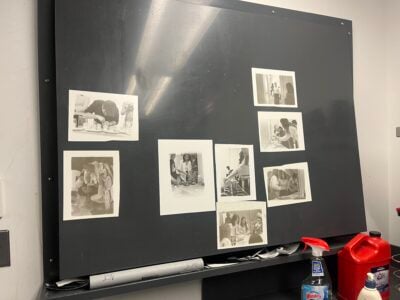
some enlarged photos from the shoot, drying. they’re a little washed out because the darkroom was running out of photo developer :(
Before starting the film unit, we also worked briefly with digital cameras! Two of those photos:
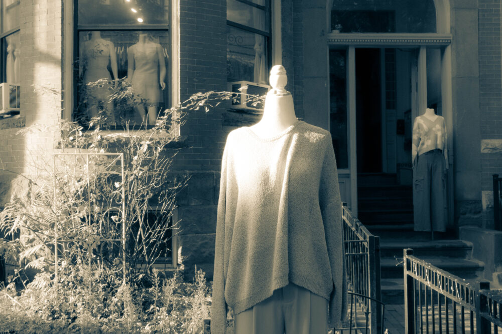
mannequins in front of a boutique on Newbury Street
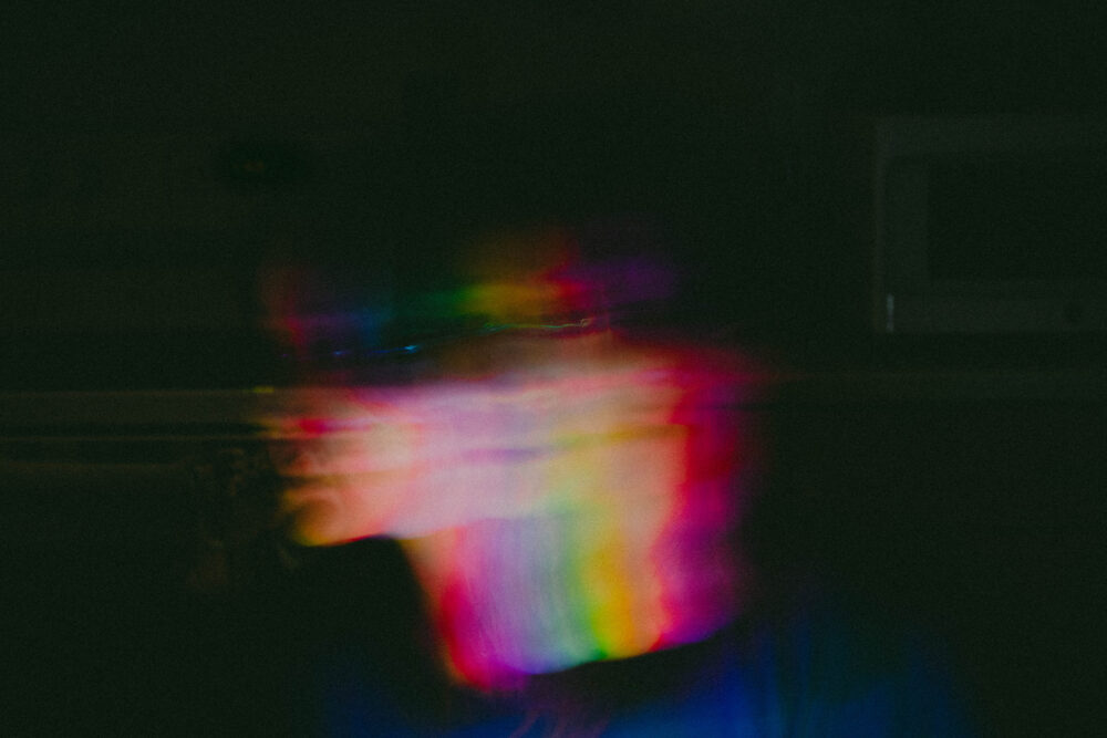
Joanna, Angela Z. ‘24, and I took this for an assignment centered around long exposure photography
?? uncategorized
Metropolis (a community makerspace) started running stained glass trainings this semester, so I signed up for one and made this poorly soldered but still lovable Kirby. There’s no face because the glass pieces for the eyes/mouth would be too small, but you get the idea:
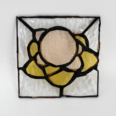
faceless kirby on a star
I’ve also been working on my Infinite spread, which has been really fun. Admittedly, I find myself doing more administrative work than actually making pieces, but there’s an amazing team of fabricators assigned to my spread who’ve been producing some really cool stuff. Our primary form of fabrication right now is metal laser cutting, which we’ve been doing in the MAD (Morningside Academy for Design) makerspace.
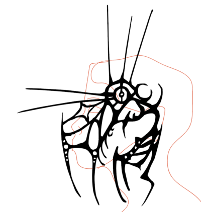
design for a metal “headset” that’s supposed to bend to encircle the ear and head of the wearer (hopefully it actually works)
As an aside, I knew about MIT’s prominent makerspace presence before coming here, but I assumed the spaces would be primarily centered around engineering. Although there is definitely that emphasis, I’ve been pleasantly surprised to find that the maker culture extends to the arts as well. The result is this really cool confluence of cutting edge maker technologies with slow, traditional crafts. For example, in the Mars Lab ceramics studio, besides the standard sculpting tools, there’s also a Formlabs 3D printer that’s set up to use ceramic resin–so it can 3D print elaborate clay bodies with geometries that would be extremely difficult to make by hand. It’s pretty crazy stuff.
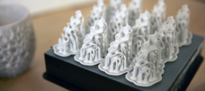
an example image from the Formlabs website
Besides making things, I’ve also been trying to go to more art-related events both on and off campus. In early November, the MIT Museum hosted an event with Lynda Barry (!!!), a famous cartoonist. My high school English teacher was a huge fan of Barry, and I knew I had to go, if only to send her a picture. Barry talked about the act of drawing as an act of play, and the inherent joy and discovery kids have when they draw and craft stories. The presentation was phenomenal, and the event was discounted to just $5 for MIT students :- D
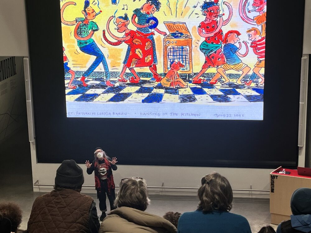
yayy
MIT ID holders also get free entry to most nearby museums, a luxury I take full advantage of. Boston boasts an incredible selection of art museums, most notably the Museum of Fine Arts (MFA), the Institute of Contemporary Art (ICA; my personal favorite), and the Isabella Stewart Gardner Museum.
In October, the MFA opened a new exhibition called Fashioned by Sargent. Sargent, AKA John Singer Sargent (1856-1925), was one of the most famous oil painters of his time, and he specialized in portraits. The exhibition explores the relationship between Sargent’s subjects and the luxurious garments they wore for their portraits, and it actually features some of the original dresses displayed next to the paintings. I went with a few friends, and that was where I got to see Nonchaloir in person!
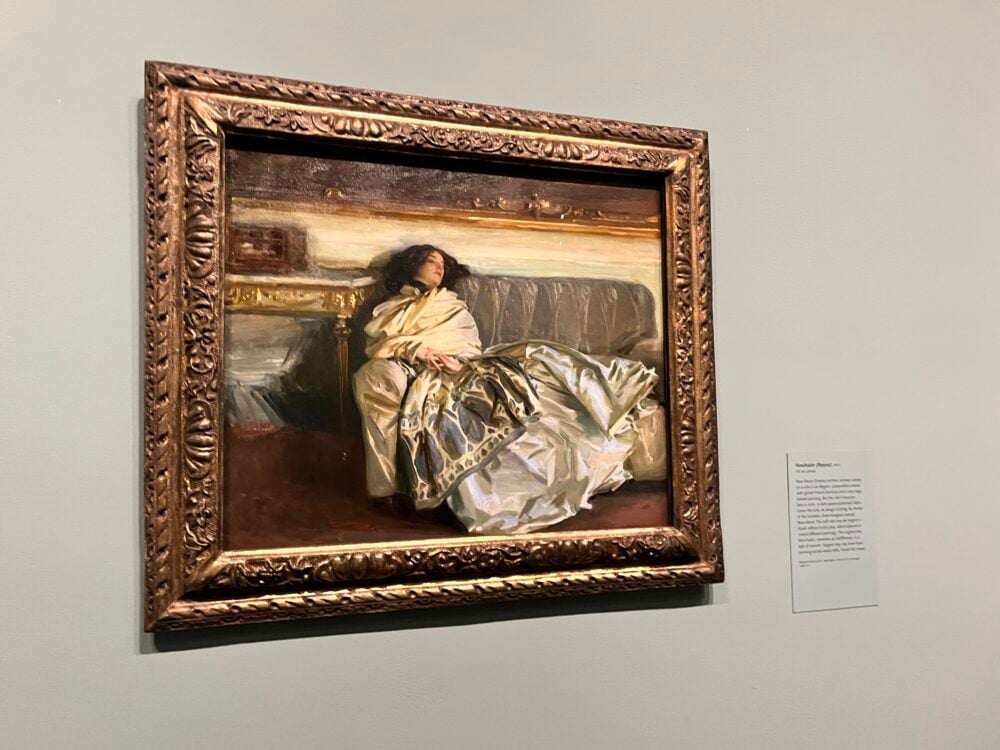
it was smaller than I expected tbh
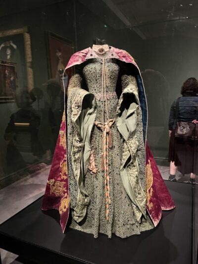
one of the gowns on display
Finally, I went to the Boston Art Book Fair with Teresa J. ‘26. It’s an annual event put on by the Boston Center for the Arts, and it offers workshops, panels, and booths put on by over 140 exhibitors selling various printed matter. The exhibitors range from established publishing companies (e.g. the MIT Press had a booth there) to independent artists who run their own small businesses. It was so inspiring seeing all the incredible, experimental work and passionate artists, and it took all my effort to not spend money at all of the booths.
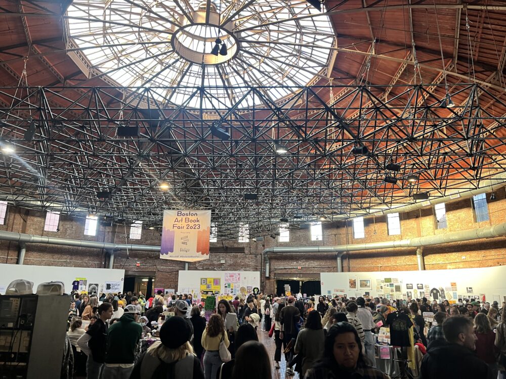
the main hall where all the booths were
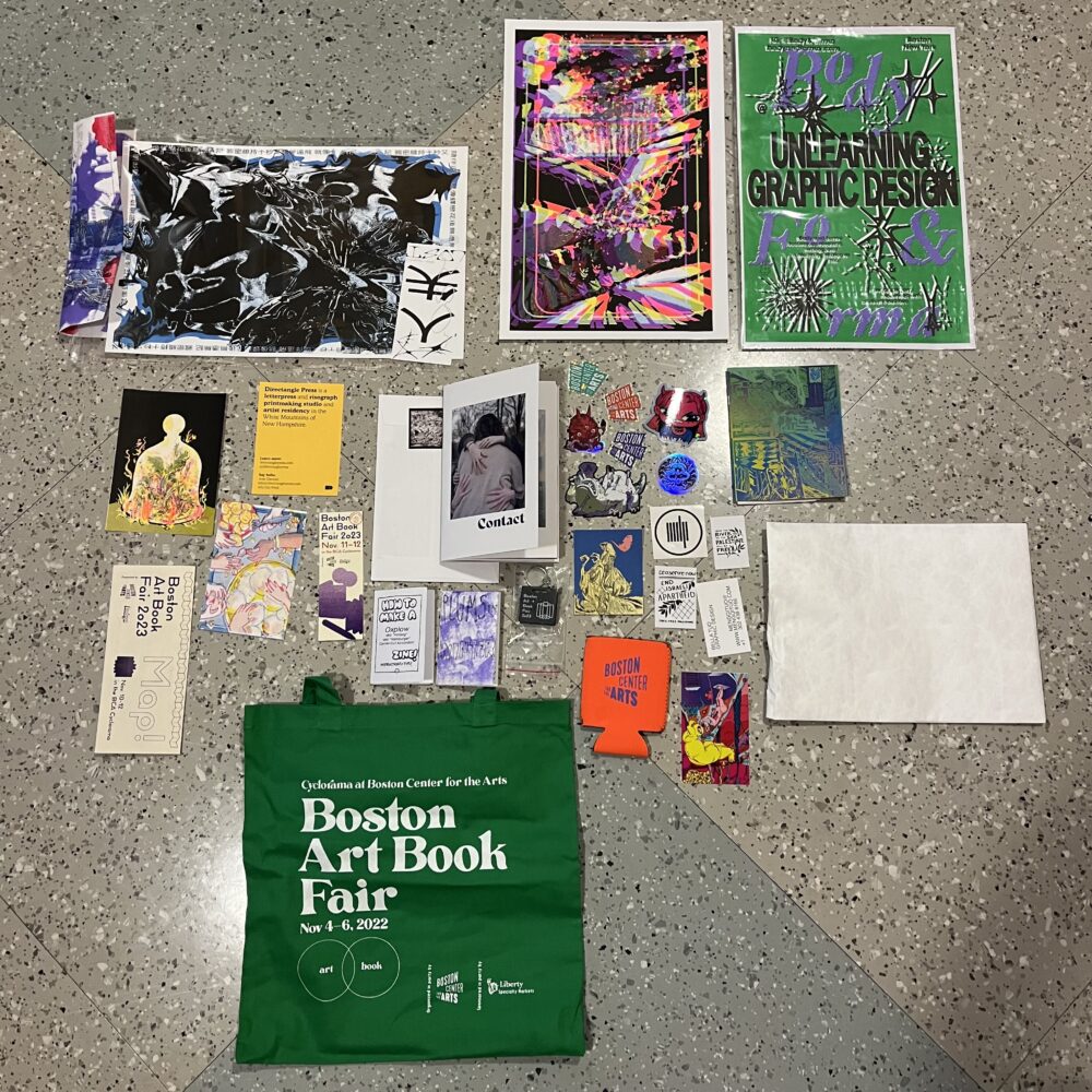
everything i got for free or bought there
So that’s my past few months, benchmarked by various art things! This post is a little all over the place and much longer than I initially planned; it’s more of an amalgam of a bunch of moments than a cohesive story. But the throughline is that I have been finding so, so much joy in the arts this semester, both in creation and consumption. They are fresh and heady and infused with so much life, and I always forget just how joyful it is to make art. It adds hue and dimension to my days, which are usually filled with lectures, problem sets, and my laptop screen (which, don’t get me wrong, my technicals bring me joy and fulfillment too, just in a different way). And for that I’m extremely grateful.
Anyway, we’re entering the last month of the year now! I hope December is just as dappled with flecks of paint, dried clay, and eraser shavings!