Internet Nostalgia by Chris M. '12
Internostalgia!
Well as you may have heard from various other blogs, this week served up a heaping dose of pain in the form of academic expectations. If you ever want to know the surface area of a golf ball with radius 3cm covered with 100 dimples hemispherically embedded with radius 3mm, I can help you out. (note: turns out that’s impossible, you can’t fit 100 dimples with those dimensions). MIT is getting tricky like that. Much like the leaves have abruptly shed their quiet greens to give way to an explosion of reds yellows and oranges, MIT has shed the appearance of normal university and has abruptly shifted into high gear. Don’t let that freak you out though, MIT is really really good at helping you adjust and prepare for such shifts. (read: Pass/No Record. Embrace it)
All this difficulty may make you yearn for a simpler time, a quieter time. A time when the internet was young. You kids and your Web 2.0, user submitted content, and fancy flash and java. Back in the day we didn’t have all the bells and whistles, like the ability to tell someone their video on YouTube of a baby hamster was “OmGZZ TAT HMASTER IS SOO HAWT LOL!” No, back then, if we wanted to know how a babby was formed, it meant an akward talk with mom and dad. If only there were a way to show you the humble beginnings of the ‘net, before LOLcats and chocolate rain.
Ladies and Gentleman, I have found such a way. Thanks to the Internet Archives, I’ve managed to pull up some of the dusty old versions of the web, some from as many as 12 years ago. Laugh, gape, and enjoy:
We’ll start things off with something iconic, and what could be more iconic than McDonalds? This is what a multi-billion dollar company came up with for the web in 1996:
McDonalds-1996
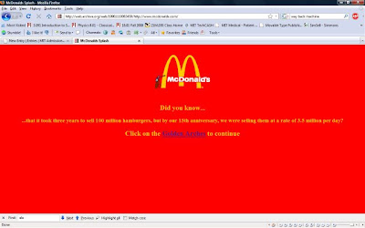 |
Whoa, that’s it? Yes folks, back in the day that was the bleeding edge of technology, two colors and a tiny gif of a man on a ladder. Well one example isn’t a fair respresentation of companies right? let’s choose another high-profile company with tons of money to throw into a web design team.
Pepsi-1996
 |
OMG MY EYES!!!! I’m pretty sure my retinas have just melted. They seem to have taken their design cues from a group of 12 year old Myspace designers. (if any of you have a myspace that looks like that, please please fix it.)
This does teach us a few important lessons though:
1) more is definitely not always better
2) non-tesselating backgrounds should stay non-tesselating.
I don’t know if you can read that tiny text but apparently there is a low-res version for people with speeds “lower than 28.8 kbps” Lower than 28.8kbps?! I didn’t even know that was possible!! Once again though, it’s hard to blame them, I mean after all this is new technology, if we want an example of what’s truly possible we should turn to some kind of Institute of Technology…..
MIT-1996
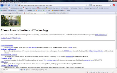 |
Surprised? I sure was. A tiny little picture and some hyperlinks are a long way from the ever-changing home page of today. But it’s better than some other universities up the river…
Harvard-1997
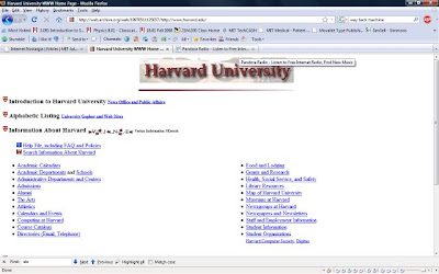 |
No way would I think that website belonged to one of most elite schools in the country. If I didn’t know any better I would’ve called that a fake. It doesn’t quite inspire the same awe and respect that the school deserves does it? But apparently a website that failed to inspire respect for an intimidating organization was pretty common, as evidenced by….
CIA-1998
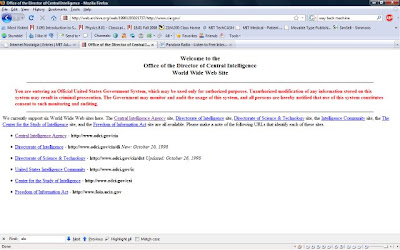 |
THAT’S the CIA website? That’s the super scary organization that can see you from space and erase your brain with lights? seriously? Am I supposed to be afraid of a website that has black text on a white background? Oh but they sternly warn you that this is an official government website, and you can tell they’re serious because the text is red. Psh I’m more afraid of goats. (Seriously, goats freak me out. Look at their eyes, that’s not right) Luckily the turn of the millenium brought on huge leaps in technology, including things like iPods.
Apple-2001
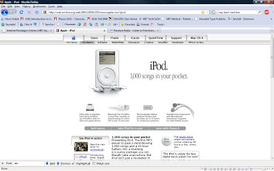 |
Believe it or not, back before the iCan’t-think-of-an-original-name craze caught on, there was simply iPod. No nano, no touch, no shuffle, just iPod. It sported an “ultra-slim 5 Gb hard drive” and promised a whopping 10 hours of play time. Let’s evaluate “ultra-slim” for a second:
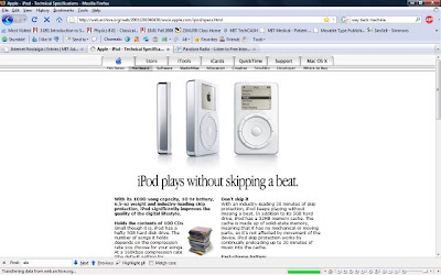 |
Ultra-slim eh? yea ok, that’s about as ultra-slim as Rosie O’Donnell at a buffet. Seriously that thing looks like it needs a luggage tag to be carried anywhere. Pause for a second though and realize that that behemoth held 5Gb. I’ve got SD cards that have more memory than that now. A 4 Gb USB memory stick will run you $20 now. Isn’t that incredible? Nowadays the similar iPod Classic has 120 Gb, 36 hours of audio, color screen, and costs $50 less. That’s really amazing. And the trend with the iPod Touch and iPhone has been to double memory every year. That kind of growth is mind blowing, almost as mind blowing as the social networking phenomena, wonder what that looked like in it’s infancy?
Myspace-2003
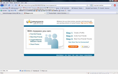 |
Hehe that was the site that started off the social networking craze for a lot of people. look how easy it is to get signed up! Three steps, that’s it! Then you too can be stalked as you fill your profile with tons of glittery gifs and music and surveys about 1,285 things no one cares about! Wow you ate lasagna for lunch? Fascinating! Of course Myspace was just the beginning, nowadays most everyone is in love with Facebook.
Facebook-2005
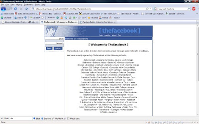 |
Yes, that’s was the old facebook. Somehow I don’t think that’s what everyone has in mind when they join the groups like “Bring back the OLD FACEBOOK NOW or omgz I’ll be mad!” For those unaware, Facebook was once an exclusively college networking site. A way to keep in touch with your college friends. Then they made a high school facebook, then merged the two, opened it up to anyone in the US, then the world, and of course the next logical step would be the galaxy. “1 Friend Request from Gllxxazzrog” can’t be too far off. One website that’s as universal (at least to you guys) is the MIT admissions site. Are you ready for this?
MIT Admissions-1996
 |
No blogs (and thus no bloggers, EEP!) and a bulleted list. Let’s take a look at the Freshman Admissions page (which is the great grandaddy of the website you’re lookin at right now.)
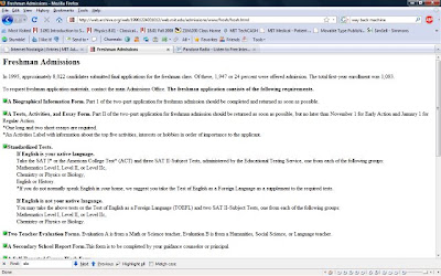 |
There’s some great information in there. For one thing, back in the day an interview was REQUIRED, and there was none of this MyMIT application tracker or Online Application stuff, it was papers mailed to you and you waited for your letter and that was that. No camping out on the decisions page hitting refresh every 5 seconds, if your postman was feeling particularly underpaid that day, you wouldn’t find out until maybe 2 or 3 days later.
Well there’s a peek at what the Internet used to look like. Clearly there have been some welcome advances in design and interactivity, but before you go and brag about how great your new-fangled web is, consider this:
Back then, the MIT admission rate was 25%.
If that doesn’t make you yearn for the old internet, nothing will.
wow.
(and i already had facebook at that time, heh.)
That’s scary. I used to think that my third-generation iPod was hardcore.
One thing I certainly do NOT miss about the 90’s:
AOL
This is so awesome! If you look at gaming over the years you see the same thing.
My favorite was the CIA website, it looks like a mistake.
Yes those were the good o’ days when sites were small without a lot of big pictures and sound bits. You could go to a site, it would load fairly quickly, and you could find what you were looking for. No banner ad’s. No pop up’s. Life was simpler back then… And my son was a lot younger.
Oh man, this makes me so sad! Why?
Back home, we still use AOL.
And our internet speed?
26.2 kbps.
So yes, something lower than 28 k does, in fact, exist.
Internet here at MIT is quite possibly the greatest thing on the planet, no lies.
Lol- Shockwave plug ins
Have ALL the My MIT accounts of the last admissions cycle been deleted yet? I want to reapply but am having trouble doing so.
25% was nothing, compared to having to post my application all the way from Malaysia. And filling in the tiny spots by hand for a 1 in 4 chance of getting accepted? I’d rather have the 2.7% i’tl student acceptance rate! At least then I could tell people about the brutal acceptance rate, instead of failing to get accepted at a fairly decent acceptance rate.
After studying voter patterns and comparing them to random patterns, I have to admit that it is crazy to wait 6 months to get accepted into MIT under those conditions.
Anyway, I’m proud to say that back in 1998, my website was about as good looking as the McD one I think you couldn’t really blame them. Using a fat logo and a bunch of flashy pictures would’ve made dial-up users very annoyed. I actually built an ugly and a not-so-ugly version of my site to cater to the slow modem users.
“Back then, the MIT admission rate was 25%.”
If the number of applicants was the same back then, I’m so inventing a time-traveling machine.
(…Although something makes me think that if I was actually able to do that, I might get into MIT in the current day.)
“No camping out on the decisions page hitting refresh every 5 seconds”
really there’s a decisions pg? where??
;-D
@Anxious
yup, as far as I know. At least mine was.
@Deng
oh yes, there’s a decision page. Don’t worry, you’ll find it in due time.
And here we see yet another advance time has brought to the Internet. Who remembers when spam was just canned meat?
Anyway, I enjoyed this entry. I don’t remember when I started using the Internet, but I don’t think it was quite that bad when I first got there.
I would like the return of the twenty-five percent acceptance rate, though.
yes, but there was also not a collegeconfidential forum where everybody was telling you to “camp out on the decisions page hitting refresh every 5 seconds”
Piper’s #1 Suggestion to Prospectives:
Do. Not. Go. To. Collegeconfidential.
I didn’t start posting there until a year after I was admitted to MIT, but if I had been there as an applicant… *shakes head*
Ah, yes…the good old days
Thanks Chris, this post brought back quite a few memories!
@chris 12
err.. thanks for no help
jk
@ brian
of course not
“Back in the day we didn’t have all the bells and whistles, like the ability to tell someone their video on YouTube of a baby hamster was ‘OmGZZ TAT HMASTER IS SOO HAWT LOL!'”
Oh my god…I don’t know why, but I read that sentence and found myself rolling on the floor with laughter. Maybe it’s because I’ve read far too many a YouTube comment that reads almost exactly like that, for example: “AAAHAHAHHAHAHHGAGAGHAJAJJHAHAH AH! OMG
HAHHAHAHAHHAHAHHA SOOOOO FRICKEN FUNNNYYYYY” as a response to two kittens wrestling…wow…
Ooohh… The Wayback Machine aka the Internet Archives! This non-profit was founded by MIT alum (and Chi Phi brother) Brewster Kahle. He’s a good model to follow for those of you who make your millions early. -McG
I love old webpages. And FYI, I first found out about MIT in 1999 or so and do remember this webpage or some variant. Vaguely…
Actually what I did was just subtract the area of the hemispheres embedded on it which is 100*2pie*r2 from the surface area of the sphere as a golf ball is spherical i.e 4pie*R2
The method there is very different
This post was interesting and I guess the answer to your golf ball question is 18pie cm2. Mail me if i am right
@ashkay
thats unfortunately incorrect. but! if you are that interested in finding out how to do it, you can check out the answer here
http://math.mit.edu/18.01/psets/PSet2solns.pdf
starts on page 3