January in the Studio by Natasha B. '16
4.11A: Architecture and Environmental Design Intensive
I’m perched on the top step of the super-architected Stata amphitheater, a little blinded by the brightness of sun and snow. In searching for a place to sit, I named the following constraints: that I must sit outside, that there must be light, that I must have a dry seat and a wifi connection. I didn’t think about the temperature, so my fingers are almost too cold to type, but hey, that’s the outside for you.
The class I took over IAP was about designing with constraints. It was about making your own rules and following them unswervingly. 4.11A: Architecture and Environmental Design Intensive is a month-long class with an enormous studio component. I took it for context. My department, Urban Studies and Planning, is within the same school as Architecture, and while there are some overlapping courses and professors, so far, I hadn’t investigated architecture. If I’m going to study the built environment, I figure I should share some background with the people who make it.
In lecture, we learned principles of design: rhythm, scale, proportion. We watched the Eames Classic “Powers of Ten” and read about harmony, structure, and the golden ratio. We had guest lectures from Anne Whiston Spirn, my advisor, and Marie Law Adams of Landing Studio.
<br
</br
In studio, we measured and traced and cut and built and did it all over and over again. We set rules and followed them painstakingly, constructing careful abstractions of human proportion and movement. At times, it was frustrating. At times, I felt forced to adhere to arbitrary rules I didn’t understand, and the profound interpretations we were expected to come up with felt like b.s. or exercises in covering your tracks after messing up. But then I could see, in my own projects and in my classmates’, how the constraints had not choked creativity. They had permitted it.
Twice during the semester we presented our work in the form of a review. Each student displayed his or her drawings and models and gave a short presentation to a panel of architects, students and faculty, followed by questioning that could feel like either casual conversation or interrogation. The panel evaluated our craftsmanship, our methods, the rigor of our thought and decision-making processes. It looked like this.
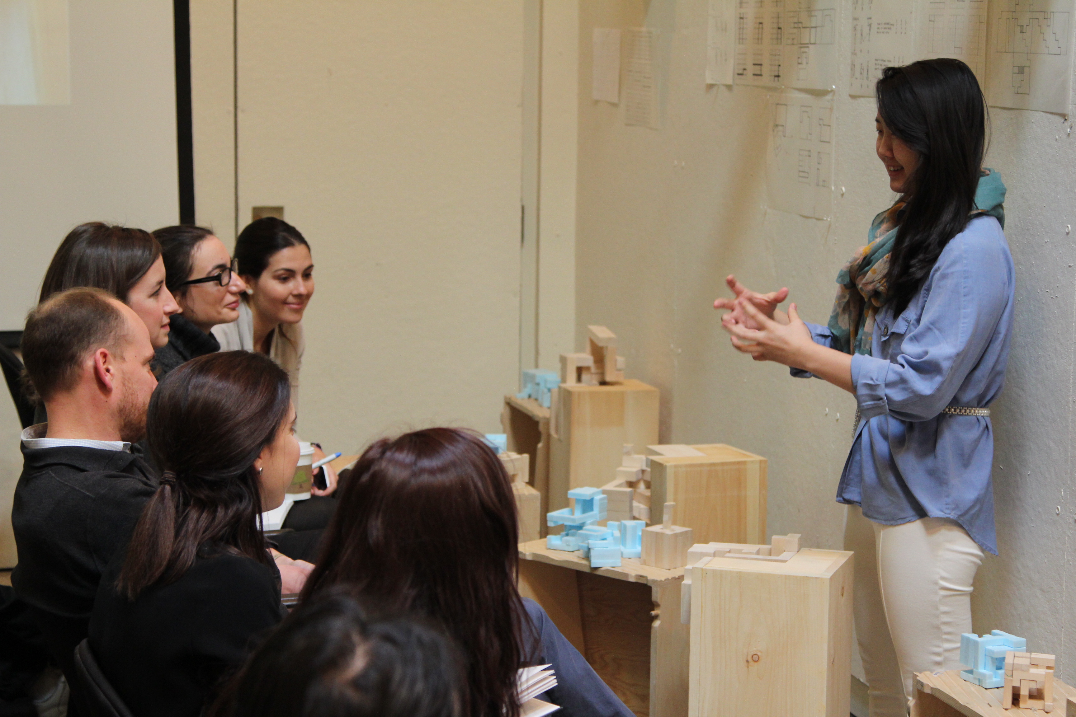
Grace Park (Wellesley, 2016) explains her models to an audience of architecture students and faculty.
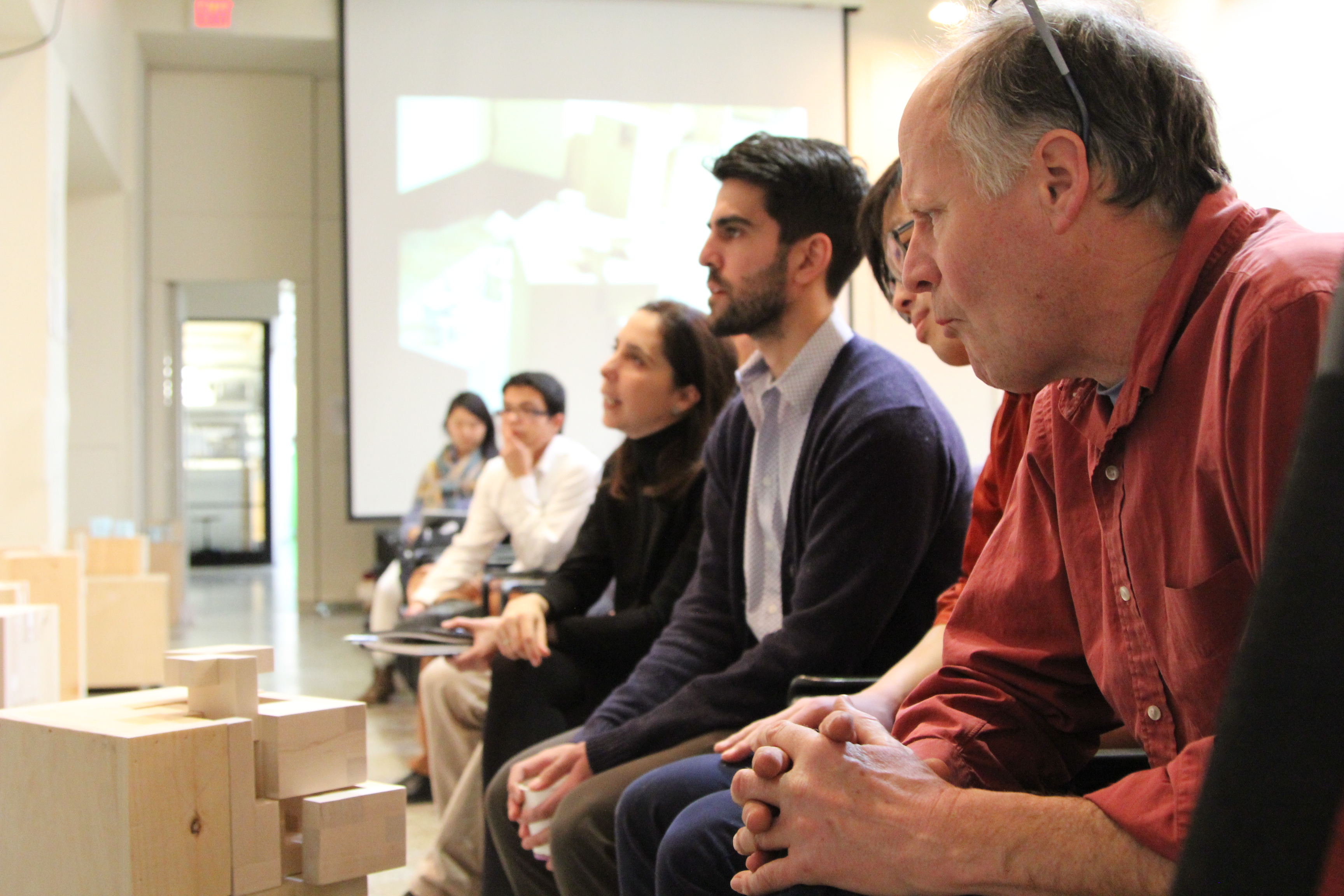
They listen intently.
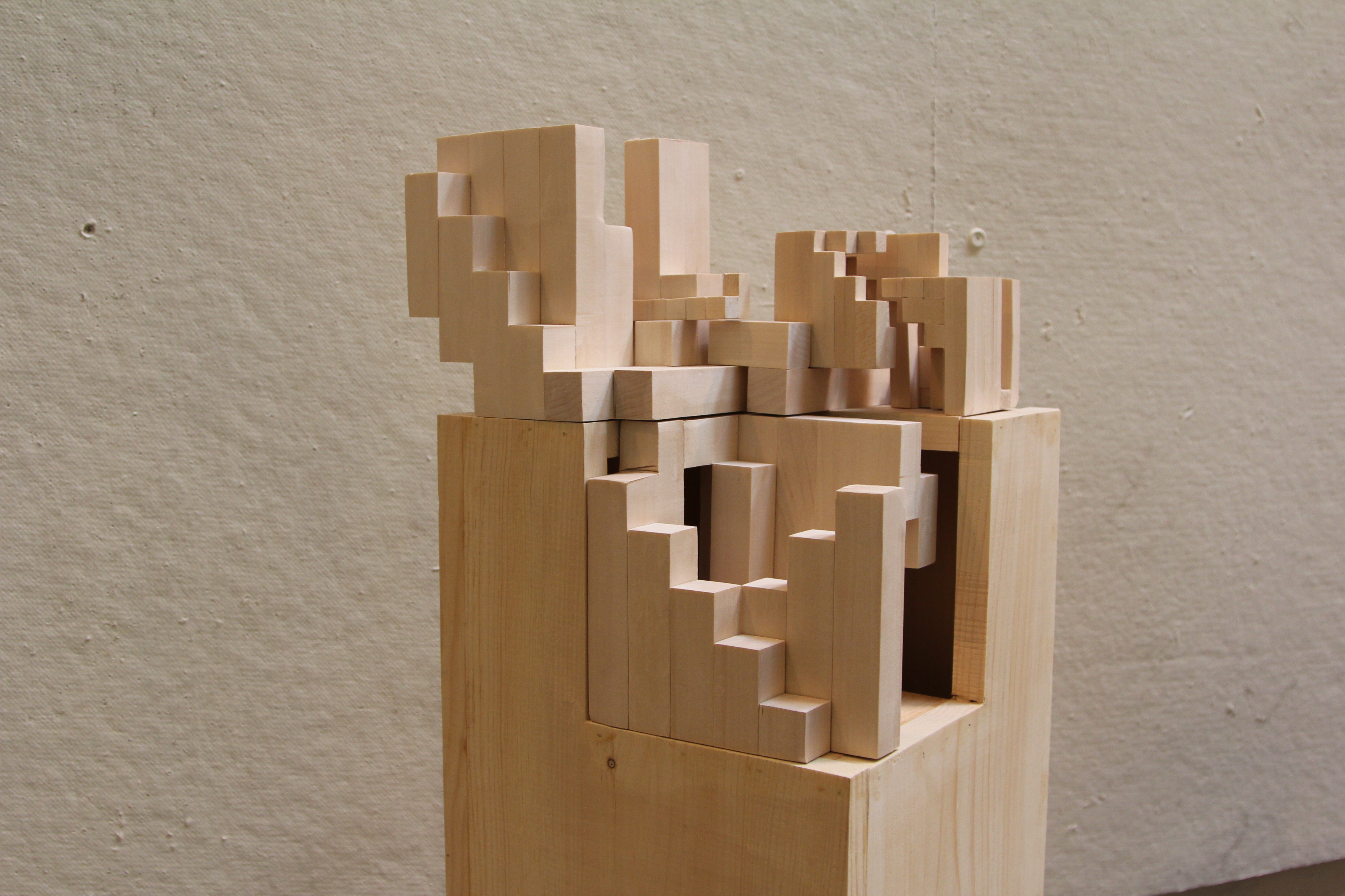
Grace’s final project, disassembled.
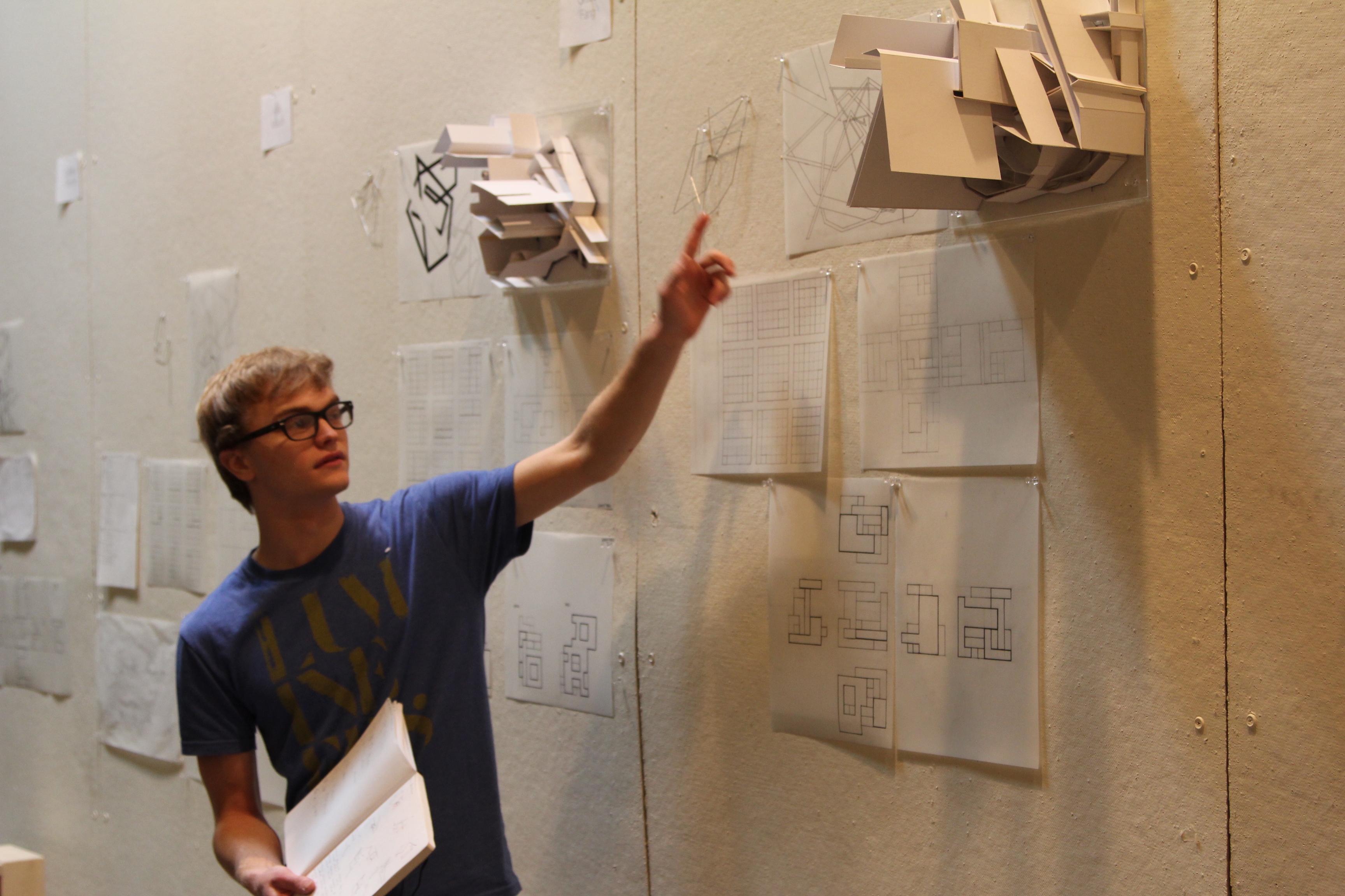
Anthony Kawecki (MIT, 2017) points to his work from early in the month.
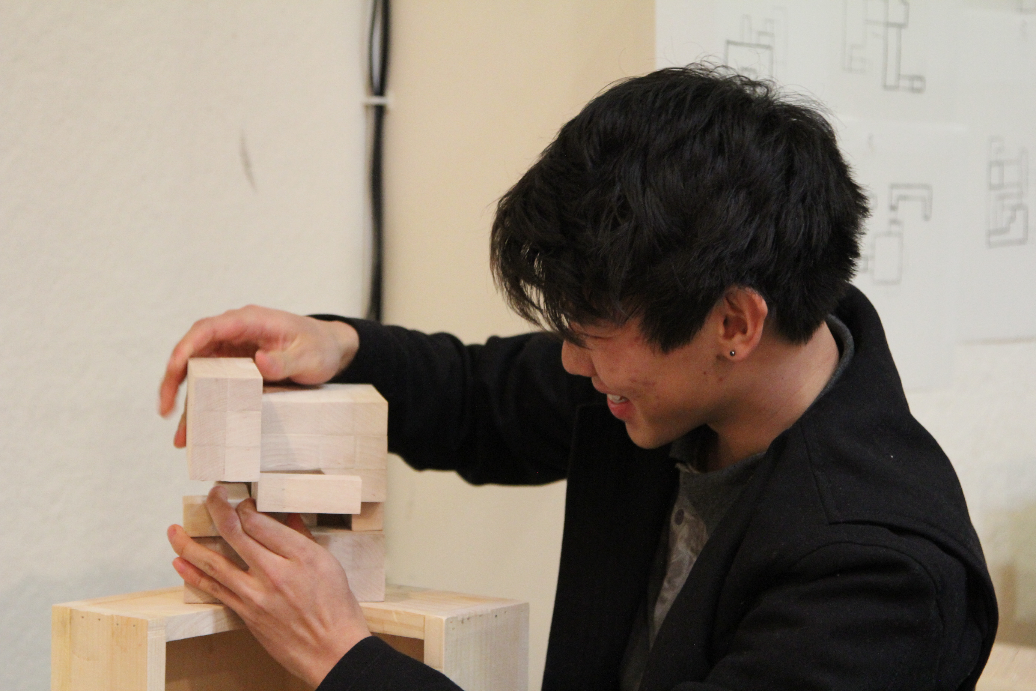
Justin Cheung (MIT, 2016) demonstrates the interactive movement of his wood cube.
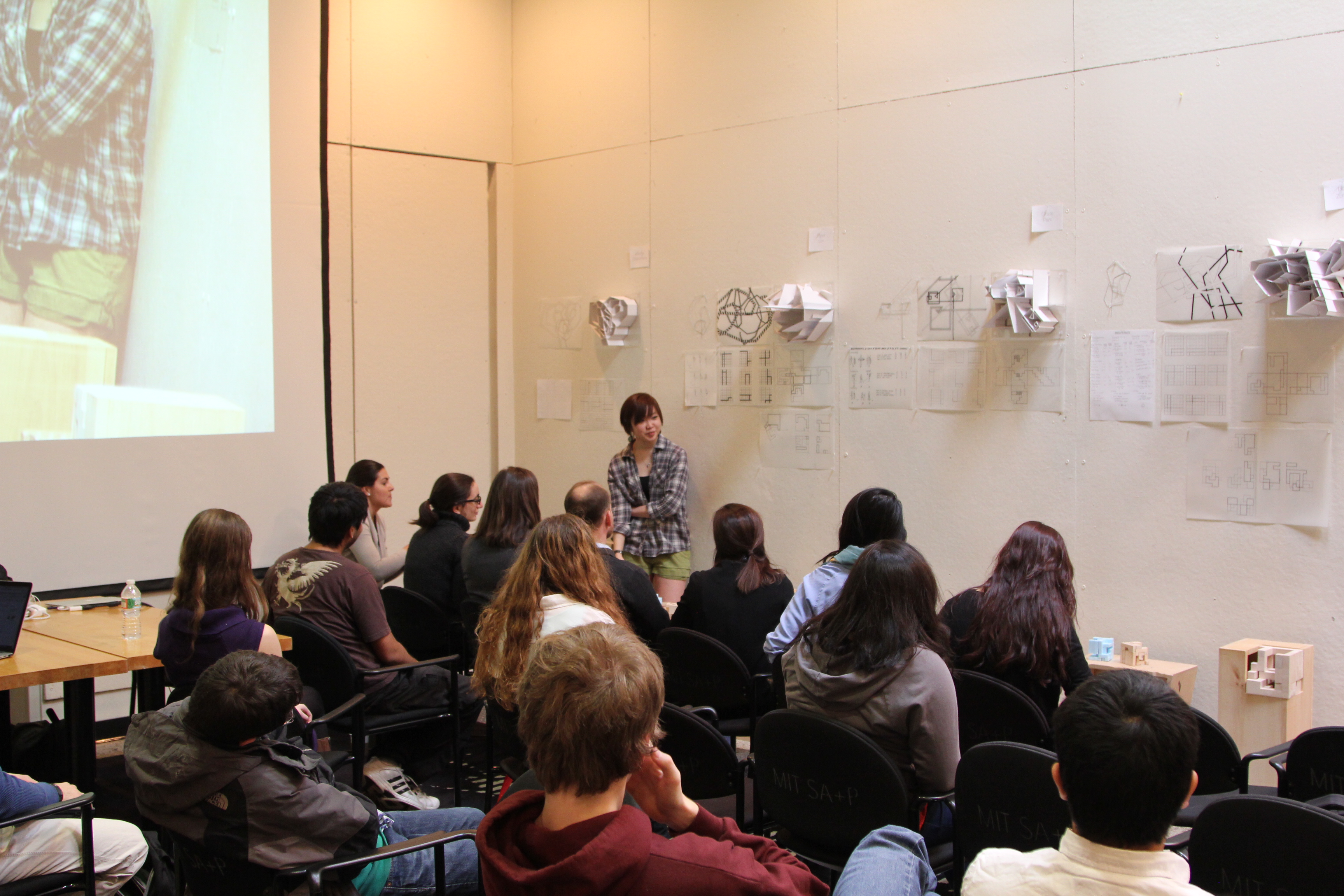
Piper Lim (MIT, 2017) has everyone’s attention.
Last time I posted about architecture, some people got riled up. Some people thought that it was too artsy, shallow, superficial. Too unscientific. It’s true that architecture is not a hard science. It’s not a pursuit of truth. There are no proofs or controlled experiments. The architecture major at MIT is notorious among undergrads for two things: abstractness and difficulty. The architecture students work harder than most of us and sleep less. MIT is an engineering school, but that fact shouldn’t relegate other disciplines to low status. Design is not solely aesthetic. Good design takes rigorous thinking. It takes compromise, comprehension, good craftsmanship. I’m not an architect, and this class didn’t make me one. What we did was just practice.
From the department website:
“Architecture was one of the four original departments at MIT, and it was the first signal that MIT would not be narrowly defined in science and technology. Through recognition of architecture as a liberal discipline, the Department has long contributed to learning in the arts and humanities at MIT.
The Department is committed to a concern for human values and for finding appropriate roles for architecture in society. It is a place where individual creativity is cultivated and nurtured in a framework of values that are humanistically, socially, and environmentally responsible.”
Technological advances should be accompanied by innovation in design. Otherwise, we’re stuck living among anachronisms.
What do you think? What are your thoughts on architecture, craft, the intersections of design and STEM in general?