The Years of the Rat by Matt McGann '00
More about MIT's famous class ring: the "Brass Rat."
Following up on JKim’s entry about excitement for the unveiling of the ring, here’s a bit of history and background.
Each class year at MIT officially gathers three times — once, at the beginning, for the freshman picture; once, at the end, for graduation; and once, halfway through, for the unveiling of the class ring. The design process begins in freshman year with the highly competitive process of choosing the ring committee, or “RingComm,” of 12 class members, students representing different MIT walks of life. The RingComm next solicits bids for the very lucrative ring contract: 90% of all students will purchase the ring in a typical year; one company actually shuts down their factory for the one week each year of prime MIT ring-buying. Using imagery representing events from their first two years at MIT, and drawing upon suggestions and ideas of the entire class, RingComm designs the ring over a six-month period, unveils it at an extravagant event, and stages a lavish delivery ceremony.
How did this all start?
The history of the Massachusetts Institute of Technology Class Ring dates back to the spring of 1929. C. Brigham Allen, President of the Class of 1929, appointed a ring committee consisting of members from the classes of 1930, 1931, and 1932. Their mission was to design a ring to be used as the Standard Technology Ring. The committee’s first decision was whether to use the beaver or the Great Dome on the ring bezel. After much debate, the committee decided to adorn the bezel of the ring with the beaver and have a three-piece construction, with MIT and the class year each appearing on a separate shank. Thus the Brass Rat was born as a tradition at MIT.
Yes, the ring is known as the Brass Rat. Why? Because it is made of gold and features a beaver on the front.
Why a beaver? Another interesting story. In 1914, Lester Gardner of the MIT Club of New York proposed a mascot to President Richard Maclaurin.
“We first thought of the kangaroo, which, like Tech, goes forward by leaps and bounds. Then we considered the elephant. He is wise, patient, strong, hard working, and like all those who graduate from Tech, has a good tough hide. But neither of these were American animals. We turned to [William Temple] Hornaday’s book on the animals of North America and instantly chose the beaver. The beaver not only typifies the Tech [student], but his habits are peculiarly our own. The beaver is noted for his engineering, mechanical skills, and industry. His habits are nocturnal. He does his best work in the dark.”
Now that you have all that background on this important aspect of MIT tradition, I want to use today’s entry to catalog the recent history of Brass Rat designs, focusing on the bezel, or front, of the ring.
Let’s start with the Rat which was just unveiled: the Class of 2010 Brass Rat.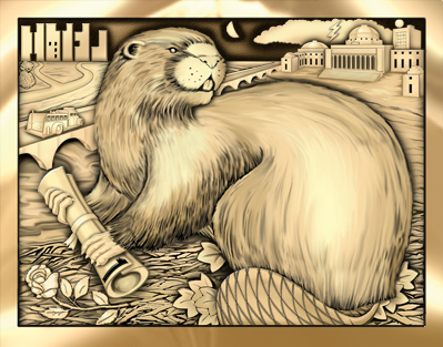
The Class of 2009 Brass Rat: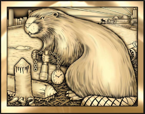
The Class of 2008 Brass Rat:
The Class of 2007 Brass Rat: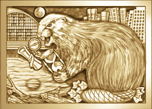
The Class of 2006 Brass Rat: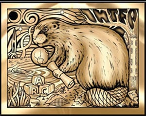
The Class of 2005 Brass Rat: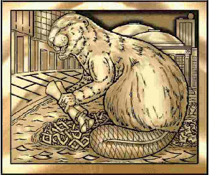
The Class of 2004 Brass Rat: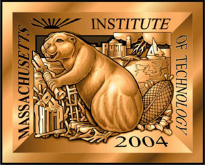
The Class of 2003 Brass Rat (stainless steel option shown):
The Class of 2002 Brass Rat:
The Class of 2001 Brass Rat: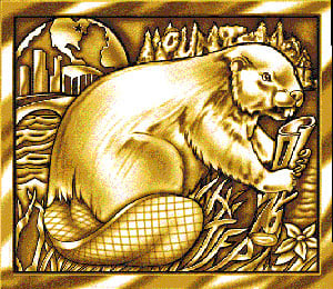
And finally, the Class of 2000 Brass Rat (the one currently on my right hand):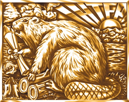
Which Rat is your favorite?
[updated from a previous entry, which shortly thereafter became a Wikipedia page]
My favorite is going to be next year’s.
Duh, Matt. :D
2007 and 2005. i like beavers with spunk.
How about the Class of 2012? I really want one..sniff..sniff.
2009 is my favorite.
I like 2000’s. The rays of sunshine are a nice touch.
Also, is that a fish with three eyes that I spy in the ’00 ring?!
Wow, all of them say IHTFP.
Funny how the farther you go down, the pictures get grainier
A testament to the progress of technology perhaps?
I like 2010 because it’s the only beaver that’s not looking straight forward.
I have a question, how exactly is the RingComm selected?? Can you describe the application/selection process?
As a past ring committee member myself it’s cool to see the most recent versions of this symbol gathered together in this way. That being said, the Class of 1986 will remain my favorite as it’s the one I wear
Muahaha. The ’07 beaver looks like a maniacal evil genius. Love it.
Sorry if this is a silly question – but where is the IHTFP on the 2009 and 2010 ones?
I see it on all the other ones…
Erin K:
2010: upper left corner,spaces between those buildings
2009: dark lines on the tail of the rat (took me a while to find that one!)
Those are really clever designs! Seems like there’s always more hidden in the picture.
…Hey! On the 05 one somebody’s drowning in the background! Does that signify what was experienced by that class?
Nevertheless…I would like a ’12…
2007!!! :D And 2010! But I bet that 2012’s would be way better !!!!!!
@ jinziling –
“A hand in the water for the FSILG coordinator who was thrown into the Charles River.”
From wikipedia, lol.
Thanks jinziling!
Looks like I have spent too much time on Objective-C today! Hahaha, my eyes are all burnt out. // But it’s fun
I’d like to see one with a beaver wearing rocket skates ^_^
Obviously, 2010 is the best so far. It’s freaking beautiful. Very classy, hot beaver, and nothing is too rowdy looking.
@ Oasis:
Thanks~ but i failed to google out a newspaper article for more details on that event.
I did not notice the ‘eight ivy leaves’ theme until i read the wiki page lol~ that’s superb!
@Erin:
ooohhh I love your website~ keep up the great work with robots!*^v^*
2010 is definitely the best looking, but (no disrespect class of 2000) did anyone notice that the 2000 beaver actually looks like a rat.
Oh, and like everyone else, I wouldn’t mind having the ’12. : )
2010’s the best. I love the way he crushes the Ivy leaves. Perfect attitude!
I understand why you went back only as far as you did, but my biased opinion is for the Class of ’90 when we first added the skylines to the side bezels. In the spirit of technological advancement, Balfour changed the ring manufacturing to a five piece mold from the traditional three, and it’s been there almost ever since (after being omitted by the ’91s. Those of us on the committee were sensitive to showing a bit of restraint in the design and trust me, there were many ideas along the lines of what is there now that were rejected because we knew there would be a backlash by our classmates that we had witnessed the year before. We mostly would hide references like numbers rather than depict symbols. Compare even the ones of that era to the originals. For about 50 years there was what we called the “golf ball” look with these spherical designs on the sides.
Being more of a traditionalist, I go with the older ones that appear more “grainy” because there is more definition to the engraving and the newer ones look a little “cartoony,” partly because of the artists involved who work for the companies.
I encourage everyone interested to be on the Ring Committee; if you’re a freshman, contact your class officers to find out how to apply. If you’re a future student, it’s one more great experience you can have at the ‘Tute.
’12’s will definitely be the best!
I love how every year’s ring has the “IHTFP”
lol
’07 is def the coolest
i like 09 and 10 cause they both look cool. Haha. No, really i like the way the beavers look. 09 kinda looks maniacal and the beaver in 10 just looks pompous.
The gnawed logs and the ingenious tail makes the 2009 really great!
Hey Matt, can you please tell us the tentative date of results? Anxiety is killing us!
For me, 2000 and 2010 stands out.!! 2010 more.
definitely the ’10 one because of the crushed ivy leaves and i LOVE the idea of the bolt of lightening
Got to go with 2010! The expression caught my eye…Not arrogant,yet aggressive. Proud…and yet not haughty…n of course the bolt of lightning over the Great Dome does nothing but add to the effect!
Must say Im quite excited to see the design 2011 RingComm comes up with…
What would it feel like…to be a part of a family of MIT-ians, where each member is connected with something as personal as a ring in common…
I agree with Aditi and the rest of peeps who think that 2010’s ring is thus far the coolest!The whole harry-potter+environmental-concern engendered lightening bolt, the IHTFP in the buildings( totally awesome), the athena owl made of the letters MMX (2010 in Roman numerals!)with ‘tool’ and ‘punt’ as the eyes, and the symbolic positioning of the beaver over the ivy leaves…..what ring thus far has been soooo coool! And don’t forget Kerberos on the back of the ring!
The wonderful thing is that all the rings have a lot in common( IHTFP, Beaver, ivy leaves, hacks, skyline, symbol of hard work etc. etc. etc.). Just adds to the fact that MIT follows tradition ( when needed)!!
Hey Matt….that was a wonderfull post!
Could you please tell me the tentative dates by which the RA’s can hear from the MIT admissions office?
Thank you!
Hey Ben, why is the “Massachusetts Institute of Technology” on the dome written with v’s?
(as in “Massachvsetts Institvte of Technology”….i noticed this on the admissions homepage and i was wondering)
the 2010 class ring is the coolest thing ever. the harry potter lighting bolt? that’s like, amazing. and the whole design was beautifully put together.
I’m kicking myself now for not applying to RingComm… I love the Rat, but I wish I had been a part of the design process.
Khaled,
You see “V”s in the place of “U”s because it’s a convention in Latin:
“Special case: The letters “U” and “V”
Note that often on release covers the letter “U” is written as “V”. This usually happens (as it should) only when the text is written in all-caps: “ATHENAEVM” for “Athenaeum”, “RVBICON” for “Rubicon”. In such cases, write them into the database in mixed-case (as described by the rules above) and use the letter “u” for lower-case and “V” for upper-case.” – http://musicbrainz.org/doc/CapitalizationStandardLatin
I know this isn’t the most authoritative source, but it’s what two seconds on Google produced (also, it’s accurate).
-Nick ’06
come on Matt… give us some updates on RA
I have a question, how exactly is the RingComm selected?? Can you describe the application/selection process
Good Job to 2010. That one took me the longest to find the IHTFP. I had been staring at the buildings for so long, but I saw two old men instead of the wineglass. Ugh. They were all well hidden, though. A second look at 2000 revealed the IHTFP, then I read a comment pointing out they all have them, requiring me to spend minutes on end looking for them.