
There is no such thing as a typical day by CJ Q. '23
on energy levels and productivity
Some days, I feel good. Some days, I feel like I can work for hours. On those days, I get a lot done. I find myself able to work for like, four or five hours in a row. And everything feels interesting, and good, and amazing. And I feel good about these days, because I like the feeling of accomplishing work. (Do I like the work, or do I just like the feeling? That’s another discussion.)
On some days, I get almost nothing done. I try to work, I really do. I spend time sitting in front of Sublime Text, trying to hammer out code. Hours staring at my text editor, trying to write a blog post. And on these days, I get constantly distracted. I can’t spend more than fifteen minutes without opening Discord or Messenger. I work for an hour, and then I’m lying on bed scrolling through my Twitter feed. These days feel worse.
And these days, they string up. Sometimes I feel like lightning strikes me and I get a project done in three days of concentrated effort. Sometimes there are weeks when everything is just a haze. Sometimes even months. Not months where getting things done is impossible; I’m lucky enough to have never experienced this. In these months, work is hard enough to make me feel like I should be able to do it if I tried, but I’m just not trying hard enough.
When I think about how much energy I have to do “work”, or “productive things”, I have this pet theory. It’s not perfect, and I don’t really know how well it applies to other people. But it goes like this.
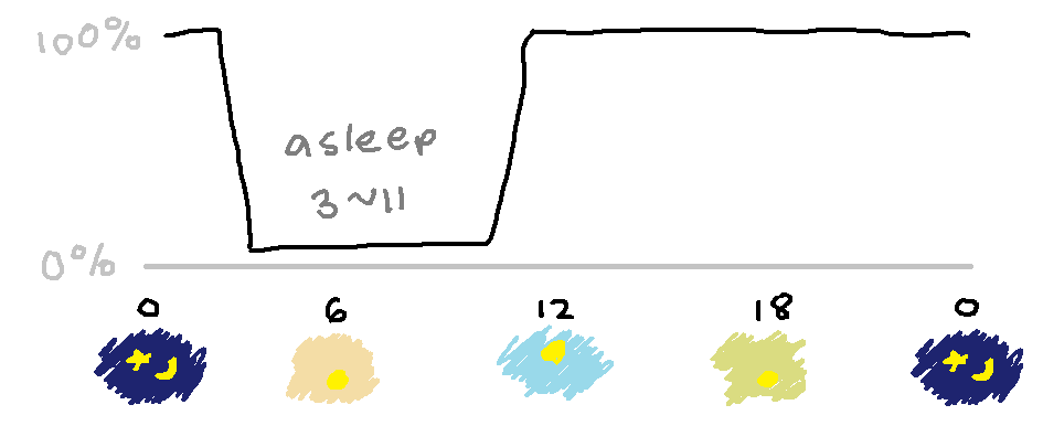
In any given day, there are always hours when it is impossible for me to work. And these are the hours when I’m asleep. So if we graph my ability to do work in a given day, which you can think of as my “energy”, or “charge”, or “productive hours”, or something like that, it would look like this:
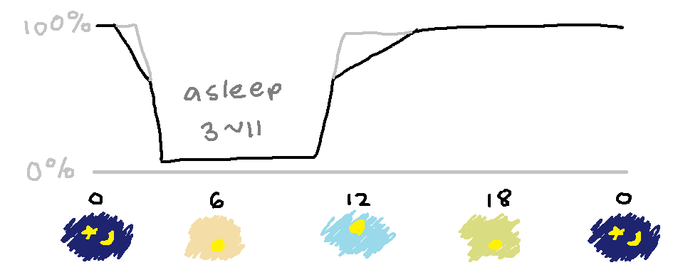
Okay, not really. I don’t immediately start the day at 100%, nor am I able to do work up to the minute I sleep. It looks more like this:
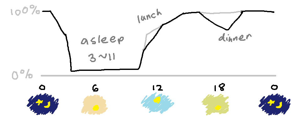
 And food matters a lot too. I can’t really work when I’m hungry, which is when I wake up. And I don’t really work that well immediately after a meal. So let’s add in lunch and dinner:
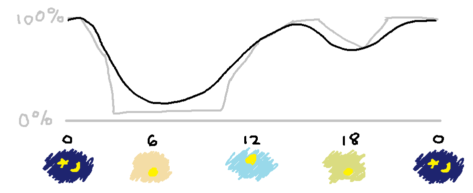
 Now, this is a pretty simple model. I don’t always go to sleep at 3 and wake up at 11. My lunch and dinner times vary, and sometimes I go on a Zoom call while I’m eating. Sometimes I just get random dips or bursts of energy throughout a given day. And there are more factors I’m not even aware of. If you take all of that into account, this would look a lot messier.
But let’s ignore that. In fact, let’s simplify this daily model even further:
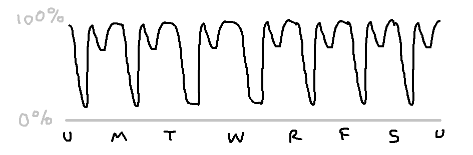
So to model a week, we just stick seven of these next to each other, right? Here, U means Sunday, and R means Thursday:
 Okay, that’s not really right. There’s a factor that’s weekly as well, which looks like this:
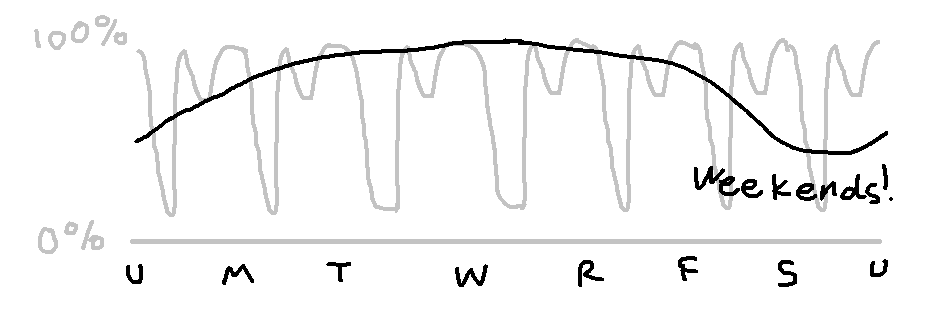 So if we combine these two factors, we get something that looks like:
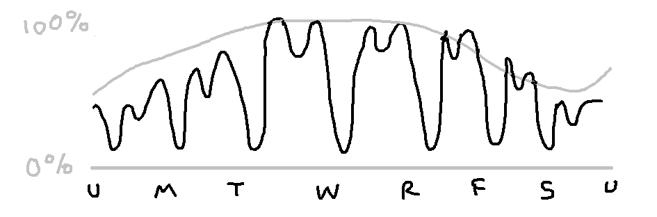
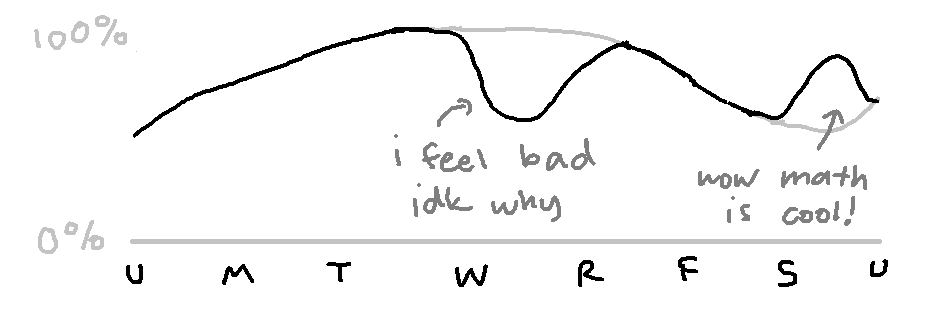
This is a bit complicated, so I’ll just draw the weekly factor. But even the weekly factor isn’t that smooth. It goes up and down. Sometimes I just feel bad, and tired, even from the moment I wake up, and I don’t know why. Sometimes, even if it’s a day I wouldn’t normally do a lot of work, it just feels interesting.
Of course, it’s not like that every week. Maybe it’d make more sense to plot it on the monthly level:
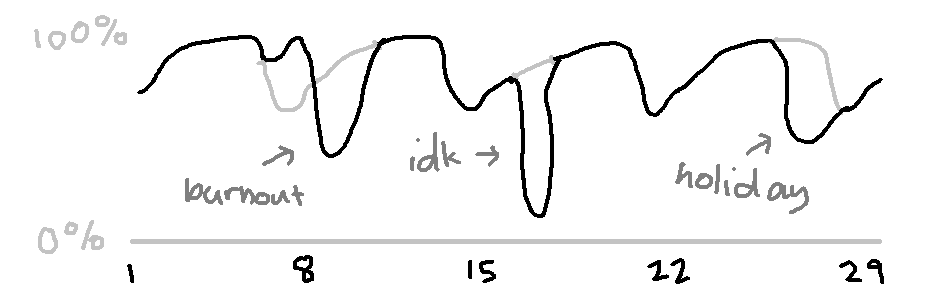
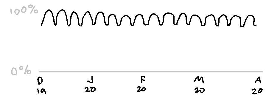
And as much as I’d like to pretend that the past few months for me have looked like this:
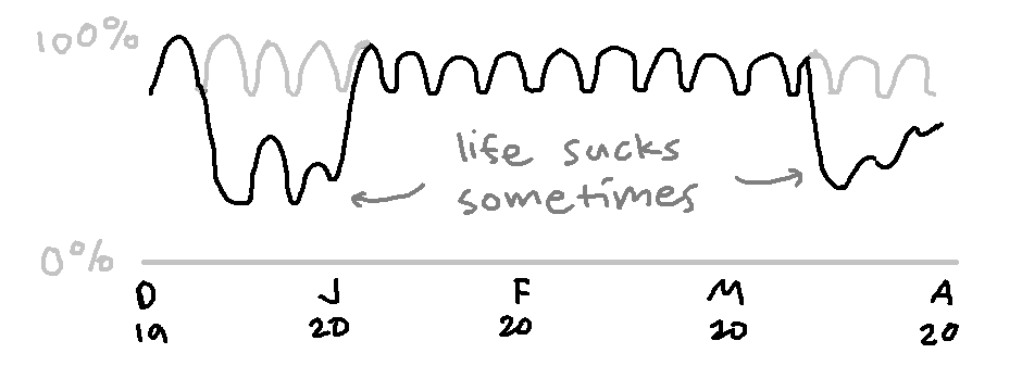
 Sad things happen. And they keep happening. And it affects me for weeks, months.
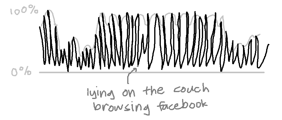
And the weird thing about it isn’t that every day in those dips are bad. I did good work on some of them, definitely. And it isn’t that every day in the middle was really good. There’s still that smaller factor, the one that affects days rather than weeks, that I haven’t drawn. And then there’s the factor that affects hours, rather than days, that I haven’t drawn. And if I drew that, then maybe the whole graph would look like this, with a little more spikes: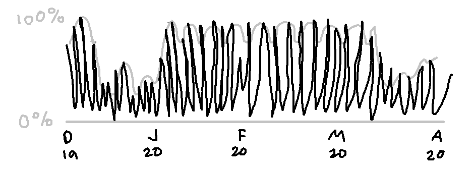
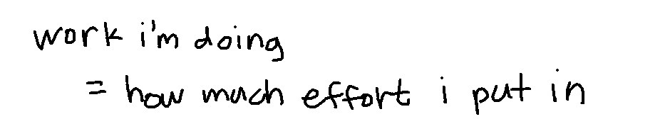
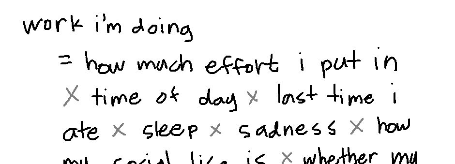
And it really is just the case that however productive I am, at any given moment, is just a product of an innumerable number of factors. How much effort I’m putting in, the time of day, the last time I ate food, what happened yesterday, how much sleep I got, how my social life is doing, whether my meds are working, whether something really sad happened recently…
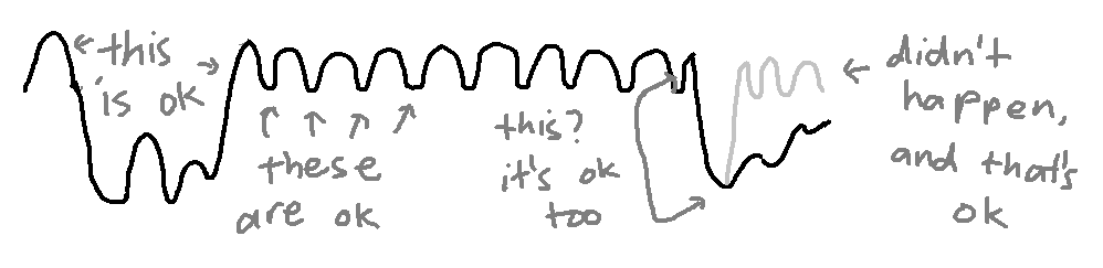
But it never feels like that. In the moment, it feels like this:
In the moment, all I see is this:
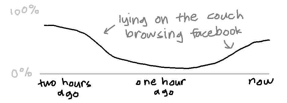
I have to tell myself that the way it actually works, is this:
And that lying on the couch browsing Facebook for an hour isn’t a huge failure. In the big, big, big scale of things, it’s here:
And all of this, I guess, now that I’ve written (drawn?) it out, feels obvious. It just feels true. It’s true when I think about it. It’s true when I read it, on the page. like this. There’s nothing new here, this is all something I’ve thought about before, this is probably something a lot of people have thought about before. It makes a lot of sense, that a lot of these factors aren’t really under my control.
And it’s not a cop-out or anything to say this, right? It’s okay if I don’t have the energy to do things, it’s okay if I take breaks, it’s okay if there are weeks where I do less work than usual. It’s okay, and look, here, I have a good explanation for why! So what if I’m less productive today than yesterday? No two days are the same! There is no typical day! You’re okay, you’re doing fine, you’re valid, and this is all, all normal!
I don’t believe it. Not entirely, not really, not yet. But, whatever. I’m gonna get back to work.