Visualize this! My new UROP by Anelise N. '19
We've got some really cool stuff going on this semester
It’s a new school year, and I’ve started UROPing in a new lab!
For anyone who doesn’t know, the UROP (Undergraduate Research OPportunities) program gives MIT undergrads a chance to do meaningful research in cutting-edge labs around campus. I have been UROPing since freshman spring, but this year I’m starting in a new lab. The group is in MIT CSAIL (the Computer Science and Artificial Intelligence Lab). Our work is at the intersection of computer vision, graphics, and visualization. We are advised by three different professors—Aude Oliva in Computational Perception and Cognition, Frédo Durand in graphics, and Hanspeter Pfister at Harvard’s Visual Computing Group. The leader of our group is Zoya Bylinskii, a PhD student, and our group consists of three MEng students, a Master’s student from Harvard, and me :)
I’m really excited to be working with this group this year. They have a really energetic, collaborative, and creative approach to research that I like a lot. At any given time, there are multiple threads being pursued at once, and everyone is kept in the loop as far as what the progress of each project is. That means everyone has the freedom to hop between projects, ask for help or input from anyone else in the group, and really take charge of an area that interests them. When important deadlines approach, everyone hops in to get the task done. Also, even though I only really started working with this group at the end of last year/beginning of this year, I feel really included in what is going on and I already have significant responsibility and input. For me, who is highly motivated by a sense of purpose and working with other people, it’s a really good fit.
I think the best way to get a sense of what our research is about is to give you a sampling of the projects we’re working on this semester!
Icon classification/infographic summarization
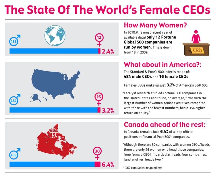 An example of an infographic. You can see the whole image on Visual.ly
One of the ongoing challenges that we are trying to tackle is how to “summarize” an infographic. Infographics are visualizations, like charts or diagrams, that are used to present data in a graphic way. They are found in textbooks, PowerPoints, social media, newspapers…anywhere there is a need to quickly and effectively convey data.
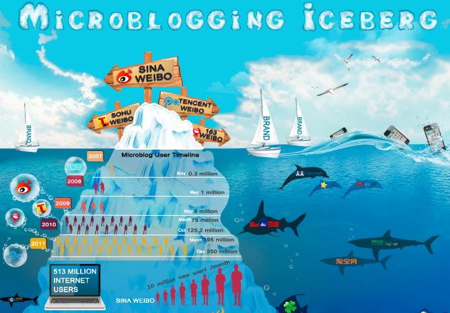
The challenge of infographic summarization is to select a single snippet from a large composite image that represents the theme of the whole visual. Infographics are multimodal—they convey a message using both text and images. Thus, a good summarization has to harness graphics, but it also has to consider the textual context of the piece or risk misrepresenting the material. For instance, the piece below uses imagery of an iceberg as a metaphor for microblogging—clearly, returning a picture of a glacier would not be an apt snapshot of the subject material.
In a recently arxived paper, the group proposed a largely text-motivated method for generating “visual hashtags” for an infographic. In a nutshell, they used the text to predict a category for the subject of the infographic, then trained a visual model to find the crop of the document that most closely matched that category. The paper did explore using images as a predictor of category, but this was outperformed by the text-based method.
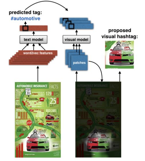 A visual representation of the pipeline used to generate visual hashtags. Check out the full paper!
This is a little unsatisfying—ideally, we would be able to infer something about the graphic’s meaning from its visuals, or from the relationship between text and visuals. Before this can happen, there are some challenges that have to be solved.
The first is actually being able to detect where the icons are in an infographic. An icon is a standalone, animated/designed/drawn picture (as opposed to a natural image like a photograph). This is important both for training purposes and for generating suggestions for “summary” images to return. State-of-the-art object detectors work fairly well for natural images, but not so much for icons, so the group has been developing our own icon detector.
The second is figuring out how to classify icons into one of several buckets. In order to do this, we need a lot of training data—that is, examples of icons in each of a few hundred categories such as “business”, “university”, and “comparison”. Unfortunately, the data you can find on the internet is pretty messy. We’re working on a process for filtering our images to make sure that each of our icons in each category is a) actually an icon and b) actually relates to its topic.
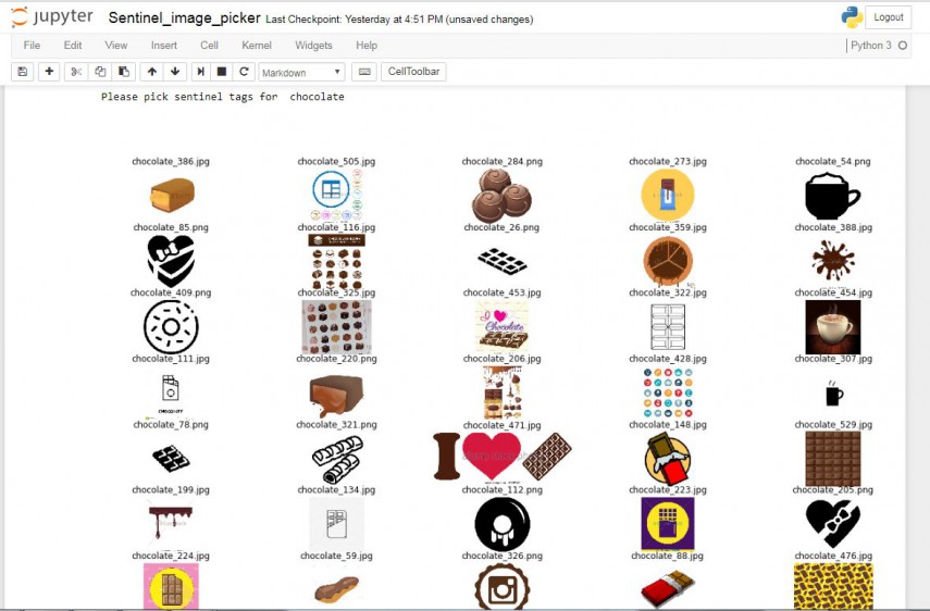 In order to verify the quality of our “cleaned” results, we need to choose a few “sentinals” for each category–that is, an image that is so representative of the given category that it obviously corresponds to that label. We use these for quality control–for instance, if a crowdsourced worker did not select image number 148 as relating to chocolate, we could invalidate their work as low-quality. We had to choose 3 sentinals for each of some ~300 topics, so one member of the group created a simple task to record our answers, and everyone pitched in to select images for around 50 categories each. It’s pretty trivial chosing representative images for chocolate, but once you start getting to really vague concepts like “benefit” or “comparison” it can get tricky!
Finally, in order to test the accuracy of our icon detector (and our ultimate system for proposing visual summaries), we need baseline data for the location of icons in several infographics. How could we get so much data?
By harnessing the power of MIT undergraduates! A couple of weeks ago, we ran a study where, in exchange for a Chipotle burrito, around 30 undergraduates agreed to annotate icons for around half an hour. We were able to collect ground truth data for around 200 infographics.
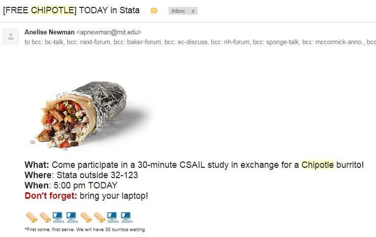 I sent so much spam out the day of our experiment I wouldn’t be surprised if every student in the school received this email.
A screenshot of the icon-labeling task that people did in exchange for Chipotle. The idea was to cover all the icons in the image with the red boxes.
Now, we’re ready to work on categorizing icons and breaking an infographic down into its visual components. Updates later!
Titles and Perceptions of Graphs
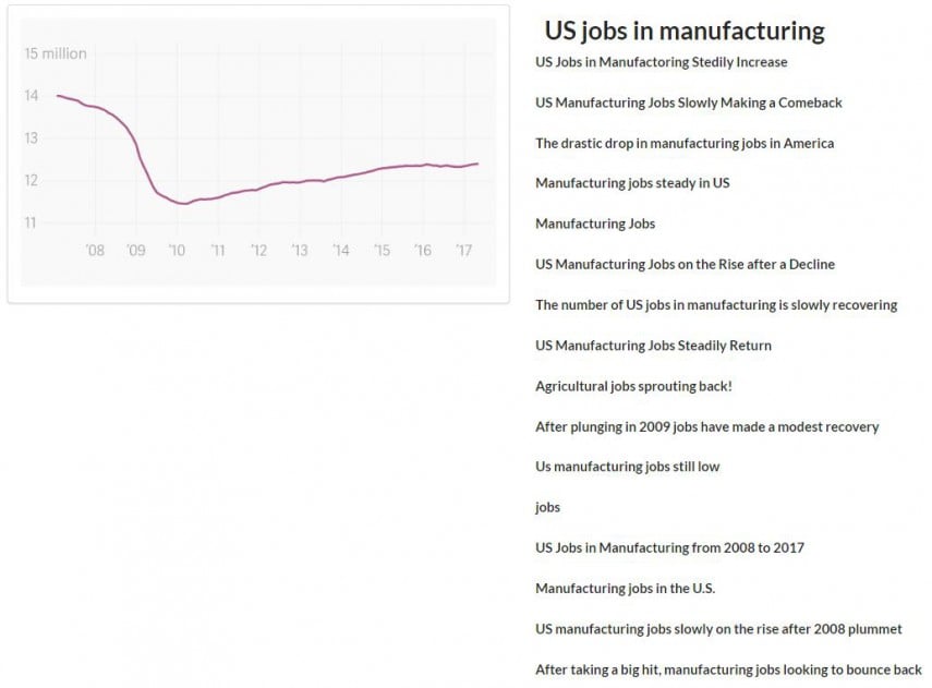
This project is in its early stages, so it could still go in lots of directions. The basic question we want to ask is: How does changing the intensity of a title influence a person’s memory of the information presented in a graph?
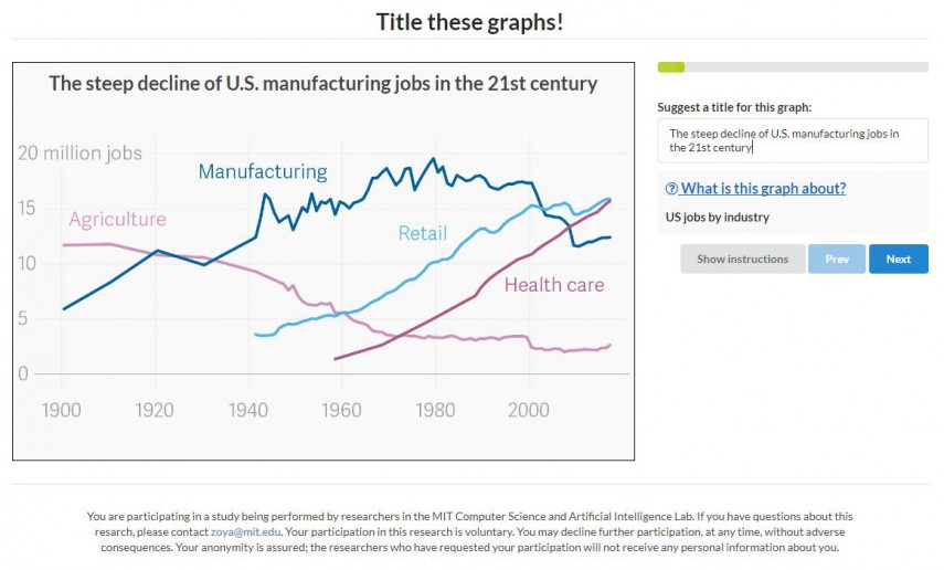 A screenshot of what the title-suggestion task looks like. Workers are shown a graph, given a description of the material, and asked to propose a title (preferably one which describes the trend shown in the graph).
As a preliminary step, last week I ran a test through Amazon Mechanical Turk, a crowdsourcing platform, where we asked workers to generate a title for a graph, given only the axes and a description. We were really pleasantly surprised to see how many high-quality titles we got—and how much variation we saw.
Going forward, we want to design an experiment where we present the same graph to different Mechanical Turk workers with a variety of titles, and then we try to measure how their memory of the chart is influenced by the tone of the title. This is something I’ll be working on over the next week!
Poster Viewer
As part of exploring how people interact with large-scale visuals, we are building a tool to help view academic posters—the kind that people present at research conferences. Right now, if you wanted to browse posters in a certain category at a certain conference, you would have to sift through a list of titles and authors and then open each PDF in turn. My group is working on a tool that would let you search and filter posters and then open them in a gallery-like interface where you can easily swipe between documents. The tool also records viewing data about what parts of the poster the viewer zoomed in on, and for how long.
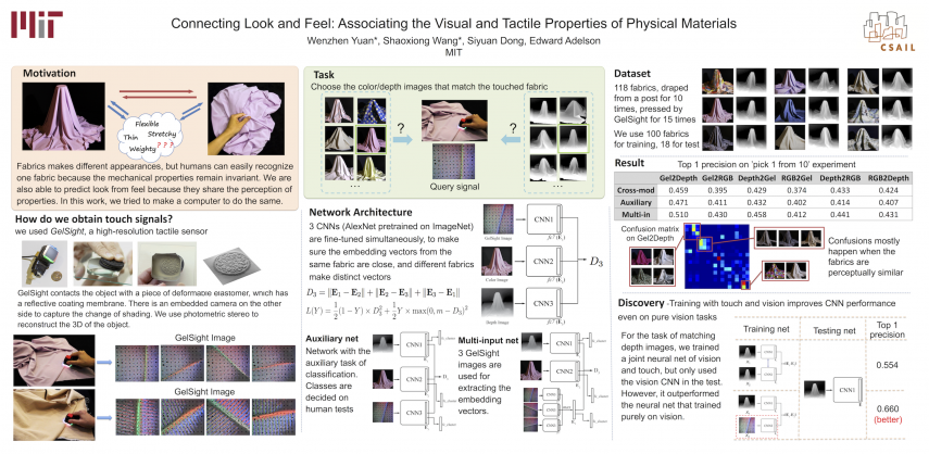 This is an example of an academic poster from CVPR, a major Computer Vision conference that took place over the summer. It corresponds to this paper.
The goal is get the tool ready so that it can actually be used at a conference and we can collect viewing data from a larger audience. At that point, there are some interesting questions we want to ask, such as: Can we create personalized snapshots or gifs of the poster based on a user’s viewing pattern that help them remember at a glance what they saw? Can we predict such an enticing visual before the user even opens the poster? And can we use the simple data we’ve collected from the viewer to model the saliency of different aspects of a poster/infographic in a non-intrusive way?
Right now, the UI is working and looks great! However, we would like to build in filtering and search capabilities, which will require a more sophisticated back-end than we have now. One of the things I’ll be looking at this semester is setting up a database that can support these features.
As you can see, there’s a lot to work on this semester. I’ll have more to write about in the future as our projects change and develop!
