Redesigning a hall logo: 4.500 part 1 by Jamie C. '19
4.500 part 1
4.500, Intro to Design Computing, my favorite class this semester, is a design class with a project every week. The first four projects involved using CAD software to design 2d and 3d objects, and then laser cutting masonite boards fabricate the objects.
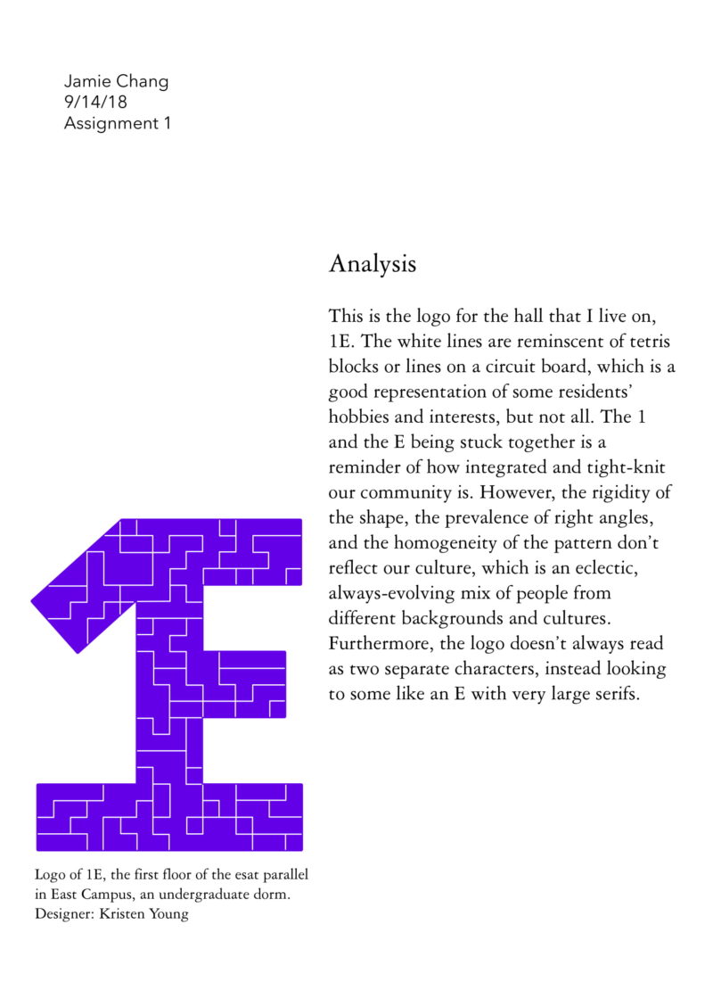
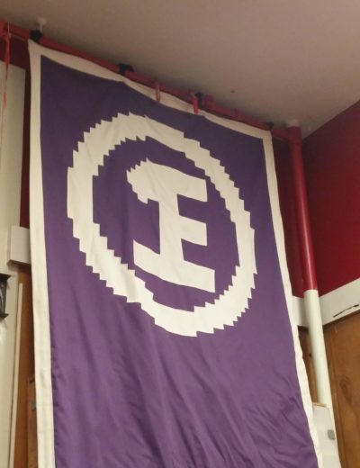
For the first assignment, we had to use CAD to trace an existing symbol or logo, analyze the pros and cons of the symbol, and improve on it throughout 3 iterations. I chose the 1E logo (my hall in East Campus).

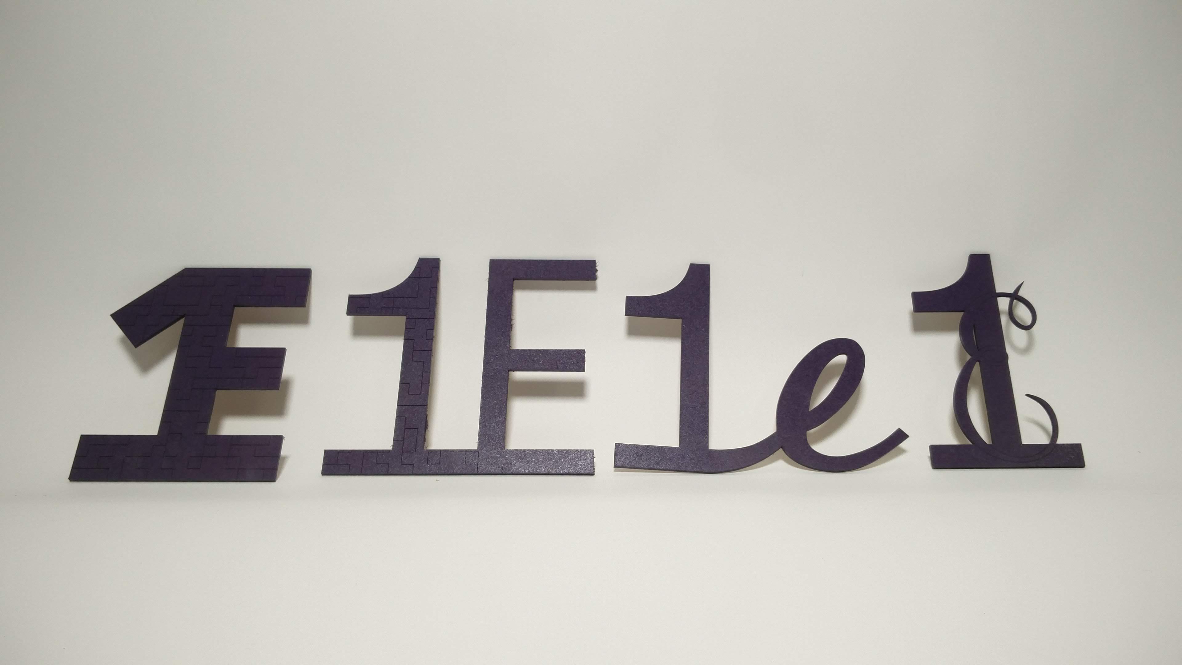
AutoCAD was strongly recommended for this class, and since I was very used to Solidworks and Rhinoceros, learning how to use AutoCAD took a bit of time. Eventually I finished tracing the logo. I laser cut (red lines are engraved while green lines are cut) and spray painted it.
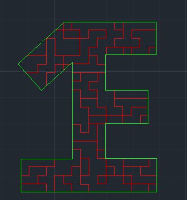
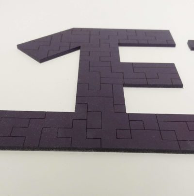
Honestly I don’t like it- it’s too blocky and looks kind of outdated. The rigidity and homogeneity of the logo don’t represent the diverse interests and hobbies of the people that live here, and the logo overall doesn’t quite read as 1 and E, it looks like an E with a weird flag. The 1 and the E being attached does reflect our tight-knit community, where 40 different people are integrated into one space.
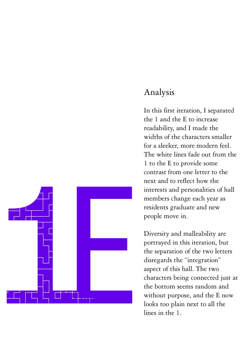
For my first iteration I separated the 1 and the E, used thinner letter widths, and had the engraved lines fade out from the 1 and the E.
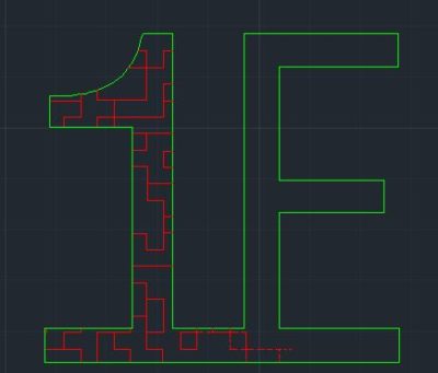
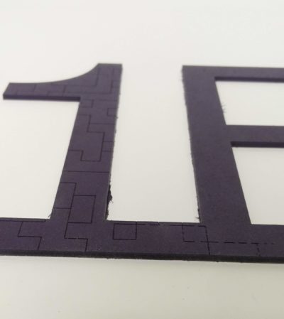
The diversity of 1E and the malleability of the culture are portrayed through the different textures (engraved and smooth), but the separation of the letters disregards the “integration” aspect of hall. The characters being connected at the bottom almost seems random and without purpose.
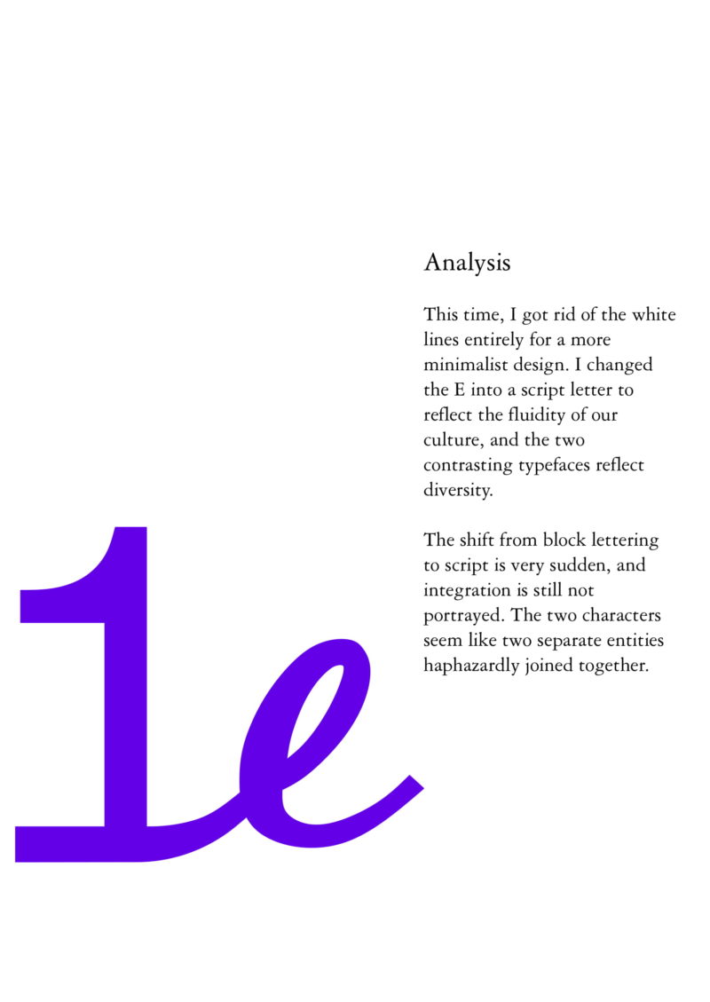
For the next iteration I tried using a different typeface for the E, and I got rid of the etched lines for a more minimalist look.
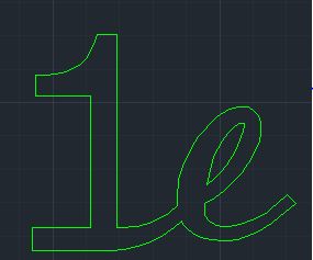
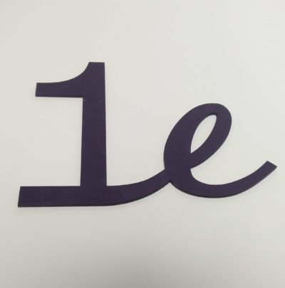
The flowiness of the script works to portray the fluidity of our culture, but the shift from the 1 to the e seems sudden, as if the 1 was quickly stretched and taped to the e.
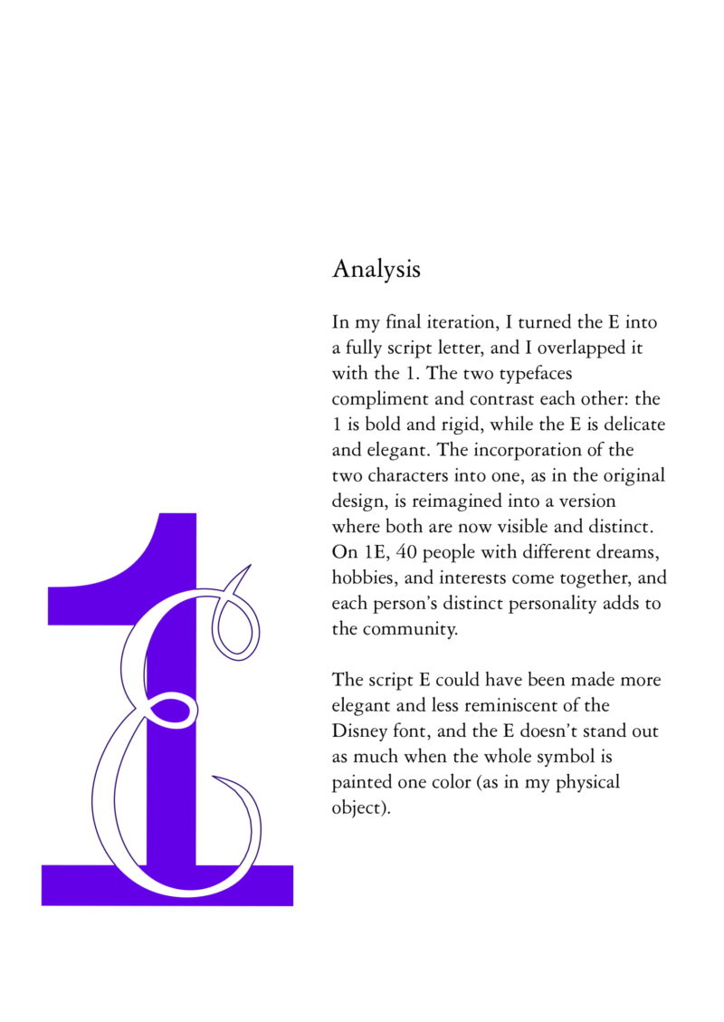
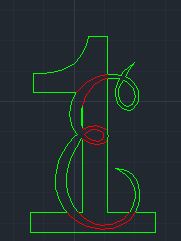
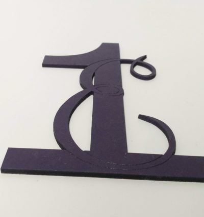
My final iteration superimposed a script capital E on top of the bold, rigid 1. The two typefaces complement and contrast each other, signifying how 40 people with different hobbies, interests, and personalities each contribute to the community.
Here’s the writeup I turned in (click the arrows to scroll through the pages!)
