An MIT Underwear Exposé (and Sorting Hat) by Lydia K. '14, MEng '16
The coolest data you never wanted to have.
A lot of socializing at MIT happens on the dorm mailing lists. One of my favorite mailing lists is Burton-Conner’s, not because of the content of the mailing list (I’ve never been on it), but because of the excellent barrier to emailing it: it is tradition, a very important rule, and a sign of respect to sign emails to the Burton-Conner dormwide social mailing list with the color of the underwear you are wearing. (For a more detailed explanation, see Snively ‘11’s post from 2009.)
This rule is a huge boon to those of us who are data-curious and kind of creepy. All MIT undergraduates, even those who have never lived in Burton-Conner, have a wealth of data on the self-reported underwear colors of people who have emailed the entire undergraduate population, which includes Burton-Conner. Reasons for emailing all undergraduates include event announcements for student groups and departments, flame wars, and occasionally lost items. In contrast, the kinds of emails sent within a dorm mailing list include, at the top of my inbox right now, parties, house meetings, and foodmobs to restaurants in Boston; decisions about when to turn off the heating for spring, invitations to test food experiments, and a memo to the person who left their clothes in the middle washer; and requests for empty gallon jugs, superglue, cooking scales, male-to-male audio cables, MIDI cables, 120V twist lock connectors, funnels, and hairdryers.
At the end of one IAP, from BMF and Destiny kitchens, my room, Cory’s room, and Random Hall desk, I downloaded and parsed all the emails that had been sent to my MIT email address. I extracted the underwear colors from the emails and I retrieved data (this part by hand, not with a script) on the people who had sent them from the MIT people directory. 417 days later I had a very bad headache, so I made pie charts from the parsed data and traced and colored them in BMF kitchen.
The data are squirmy, like most data:
- We can’t know what proportion of the self-reported underwear colors is real and what proportion is made up.
- My parsing might be imperfect, especially if anyone made a typo.
- Class years are wrong for anyone who took a gap year between when they sent an email and when I retrieved their data, or for people who were superseniors when I retrieved their data, since superseniors are grouped with seniors in the MIT people directory.
- Similarly, I can’t know if a person switched living groups or departments after sending their email; they are grouped with the living group and department they belonged to when I retrieved their data, not the living group and department they belonged to when they sent their email.
- Finally, to protect the privacy of the people wearing the underwear, I am not going to tell you what years these are from.
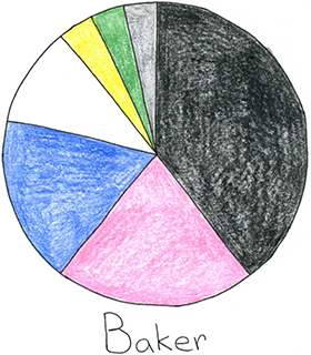
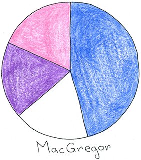
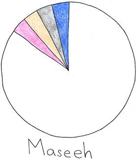
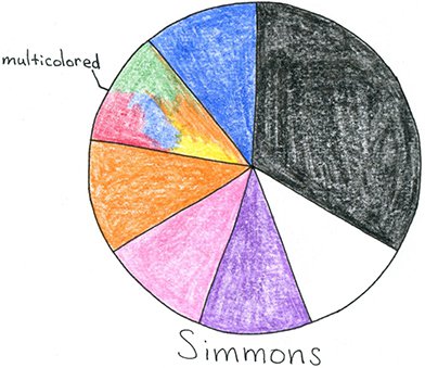
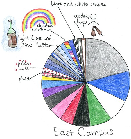
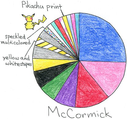
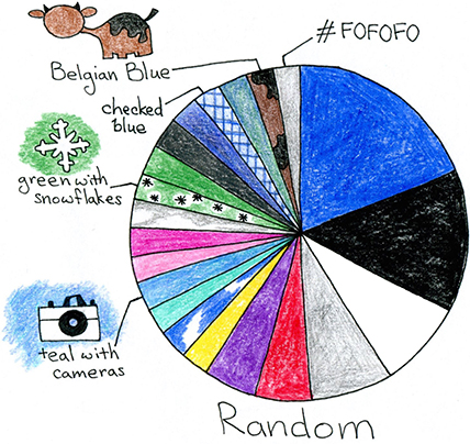
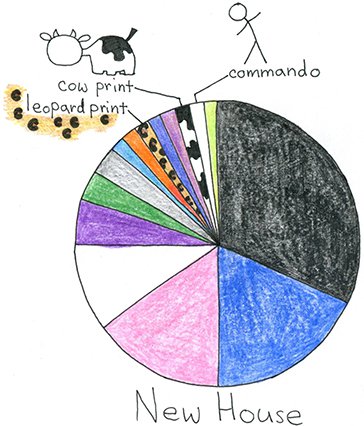
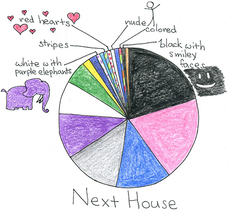
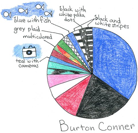
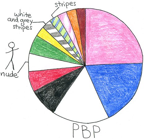
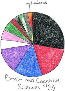
Figure 1a: Underwear Color by Undergraduate Dorm
I dearly enjoy these pie charts. They are not a perfect picture but they are a kind of picture of our very varied homes. I think they capture a bit of the self-presentation of the dorm cultures, from one particular perspective and in one particular slice of time.
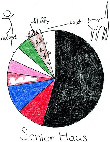
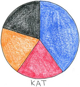
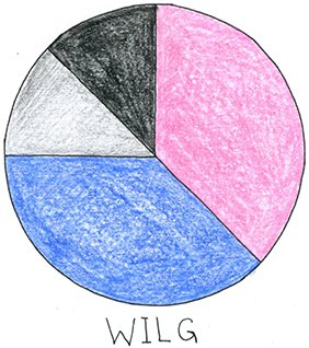
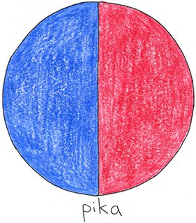
A few other living groups also contributed their data, though you are officially not allowed to live in these places until your second year at MIT.
Figure 1b: Underwear Color by Non-Dorm Living Group
I just checked out Harry Potter and the Sorcerer’s Stone to reread it, after reading a particularly engaging/addicting/help fanfic with Harry Potter as a squib. There are lots of parallels between MIT and Hogwarts. Both are magical and occasionally terrifying. Both have weird rooms and passageways to explore and discover, staircases that lead to different places depending on when you take them, and unique and varied houses with beloved authority figures. There are also cupboards, some of them under stairs, where people have been rumored to live.
But we don’t have a sorting hat, so I made a sorting hat, using the most comprehensive, unbiased data available to me (which is unfortunately neither comprehensive nor unbiased). We are going to use Bayes’ Theorem, which I think, based on my 5.59 years of experience, is the very favorite theorem of the computer science part of the course 6 (electrical engineering and computer science) department and possibly also course 7 (biology).
Bayes’ Theorem allows us to calculate what we don’t know from what we do. Formally, for an event or truth A and an event or truth B, Bayes’ Theorem is as follows:
| Pr(A|B) | = | Pr(B|A) Pr(A) | |
| Pr(B) |
In other words, the probability of A given that B has happened or is true is equal to the probability of B given A, multiplied by the overall probability of A and divided by the overall probability of B.
In our case, armed with the information we collected from my inbox, we can use Bayes’ Theorem to calculate the probability of you living in a dorm given your self-reported underwear color.
| Pr(dorm|underwear color) | = | Pr(underwear color|dorm) Pr(dorm) | |
| Pr(underwear color) |
If you were wearing purple underwear, for example, we could calculate the probability of you living in Simmons.
| Pr(Simmons|purple) | = | Pr(purple|Simmons) Pr(Simmons) | |
| Pr(purple) |
Simmons accounts for 10.49% of the undergraduate population living in dorms, and of emails coming from Simmons residents and signed with an underwear color, 11.11% were purple. Finally, we can calculate the denominator, Pr(purple), by adding up the probability of wearing purple underwear in each dorm where people wear purple underwear multiplied by the probability of living in that dorm in the first place. (In other words, the denominator is the sum of all possible numerators.)
Pr(purple) = Pr(purple|Next) Pr(Next) + Pr(purple|East Campus) Pr(East Campus)
+ Pr(purple|McCormick) Pr(McCormick) + Pr(purple|New House) Pr(New House)
+ Pr(purple|Simmons) Pr(Simmons) + Pr(purple|Random) Pr(Random)
+ Pr(purple|MacGregor) Pr(MacGregor)
= (10.26%)(10.59%) + (3.23%)(10.89%) + (7.58%)(7.11%) + (6.67%)(8.76%)
+ (11.11%)(10.49%) + (5.41%)(2.84%) + (18.18%)(9.70%)
= 5.64%
We can therefore say, if you are wearing purple underwear, that the probability of you living in Simmons is 20.67%.
| Pr(Simmons|purple) | = | Pr(purple|Simmons) Pr(Simmons) | = | (11.11%)(10.49%) | = | 20.67% | |
| Pr(purple) | (5.64%) |
We can similarly calculate Pr(Baker|purple), Pr(Maseeh|purple), and so on. (See the supplemental tables at the end of this blog post if you would like to perform these calculations by hand with your own underwear.)
From this, we can code up a sorting hat. It won’t be an exact sorting hat—the fact that you are wearing purple underwear only gives you a probability distribution, not a guarantee. But there’s an element of chance to everything, right? So here we are: a probabilistic underwear sorting hat.
 |
I may not be practical, You can dye your boxer briefs, There’s no color underpants |
My underwear is .
We can also frame these data a few other ways.
Figure 2: Underwear Color by Guesstimated Binary Gender
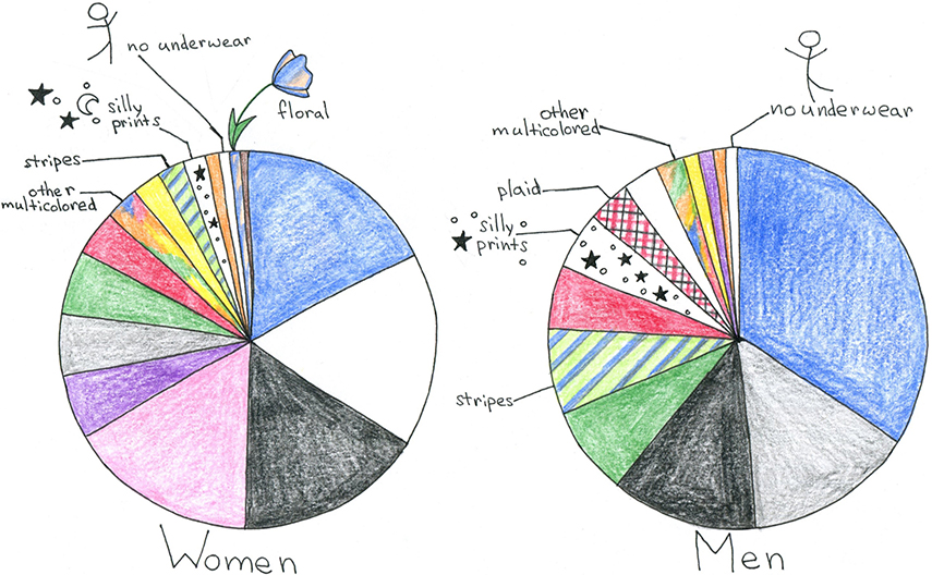
Figure 3: Underwear Color by Day of the Week
The radial axis is the percent of underwear that was each color on that day of the week. The right side is a zoomed in version of the left side, to facilitate viewing the rarer, more fun colors. Roll over the image if you’re on a computer or click if you’re on a tablet to see each color on its own.
We can see that blue is a staple throughout the week. Wednesday is not the day for black, but is a peak day for pink. Saturday’s the day people break out the yellow and don’t wear stripes. Sunday is a great day for silly prints.
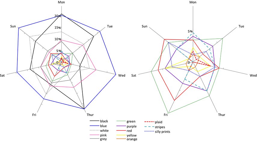
Figure 4: Underwear Color by Class Year
As before, roll over the image (on a computer) or click (if you’re on a tablet) to see each color on its own.
There is a sad, persistent decrease in multicolored underwear, ending with none by senior year. There is also a persistent decrease in purple and green and a sharp drop in pink underwear after sophomore year. Meanwhile, blue and grey underwear increase throughout a student’s academic career. Red and white move around but end up where they started: they seem to be occasional staples students come in and leave with. Black sees a sharp increase after freshman year and doesn’t grow after that.
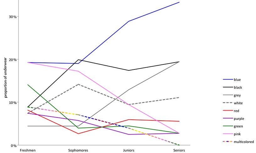
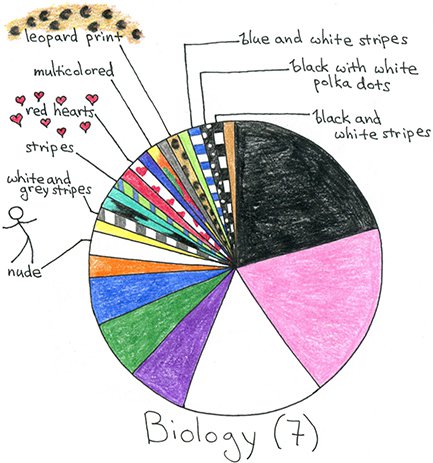
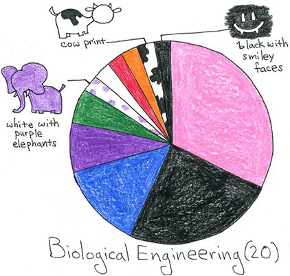
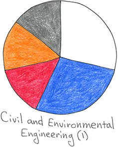
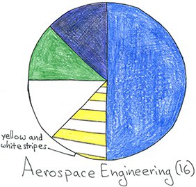
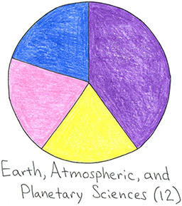
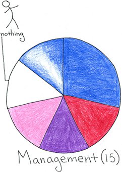
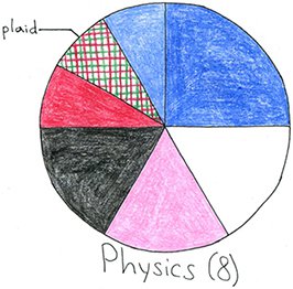
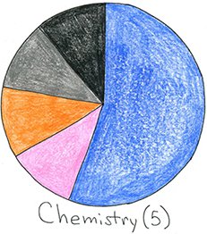
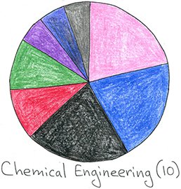
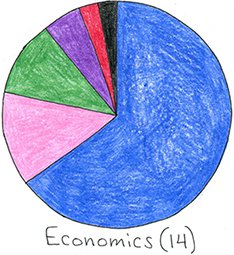
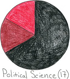
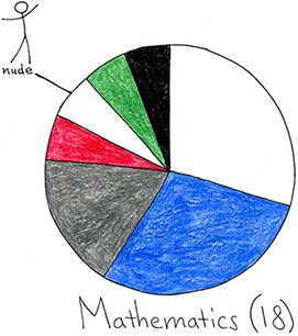
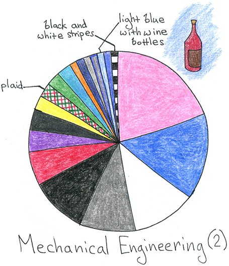
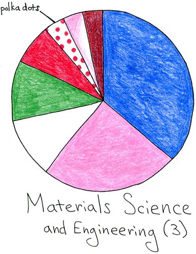
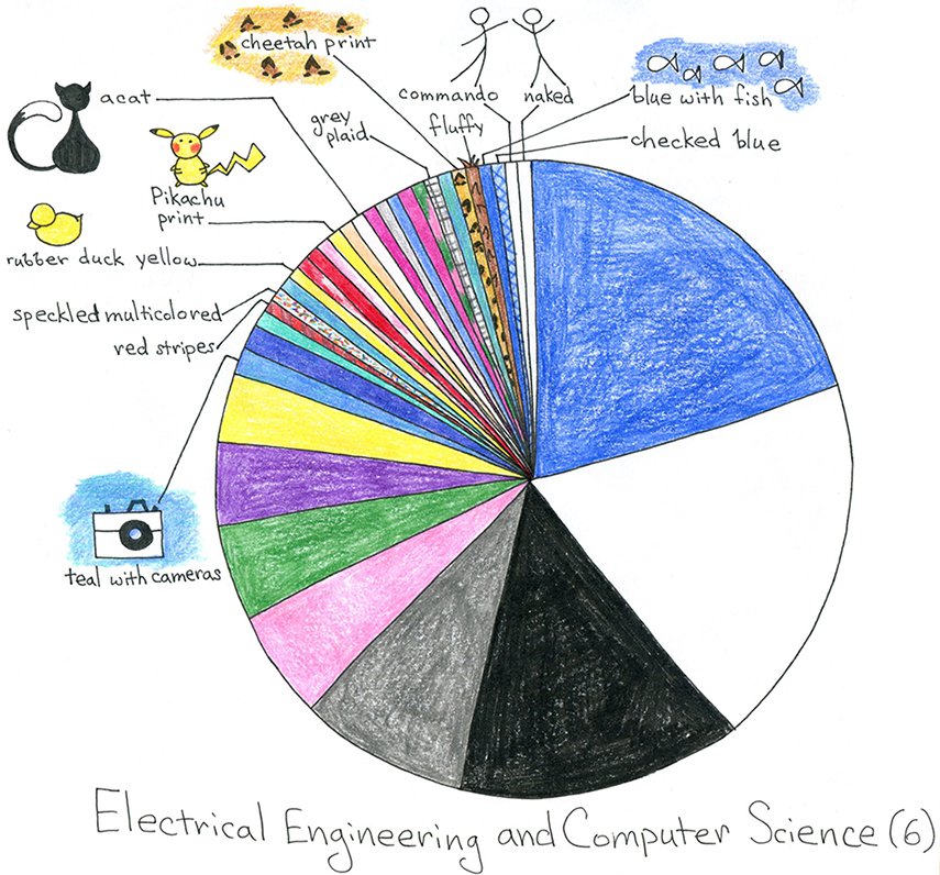
Figure 5: Underwear Color by Department
Different majors are also nice to look at. I like that course 7 (biology) and course 20 (biological engineering) both have animal prints. I also like that course 16 (aerospace engineering) is colored kind of like airplanes, at least in my mind. Course 6 (electrical engineering and computer science) is the largest department, and has a wide variety of underwear colors.

My field, computational biology, runs largely on perl, so writing a pattern matching script to parse the contents of my inbox once I had downloaded them was something I was well trained to do. It was surprisingly difficult, however, to collect my data from Google, where all my email addresses supersecretly lead. I did it a while ago, back when you could look up MIT students’ addresses in addition to their years and departments. Things might have changed (I hope they have changed). Here is how I went about obtaining my data:
- I deleted spam and emptied the trash.
- In Gmail, there is a gear button in top right corner. Click: Settings, then Accounts, then Other Google account settings, then Data tools, then Download data: Select data to download. Create an archive. Select Mail under Home and Office (if you want, select the labels you want to download) and press the red CREATE ARCHIVE button. Wait (hours or possibly days) for an email. In my case, the collection happened from 11:15 am to 2:22 am, or 15 hours and 7 minutes to collect 6.78 GB of emails. I tried again with the contents of my MIT label only. This took from 1:30 am to 9:52 am, or 8 hours and 22 minutes to collect 5.77 GB.
- I followed the link sent to my email. If the file were small, I could have just downloaded it. Unfortunately the file was not small—decidedly not small. This for some reason necessitated Internet Explorer: other browsers wouldn’t let me download such a large file, and I couldn’t figure out if or how I could curl it. The most frustrating browser was Google Chrome, which pretended to successfully download the file until the very very end, when it gave me a network error and gave up. Safari was kind of fun: it showed the download date as 3 am Jan 24, 1984.
 The only browser fit for the task, Internet Explorer, is unfortunately (?) no longer available for OS X. I ended up downloading the contents of my inbox onto a computer with Internet Explorer (which may or may not have been a pretty slow computer that belongs to Housing and lives at Random Hall desk, where I might have had very long and, since everyone was asleep, very private Sunday morning desk shifts (I admit nothing)), and then using an external harddrive to transfer the file to my personal laptop.
Stripped of non-text attachments, the 5.77 GB of my inbox was only 137.5 MB.
A decent chunk of those 137.5 MB is the Wikipedia article about Vlad the Impaler, which appears in its entirety ten times. The phrase “Vlad the Impaler” appears 535 times. The Bible, from the Book of Genesis through the Book of Revelation, appears twice, and The Communist Manifesto by Karl Marx and Friedrich Engels appears 17 times. Without Vlad et al., the emails I cared about, which were those that contained underwear colors, were only 907 KB.
This was, by the way, a number of years ago. I’ve hit my 15 GB Gmail limit a few times since then (I’m currently back to 95%).
Supplemental Table 1: The Proportion of Dorm-Living Undergraduates Living in Each Dorm (at Capacity)
| Baker | 317 students | 9.67% | McCormick | 233 students | 7.11% | |||||
| Bexley (RIP) | 116 students | 0% | New House | 287 students | 8.76% | |||||
| Burton Conner | 346 students | 10.56% | Next House | 347 students | 10.59% | |||||
| East Campus | 357 students | 10.89% | Random | 93 students | 2.84% | |||||
| MacGregor | 318 students | 9.70% | Senior Haus | 146 students | 4.45% | |||||
| Maseeh | 490 students | 14.95% | Simmons | 344 students | 10.49% |
Supplemental Table 2: The Proportion of Emails with Each Underwear Color by Dorm
| Next House | Burton Conner | East Campus | McCormick | New House | ||||||
| black | 21.37% | 20.93% | 6.45% | 6.06% | 31.67 | |||||
| white | 7.69% | 4.65% | 8.06% | 3.03% | 10.00% | |||||
| blue | 15.38% | 37.21% | 22.58% | 27.27% | 20.00% | |||||
| pink | 19.66% | 4.65% | 4.84% | 15.15% | 15.00% | |||||
| grey | 12.82% | 2.33% | 30.65% | 7.58% | 3.33% | |||||
| purple | 10.26% | 3.23% | 7.58% | 6.67% | ||||||
| red | 0.85% | 11.63% | 4.84% | 13.64% | ||||||
| green | 5.13% | 2.33% | 8.06% | 6.06% | 3.33% | |||||
| blue-green | 0.85% | 4.65% | 3.03% | 1.67% | ||||||
| yellow | 1.71% | 1.61% | 4.55% | 1.67% | ||||||
| orange | 1.67% | |||||||||
| brown | 0.85% | |||||||||
| striped | 0.85% | 4.65% | 1.61% | 1.52% | ||||||
| polka dotted | 2.33% | 1.61% | ||||||||
| animals | 0.85% | 1.52% | 3.33% | |||||||
| multicolored | 0.85% | 4.65% | 4.84% | 3.03% | ||||||
| commando | 0.85% | 1.61% | 1.67% | |||||||
| total | 100% | 100% | 100% | 100% | 100% |
| Baker | MacGregor | Maseeh | Senior Haus | Simmons | Random | |||||||
| black | 39.29% | 54.55% | 33.33% | 13.51% | ||||||||
| white | 10.71% | 18.18% | 84.62% | 11.11% | 8.11% | |||||||
| blue | 17.86% | 45.45% | 3.85% | 9.09% | 11.11% | 27.03% | ||||||
| pink | 21.43% | 18.18% | 7.69% | 4.55% | 11.11% | 2.70% | ||||||
| grey | 3.57% | 3.85% | 13.51% | |||||||||
| purple | 18.18% | 11.11% | 5.41% | |||||||||
| red | 9.09% | 8.11% | ||||||||||
| green | 3.57% | 4.55% | 5.41% | |||||||||
| blue-green | 8.11% | |||||||||||
| yellow | 3.57% | 2.70% | ||||||||||
| orange | 11.11% | |||||||||||
| striped | 5.41% | |||||||||||
| multicolored | 4.55% | 11.11% | ||||||||||
| commando | 13.64% | |||||||||||
| total | 100% | 100% | 100% | 100% | 100% | 100% |