What’s trending?: My Computer Vision final project by Anelise N. '19
Where trendy styles = adding styling to trend lines
The last couple weeks of my fall semester were almost entirely consumed by my final project for 6.869: Computer Vision. So I thought I would share with you guys what me and Nathan, my project partner came up with!
For those of you who aren’t familiar, Computer Vision is the study of developing algorithms resulting in the high-level understanding of images by a computer. For instance, here are some questions you might be able to solve using computer vision techniques, all of which we tackled on our psets for the class.
Given a simple natural image, can you reconstruct a 3-d rendering of the scene?
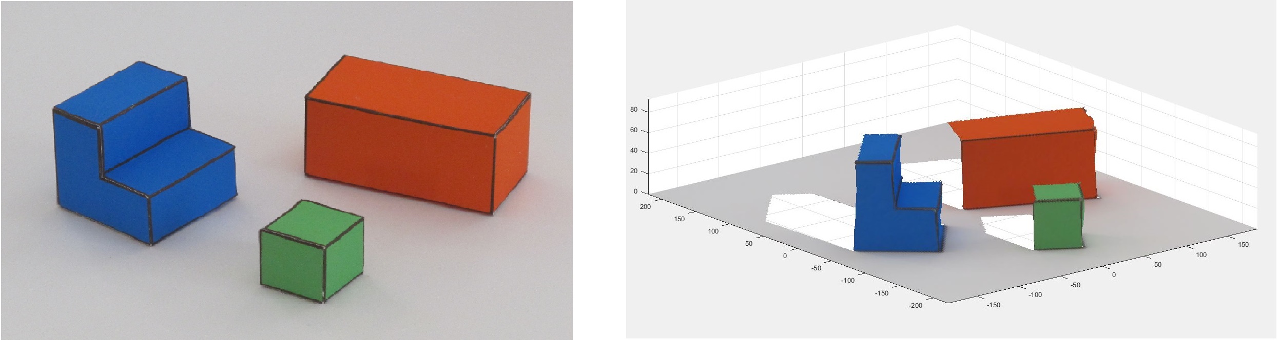
On the left: a picture of a “simple world” comprised only of simple prisms with high-contrast edges on a smooth background. On the right: a 3-d representation of the same world.
Given several images that are of the same scene but from different angles, can you stitch them together into a panorama?
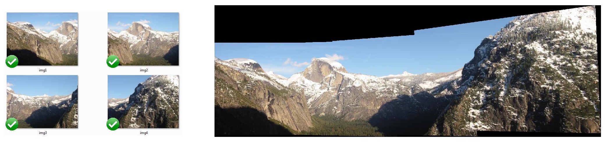
On the left: original photos from the same landscape. On the right: the same photos stitched together into a single image.
Given an image of a place, can you sort it into a particular scene category?
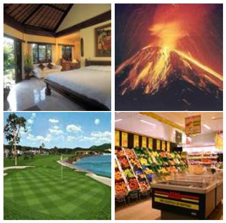
This was actually the focus of an earlier project we did for this class. The project was called the Miniplaces Challenge. We were given 110k 128 x 128 images, each depicting a scene, and each labeled with one of 100 categories. We used these examples to train a neural network that, given a scene image, attempted to guess the corresponding category. Our network was able to attain 78.8% accuracy on the test set. If you’re interested, our write-up for the project can be found here!
The ground-truth categories for these scenes are, clockwise from the top left: bedroom, volcano, golf course, and supermarket.
For the final project, our mandate was broad: take our ingenuity and the techniques that we had learned over the course of the class and come up with a project that contributes something novel to the realm of computer vision.
There were some pre-approved project ideas, but my partner and I decided to propose an original idea. I worked with Nathan Landman, an MEng student from my UROP group. We wanted to work on something that would tie into our research, which, unlike a lot of computer vision research, deals with artificial, multimodal images, such as graphs and infographics.
We decided to create a system that can automatically extract the most important piece of information from a line graph: the overarching trend. Given a line graph in pixel format, can we classify the trend portrayed as either increasing, decreasing, or neither?
The challenge: identify the trend portrayed in a line graph

Line graphs show up everywhere, for instance to emphasize points in the news. Left: a graph of the stock market from the Wall Street Journal. Right: a stylistically typical graph from the Atlas news site.
This may seem like a pretty simple problem. For humans, it is often straightforward to identify if a trendline has a basically increasing or decreasing slope. It is a testament to the human visual system that for computers, this is not a trivial problem. For instance, imagine the variety of styles and layouts you could encounter in a line chart, including variations in color, title and legend placement, and background, that an automatic algorithm would have to handle. In their paper about Reverse-engineering visualizations, Poco and Heer [1] present a highly engineered method for extracting and classifying textual elements, like axis labels and titles, from a multimodal graph, but do not attempt to draw conclusions about the data contained therein. In their Revision paper, Savva, Kong, and others [2] have made significant progress extracting actual data points from bar and pie charts, but not line graphs. In other words, identifying and analyzing the actual underlying data from a line graph is not something that we were able to find significant progress on.
And what if we take it one step further, and expand our definition of a line graph beyond the sort of clean, crisp visuals we imagine finding in newspaper articles? What if we include things like hand-drawn images or even emojis? Now recognizing the trendline becomes even more complicated.

The iPhone graph emoji, as well as my and Nathan’s group chat emoji.
But wait…why do I need this info in the first place?
Graphs appear widely in news stories, on social media, and on the web at large, but if the underlying data is available only as a pixel-based image, it is of little use. If we can begin to analyze the data contained in line graphs, there are applications for sorting, searching, and captioning these images.
In fact, a study co-authored by my UROP supervisor, Zoya Bylinskii, [3] has shown that graph titles that reflect the actual content of the chart –i.e., mentions the main point of the data portrayed, not just what the data is about—are more memorable. So our system, paired with previous work on extracting meaningful text from a graph, could actually be used to generate titles and captions that lead to more efficient transmission of data and actually make graphs more effective. Pretty neat, huh?
First things first: We need a dataset
In order to develop and evaluate our system, we needed a corpus of line graphs. Where could we get a large body of stylistically varied line graphs?
Easy—we generated it ourselves!
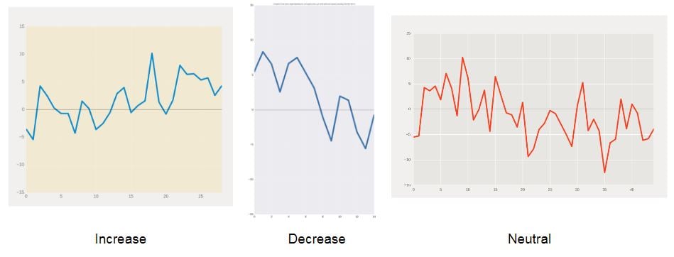
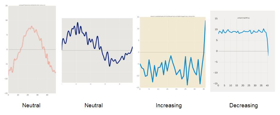
Some example graphs we generated for our dataset, and their labels.
We generated the underlying data by taking a base function and adding some amount of noise at each point. Originally, we just used straight lines for our base functions, and eventually we expanded our collection to include curvier shapes—sinusoids and exponentials. Using Matplotlib, we were able to plot data with a variety of stylistic variations, including changes in line color, background, scale, title, legend…the list goes on.
Examples of “curvier” shapes we added to our data set.
Using this script, we generated 125,000 training images—100,000 lines, 12,500 sinusoids, and 12,500 exponentials—as well as 12,500 validation images. (“Train” and “validation” sets are machine learning concepts. Basically, a training set is used to develop a model, and a validation set is used to evaluate how well different versions of the model work, after the model has already been developed.) Because we knew the underlying data, we were able to assign the graph labels ourselves based on statistical analysis of the data (see the write-up for more details).
But we also wanted to evaluate our system against some real-world images, as in, stuff we hadn’t made ourselves. So we also scraped (mostly from carefully worded Google searches), filtered, and hand-labeled a bunch of line graphs in the wild, leading to an authentic collection of 527 labeled graphs.

Examples of images we collected (and hand-labeled) for our real-world data set.
We hand-label so machines of the future don’t have to!
Two different ways to find the trendline
We were curious to try out and compare two different ways of tackling the problem. The first is a traditional, rules-based, corner-cases-replete approach where we try to actually pick the trendline out of the graph by transforming the image and then writing a set of instructions to find the relevant line. The second is a machine learning approach where we train a network to classify a graph as either increasing, decreasing, or neither.
Each approach has pros and cons. The first approach is nice because if we can actually pick out where in the graph the trendline is, we can basically reconstruct a scaled, shifted version of the data. However, for this to work, we need to place some restrictions on the input graphs. For instance, they must have a solid-color background with straight gridlines. Thus, this approach is targeted to clean graphs resembling our synthetically generated data.
The second, machine-learning approach doesn’t give us as much information, but it can handle a lot more variation in chart styling! Anything from our curated real-world set is fair game for this model.
Option 1: The old-school approach
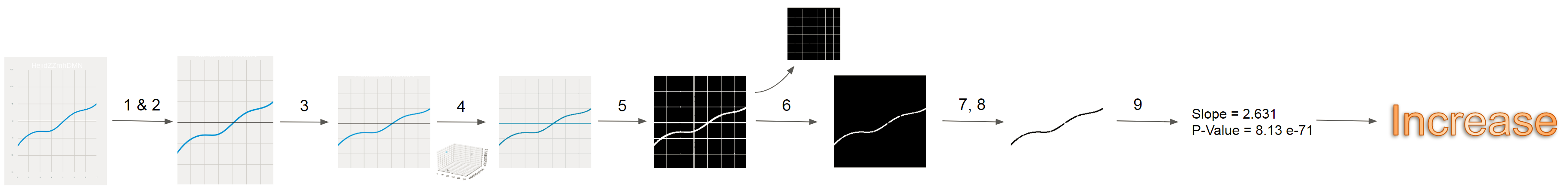
A diagram of the steps we use to process our image in order to arrive at a final classification.
Here is a brief overview of our highly-engineered pipeline for determining trend direction:
- Crop to the actual chart body by identifying the horizontal and vertical gridlines and removing anything outside of them.
- Crop out the title using an out-of-the-box OCR (text-detection) system.
- Resize the image to 224 x 224 pixels for consistency (and, to be perfectly frank, because this is the size we saved the images to so that we could fit ~140k on the server).
- Color-quantize the graph: assign each pixel to one of 4 color groups to remove the confusing effects of shading/color variation on a single line.
- Get rid of the background.
- Remove horizontal and vertical grid lines.
- Pick out groups of pixels that represent a trend line. We do this robustly using a custom algorithm that sweeps from left to right, tracing out each line.
- Once we have the locations of the pixels representing a trend line, we convert these to data points by sampling at a consistent number of x points and taking the average y value for that x-value. We can then perform a linear regression on these points to decide what the salient direction of the trend is.
As you can see, this is pretty complicated! And it’s definitely not perfect. We achieved an accuracy of 76% on our synthetic data, and 59% on the real-world data (which is almost double the probability you would get from randomly guessing, but still leaves a lot to be desired).
Option 2: The machine-learning approach
The basic idea of training a machine learning classifier is this: collect a lot of example inputs and label them with the correct answer that you want your model to predict. Show your model a bunch of these labeled examples. Eventually, it will learn for itself what features of the input are important and which should be ignored, and how to distinguish between the examples. Then, given a new input, it can predict the right answer, without you ever having to tell it explicitly what to do.
For us, the good news was that we had a giant set of training examples to show to our model. The bad news is, they didn’t actually resemble the real-world input that we wanted our model to be able to handle! Our synthetic training data was much cleaner and more consistent than our scraped real-world data. Thus, the first time we tried to train a model, we ended up with the paradoxical results that our model scored really well—over 95% accuracy–on our synthetic data, and significantly worse—66%–on the real-world test set.
So how can we get our model to generalize to messy data? By making our train data messier! We did this by mussing up our synthetic images in a variety of ways: adding random snippets of text to the graph, adding random small polygons and big boxes in the middle of it, and adding noise to the background. By using these custom data transformations, and by actually training for less time (to prevent overfitting to our very specific synthetic images), we achieved comparable results on our synthetic data—over 94% accuracy—and significantly better real-life performance—84%.

A diagram demonsrating the different transformations our images went through before being sent to our network to train.
Looking at the predictions made by our model, we actually see some pretty interesting (and surprising) things. Our model generalizes well to variations in styling that would totally confuse the rules-based approach, like multicolored lines, lots of random text, or titled images. That’s pretty cool—we were able to use synthetically generated data to train a model to deal with types of examples it had never actually seen before!
But it still struggles with certain graph shapes—especially ones with sharp inflection points or really jagged trends. This illustrates some of the shortcomings in how we generated the underlying data.

On the left: surprising successes of our graph, dealing with a variety of stylisic variants. On the right: failures we were and were not able to fix by changing our training setup. The top row contains graphs that our network originally mislabeled, but that it was able to label correctly after we added “curvier” base functions to our data set. The bottom row contains some examples of images that our final network misclassifies.
A note on quality of life during the final project period

Unanimously voted (2-0) favorite graph of the project, and correctly classified by our neural net.
Computer Vision basically ate up Nathan’s and my lives during the last two weeks of the semester. It lead to several late nights hacking in the student center, ordering food and annotating data. But we ended up with something we’re pretty proud of, and more importantly, a tool that will likely come in useful in my research this semester, which has to do with investigating how changing the title of a graph influences how drastic of a trend people remember.
If you are interested in reading more about the project, you can find our official write-up here.
Until next time, I hope your semester stays on the up and up!
References (only for papers I’ve referenced explicitly in this post; our write-up conains a full source listing.)
- J. Poco and J. Heer. Reverse-engineering visualizations: Recovering visual encodings from chart images. ComputerGraphics Forum (Proc. EuroVis), 2017.
- M. Savva, N. Kong, A. Chhajta, L. Fei-Fei, M. Agrawala,and J. Heer. Revision: Automated classification, analysis and redesign of chart images. ACM User Interface Software& Technology (UIST), 2011.
- M. A. Borkin, Z. Bylinskii, N. W. Kim, C. M. Bainbridge,C. S. Yeh, D. Borkin, H. Pfister, and A. Oliva. Beyond memorability: Visualization recognition and recall. IEEE Transactions on Visualization and Computer Graphics, 22(1):519–528, Jan 2016.