
Designing dead ends by Jeremy W.
A look into the "misc." folder on my desktop
In August I celebrated my four year workiversary01 🍰 as the in-house designer on the communications team at MIT Admissions and Student Financial Services. Essentially, in the months when I’m not reading applications, sitting on the admissions committee, or doing recruitment travel,02 In a typical year, that is. I am responsible for setting up our major publications to print (like the Affording Your MIT Education book for SFS, and the Application Guide, Best of the Blogs, and Make History poster for Admissions), designing the admitted student packages, and producing a slew of miscellaneous materials—everything from fact sheets, keynote presentations, business cards, advertisements, and even laser-etched wooden challenge coins.03 But I’ll save that story for another time...
A major part of being a designer of any kind is being comfortable with the fact that most things you make will never see the light of day. And this is something that I’m still getting used to, four years on the job.
For every publication I design that gets sent to press and mailed to thousands of prospective students, there are at least five other versions that got scrapped in discovery, rejected during final approval, or cancelled due to budget constraints. Often times, the only other set of eyes that see my projects are Kellen’s, because—back when we worked on campus—he sat at the desk behind me and could see what I was working on from my obnoxiously large monitor.
For the dual-purpose sake of nostalgia and decluttering my desktop, let’s take a quick retrospective at a few projects that never were.04 Although, if you think about it, this blog is a way to reincarnate them. Perhaps this was their fate all along?
2017
Campus Preview Weekend
In the fall of 2017, I introduced a new set of brand standards for Campus Preview Weekend, set to be unveiled in April 2018. The new brand was complete with a refreshed logo, new color palette, and a suite of merchandise, like water bottles, lanyards, and shirts. But, as every designer knows, it’s not a rebranding if you don’t mock it up on a tote bag. (!!!)
Unfortunately, our budget had other plans, so these were never produced. And as much as I love convincing the world I actually read my subscription to The New Yorker,05 Honestly? I’m a few months behind. I still would have loved the opportunity to rep MIT at the grocery store with one of these bags.
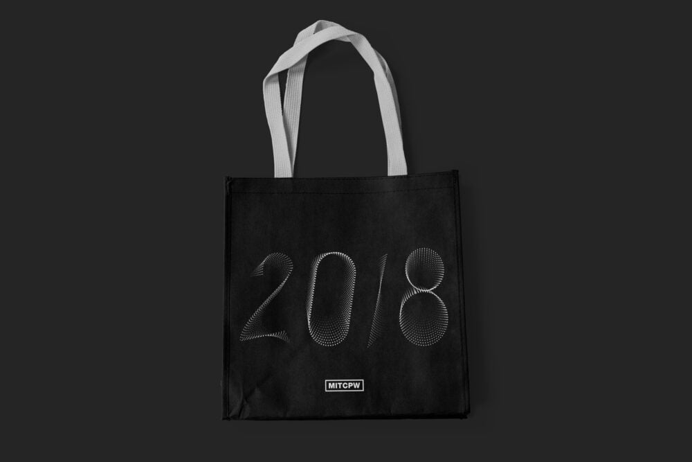
This was meant to be given out to students at CPW check-in with a matching water bottle.
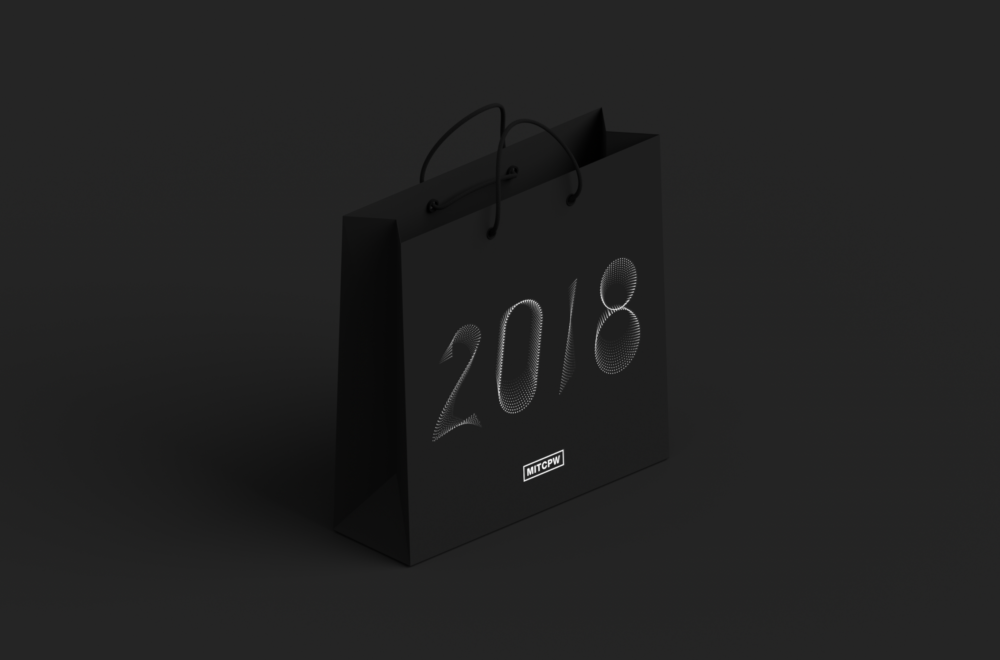
I also made a matching gift bags for parents. I think that year they just got a map, instead!
2018
Admissions web concepts
Some of you might remember that we redesigned the sites for Admissions and SFS a few years back. We did, in fact, hire a professional agency to take on this project—and I am very much not an employee at said professional web design agency. But did that stop me from designing web concepts of my own? Of course not. Like any good tragic hero, I was my own worst enemy on this one.
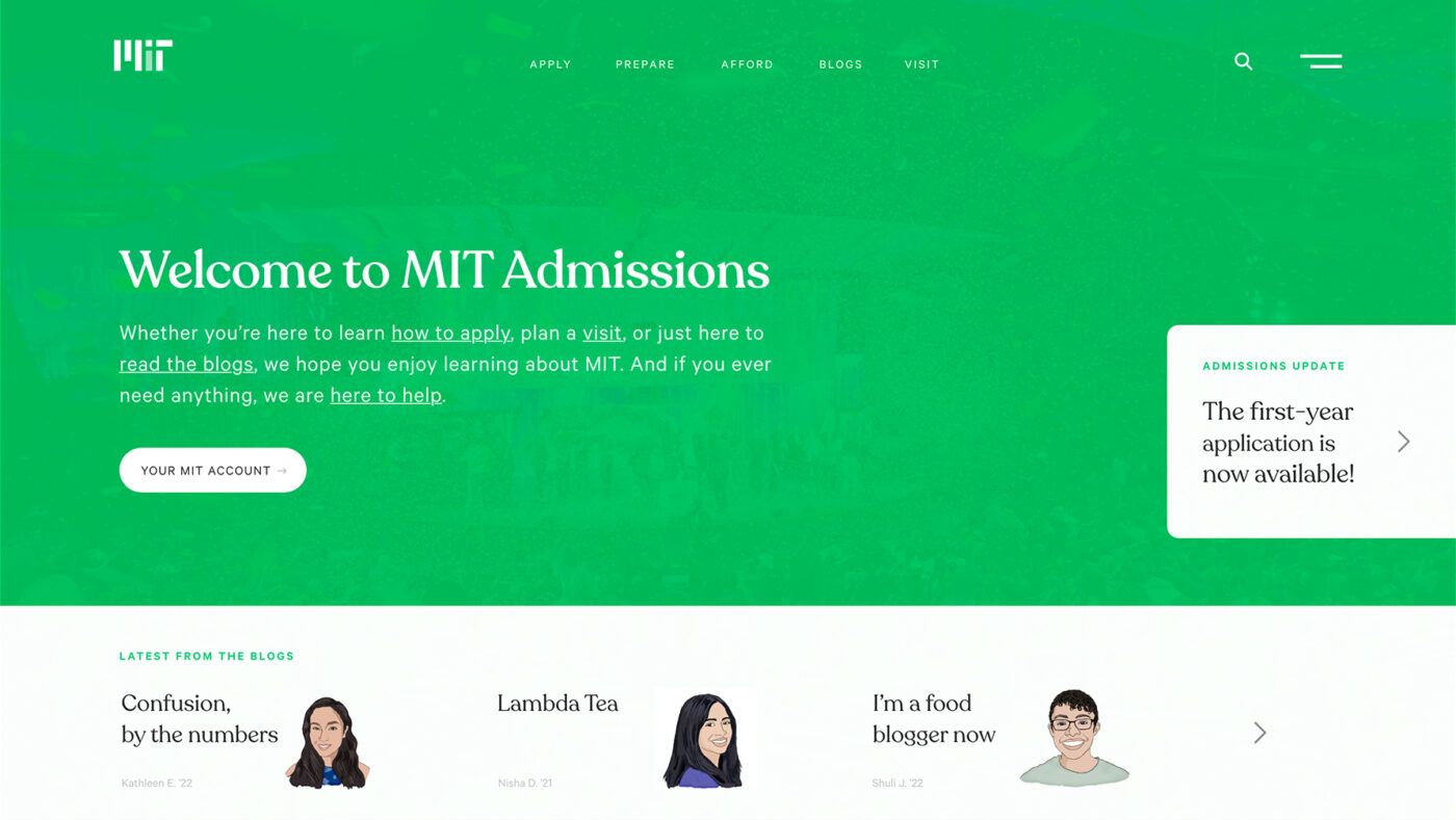
Here’s a look at the admissions homepage, featuring a scrolling carousel of recent blog posts.
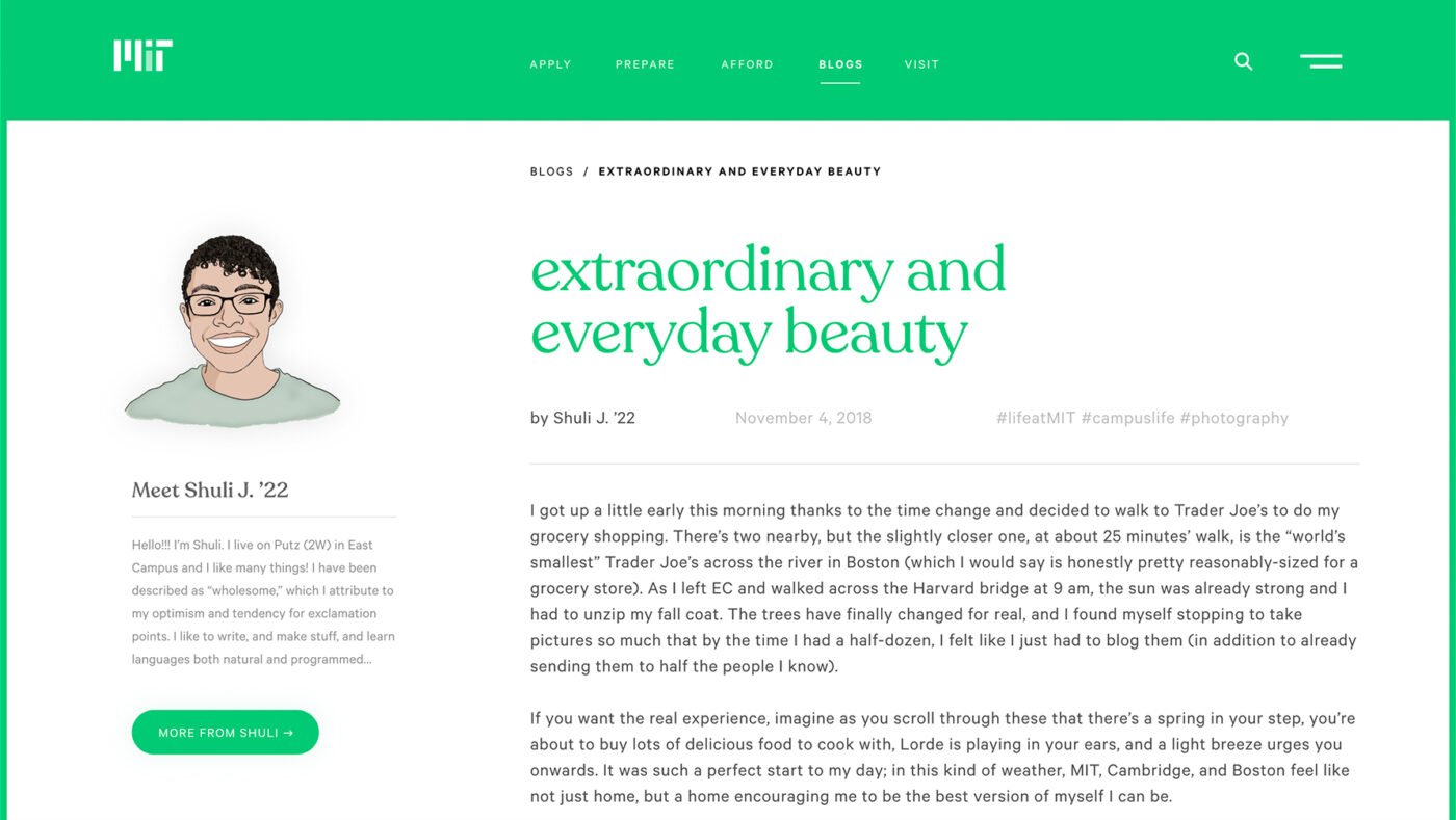
A snapshot of a full blog post, featuring Shuli!
This is the landing page for the “apply” section, which offers a related blog of encouragement from The Twins.
It was a lot easier for me to focus on sharpening my UI and web design skills because I was working in familiar content territory (as opposed to designing a site for a fake company, hypothetical product, or an organization I’m less familiar with). As an added bonus, these web mockups offer a rare example of work I’ve made intentionally designed with color! (It shouldn’t take long to notice that my design preferences gravitate toward black, white, and grey—much like my wardrobe).
For all my type nerds out there, I paired Recoleta by Latinotype with Calibre by Klim Type Foundry. Even if it was a gratuitous exercise, I still like how these turned out, and I think they deserve some archival acknowledgement.
Class of 2023 tube concepts
Ever year I take the lead in designing the packages we send to admitted students. Colloquially they are known as “the tubes,” named after the silver packing tubes we use to ship them. Alongside their admit letter and some other important documents, we like to create a print or poster of some kind that unique to the admitted class—and it is usually centered around some kind of concept or theme.
Though we ended up going in a different direction, my earliest plans for the ’23 poster were based around optical illusions and tricks of the eye. I found a cool quote from Ada Lovelace, mathematician and early computer programmer, about imagination, and I set out to build the tube theme around imagination as a creative form of escape—an illusion of reality, of sorts
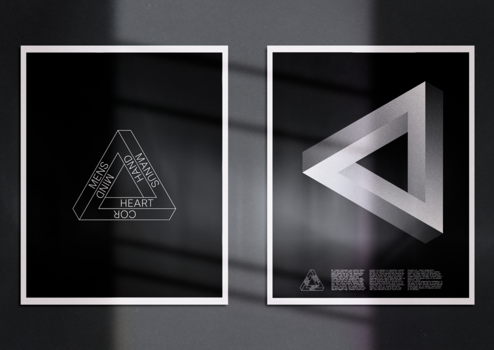
thanks to @haugentheodor for the mockup
After rendering all sorts of impossible triangles and illusions, I eventually led myself astray down a rabbit hole of isometric patterns. I don’t really remember what I was thinking here, but I do remember that these were exceptionally fun to make. Still, the isometric designs never coalesced into a solid concept, and ended up looking more like custom MIT 2023 gift wrap…
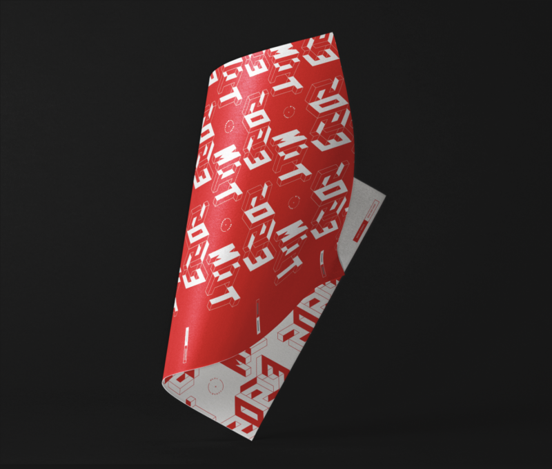
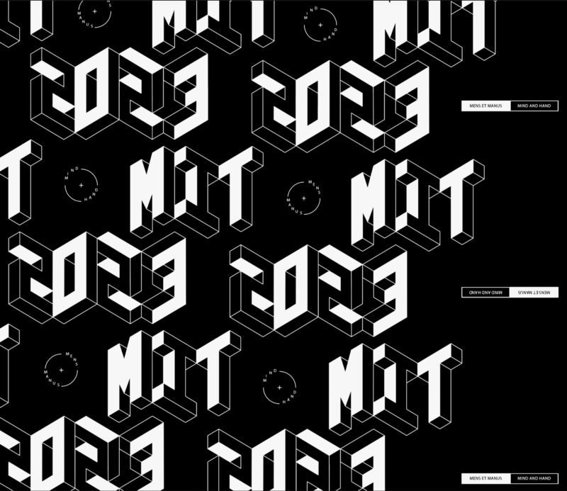
In the end, I scrapped all of these ideas and started over completely.
2019
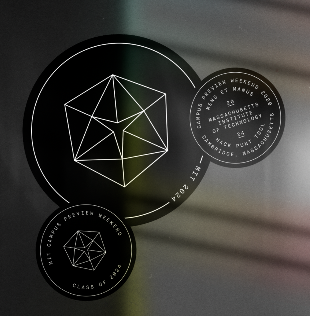
Class of 2024 stickers
In the wake of the global pandemic, in-person Campus Preview Weekend this past April was cancelled, a month-long virtual variation (CP✱) taking its place. With the move from in-person to online, I introduced a Limited Edition™️ virtual CPW brand (which you can learn more about here!), which was an unexpected opportunity to create some new design work. Unfortunately, some projects I had planned pre-cancellation got lost in the virtual shuffle.
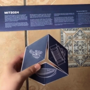
One of those projects that got left behind were holographic stickers I made for the Class of 2024 to give away at CPW. The stickers feature a minimalist flextangle graphic, referencing the custom 24-sided flextangle I designed for the Class of 2024 tubes.
We based their tube concept on the tesseract, and its ability to fold between worlds. The concept was framed as students were travel from wherever they call home to build their new home at MIT,06 We decided on this concept in the fall of 2019—not realizing just how difficult traveling between homes would soon become. the tesseract was a symbol of that transition.
(While we’re on the subject, check out this tube unboxing video from blogger Mel N. ’24! She’s going to love that I’m including that video in this blog…)
video by Binh P. ’24 / gif made by me
With everything that came up with shifting to a virtual CPW, the stickers never got made. This was much to the disappointment of several the sticker-obsessed ’24s in Discord—who are properly aligned within MIT’s well-established laptop sticker culture. I don’t want to make any enemies out of the ’24s, so I’ll have to look into getting these printed and shipped to campus once we’re all back.
2020
For me, design is as much about letting go as it is about creating.
Much of this year so far has been about pivoting out of dead ends, and I am grateful to have developed some semblance of design resilience in the years prior that have made these circumstances slightly less immobilizing.
There are dozens of projects cursed to a lifetime of purgatory in my drafts—some of them even better than the versions that were completed!—but the reality of being a designer is accepting that rejections, criticisms, and alterations are a fundamental part of the craft. It’s not about being a Creative Genius whose work is taken at face value as a masterpiece. Embracing change in all of its forms is just as important as any design sensibility, artistic vision, or so-called creative genius.
Yes. A small part of me still feels disappointed after a project doesn’t end up making it. But if there’s one thing I’ve learned in four years at MIT, it’s that the best way to ameliorate the frustration of dead-end designs is to keep designing.
- 🍰 back to text ↑
- In a typical year, that is. back to text ↑
- But I’ll save that story for another time... back to text ↑
- Although, if you think about it, this blog is a way to reincarnate them. Perhaps this was their fate all along? back to text ↑
- Honestly? I’m a few months behind. back to text ↑
- We decided on this concept in the fall of 2019—not realizing just how difficult traveling between homes would soon become. back to text ↑