
Oh, the things I can nerd on about by CJ Q. '23
not comprehensive
Math words, but not the math part. Yes, I can nerd on about math, but I’m also interested in math-related things that aren’t directly math. Did you know that the word “matrix” comes from Latin mater, meaning “mother”? It’s from the same root we get alma mater and matriculate. It’s actually in the sense of, “the place where something originates”, like alma mater. For Sylvester, who introduced the term, a matrix is where a determinant comes from. Interestingly, Lewis Carroll preferred the term “block”, which I think is way more reasonable.
In Tagalog, mathematics is sipnayan, from isip “mind” and sanayan “practice”; hence sipnayan, mind practice. I think this is way cooler than the alternative matematika, tracing back from Greek manthanein “to learn”. Another cool word: awanggan “infinity”. I don’t know where that comes from; my best bet is an abbreviation of walang hanggan, “no end”. But it sounds so cool, awanggan, the way those vowels are so open, as if the word wants to hang on to your mouth even when you’re done saying it.
The words “tangent” and “integer” are cognates; the former from Latin tangere “to touch”, and adding the prefix in-, for negation, goes to integer. So “tangent” means touching, and “integer” means untouched, in the sense that it’s whole, or complete; compare intact, or integral. And Latin integer became Old French entier, which is where we get “entire”.
Actually, just words in general. In Tagalog, “I love you” is mahal kita. It’s neat that kita is a pronoun that doesn’t just indicate “me” being the subject, but “you” being the direct object, and I don’t think I’ve seen a pronoun like this in other languages. And it’s kinda romantic that, in mahal kita, the “you” and “I” are merged into a single pronoun, as if it’s been said so many times that we found a need to shorten it.
In Tagalog, mahal also means “expensive”, and it’s the same in Malay, where the word probably comes from. It went from meaning something valuable, to someone valuable. A similar pattern is with English “dear”, which also apparently used to mean expensive.
In a completely unrelated note, Hindi also has the word महल, pronounced mahal. You know, as in Taj Mahal. It means “palace”, which, if you close your eyes and coerce the meaning of the word enough, could also mean something expensive, valuable, or grand, by association. It comes from Arabic مَحَلّ, mahall, which just means “place” or “residence”. The poet in me still wants to relate this to love, in that a loved one can be a source of rest, but at this point it is definitely poetry and not etymology.
And languages, in general. I talked about a little of this when I mentioned how I taught Esperanto for Splash, but conlangs in general fascinate me. I think Toki Pona is neat, even if I still haven’t gotten around to fully learning it yet, after like four years of telling myself I would. Other language-y things I find neat are sign languages, which conlangers have explored to great extents, Blissymbols, sitelen sitelen, and language models. But maybe this is best left for another time.
jan Sije, which is how i’d write my name in toki pona, in sitelen sitelen, made with this neat renderer
And you know, how words are used. I trace a lot of the influence in my writing from spoken word poetry. The earliest I remember using numbers to separate the parts of anything I’ve written was a journal entry in September 2017. It was titled “I am not Zorn’s Lemma”, and it made this play on how you can count higher and higher, but never reach infinity. (Again, I’m interested in math, and not just the math parts of math.) I kind of borrowed this style from some poems I’ve heard that separated their parts with numbers. To this day, it’s my go-to way of organizing a blog post.
Or take To the exclusion of everything else, which I originally wrote in May 2019. There’s some good use of repetition in the parts I feel are most powerful. In Thirteen, for example, there’s the phrase “will be better for me”. Or in Fourteen, a paragraph where the first three sentences began “I wasn’t going to disappoint…” This is definitely something I’ve picked up from spoken word poetry without realizing, at the time.
And calligraphy, and typography, or to continue the train of thought, how words are written. I don’t remember which of the two I was first interested in, but they kind of feed off each other. Here’s one of my earlier pieces, that I have a picture of, anyway: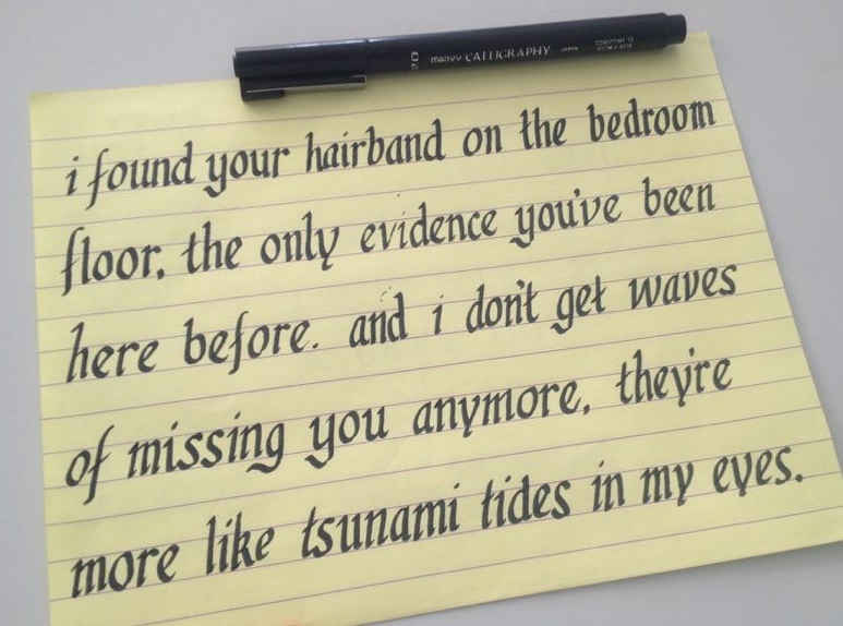 It’s one of my earliest attempts to try writing Italic, from four years ago, I think. There are like, at least two different ys, one of which looks really weird. And the slope changes a lot, even within a word, like the “and” in the third line. The letter width is a bit thinner than a normal italic too, but at least that part was intentional.
And yes, Italic, with a capital I, because it refers to the Italic script, as before italics were used for formatting, it was considered a separate script. Rather than emphasizing certain parts with italic, there’d be entire books written in Italic. And later, when the printing press became a thing, if you used italic, you printed the entire book in italic.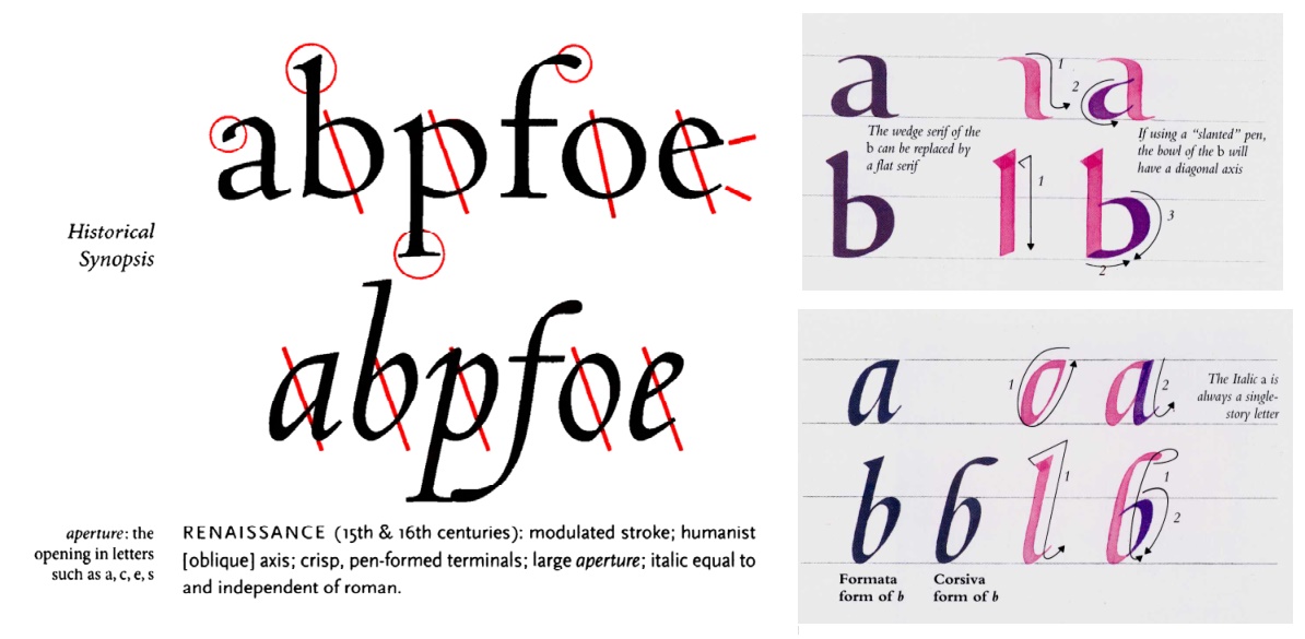 The left part of this picture is from The Elements of Typographic Style, and the right parts are from The Art of Calligraphy, the top part being a Humanist script and the bottom, an Italic script. Type is idealized writing, at least, when it started out, back in the days when calligraphy was more common and fonts were sets of metal blocks you could carry in a briefcase. Note the similarities with these two: the contrast between thick and thin strokes, how short the a is compared with the b, the angle of the pen, and the terminals of the strokes, or where they begin and end.
And typography changed, as things tend to do over five centuries. While The Elements of Typographic Style is a great book, it’s pretty dated. Here’s a part of Stop Stealing Sheep and Find Out How Type Works. When I see this, in contrast to the above, I think about how the use of type has changed. The typefaces we use are pretty far removed: this one has almost no difference between stroke width, with few serifs, clearly made by machine, and not pen. The way it’s used is pretty different from back then; today type is so ubiquitous, and literacy rates much higher, that it’s used everywhere, even in something as simple as navigation. Even the medium is different. Books were meant to be read with light shining on them, but things change when you type is backlit.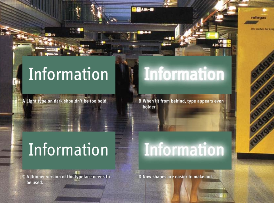
Cubing and Tetris. A brief digression, because I don’t really know where else I’d put this. There was a brief stint, some time in my life, when I really tried to learn how to speedcube. I think I got about sub-40 and stopped, which meant that I could consistently solve a Rubik’s cube in under forty seconds. The result is that I can now hold conversations with speedcubers about cubing-related things, and I know some of the vocabulary like CFOP and color neutral and +2, even if I can’t actually solve a cube that quickly. If I continued, maybe I would’ve gotten into BLD or FMC. (These mean blindfolded and fewest move challenge, respectively.) But I didn’t, and now my hobbies are different, I guess.
Kind of the same thing happened with PvP Tetris, but not really. I can put up a little fight in, say, Jstris; my last few games have an average of 15 APM, which means I send around 15 lines per minute. My openers switch between doing a T-Spin Double, if I can find one, a 4-wide, especially if I start with SZ, or OZJ. My midgame is just whatever happens, I guess, although I tend to downstack quite often. I think I’m decent at Tetris, but it’s definitely only something I pick up every-so-often.
big brain downstacking i wish i could do. from tetris concept.
And heraldry, and vexillology. Back to artsy things again. I’ve mentioned my love of heraldry, and specifically blazonry, in my post about Mystery Hunt. Heraldry goes hand-in-hand with vexillology, the study of flags, just like calligraphy and typography. I taught a class about vexillology for a lecture during Summer HSSP this year, where for most of the time, we talked about flag design, and what made a good flag and a bad flag.
Maybe you might be familiar that a good principle for designing a flag is simplicity; or you may have heard the rule “simple enough for a kid to draw”. Certainly you don’t want a flag to be too complicated. But a flag can be complicated in multiple ways, and not all of these ways to be complicated are bad. As an example, look at these six flags: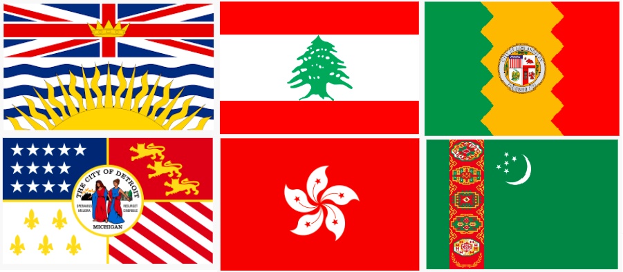 The two flags on the left are British Columbia and Detroit. They both have a complicated overall design. The two flags in the middle are Lebanon and Hong Kong. They have a pretty complicated central element, one that isn’t easy to draw from memory, yet I still think they’re nice. On the other hand, the two flags on the right, which are Los Angeles and Turkmenistan, have a complicated element as well, that I think doesn’t look as nice.
So there’s subtlety in this rule. It isn’t just a matter of “everything complicated is bad”, or even “put all your complexity in a single part of the flag”. I guess that’s one thing I appreciate about design in general. If I was feeling more literary right now I’d make a comparison or something.
And design, in general, a thread that unites many of the things above. Other design things I can nerd on about include product design, newspaper layouts, and web design. And wow, I have a lot of feelings about web design, and user interfaces in general, and I constantly wish I was better at it.
But it’s not a single thread that stitches everything I’m interested in together. I wish I could summarize all of my interests with a pithy one-liner, like “passionate about the intersection of technology, problem solving, and social change”, with apologies to Kat H. ’23. But the thing is, there’s no underlying motif between combinatorics, and web development, and algorithms, and typography, and vexillology, and puzzlehunts, and mathematics education, and Tetris, and square dancing, and spilling out the details of my life in front of everyone in the internet.
Even if you cut off the “hobbies” and only kept the “work”, as if there was a meaningful distinction, there’s still no single theme. The best I could come up with is that I’m passionate about “writing math, writing code, and writing blog posts”, which doesn’t really capture it. I keep fantasizing that someday I’ll find a job that’ll match all of these things I like, but to be honest, it probably doesn’t exist.
As much as I want to cut off the other things I’m interested in and only focus on one of them, I can’t. It’s too painful. Not only that, it feels like I’m betraying myself. It feels like I’d be selling out, whether I decided to only keep math, or only keep CS, or only keep writing. Yes, dropping everything and just focusing on writing, to me, feels like selling out.
I’ve thought about all of this before, but it’s good to remind myself of what I believe in, from time to time. I don’t have to sacrifice any of these parts of myself. (Conversely, I don’t have to be “well-rounded” either, whatever that means.) Again and again, I find myself coming back to what Austin Kleon wrote in Steal Like an Artist:
The thing is, you can cut off all your passions and only focus on one, but after a while, you’ll feel phantom limb pain. […] Don’t throw any of yourself away. Don’t worry about a grand scheme or unified vision for your work. Don’t worry about unity—what unifies your work is the fact you made it. One day, you’ll look back and it will all make sense.
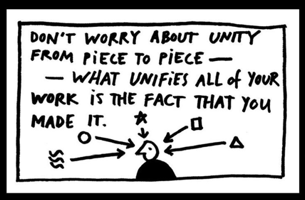
(picture also from Steal Like an Artist)
I hope it’ll all make sense.