Why the title of this post is really important by Anelise N. '19
I got to present my UROP work looking at the titles of graphs at the Vision Sciences Society conference in Florida!
For the last 6 days, I’ve been at the Vision Sciences Society conference in Florida!
The view from our hotel room.
As its name indicates, this conference is dedicated to the study of human vision—figuring out how and why the human visual system works the way it does. The conference covers everything from computational models for describing human behavior in response to visual stimuli to neuroscience experiments to tease out what parts of the brain process which visual cues.
The conference lasted for six very intense days. Each day, there were two different poster sessions and eight presentation sessions, with one poster session and two talk sessions all running concurrently.
Part of the schedule for last Tuesday…there was a lot going on!
Topics of the presentation sessions included perception (how the visual system actually represents visual stimuli inside our brains), memory (how the brain retrieves information once it has been viewed and absorbed), attention (what people focus on when shown a visual stimulus), brain scanning, visual search, and much more. My favorite talk session was actually the first one I attended. It was a symposium on vision science and visualizations that my research supervisor, Zoya Bylinskii, helped organize. Speakers talked about methods to approximate where people look on a visualization, what computations our brains might actually be doing when we see a bar chart, and the effects of color on how we interpret a chart or graph.
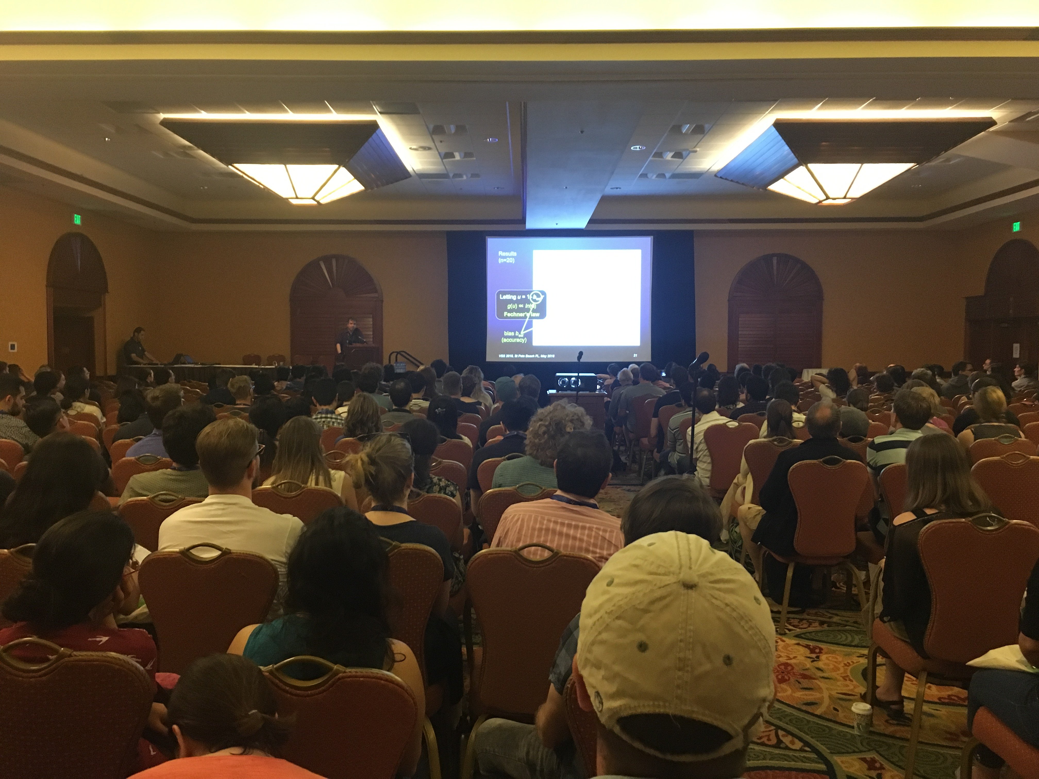
The visualization symposium got a big crowd!
Poster sessions give people the opportunity to present research they have been working on (which could potentially be exploratory or in-progress) by making a poster of their work and discussing it with other researchers. Literally hundreds of people set up their posters in the same room, and conference attendees can browse through the different displays to check out what people are working on. If a piece of research looks interesting, they can ask the author to explain the project, and you can have an in-depth, interesting discussion that lets the conference attendees learn about breaking research in their fields and lets researchers get feedback or suggestions on their projects. I actually ended up liking the poster sessions even better than the talks, because I could choose which projects seemed interesting or relevant to me and then engage in an interactive, critical discussion with the researcher.
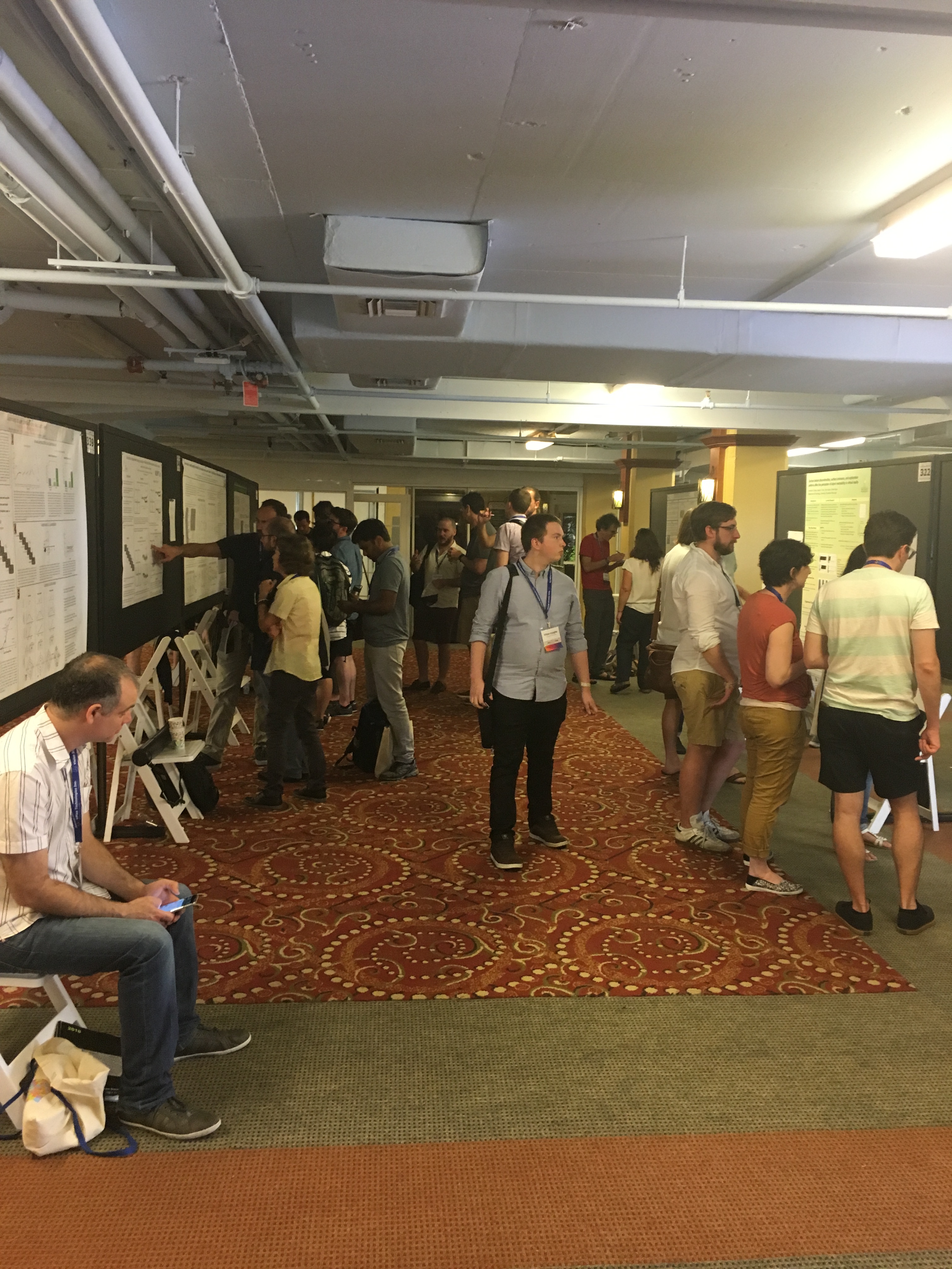
One of the poster sessions.
There was also a keynote speech by Professor Kenneth Catania of Vanderbilt, a biologist who investigates the fascinating habits of some of the most exotic animals on the Earth. He talked about the incredibly sensitive nose of the star-nosed mole and how its probing gestures resemble those of the human eye, as well as the complex hunting strategies of the electric eel and the tentacled snake.
I was there to present a poster of the work I’ve been doing at my UROP this year!
I’ve been looking at how changing the title of a graph can affect how people remember the data it contains—specifically, its slope. Previous research has already found that titles are a really important part of visualizations—they are where people spend the most time looking and play a large part in determining how memorable a visualization is. Titles are also most effective when they contain the main message of the visualization—but if that message is biased or one-sided, it can effectively bias how people interpret the data contained in a graph. We wanted to run a really controlled experiment to see if small changes in a graph’s title—in this case, a single word—can affect how people report its content.
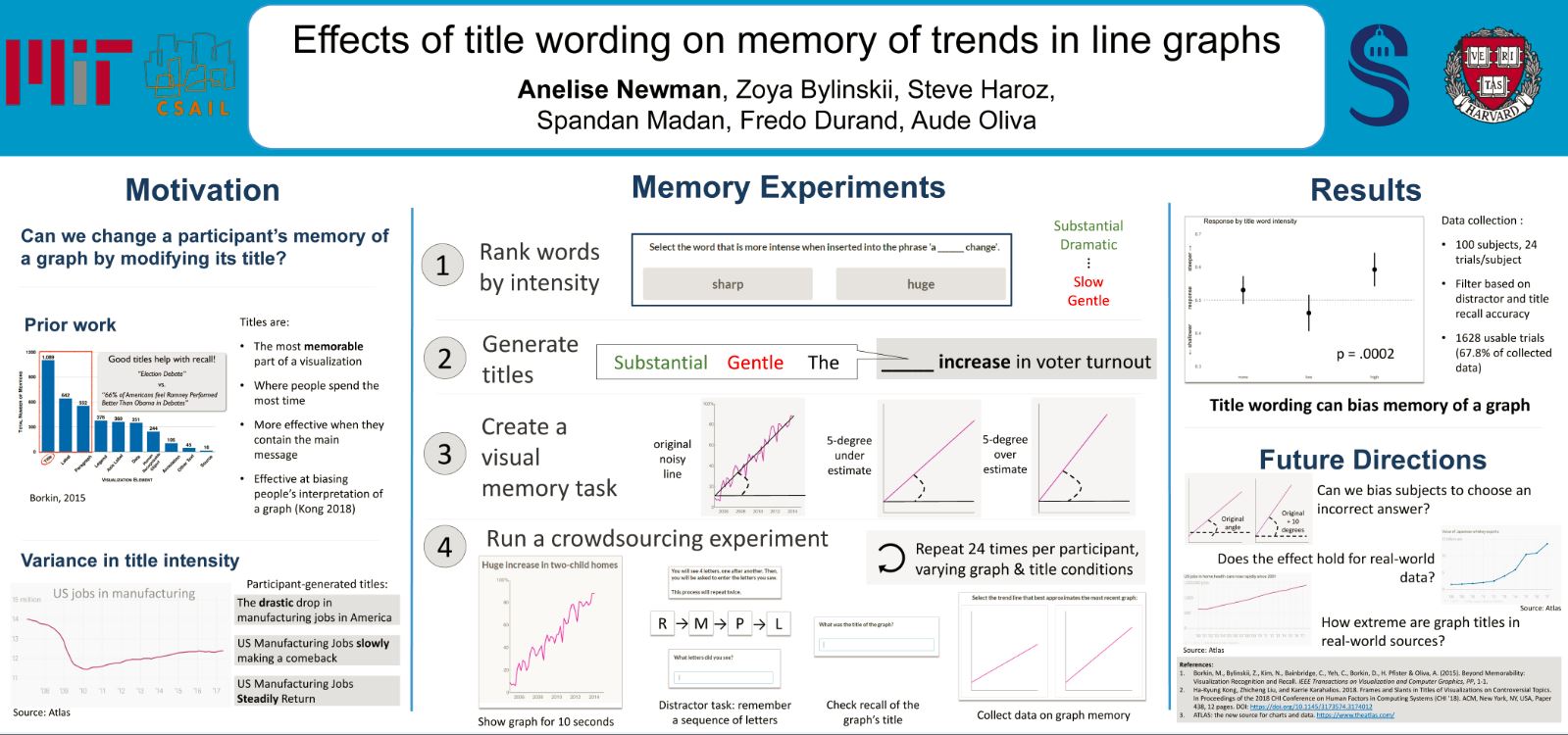
First, we had to come up with some titles. All of our titles were of the form: “<adjective> <increase/decrease> in <two-word topic>”: for instance, “Substantial increase in voter turnout”. The intensity of the first word, the adjective, was the independent variable we were controlling. So we needed to come up with a ranking of different adjectives based on how “intense” of a trend they implied. We did this by collecting a list of 22 adjectives that could be used to describe a trend or a slope. We then presented pairs of these words to crowdsourced workers and asked them to choose which of the two options they thought was “more intense when inserted into the phrase ‘a ______ change’”. After collecting 15 votes per word pair, we used these pairwise comparisons to rank our list.
Our final ranked list of adjectives.
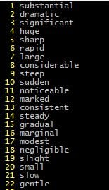
We took the top 4 words and used those as our “high intensity” condition, the bottom 4 as our “low intensity” condition, and we used the word “the” as a neutral condition.
We also generated graphs to use as stimuli. Each graph was just a line at a certain angle from the horizontal with some noise added.
An example graph (with title) that we would show to a subject.
We then ran a study through the crowdsourcing platform Mechanical Turk. We showed subjects one of the generated graphs with one of the three title conditions. We had them do a distractor task where they had to remember a sequence of letters that came across the screen, to prevent them repeating the title or some other information in their head. We asked them to recall the title. We then gave them two trend lines and asked them to choose which one they thought better approximated the graph they saw. One trendline was 5 degrees shallower than the original noisy line and one was 5 degrees steeper.

An example of the two slope options we would show to a subject.
We found that people who saw a high-intensity title were significantly more likely than those who saw a low-intensity title to pick the steeper line. So changing the title did bias how people reported the content of the graph!
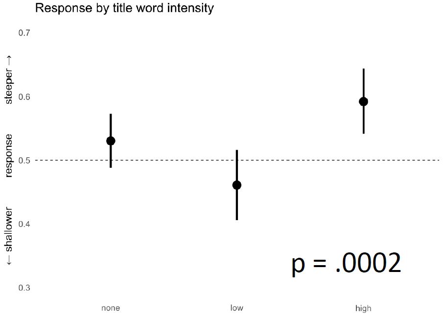
A graph showing the results of our study. The y-axis is the fraction of respondants who chose the steeper slope. The lines for each condition show 95% confidence intervals. The “none” or “neutral” condition is almost at chance (50%); the difference between the high and low conditions is significant.
I will continue working on this project over the summer and next year, looking at things like if we can bias people to choose an incorrect slope when the correct one is also an option, or if we see the same type of bias with real-world graphs taken from actual news sites.
You might be wondering why, as a computer science student doing work in a computer science lab, I ended up presenting at a vision science conference. My group does a lot of research at the intersection of computer vision and visualizations. Computer vision deals with creating computational algorithms for performing vision tasks, such as classifying pictures based on scene location or locating certain objects in photos, whereas the study of visualizations looks at how to create data representations that are effective, accurate, and memorable. We work on creating programs for dissecting and better understanding visualizations like graphs and infographics. For instance, my supervisor has developed a computer model for predicting the visual saliency of a graphic design; recently, we have been working on creating a “visual hashtag” of an image: a text tag and a crop of an infographic that capture its main idea at a glance.
So where does human vision come into this? In order to understand what makes an effective visualization, and in order to answer questions about how humans perceive and interact with the visualizations we create, we need to have a more basic understanding of how human vision works. My supervisor, Zoya Bylinskii, has done substantial work in several key areas of vision science in order to lay the groundwork for more advanced treatment of visualizations. In vision science, memorability refers to the brain’s process of retrieving something from memory after it has already been seen and absorbed. Zoya co-authored a paper exploring what makes images and particularly infographics memorable. Attention refers to where people focus when viewing an object; Zoya’s work in this area includes creating a computer interface that can serve as a good approximation for gaze-tracking as a way of figuring out where people look when exploring a visual, and then using data collected in this manner to train a computer model to predict where people will look on an arbitrary image. The basic questions about human behavior that vision science tries to answer provide an important motivation and basis for our future work.
Plus, the conference was really fun. I met a ton of people AND got to swim on a Florida beach for the first time!
Hopefully, if I keep doing good research, I can go back next year!