
How I Write My Data Analysis Blogs by Kathleen E. '23
just in case you were wondering
My dear friend and fellow blogger Kidist A. ’22 requested I write a post to describe how I go about writing my data analysis blogs. So, here goes! I’ve outlined my general steps and linked to my old posts to give examples of what I’m talking about.
1. Identify a question

I begin by asking myself the following:
- What story do I want to tell?
- How does data analysis help tell that story?
If I’m stuck, I try to think about my life and the world around me. Are there are any patterns I’d like to investigate or phenomena I’d like to quantify?
Here are some things I’ve asked myself in the past:
- What do my work patterns look like? Confusion, by the Numbers
- What is it like to climb a 20-story building 22 times? Green Building Challenge
- How do MIT students feel about our dormitories’ new laundry system? Washlava! A Sentiment Analysis
Next, I ask myself what kind of data would be helpful to answering your question. This brings us to the next step:
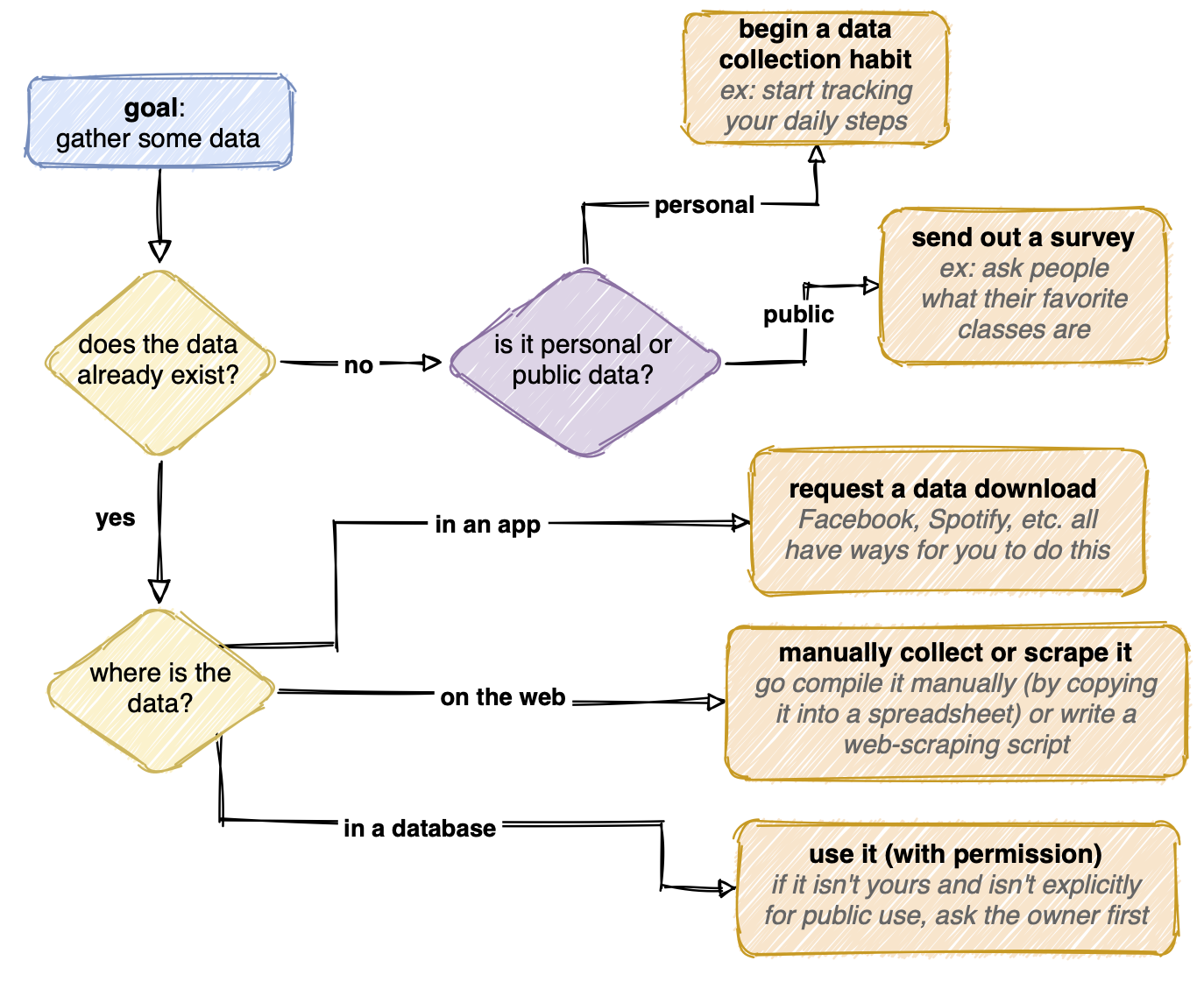
2. Gather some data
Gathering data can be straightforward or quite tedious. The data might exist already, neatly compiled in a database. If the database is public, I’m done with this step! If it’s private, I generally send a request to the owner to use it. If the data is inside an app like Facebook, I look for ways through which I can request a data download. The data could also exist somewhere a bit more inconvenient (scattered around the web, for example) and I’d have to go collect it.
If the data doesn’t exist yet, I can start creating it. If the question I’m trying to answer is more personal, I can begin tracking something in my life, either automatically (like with a step-counting watch) or manually (like recording what Netflix shows I watch each night). Or, if the data is about other people, I could conduct an experiment or send out a survey.
Here’s a flowchart I made that summarizes how I might go about getting data:
3. Clean the data

The data rarely comes ready to analyze. In order to get it ready, I need to “clean” it.
What does it mean for the data to not be ready to analyze? Maybe there’s a lot of data that doesn’t relate to my question. Maybe the data is represented in a really disorganized or inconsistent way. Cleaning could mean extracting the relevant subset of the data, organizing it, and changing how it is represented to make for a more straightforward analysis.
For example, in dormspam-the-game (Part 1) the data consisted of a list of locations where each player (in a virtual game of hide and seek) chose to hide and seek. However, there were some entries in the database that were misspelled, causing errors in my code as it tried to iterate over a list of locations. I had to go replace those entries with correctly-spelled versions of the location.
4. Do some data analysis!
I generally use Python to write scripts to analyze and visualize my data. I’ve put some of my code publicly on Github, so you can take a look at it. However, Python isn’t the only option. You can also use a variety of other scripting languages that have great analysis and visualization tools. You can also go no-code and use spreadsheet functions. With that said, here’s how I work with Python:
- I like to use Jupyter Notebooks (or Google Colab notebooks). I like these better than a raw text file because they allow for markdown notes/documentation and visualizations to exist alongside your code quite nicely. If I’m planning out my analyses, learning to use a new tool, or referencing a past result, it’s nice that I can just scroll around to look at notes/output/plots inside my notebook instead of some external reference.
- I rely heavily on packages. I almost always import Pandas, Numpy, and Matplotlib for handling and organizing my data, doing basic statistical and mathematical operations, and making basic visualizations, respectively. On a project-by-project basis, I also import additional packages to access special models and visualizations that might be relevant.
- I start by loading up my data. I can load it locally from a file on my computer. Or, more often, what I do is upload it to Google Sheets, use the “publish to the web” function to generate a link to a CSV, and then use that link to load my data. I prefer using google sheets over a local file because it has nicer version history and collaboration functions.
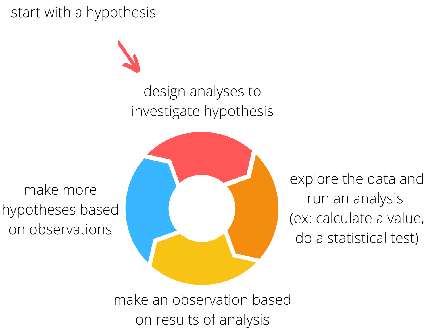
- Next, I engage in an iterative process where I hypothesize about a trend in the data, do an analysis to investigate the hypothesis, and then use the results to generate more hypotheses. With really interesting or odd data, this process can go on for quite a while.
5. Make some plots
As I analyze the data, one useful way to spot cool patterns is to make visualizations. I can do this with a variety of graphs. My first plot is often quite ugly. I can use various functions inside my plotting library to make it better highlight the data, both scientifically and aesthetically. For example, I can adjust the colors and sizing of data points, lines, and bars to better demonstrate trends. I can change the way the x and y axis are represented to make the plot look cleaner.
Aside from making static plots, I occasionally like animating plots (see Green Building Challenge and dormspam-the-game (Part 1)). Making plots is a creative process, especially when creating animated ones where features like color and size can serve a different purpose than they might in a static plot.
Making visualizations is my favorite part of the process. I love letting my artistic and engineering sides come together.
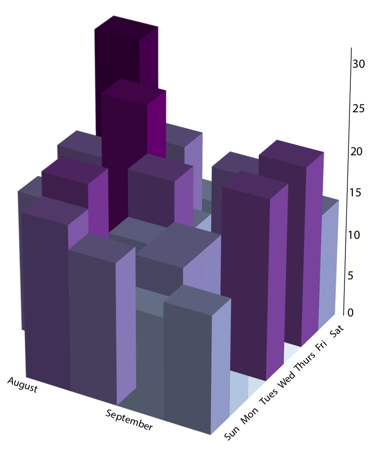
a plot from my first ever blog post showing the number of steps i took, in thousands, in my first few weeks at MIT
6. Tell a story
It’s important to think about how my data analysis and visualizations can contribute to telling a story about the trend I’m investigating or phenomenon I’m quantifying. I try to make plots in a way that allows each plot to show a new part of the story. I try to order them my plots my posts in a way that each my words and my plots together progressively tell a story about what is going on. For example, when I’ve visualized the data from a game, I might first describe the rules of the game, then describe who won, and then dive into understanding how different player strategies affected the outcome.
So, that’s pretty much how I go about writing my data analysis blogs. I separated it into 6 steps, but thinking “backwards” rather than strictly step-by-step can help make your work in previous steps more meaningful. If you think about how to make the story compelling, you can make better visualizations. If you know what visualizations you might want to make, you can better direct your data collection.