a ranking of building 68 thesis defense posters by Abby H. '20
graphic design is our passion
I spend several minutes in and around Building 68 elevators most days of the week. Often the elevators are where I find out about cool talks that are going to happen, see below.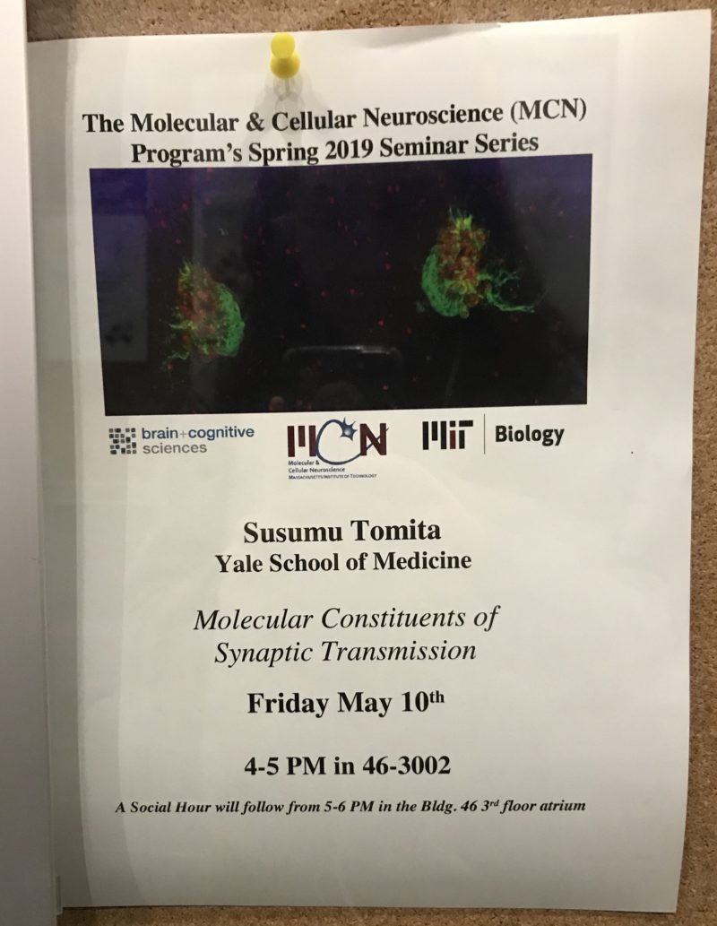
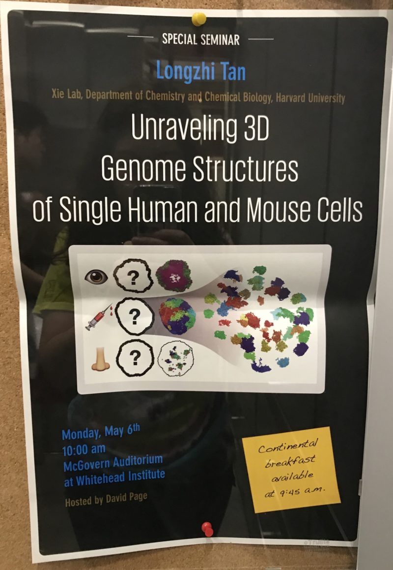
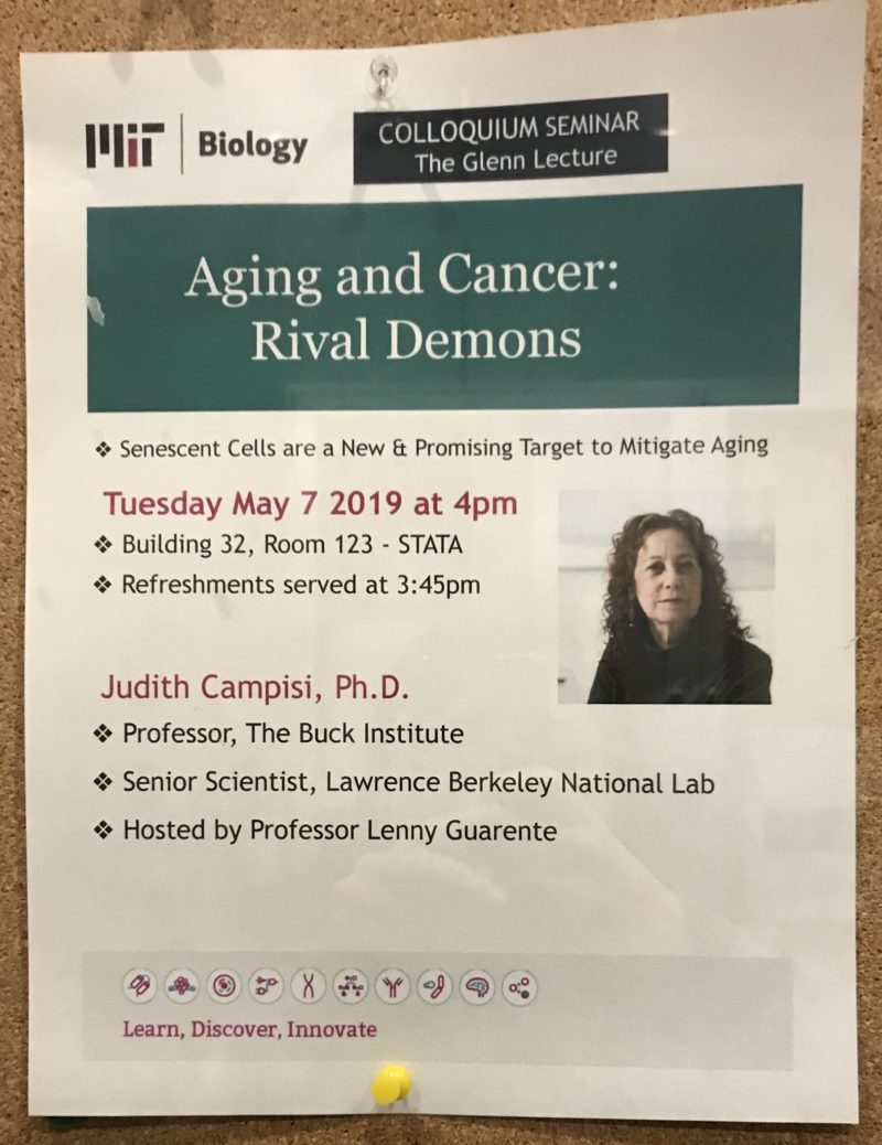
Those posters are eye-catching, professional, and seem as if they were made by someone who isn’t the person giving the talk. Except, of course, for the many posters I see advertising upcoming thesis defenses. Those posters have a kind of soul to them—they radiate heavy grad student energy. I imagine hunched over adults sitting at a computer moving text boxes around and sending things to front, grumbling about having to make one of these posters in the first place and getting frustrated when they can’t find images with transparent backgrounds. Weirdly enough, however, I’ve noticed that graphic design is something that biologists are usually pretty good at. It might be all the figures and powerpoints you have to put together. Integrated passive design education.
Here is my definitive ranking of all of the thesis defense posters I’ve seen in Building 68 in the past two weeks, from least favorite to most favorite. Strap in!01 I had a long back-and-forth conversation in my head about whether to censor the names on these posters. On one hand, a grad student's thesis is their baby. So much work gets put into these projects that it could be a bit alienating to separate their names from the years of work they put in. On the other hand, people on the internet can be mean. This is ultimately why I chose to black the names out. Additionally, even though I don't know any of the people behind these theses, I didn't want to make it seem like I was judging them personally by vaguely ranking them in terms of favorite-ness. I hope you understand, dear grad student (or freshly defended Doctor!) who may be reading this.
13. Synthetic Analog Feedback Control Circuits in Living Cells
Now this one was just a little bit plain for my tastes. It actually stood out from the others in its sheer simplicity. While I am tickled by
the line breaks in the title,02
It's almost like a course 6 snuck in as a bio grad student and was like <em>I want to study synthetic analog feedback circuits... in... umm... living cells!</em>
the little circuit diagram doesn’t do much for me. It does have a little color going on, which makes it overall not too bad. 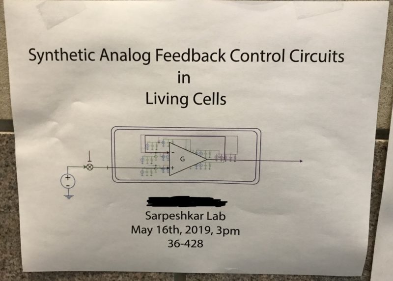
12. The Assembly and Functions of microbial communities on complex substrates
Color! Good! Also good choice using a non-standard font. This one only ranks low on my list because of the murky figures at the top which remind me of
18.0203
multi-variable calc for the non-MIT ppl out there
for some reason and therefore trigger my fight or flight response. The bottom pictures are good for doing mini-Rorschach tests, especially the last one, which makes me think either “that figure/ground illusion where it’s a vase but also two faces looking at each other” or “Simpsons hair.”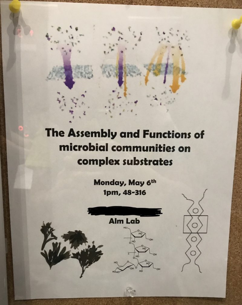
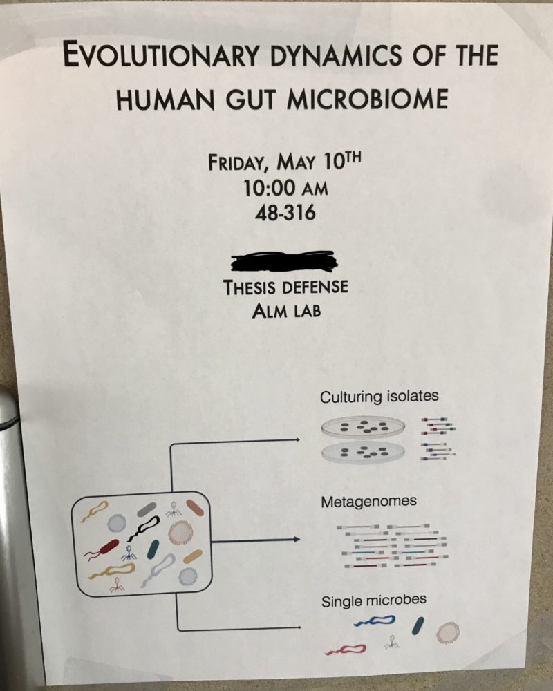
11. Evolutionary Dynamics of the Human Gut Microbiome
That poor cell is full of microbes :/ . I wish I could help him out. Oh wait, now you’re telling me that this cell is packed with little microbes initially and yet there are still “Single microbes” at the end of the experiments? Forget the cell. Poor microbes. Why wouldn’t your thesis project be setting up a blind date system for the microbes to get to know each other and maybe develop meaningful relationships? How typical of a human biologist not to care about the happiness of beings that their naked eyes can’t see.04 The original caption for this was just going to compare the microbe-y cell to an I Spy puzzle but it is very late at night at the time of me writing this, and the worms start eating holes in my brain at night (oww). Anyway, I think microbe dating would make a pretty watchable reality show on TLC.10. Understanding Neurodegenerative Disease-Relevant Molecular Effects of Perturbagens Using a Multi-Omics Approach
I had this one closer to the bottom of the list before looking at it a second time and recognizing genius. Yes, it is a very average-looking poster. Yes, it contains the words “perturbagens” and “multi-omics,” and I did have to go look up what those meant. The coup de grâce, however, is the almost comically vague choice of clip-art at the bottom. Just look at it. Eppendorf. Assay plate with like 1000 wells. DNA. Graph. Nodes ‘n edges. This poster looks like something they would use in a movie scene where they’re in a really smart genius science lab, and the genius science person explains that they’re working on “understanding neurodegenerative disease-relevant molecular effects of perturbagens using a multi-omics approach” to the non-genius protagonist hero of the story, who responds with something like “could you repeat that in English please?” Beakers and flasks full of colorful liquids are bubbling and generating fog in the background as the science genius explains what they meant in three words. Eureka!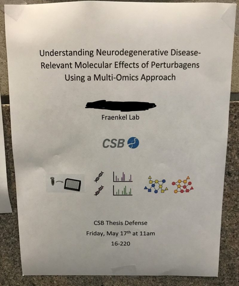
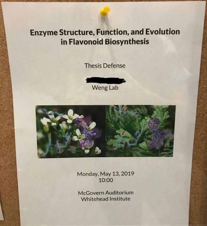
9. Enzyme Structure, Function, and Evolution in Flavonoid Biosynthesis
Oooo… flowers. Since I spend so much time doing experiments that involve animal cells, I forget that some people are plant folk. It’s refreshing. Tending to science crops. I didn’t notice the stick models in the flowers at first; it would be cool if those were bigger. Other than that, a pleasant poster.
And they use the Oxford comma!05
This is a thing that nerds who write are required to pretend to be excited about. Forgive me.
8. BMI1: a context-dependent tumor suppressor and barrier to dedifferentiation in lung adenocarcinoma
Insert Game of Thrones joke here. These dragons are giving me DeviantArt war flashbacks, but I long for colors. What do these dragons even represent? Why are they yin-yang? I want this image to be my new family crest.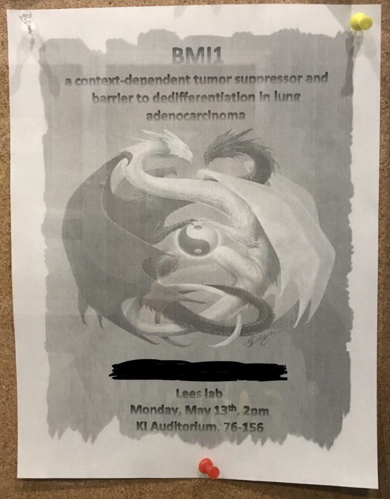
7. Biosynthesis and medicinal chemistry of therapeutically promising plant natural products
This is one of the posters that was relatively eh but got pushed up to #6 because of the topic. Natural products supported by MIT research? Cool! Also, I’m wondering if that image is a stock photo or if this artsy af grad student waited for perfect natural lighting, arranged those flowers with care on the floor, and did one (1) art and craft molecule. Good for you.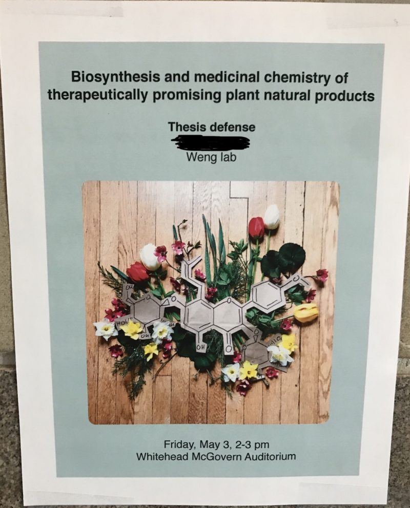
6. Developing VHH-based tools to study Ebolavirus Infection
Hate to be predictable, but of course the poster with the llama gets to be in the top half. +1 for the Pac-Men in the lower right of the summoning circle.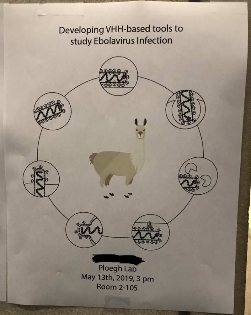
5. The evolution and specialized metabolism of beetle bioluminescence
Now this is a poster with narrative. Confused Charles Darwin. Two kind, gentle bugs. A quote from Darwin saying that the bugs are simply too different to think that they got their shared light-up capabilities from a common ancestor who also glowed in the dark. A background that at first I thought was black but is actually a picture of some trees at dusk that gives me nostalgia for childhood because the
lightning bugs06
or you can call them fireflies if you're a terrible person
would come out at dusk in the summertime.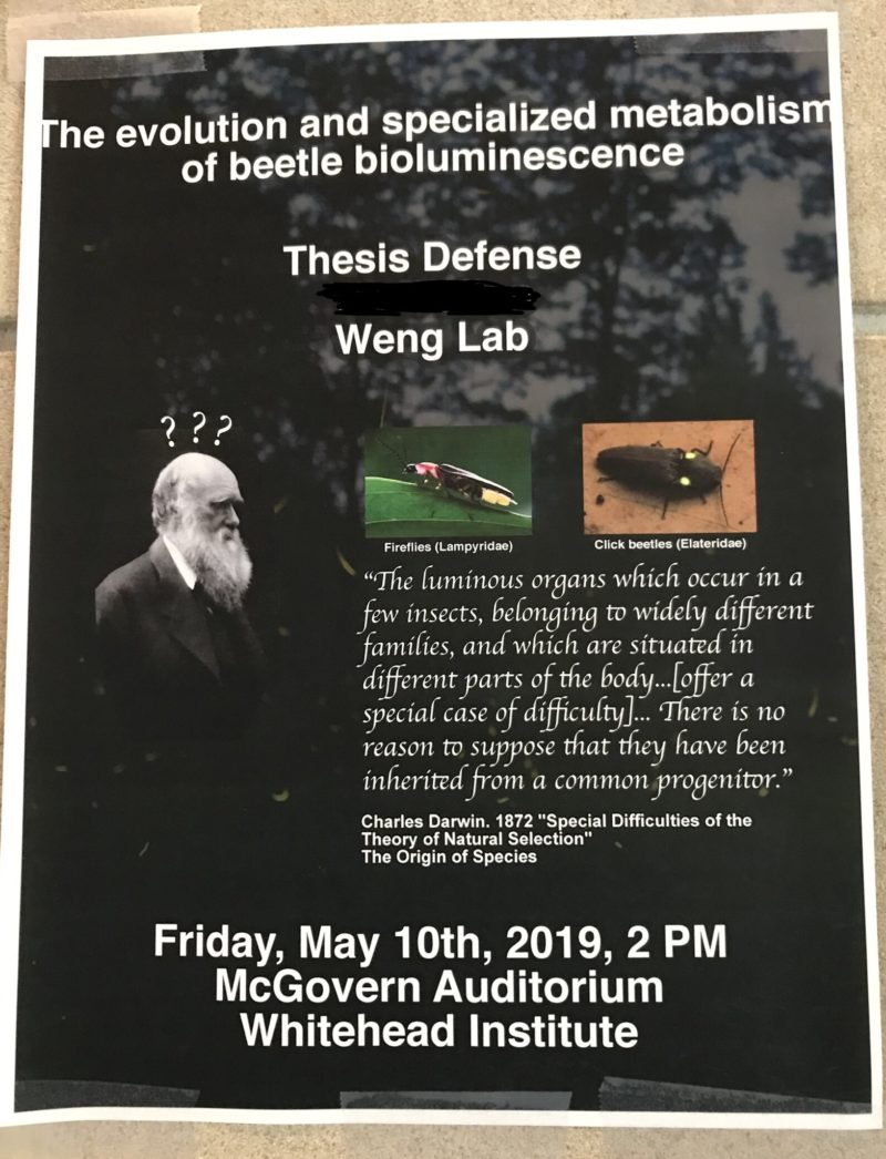
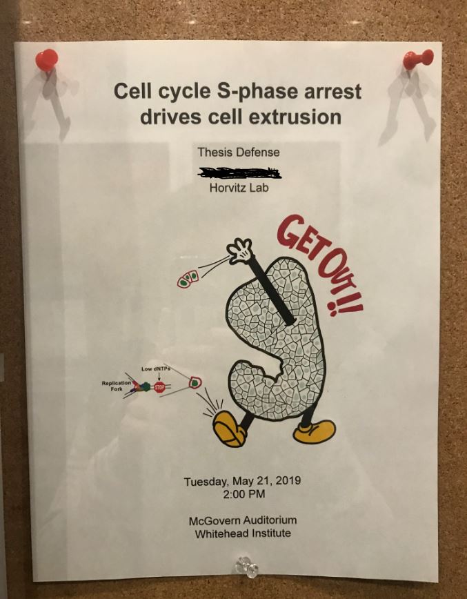
4. Cell cycle S-phase arrest drives cell extrusion
I added this one several days after this was originally posted. But look at that Mickey Mouse anthropomorphic hunk of tissue yeeting those cells out of there. This one deserves to be up here (or I guess down, since this is descending order).
3. Identification of genotype-specific dependencies in Keap1-mutant lung adenocarcinoma
Now this is a grad student who is familiar with Adobe Creative Suite. Look at that army mouse! The Nerf theme is well-executed, and I appreciate the details put into making it work (e.g. the swoosh in the Nerf logo was changed to a 2 to make it more clearly Nrf2). Also, go figure, the mouse that’s smoking a big cigar has lung cancer. Life imitates art, and this is art. Bronze medal.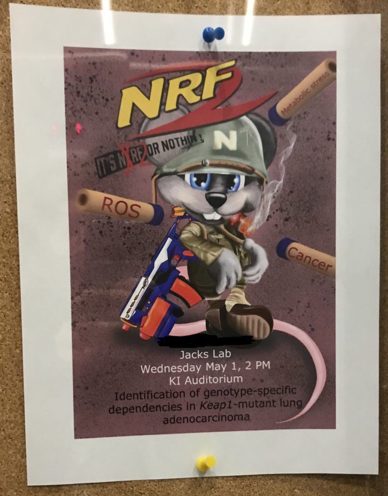
2. Understanding the dynamics of fecal transplants and the immune system to improve health
This one was in the bottom half when I first configured my rankings, but it made it up here for similar reasons to why #9 wasn’t last. It’s got that weird, irony-adjacent feel to it that could only come from a poop scientist. The poop is also a lightning cloud, and somehow Poop, Blood, and and Cheese are the most important characters in this story. Silver medal.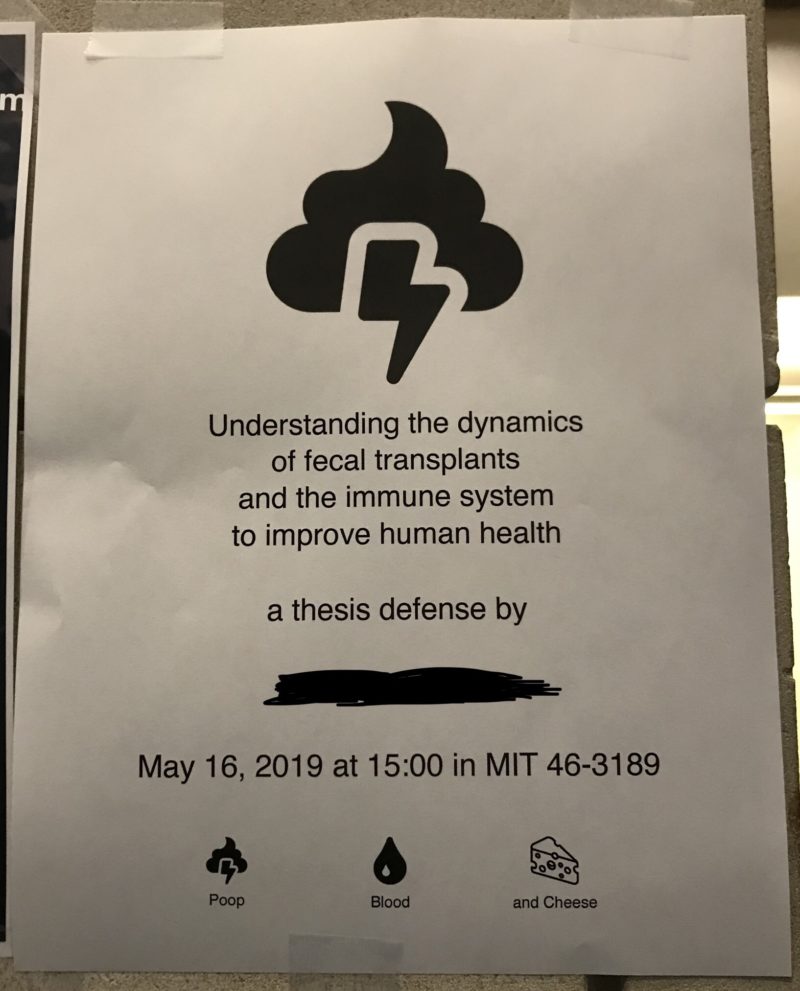
1. Promoters of Metastasis to Different Organs
Dr. Seuss! So whimsical and yet so tragic. These little colorful cells are about to make that big epithelial to mesenchymal transition and go find an exciting new place to attach, like Liver, Lungs, Brain, and Bone. It’s just so morbid to use children’s book imagery to frame metastasis. Like what’s more cute than stage IV cancer? A brave editorial decision, and well-executed at that. Gold medal.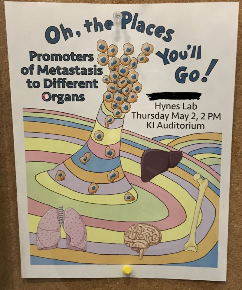
- I had a long back-and-forth conversation in my head about whether to censor the names on these posters. On one hand, a grad student's thesis is their baby. So much work gets put into these projects that it could be a bit alienating to separate their names from the years of work they put in. On the other hand, people on the internet can be mean. This is ultimately why I chose to black the names out. Additionally, even though I don't know any of the people behind these theses, I didn't want to make it seem like I was judging them personally by vaguely ranking them in terms of favorite-ness. I hope you understand, dear grad student (or freshly defended Doctor!) who may be reading this. back to text ↑
- It's almost like a course 6 snuck in as a bio grad student and was like I want to study synthetic analog feedback circuits... in... umm... living cells! back to text ↑
- multi-variable calc for the non-MIT ppl out there back to text ↑
- The original caption for this was just going to compare the microbe-y cell to an I Spy puzzle but it is very late at night at the time of me writing this, and the worms start eating holes in my brain at night (oww). Anyway, I think microbe dating would make a pretty watchable reality show on TLC. back to text ↑
- This is a thing that nerds who write are required to pretend to be excited about. Forgive me. back to text ↑
- or you can call them fireflies if you're a terrible person back to text ↑
