Art is Everywhere! by ARTalk
[by Emma Frank '15] Public Art at MIT
[by Emma Frank '15]
Before I first visited MIT, I envisioned it as a sterile place. Labs stacked on top of classrooms and everything having its place and assigned number. It didn’t seem like a place where I’d be bombarded with art from the most unlikely of places. But it is! And after a tour of MIT’s public art through my freshman advising seminar 21M.A12 (Arts at MIT), I’m flabbergasted at the huge amount of art we have on campus, and some things I never realized were art.
Now, MIT officially recognizes ninety pieces as public art, and I only saw maybe ten pieces on my tour, so you’re just going to get the highlights (as defined by me) here. If you’d like to peruse the entire collection, check out http://listart.mit.edu/public_art for virtual tours and more information on the individual pieces.
Public art at MIT took off during the Cold War as a way of humanizing the scientists who lived and worked there (AKA keeping people from having that same first impression I had). With the Percent for Art program instated in 1968, any new building project or renovation allots up to $250,000 to commission art for the space.
One of the most recent of these pieces is located in the Koch Center and it’s called “Through Layers and Leaves (Closer and Closer)” by Martin Boyce:
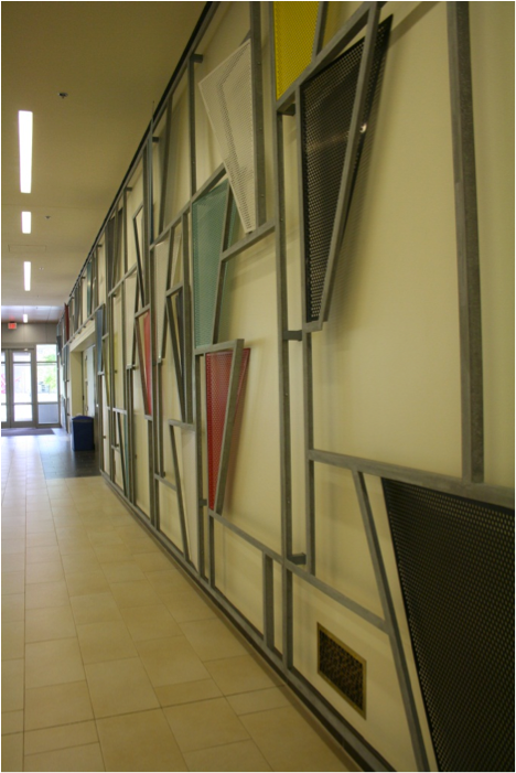
Photo © Emma Frank
This is the best photo I got that captures the scale of this piece.
This is an example of the space relating heavily to the work. The wall sculpture itself is inspired by a photo of four concrete trees from a book on French Modernist gardens from 1925, but the title and the concept of the work relates to the Koch Center’s purpose as a cancer research center. Boyce sees finding the cure to cancer as a matter of being able to recognize patterns and to look through the “layers and leaves” of the disease. Another really interesting thing? See the grate in the bottom right of the photo? There’s three of them spaced along the wall. And within the grate pattern, each one spells out “closer” “and” “closer.” It’s not something you’d notice unless someone told you, or you spent a lot of time looking at the patterns Boyce created.
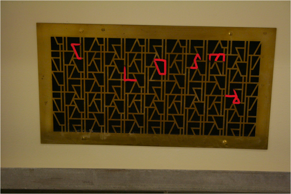
Photo © Emma Frank
You have no idea how long I stared at this thing until I found the word “closer.” You’re welcome.
Next up is a piece that I’m quite familiar with. Mostly because it’s right outside East Campus and I see it every day on my way to classes. It’s called “Transparent Horizon” and it’s by Louise Nevelson:
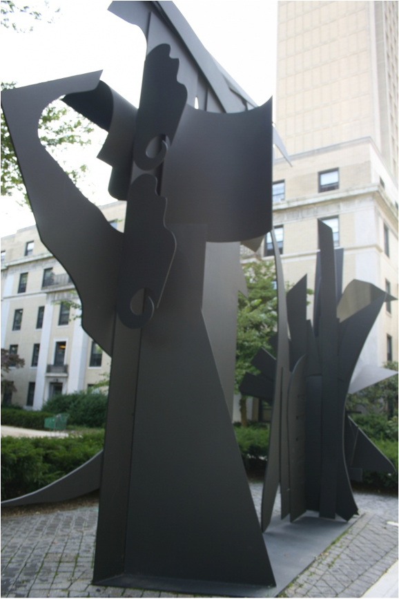
Photo © Emma Frank
I apologize for the strange lighting and composition of this photo. My only excuse is that it is really hard to take a proper photo when you’re trying to simultaneously listen to the guide, set up your photo, and not get left behind.
The piece is supposed to suggest botanical shapes. It’s actually two older pieces put together and edited to create a new piece. When it was first being installed, there was some controversy over the piece and its infringing on the students’ living space, but nowadays it has just sort of blended into the general landscape of East Campus. I’m ashamed to say that I hadn’t really noticed it before it was pointed out to me…whoops.
Speaking of not noticing things, did you know that benches can be art? And that they can have really cool stories behind them? Neither did I! In the Wiesner Building are some benches done by Scott Burton. I know, you’re about to tell me that I’m going crazy to think that of all things, benches can be interesting.
But these are controversial benches! And benches I also neglected to take a picture of…so have a picture from the internet!
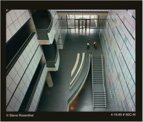
Photo © Steve Rosenthal
http://listart.mit.edu:8080/Obj1657$15
See the curved things in the center of the photo? Those are the controversial benches. I.M. Pei originally designed the space to be all angles and no curves. But you’ll note that on the left there are some balconies that echo the curves of Burton’s benches. Well, Burton’s whole point in making his benches curved in a square and angular space was to make them stand out. He wanted them to have a dialogue with the space by being a disruption and making you feel uncomfortable with them (they’re weirdly leveled and spaced). Needless to say, when the plans got changed, Burton was less than pleased. Our tour guide told us that he can still be pleased that they are a disruption since the benches get really cold during the winter and it’s a pain to sit on them.
In the same space is a piece called “Here-There” by Kenneth Noland:
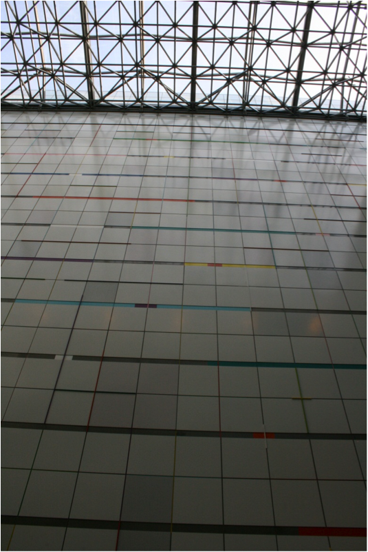
Photo © Emma Frank
This is one of my favorite pieces, it’s brilliant to just stand in front of it and look up and take it in. I’m a big fan of color, so it’s not a surprise I like this piece.
It’s actually a mural painted directly onto the metal panels, and if you look closely, you can see the actual brush strokes. For a piece that so massive and exact, seeing the brushstrokes made it just a little more human to me. It makes it easier to imagine a person creating this piece, instead of just a machine.
This next piece is located in the Stata Center. It’s called “Non-Object (Plane)” by Anish Kapoor:
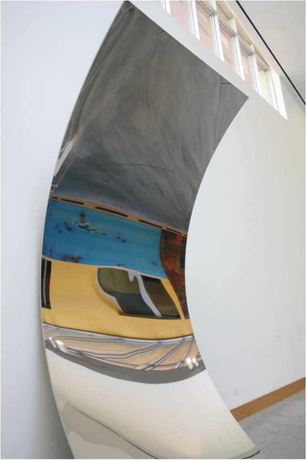
Photo © Emma Frank
I really like this photo because you manage to get a sense of how the work relates to the space.
It’s made out of mirror-polished stainless steel, a material Kapoor works with often. It’s really interesting because it’s a piece that encourages you to interact with it. It’s sort of like an artistic funhouse mirror. I found it fun to walk around it and see how it changes with the light and angle that you view it at. I’d never noticed it before since I only have one class in Stata, and it’s something you could easily walk by without realizing what it was. It doesn’t really invade the space, but rather compliments it.
Finally, we have my favorite piece. Mostly because I spent a lot of time there before the tour and didn’t realize that what I was sitting on as I worked on a Pset was art.
This is Sol LeWitt’s “Bars of Color within Squares” (a very inspired title, I know):
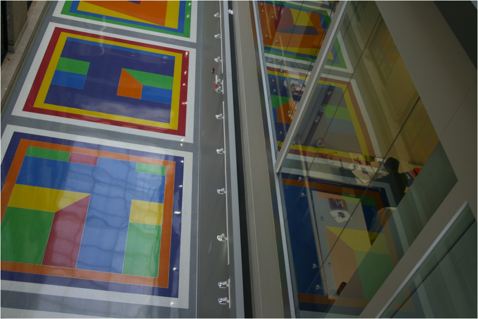
Photo © Emma Frank
I envy the people who work in the labs that surround this piece. It must be really cool to look out and see this all the time.
Often, I come to this place as a quiet place to work. There’s always a lot of light coming in, and if I want to space out for a little while, it’s a pretty interesting place to stare out into space. Sol LeWitt was known for his wall drawings where he meticulously explained how things were to be set up. He believed that as long as you followed his instructions for works, you could have your own Sol LeWitt piece. This is in a really cool space that sort of encapsulates building 6C and the physics department. You can view it from a lot of different angles since there’s balconies set up all around the work. I definitely suggest taking some time to walk around the space, it’s a really cool place to just sit and think.
So, why did I bother writing a whole blog post on public art? Because I didn’t even realize that some of the things I saw everyday were art. It’s easy to think of MIT as a cold, heartless institution where science reigns supreme, but in reality, it’s a place where art and creativity is encouraged. Art brings life to a lot of spaces here, and the stories behind some of the art are fascinating. Public art has the task of relating to where it’s placed, and public art at MIT reflects how artists see our campus. MIT is a mishmash of buildings and styles and the art here mirrors that. As a freshman, I’m still finding new places and things all the time and I’m just beginning to realize how varied and unique a place this is.
So the next time you come to MIT’s campus, take a moment to go find some of these works or the many others I just didn’t have time to write about. I hope you’ll have as much fun as I did discovering all of these pieces.
Well done Emma.
Nice post.
I love Bars of Color. Seems like a really relaxing place to work/meditate/whatever.
I loved it Emma, 1E representing. =)
Yeahhhh ARTalk!
I really enjoy the human factor in MIT.
Starting from casual posts on the admission blog to these arts, it really is a breathing community.
Emma !!!
I loved the article and pictures !!
Outstanding job !!1
I love the Sol LeWitt floor so much. Nice entry