
Fonts of MIT by CJ Q. '23
a typographical tour
MIT’s signs and posters carry diverse fonts.01 You might be thinking: <em>technically</em>, I should be calling them <em>typefaces</em>. First off, I sometimes <em>do</em> refer to specific fonts, not just typefaces. Second, the distnction doesn’t matter here. And third, <a href="https://xkcd.com/1475">xkcd 1475</a>. Consider this picture I took two years ago:
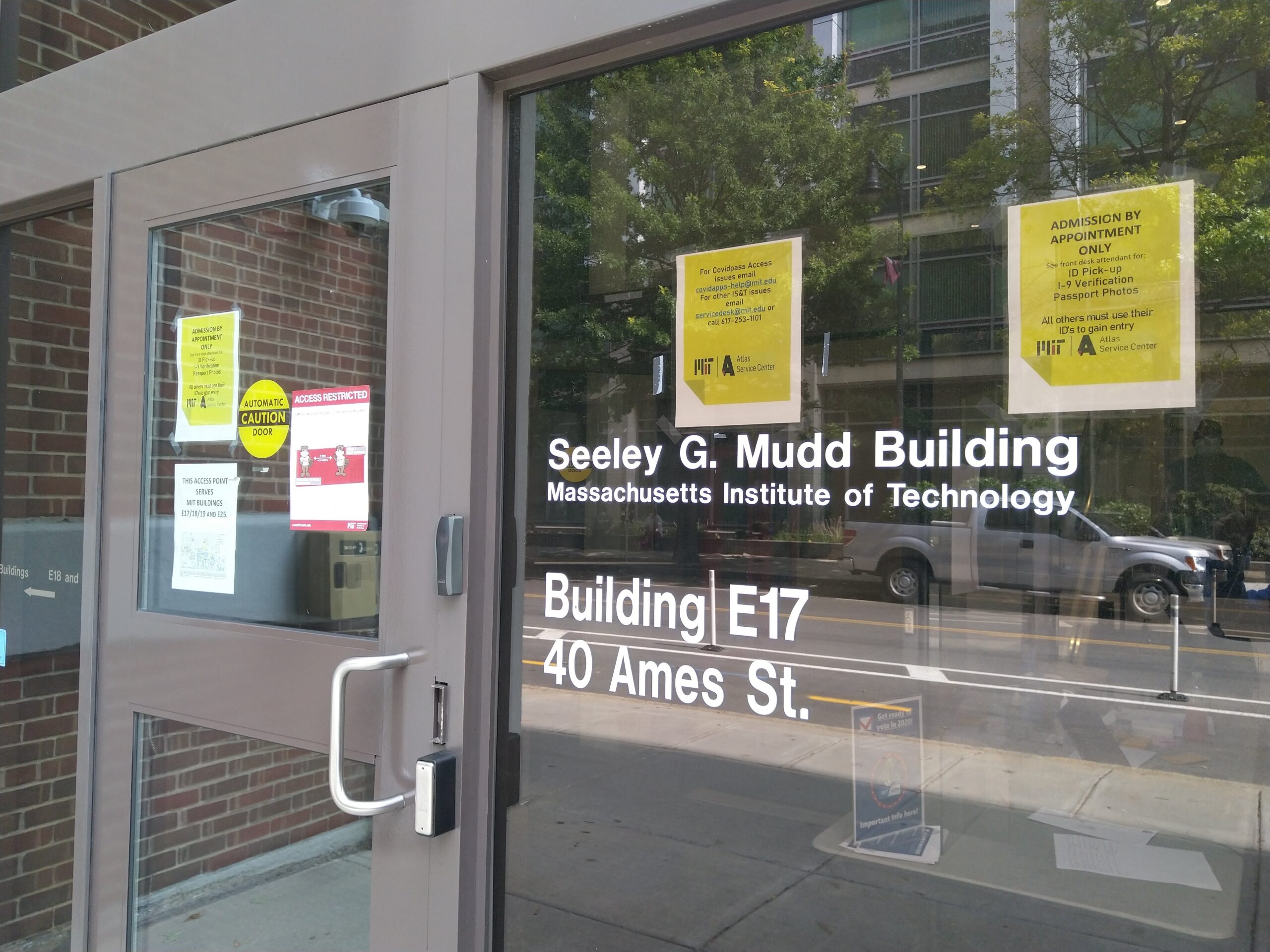
The stickers labeling the building are in Helvetica. So is the “ACCESS RESTRICTED” poster. The poster to its lower left, the one that starts “THIS ACCESS POINT”, is in Calibri. For the rightmost poster, the top half is also in Calibri. Then there’s the font used in that poster’s lower half, the same font used in the poster to its left.
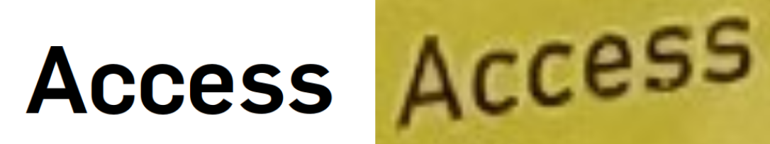
I thought, at first, that the font was FF DIN. But the website for the Atlas Service Center uses Flama, and the Atlas Service Center logo also uses Flama. Yet this poster isn’t in Flama! Observe how the lowercase C in Flama has closer terminals02 Strike one for typography jargon! A letter's terminal is where its stroke ends. compared to the poster’s.
Left: Flama. Right: poster.
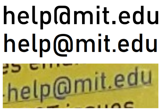
It also isn’t FF DIN itself, which has different @ and & symbols. It’s actually Bahnschrift, which is based on DIN.
Top: FF DIN. Middle: Bahnschrift. Bottom: poster.
Helvetica
Helvetica is MIT’s bog-standard corporate font. And it’s everywhere in MIT. The Stata center uses Helvetica Rounded Bold Condensed in many of its signs, like this one:
Most room signs have numerals set in Helvetica. Look at the “16-128” in this picture:03 In case you were wondering, "Concourse" is in <a href="https://www.myfonts.com/products/exp-semibold-neuropol-x-238164">Neuropol X Expanded Semibold</a>.
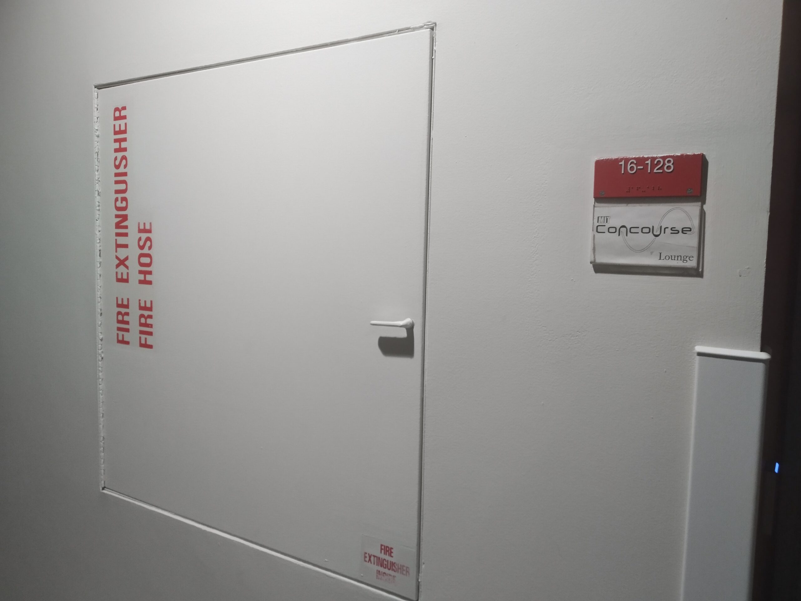
That’s not the only instance of Helvetica here. On the lower-right corner of the fire extinguisher box, we see an all-caps “FIRE EXTINGUISHER INSIDE” in Helvetica Bold Condensed. At first, I thought that the “FIRE EXTINGUISHER” painted on the left was also Helvetica Bold Condensed. But it’s not.
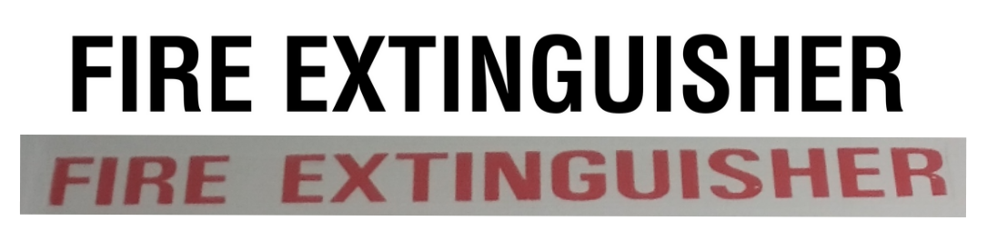
Top: Helvetica. Bottom: label.
Compare the uppercase G. In Helvetica, it always has a spur on the lower-right. But the G in the label doesn’t have a spur,04 Strike two. A spur is a piece that extends from a curve. and it doesn’t look like it’s been rubbed off. Instead, it looks like the 2012 version of Roboto Condensed Bold, which differs from the current version with the uppercase R.
Around MIT you’ll find many Helvetica lookalikes. Consider the display fonts05 Strike three. Display fonts are used for headers, logos, titles, and other large texts, as opposed to body fonts. of the Technology Review and the Media Lab. These aren’t in Helvetica, but Neue Haas Grotesk, which has slightly tighter spacing by default.
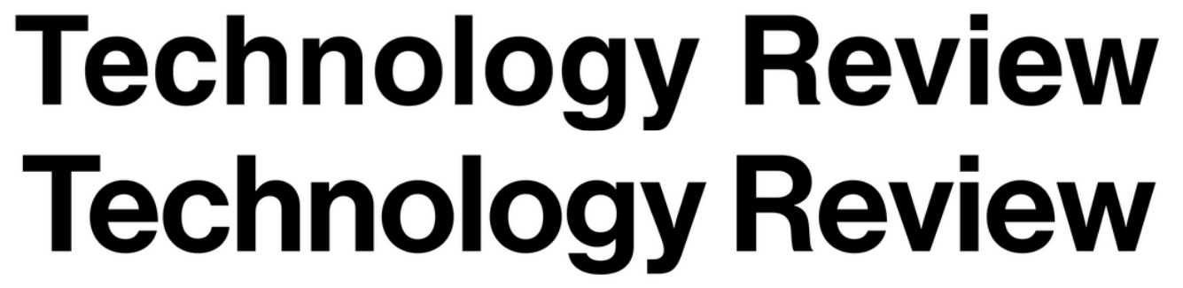
Top: Helvetica. Bottom: Neue Haas Grotesk.
By far the most common Helvetica lookalike is Arial. There’s many subtle differences between them. Compare the uppercase R we’ve been seeing in Helvetica with the uppercase R here:
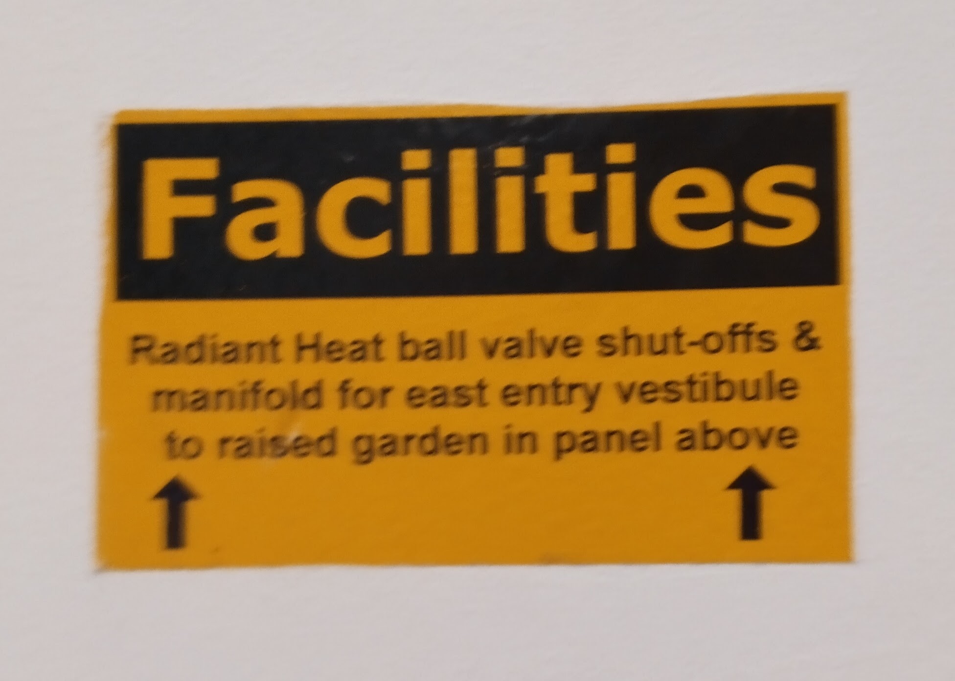
Helvetica’s R has a vertical leg,06 Technically typography jargon, but this is one of the more reasonable names. A leg is a descending lower part. while Arial’s R has a diagonal leg. That means that this sign’s body text is in Arial; we can tell even if it’s blurry. Its header, “Facilities”, is in Verdana.
Here some more Arial:
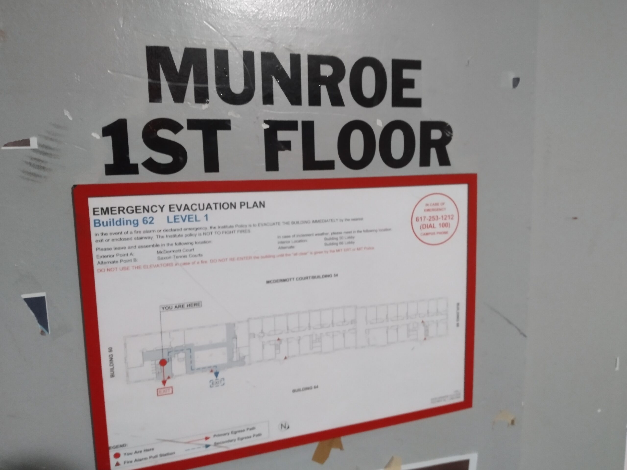
The entire evacuation plan sign is in Arial. In fact, most of MIT’s evacuation plan signs are in Arial. The “MUNROE 1ST FLOOR” is painted in Franklin Gothic. Like Helvetica and Arial, Franklin Gothic is a grotesque font, a font classification that describes, I dunno, fonts that look like Helvetica?
System fonts
Why do signs mix Helvetica and Arial, then? The answer’s convenience. Windows does not come bundled with Helvetica, but it does come with Arial. In fact, if you can identify Windows fonts, you’re set to identify many of the fonts you’ll see in posters. Here’s a slideshow of signs, all in Windows fonts.
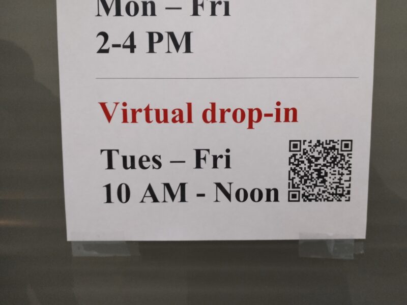
Here’s a sign for Swapfest. From April to October, hundreds of Swapfest signs will appear across campus, each featuring a smorgasbord of Windows fonts:
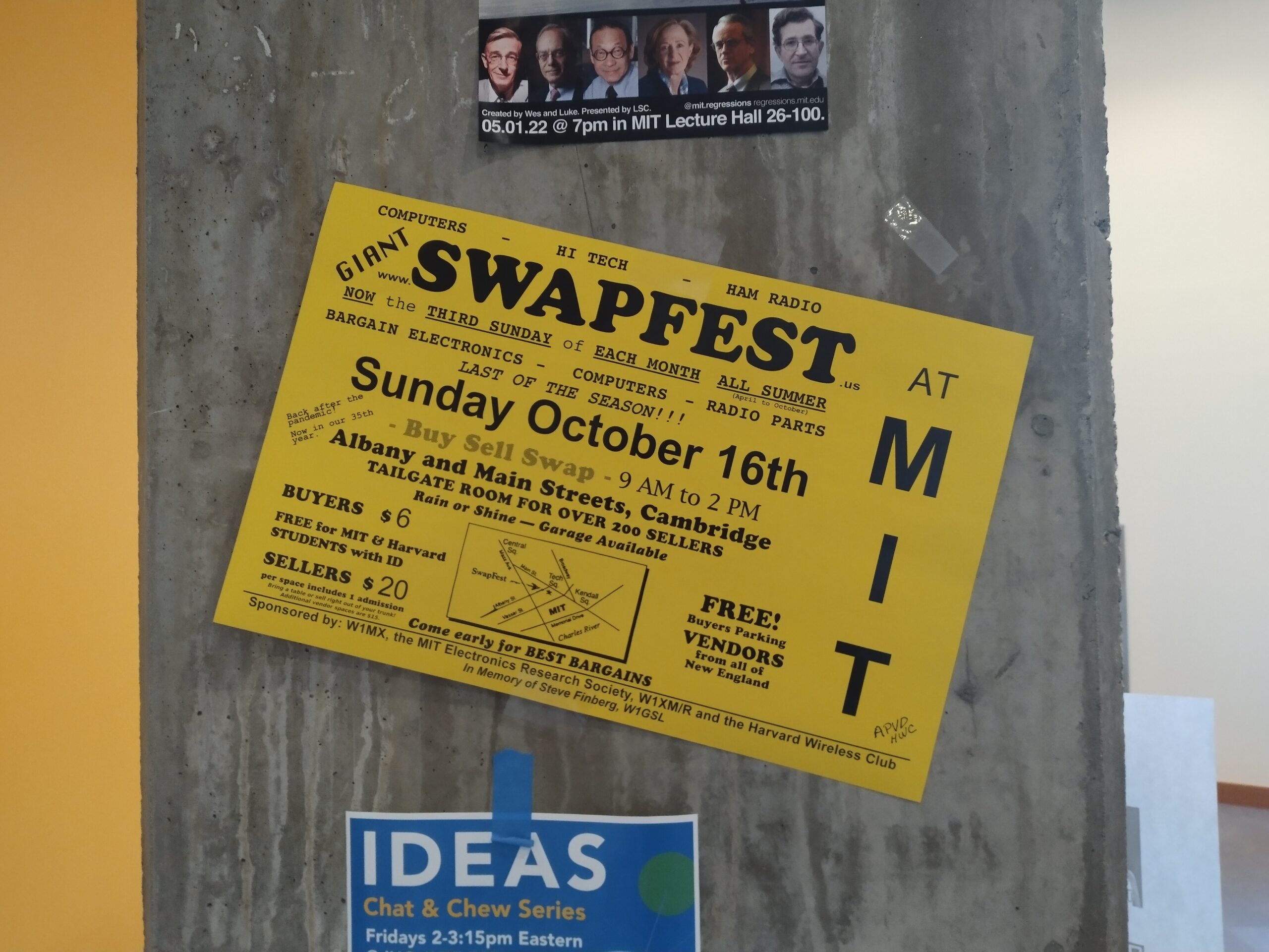
“SWAPFEST” is in Cooper Black, the monospaced07 Okay, strike four. A monospaced font is one whose letters are all the same width, as opposed to a variable-width font. font is Courier New, the “9 AM to 2 PM” is Palatino Linotype, and everything else is in Arial (not Helvetica).
Sometimes you see macOS fonts, like this one:
This is in Caslon. There are often fonts with many different versions, made by different foundries.08 Strike five. A foundry is someone or something that makes fonts. We’ve seen something similar for DIN, but at least in that case the fonts usually have different names.
The foundries Monotype, Neufville, URW, Lineto, Bitstream, and Adobe, all offer fonts called Futura, all with subtle differences.09 Not to mention <a href="https://en.wikipedia.org/wiki/Century_Gothic">Century Gothic</a>, a Windows font that I cannot <em>stand</em> in long passages. Caslon’s in a similar situation. It shares this property10 They also share the property of being named after their original designer's surname. with Baskerville, Bodoni, and Garamond.
While on the topic of system fonts, here’s two posters I saw in Building 18, one of the chemistry buildings, years ago.
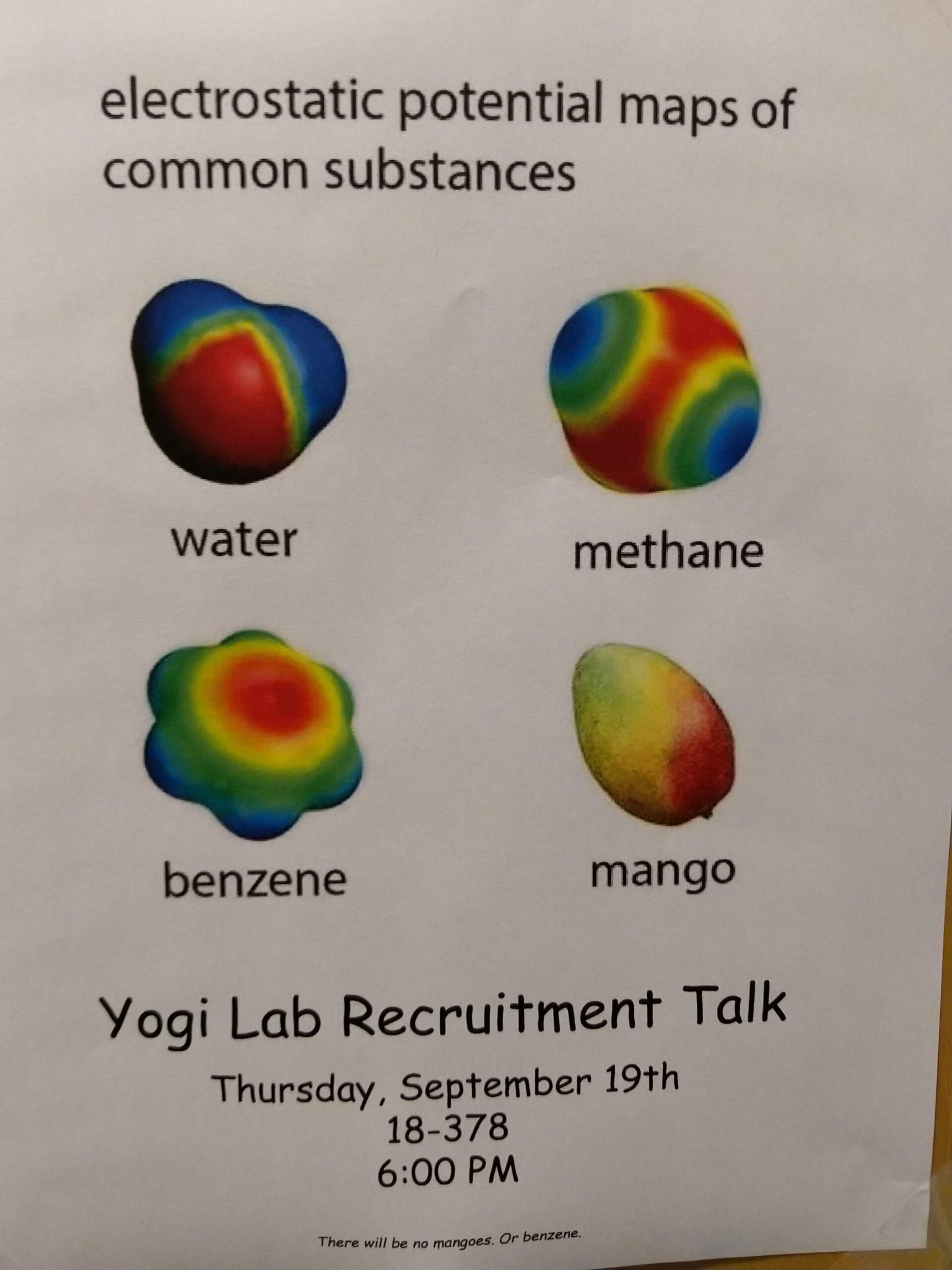
Most of the poster is in Segoe.11 A friend points out that maybe this is actually Myriad, rather than Segoe, due to the lowercase A and R. I think they’re right, but I’ve already written this post assuming this is Segoe, so whatever. When it comes to Windows fonts, Segoe is the most Windows-y of Windows fonts, because it’s central to Microsoft’s graphic identity. (MIT’s graphic identity does not have a specified font.)
And the bottom third of the poster is in Comic Sans. Comic Sans is one of those fonts that’s gained notoriety from inappropriate use, like Papyrus. This font pair is so notorious it’s appeared in Undertale, and a designer fused them into Comic Papyrus, er, Comic “Parchment”.
Here’s the second poster:
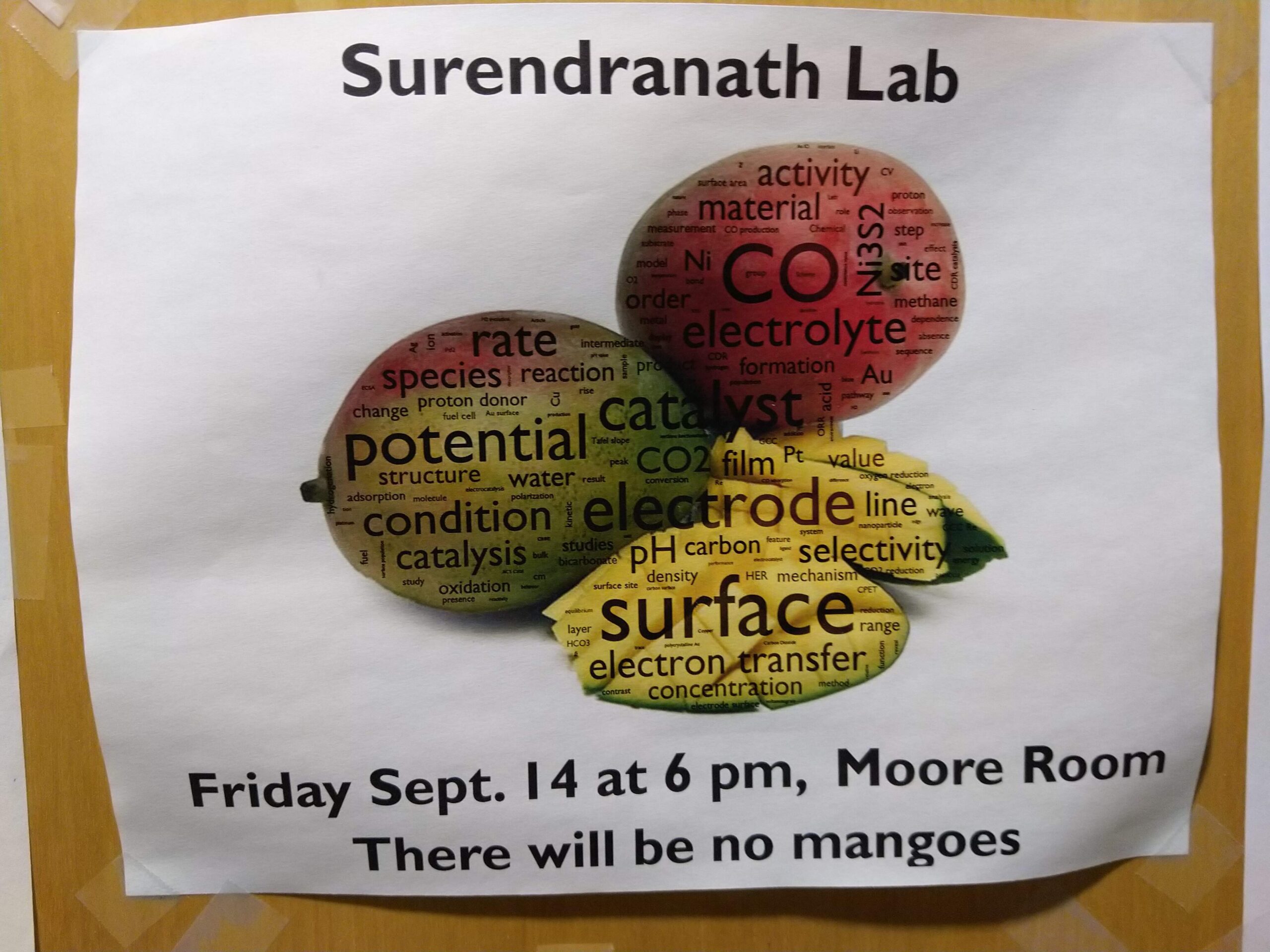
This one is in Gill Sans. These days Windows comes with Gill Sans too. Gill Sans is kinda like the anti-Futura of fonts: if Futura was meant to be geometric and sharp, Gill Sans was meant to be humanist and soft.
Signage
I’ve always loved signage. I’ve alluded to it in my last post about typography. A place can set its tone through conscious font choice of its signs and posters.
Take Gill Sans, for example. RLE, the Research Laboratory of Electronics, uses Gill Sans for not only its wordmark,12 A wordmark, or logotype, is the text-only version of a logo. Sometimes a wordmark is paired with a graphic logo, sometimes it stands alone <em>as</em> the logo. but its signs and posters:
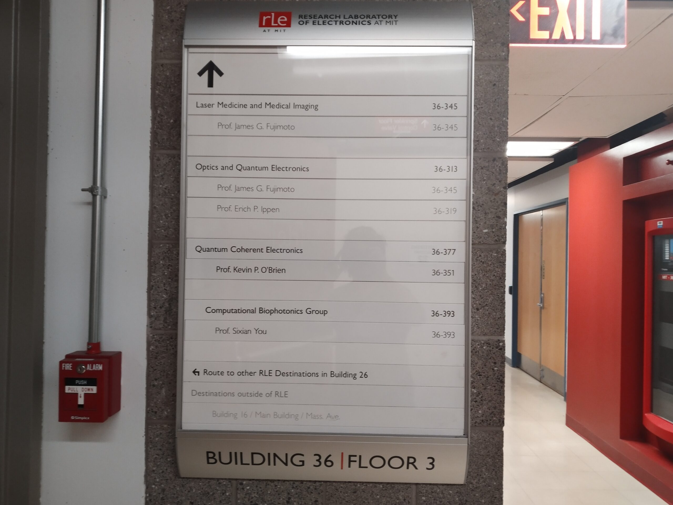
The consistent use of Gill Sans helps make RLE feel like a coherent part of MIT’s buildings, and helps distinguish it from other labs. The important thing is consistency: it’s used for building directories, research posters, tarpaulins with quotes, navigation signs.
Here’s a poster from QEG, the Quantum Engineering Group, whose labs are right next to RLE’s:
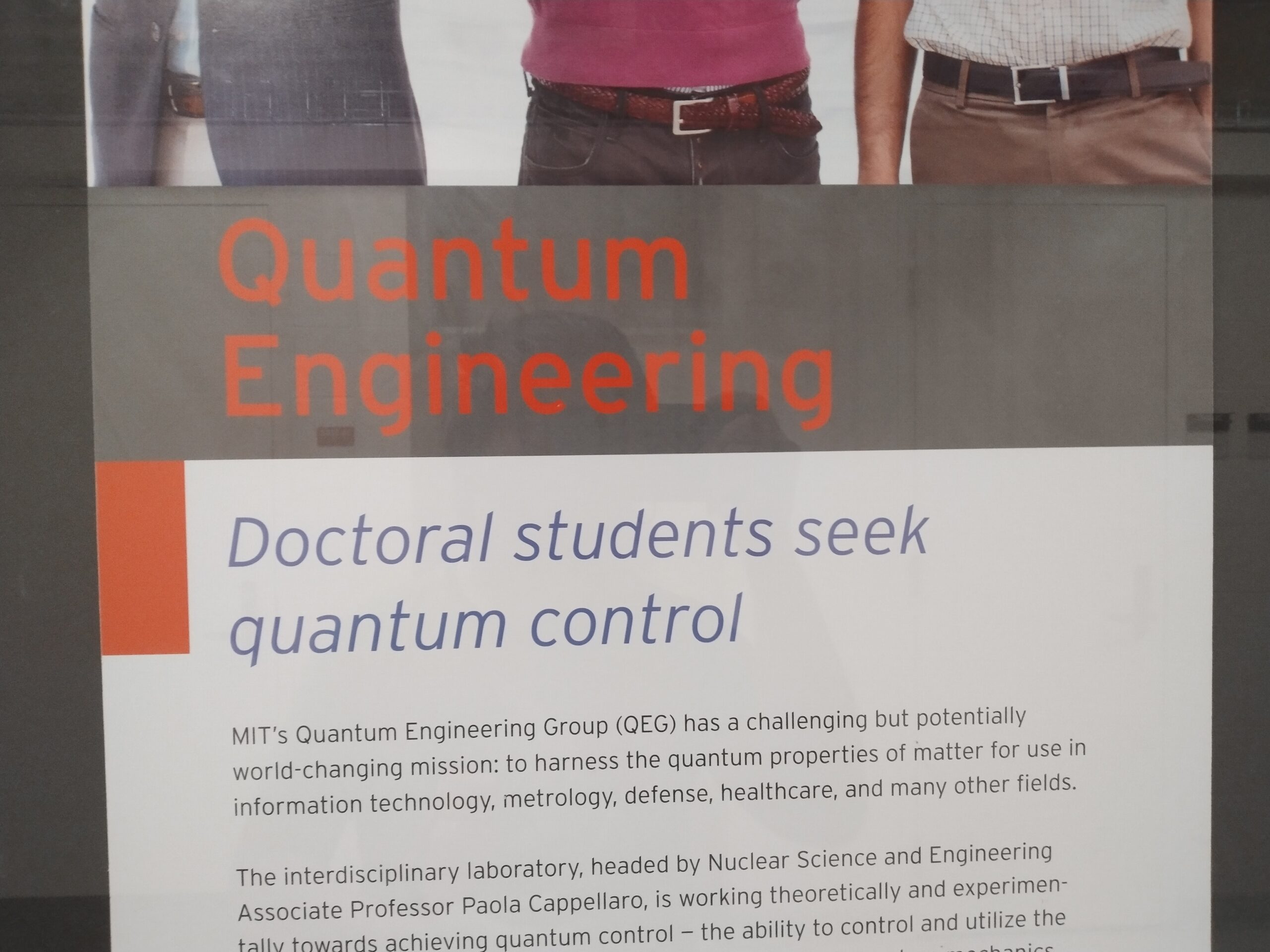
This one’s in Interstate. It’s a font based on the road signage font, which is Highway Gothic. Anyway, I love Interstate. The sharp terminals and large x-height13 Strike six. A font's x-height is the height of its lowercase X, as compared to the height of its uppercase letters. give it a unique character.
As another example of how font choice can define a building’s character, take a look at this intersection between Building 12, where MIT.nano is, and Building 16.
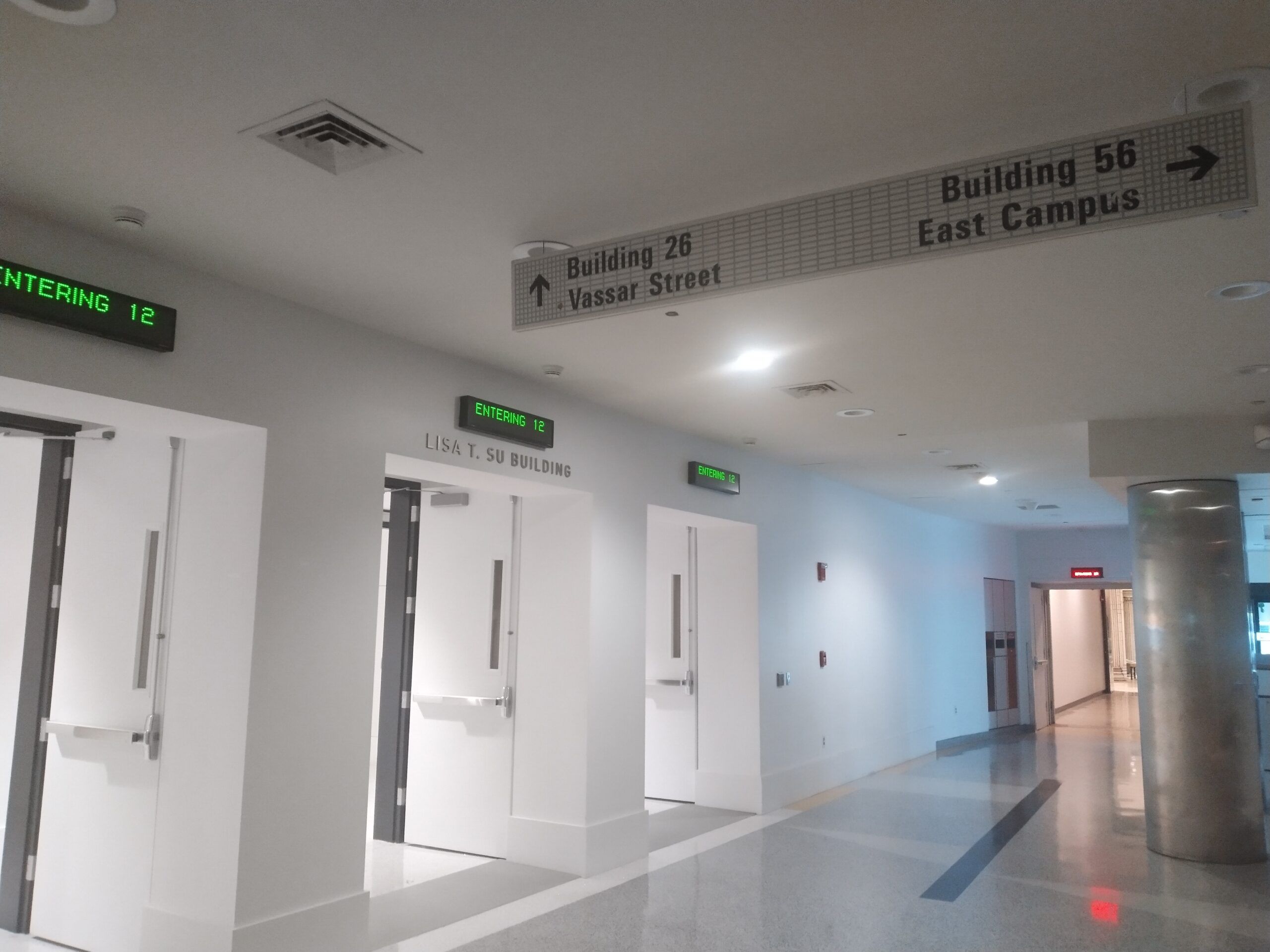
There’s three fonts in this picture:
- There’s a pixel font used in the “ENTERING 12” signs, which is hard to identify because, in the US, pixel fonts aren’t copyrightable.
- There’s the font used for “LISA T. SU BUILDING”, which is Compasse.
- Then there’s the font used for the “Building 26” sign, which is Brown. (It looks like Franklin Gothic, but there’s numerous differences.)
Compasse is the font that MIT.nano uses for all of its signage:
I think it works well. Most of Nano’s signs use a thin weight14 Strike seven. A font's weight can be regular, bold, light, thin, extra bold, semibold, etc. , as if the letters are themselves made out of smaller particles than normal letters. But Compasse has several weights available, so a heavier weight can be chosen if necessary.
Brown is the font that Buildings 16 and 56 use for all of its signage:
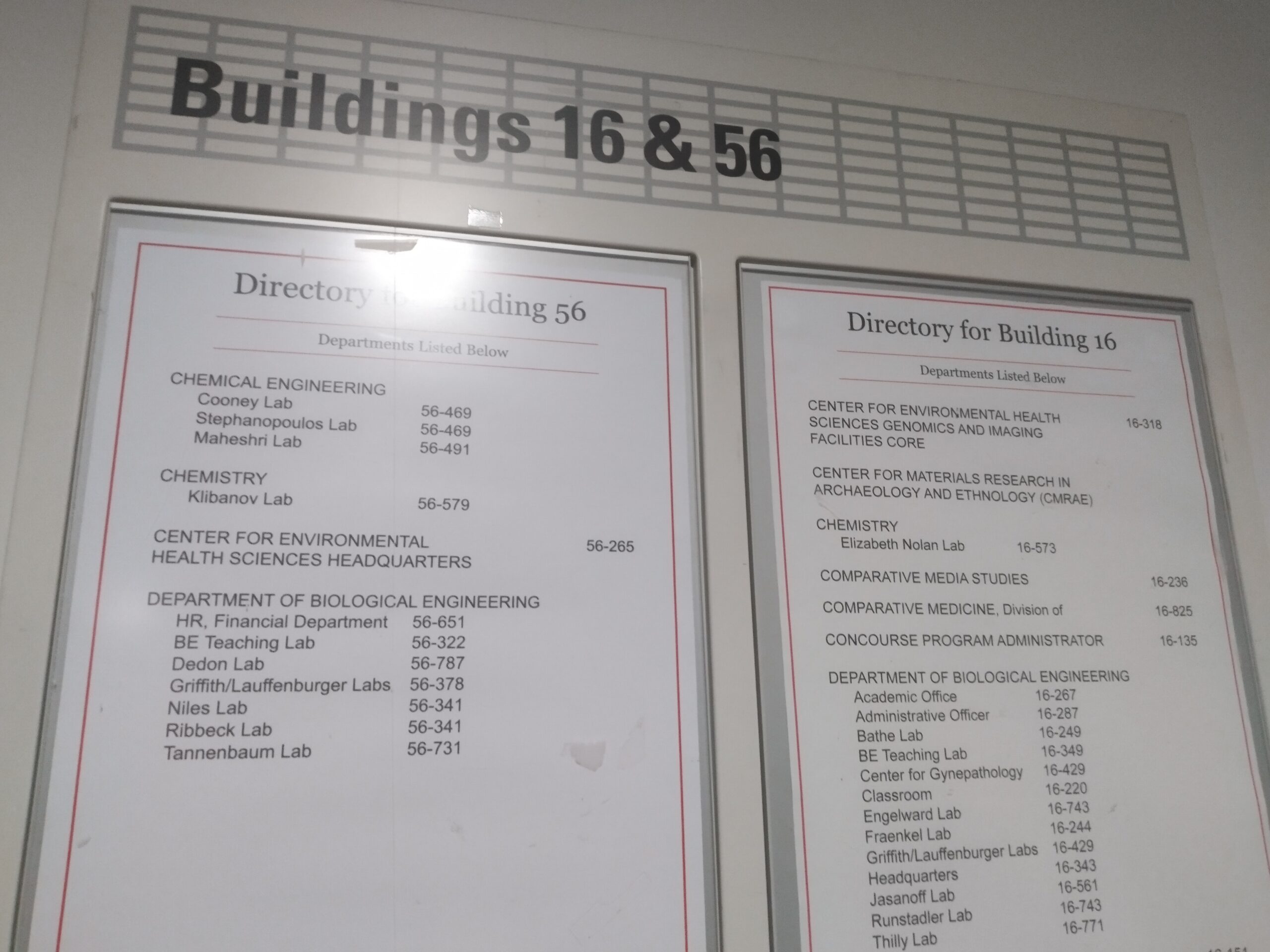
Well, most of its signage. The navigation signs all use Brown, but the directories here are in Georgia and Arial, again two Windows fonts.
How to ID fonts
How do you identify a font? It helps if you’ve seen it before. This is why system fonts are easier to identify; you can just go down, say, the Windows font list and check what matches.
This one, for example, uses Century Schoolbook. This is not a system font in itself, but it comes with Microsoft Office.
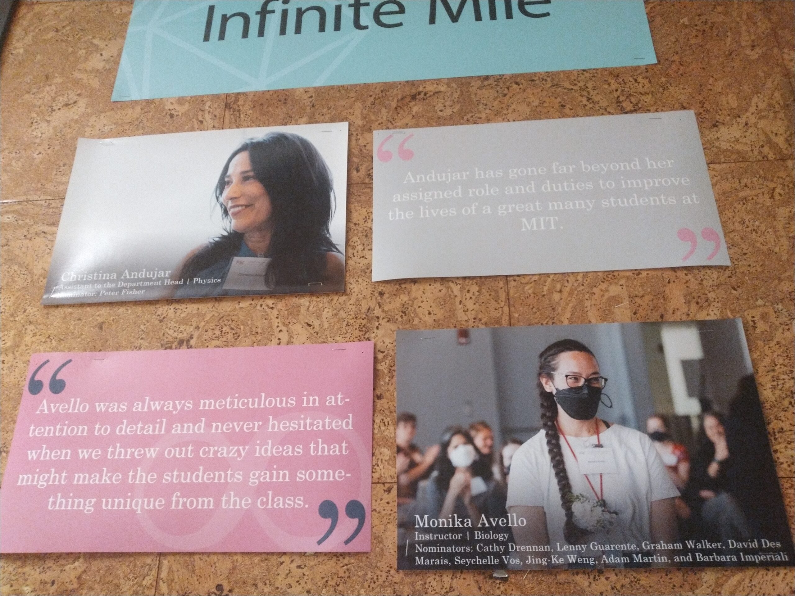
There’s also a canon of commonly used fonts that aren’t bundled with Office or Windows or macOS. Adobe’s Myriad and Minion are Adobe software defaults, and so Myriad and Minion appear quite often. Above, the cut off “Infinite Mile” is in Myriad. Other staples include Akzidenz-Grotesk, Clarendon, Eurostile, and Univers.
If that doesn’t work, you can try using a Font ID service. I’ve had the most success with WhatTheFont’s and Font Squirrel’s identifiers, although you may need to do some editing to get them to cooperate.
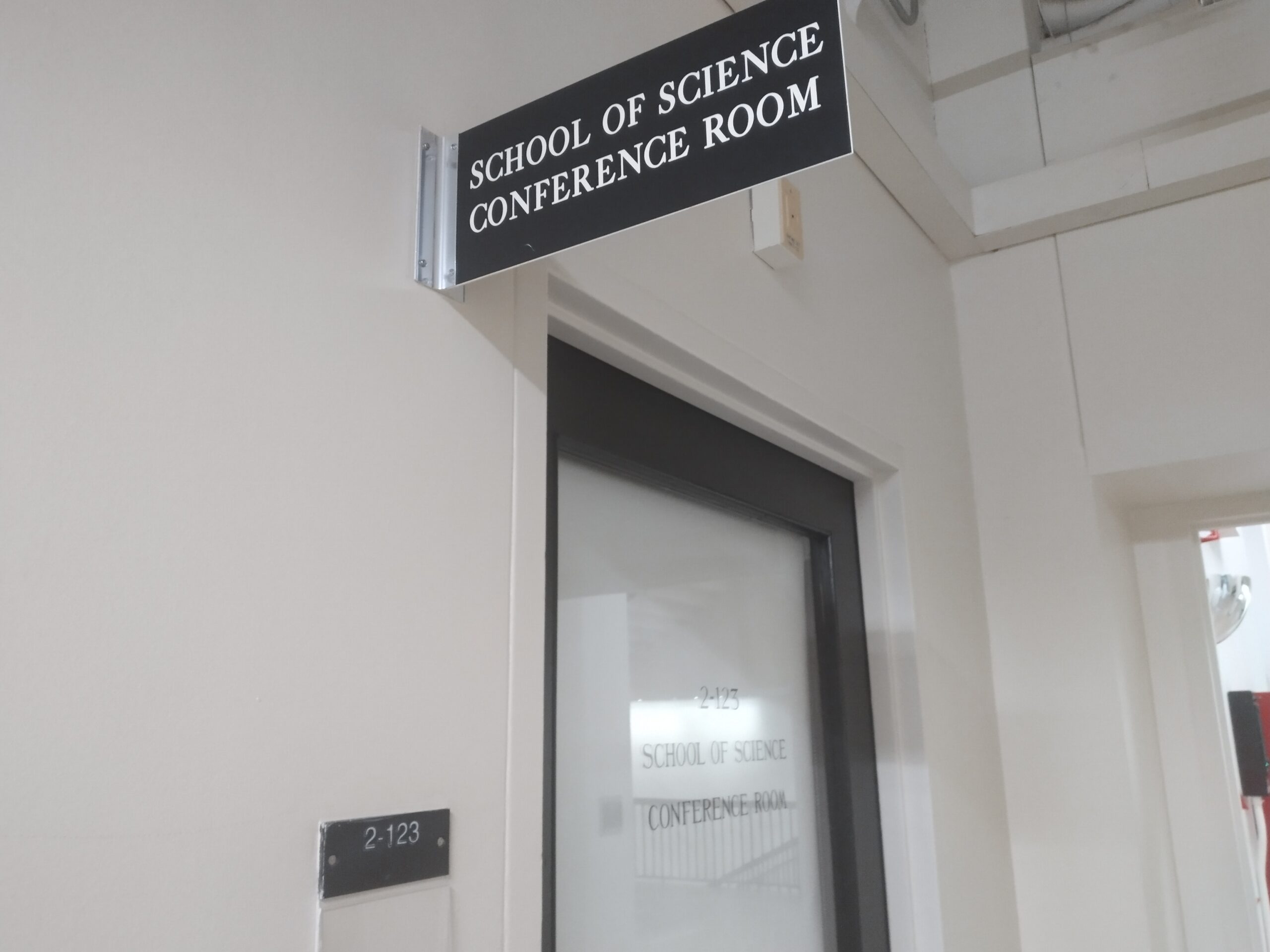
The door’s label is not a font; it’s hand-lettered by Glenn Silva. Though, the Alumni Association, in its rebranding, got a designer named Tim Ripper to finish creating Corridor, a font based on this lettering. (It’s not available commerically.)
What about the sign above the door? I didn’t recognize this one, so I cropped a word, undistorted it, and then fed it to the MyFonts identifier. That’s how I learned the font was called Replay.
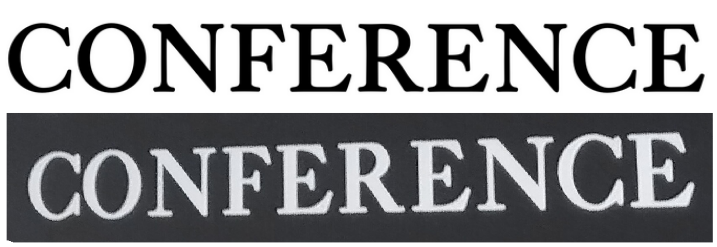
Top: Replay. Bottom: sign.
Sometimes the font’s design is too generic to pull that off successfully, or you don’t have a good enough picture. This was the case with this display I found in Building 6, which I found in my old photos:
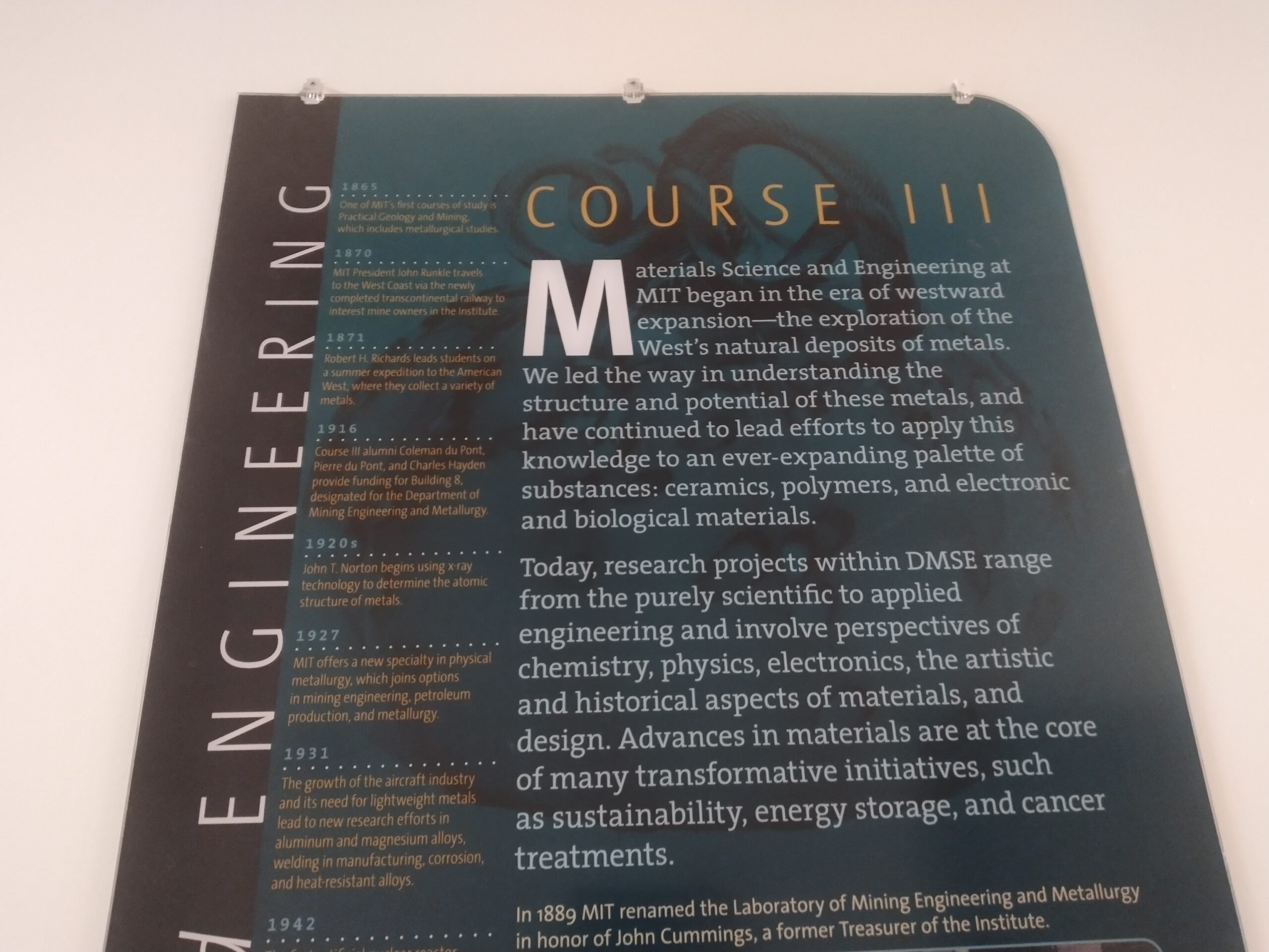
This I identified with Identifont. The sans-serif15 Strike eight, but maybe you know what this one means? A serif is a little spike or slab on the end of each stroke. font here, used for the all-caps “COURSE III” and “ENGINEERING”, as well as the descriptions for each year and near the bottom, is called TheSans. And the serif font is called—you’ll never guess—TheSerif. Both fonts are part of the Thesis system of fonts, which also includes a font called TheMix.
Free and open-source fonts
These days, the most popular font source is probably Google Fonts. And for good reason; it’s easily the largest collection of open-source fonts. Back in the day, most people only had the fonts that came bundled with their system, or from software like Microsoft Office or Adobe, or were from low-quality sources like Dafont. Professional fonts were something that designers purchased for hundreds of dollars.
Many of the early open-source fonts were unpopular. Computer Modern is an exception, but only because it was bundled with TeX, so in a sense it proves the rule. Fonts like Bitstream Charter, Linux Libertine, Cantarell, and OpenDyslexic were among the more popular ones, and if you haven’t heard of them, well, that’s how popular they were.
But then Google Fonts came out. Back in 2010, only a handful of fonts were available, like Droid or Inconsolata. This doesn’t sound like a lot, but to a web designer in 2010, this was an opportunity to use fonts beyond the ones everyone had installed in their system.
The development of Google Fonts led to higher-quality open-source fonts. Part of the quality was because these fonts were commissioned for pay, early examples being Google’s Roboto, Adobe’s Source Code Pro, Canonical’s Ubuntu, later joined by Mozilla’s Fira and IBM Plex. Google itself commissioned lots of fonts, Open Sans and Lato probably the most famous.
Yet sometimes these fonts just come from individuals! Great examples include EB Garamond, Iosevka, League Gothic, Montserrat, and Raleway. Whatever the source, many of these open-source fonts have now become classics.
Consider this display from Building 14, which pairs the classic Futura Now Condensed Bold, above the open-source Lato, a new classic in its own right:
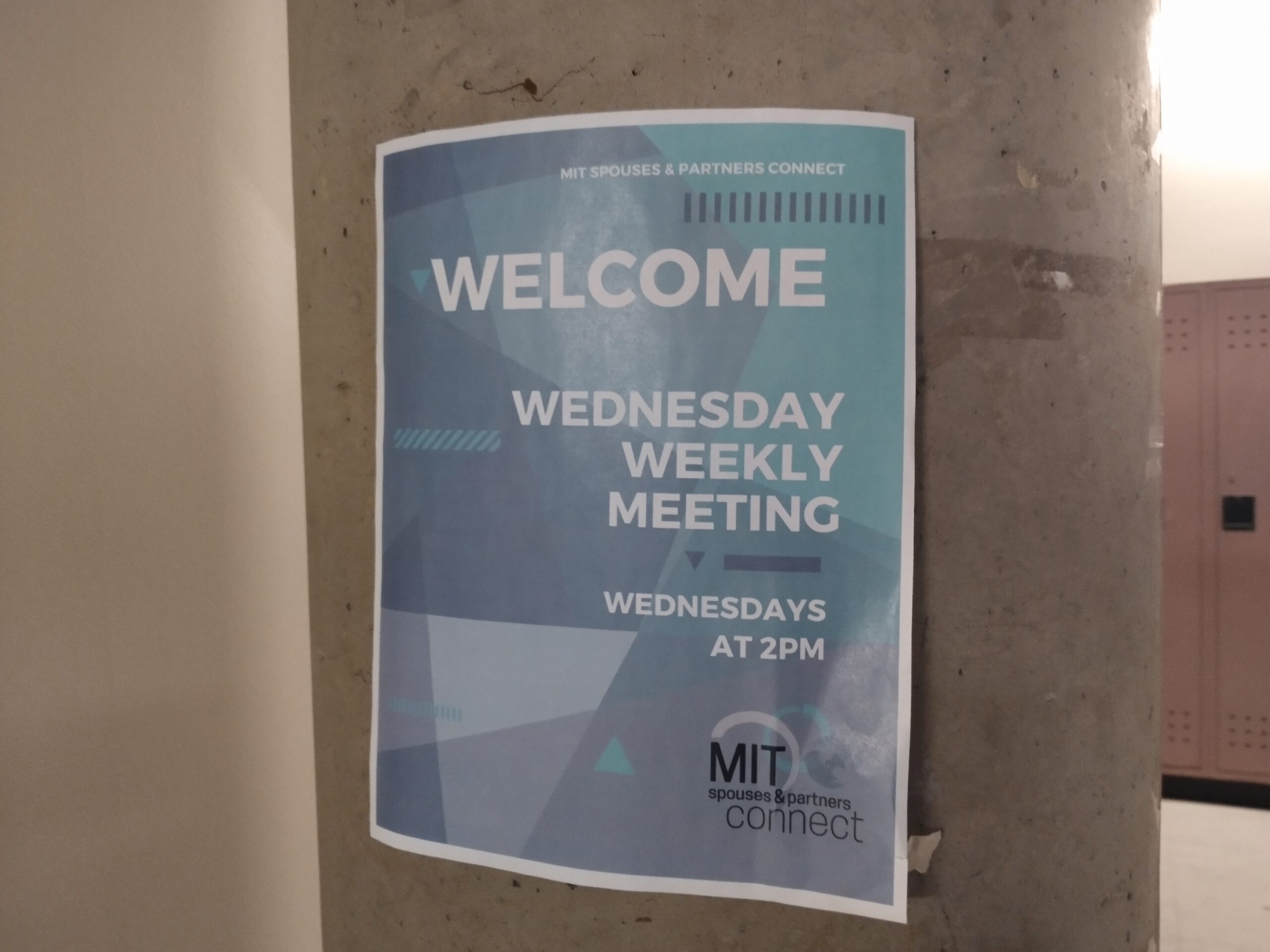
Or consider this flyer that I found in Montserrat:
Bulletin boards
Nowhere else are varied fonts most visible than in bulletin boards.
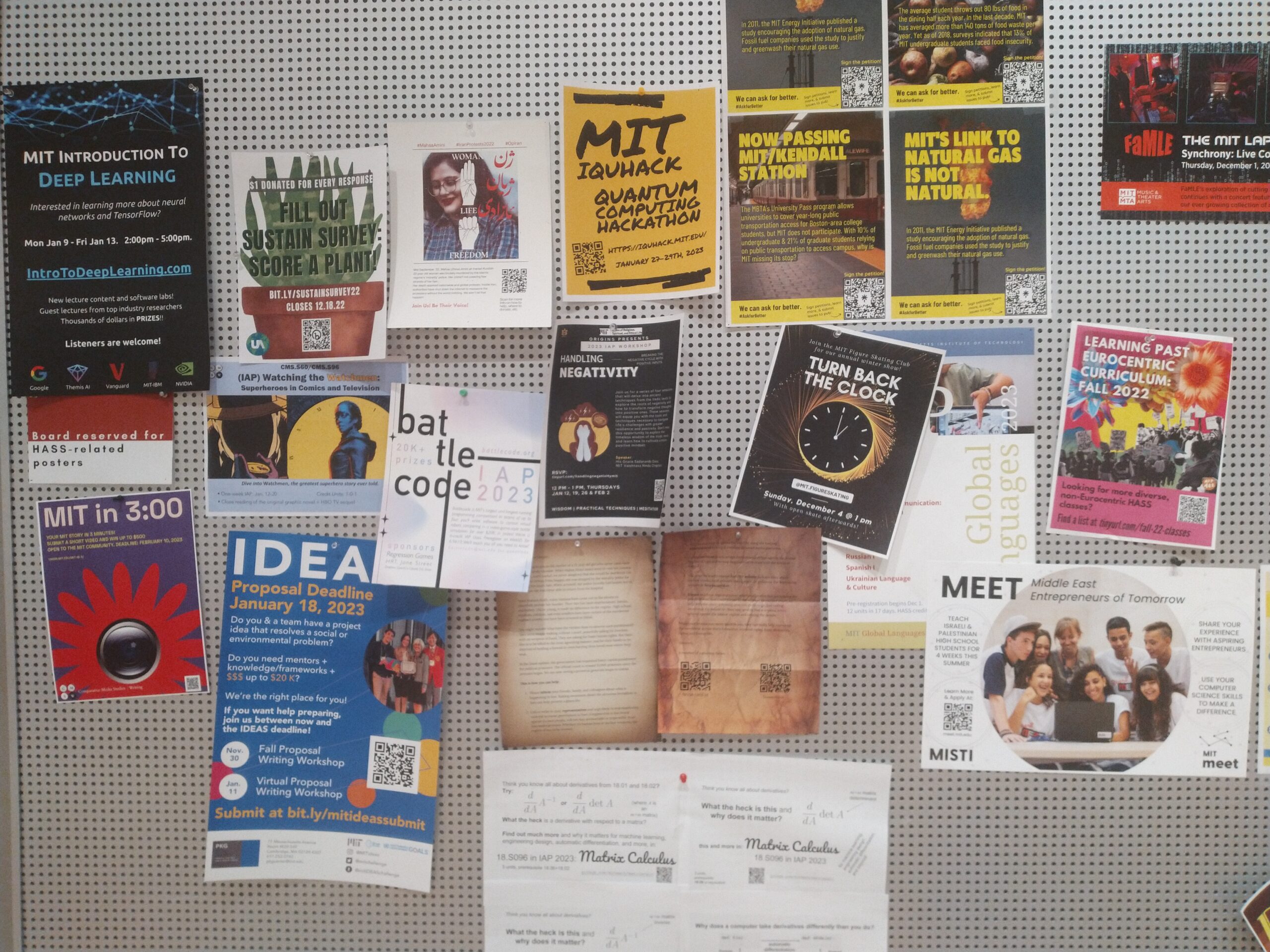
As a fun challenge, I took a single picture of this bulletin board, and tried to ID as many fonts as I could. Some of these were tough enough that I had to ask other people. But here’s my results:
- Ubuntu.
- Impact.
- Permanent Marker.
- The condensed body font is Barlow Condensed, the secondary font is Quicksand. No clue what the heading is, but it’s likely a Google font.
- The logo is distorted Impact. “THE MIT LAP” is in Barcade. The rest of the poster is in Gotham.
- Futura Bold.
- Space Grotesk Bold.
- Avenir.
- FF DIN, or some other DIN-like. Not enough visible characters to distinguish.
- Verdana.
- Heading is maybe Poppins Bold? Body is Lora Italic.
- Headings are Noto Serif. Or Droid Serif, they look the same to me. Body’s too small to tell.
- Twentieth Century and Agency FB.
- “MEET” is in Greycliff CF. The rest of the poster is Eloquia.
- Display font is Pacifico, body is Arial.
The unlabeled posters are too small to tell from a distance. Well, the poster between F and I has Franklin Gothic but its other text is too small to tell.
As always, I don’t know how to conclude, so this is it.
- You might be thinking: technically, I should be calling them typefaces. First off, I sometimes do refer to specific fonts, not just typefaces. Second, the distnction doesn’t matter here. And third, xkcd 1475. back to text ↑
- Strike one for typography jargon! A letter's terminal is where its stroke ends. back to text ↑
- In case you were wondering, "Concourse" is in Neuropol X Expanded Semibold. back to text ↑
- Strike two. A spur is a piece that extends from a curve. back to text ↑
- Strike three. Display fonts are used for headers, logos, titles, and other large texts, as opposed to body fonts. back to text ↑
- Technically typography jargon, but this is one of the more reasonable names. A leg is a descending lower part. back to text ↑
- Okay, strike four. A monospaced font is one whose letters are all the same width, as opposed to a variable-width font. back to text ↑
- Strike five. A foundry is someone or something that makes fonts. back to text ↑
- Not to mention Century Gothic, a Windows font that I cannot stand in long passages. back to text ↑
- They also share the property of being named after their original designer's surname. back to text ↑
- A friend points out that maybe this is actually Myriad, rather than Segoe, due to the lowercase A and R. I think they’re right, but I’ve already written this post assuming this is Segoe, so whatever. back to text ↑
- A wordmark, or logotype, is the text-only version of a logo. Sometimes a wordmark is paired with a graphic logo, sometimes it stands alone as the logo. back to text ↑
- Strike six. A font's x-height is the height of its lowercase X, as compared to the height of its uppercase letters. back to text ↑
- Strike seven. A font's weight can be regular, bold, light, thin, extra bold, semibold, etc. back to text ↑
- Strike eight, but maybe you know what this one means? A serif is a little spike or slab on the end of each stroke. back to text ↑