Introducing MIT Illuminations at the Welcome Center by Chris Peterson SM '13
In September 2021, when I posted about the new Welcome Center that is now home to the admissions office and plays host to our visitors, I included a list of creative touches we had added to the space to make it feel more like MIT. The last item on that list was:
~something else~: that we’re conspiring on with our old friend Ceri R. ’16, that is not live yet, but which should be very soon, at which point I will blog very loudly about it (hint)
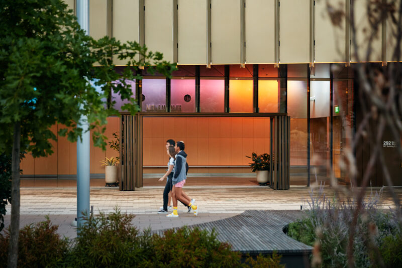
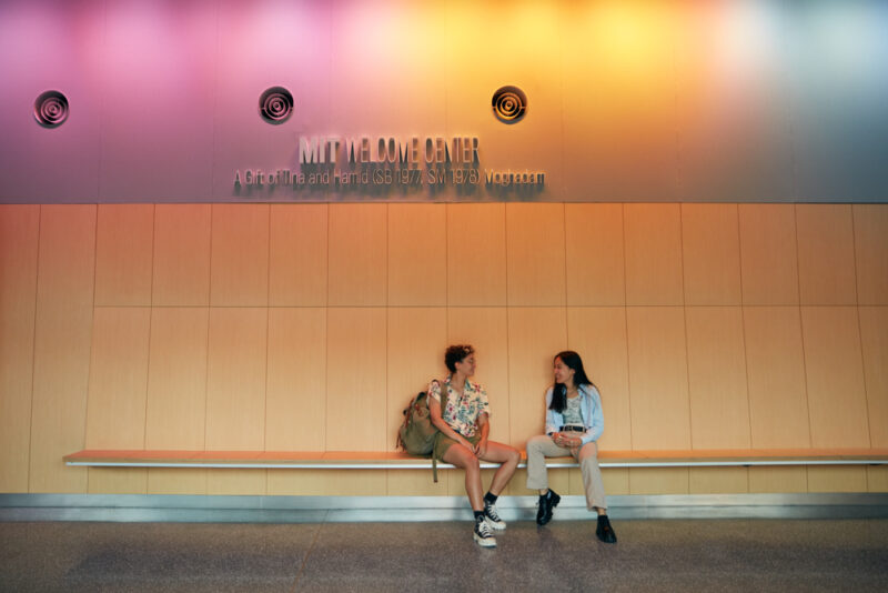
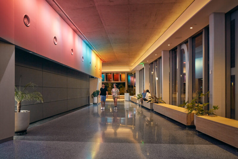
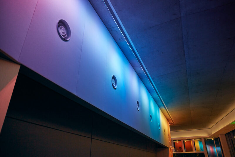
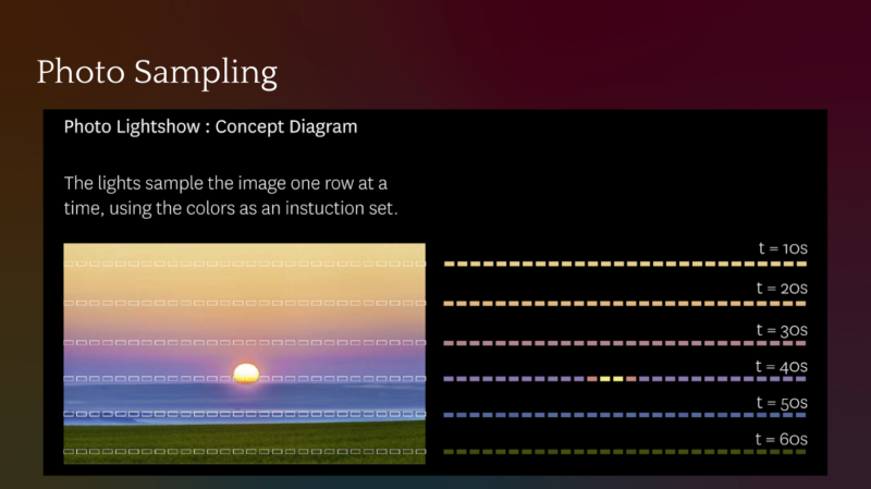
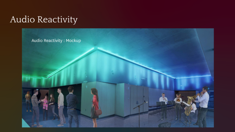
Today is the day of that loud blog, because last week we officially launched MIT Illuminations, a colorful lighting installation and introduction to open-source creative computation at the Welcome Center.
There was a long article last week about MIT Illuminations in MIT News where I am quoted telling some of the story of the installation. For the blogs, I wanted to go into a little more detail on the history of Illuminations and how we hope it will serve our visitors.
As I said in the post about the Welcome Center, we started making plans to move admissions over here back in 2015. Around 2019, as construction was underway, a group of communicators from admissions, open space programming, and other offices got together to discuss what we could do to make the Welcome Center a good front door to the Institute. In order to do that, we conducted qualitative research with students, faculty, and staff, including human-centered design workshops run by (my friend and grad school labmate) Dr. Alexis Hope, a designer and researcher based at the MIT Media Lab’s Lifelong Kindergarten group to identify themes, principles, and concepts that felt uniquely MIT.
Here were some of those identity principles:
- Extending the story: surface community stories, share more voices, broaden the reach of MIT and its relationship to the world
- Connect to the rest of campus: features that thematically ‘extend’ the central artery of the Infinite and include other Institute touchstones
- Analog, organic, human: eclectic, authentic features that live, grow, breathe
- Reliable, resilient, layered: features that work without ‘tech’ but become more interesting, compelling, unique when augmented with ‘tech’
- Participatory, dynamic, open: interactive features that allow the MIT, Cambridge, and broader community to co-create the Center
- Evolves over time: a creative foundation that can grow, change, and improve, so that the Center always feels fresh and new, not frozen in time
One of the things we learned in that research was that, while MIT has school colors, they are rarely deployed in our most visible branding, which instead relies on full spectrum color.01 MITAdmissions.org has a rainbow theme. MIT.edu has a color palette that changes every day, as it has for decades. The magazine we send to donors is literally called <a href="https://spectrum.mit.edu/"><em>Spectrum</em></a>. Also, there are many instances of the MIT community creating installations of colorful, programmable light, from Tetris on the Green Building, to Pride on the Dome, to lights on the Mass Ave bridge, to dance floors and disco hallways in the East Campus residence hall. Plus, we had this big acoustic fabric frieze spanning 120 linear feet above the auditorium.
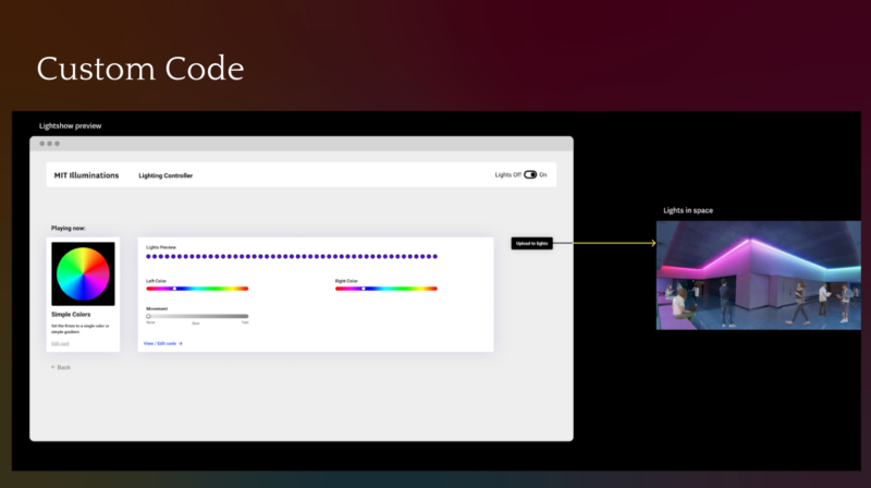
So, in early 2019, I emailed Dr. Susanne Seitinger, a Media Lab alum who had written her dissertation on lighting public spaces. She educated me about the basic concepts and considerations with interactive colorful light, and then recommended that we contact SOSO Limited, an MIT-alum founded experiential design firm that specialized in public lighting projects; I’d heard good things about SOSO because blogger Sabrina M. ’21 had interned with them. We learned that SOSO was also working on a lighting project for the new MBTA headhouse immediately next to the Welcome Center. Over that spring and summer, we started meeting about the project, and they developed a proposal that not only incorporated colorful light, but also open-source code, in keeping with MIT’s mission for open education and digital learning. We took that proposal to an MIT committee that allocates money for building renovations and public art, and they approved and funded it.
The physical lights were actually installed last year (after some pandemic delays), and we’ve been spending the intervening year developing content libraries and editorial standards. A lot of that work was done by Ceri (as mentioned in my post last year), who wrote a really impressive document focusing not only on the aesthetic standards of what looked good, but also thoughtful notes on how to think about sourcing diverse kinds of content and citing it in an inclusive way, which best practices will guide us in the years to come.
Meanwhile, I’m spending my fall working with Victor Hung ’14 — a longtime lecturer in Mechanical Engineering, designer of escape rooms, who longtime blogheads may remember from when he made MIT: The Game! back in 2011 — on a First Year Advising Seminar built around the lights (Victor is the lead instructor, and I’m the lead advisor). In the fall, we worked with MIT first years to teach them the principles of creative lighting using the open-source toolkit from SOSO, on scales from inexpensive DIY LEDs (like the kind you can get from Adafruit) to the commercial-grade lighting we have in the Center. Victor and Ceri are currently building out that curriculum into something that can easily be accessed and understood by the general public for the purposes of teaching themselves the principles of creative computation using the open-source resources of Illuminations.
As detailed in the MIT News article, many people have been working for several years to make Illuminations possible, with major investments of time and resources. I’m so thrilled that, because of all their collective hard work, we can share it with you today. While we worked on this project, I’ve introduced it to people with some version of the same basic story: “the goal is this project is so that someone visiting MIT for the first time — a Cambridge community member, or a high school student from across the country or the world — can see something creative and beautiful being done with technology, and even if they’ve never coded before, they can use the resources that MIT provides for free to learn how to make cool and beautiful things themselves, and that will stick with them whether or not they ever attend MIT as a student.” To me, this goal is a manifestation of the MIT Mission, and the admissions mission too. I hope you get a chance to see it soon.
- MITAdmissions.org has a rainbow theme. MIT.edu has a color palette that changes every day, as it has for decades. The magazine we send to donors is literally called Spectrum. back to text ↑
