More Cool Data Stuff, ft. Immersion by Nisha D. '21
I just really like data visualizations, plz don't judge
I emerge from three weeks of being fairly hosed WITH MORE COOL DATA STUFF GUYS WOOOO.
This time, though, I cannot take any credit for the tear-inducingly beautiful data visualization that you are about to see. The Media Lab is much better at this sort of stuff than I am, after all.
I present to you: immersion.media.mit.edu.

The Collective Learning group at the Media Lab put together a VERY COOL THING (that seems to be pretty dated at this point, even though my friends and I just discovered it) that allows you to visualize who you correspond with through email. It’s also LITERALLY MY FAVORITE THING ON THE INTERNET AHHHH.

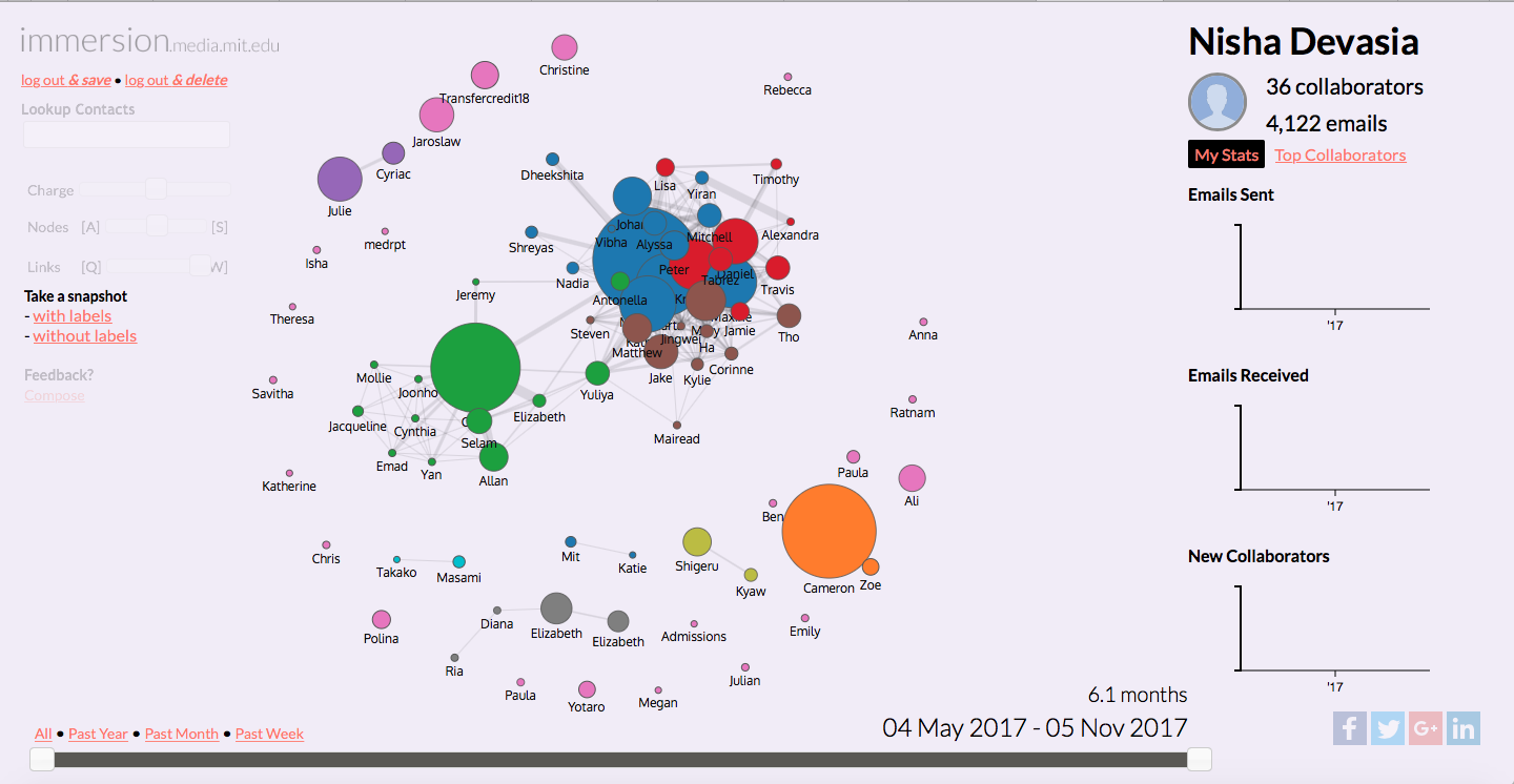
Basically, it’s a node graph that shows you who sends you emails and who sends emails to you. If we look at my graph, we can pick out three big blobs that correspond to certain groups. The green area is the blogger fam (the very large green blob is Petey, naturally), the conglomerate of blue, red, and brown blobs is comprised almost entirely of East Campus people, and the very large orange blob is my UROP advisor. You can also get even more detailed information by clicking on each node, such as your interactions with the given person in a given time period, and also the people who they’ve introduced you to via email. For a data nerd like me, this is basically the best thing I’ve ever seen.
The stats for how many emails I’ve sent/received for 2017 aren’t in yet, but if I’ve managed to send/receive 4,122 emails in the first half of the first semester, then I imagine that this graph will get a lot cooler to play with as time goes on. Some of my upperclassmen friends can go through their email interactions and how they changed depending on what semester they filter by, which is something I highly look forward to doing.
If you want to play with this (which I highly recommend; my friends and I spent approximately an hour fiddling with the different settings), make sure to log in with either your Gmail, Yahoo, or MS Exchange account. Also, please note that by signing into this site, you are giving the Media Lab access to your email metadata. Some people care about this, but if you’re like me, you’ll log in to this site with all three of your emails. Guess I’m just a sucker for Cool Data Things. In general, looking at projects that come out of the Media Lab reminds me of how badly I want to UROP there some day.
Also, general shoutout to the MIT internet: I would like to make more Cool Data Things myself, so if there’s anything that you think would be useful to have or just fun in general, comment them below!