Why didn’t MIT have a logo until 2003? by CJ Q. '23
tracing the history of MIT's logo and graphic identity
In another instance of historyposting, we’ll look into the history behind MIT’s logo, and MIT’s graphic identity in general.
I’ll take a different style of writing for this post, emphasizing the process of how I do historical research, rather than constructing a flowing, chronological narrative. So it’ll be much messier, but hopefully provide some insight as to how these posts get written.
Curiosity sniped the nerd
Like the CPW history post, this was once again triggered by an innocuous question, that Jeremy shared with us on the blogger Slack. It was an email from someone asking about why the MIT colors are the way they are.
And of course, being an MIT history question, I had to look into it. I started with the MIT graphic identity website, which I knew had information about MIT’s colors and such. When it came to history, however, all that was offered was a single page, which did not have the information I wanted. Finally, a Google search led to an MIT Libraries page, which simply says:
MIT’s official colors are Cardinal Red and Silver Gray. The colors were selected in 1876 when a communication signed by a committee representing the classes then at MIT and affirmed by the Executive Committee of the Alumni Association was voted on and approved at a meeting of the Faculty (Records of the MIT Faculty, vol. 2, April 1876).
Aha! I said. A reference! So I went to Distinctive Collections, an MIT Libraries group that collects historical documents relating to MIT. Lo and behold, they had the Records of the MIT Faculty in their collections. I sent in a request to retrieve them—after all, if I can view the primary source, why not?
At the very least, I had my answer. I went back to the Slack to share it. But alas, Jeremy already knew the answer.

nerdsniped
But with this question, I had even more questions. What was the history of the MIT graphic identity, in general, not just the colors? In particular, the most surprising part about the history page was how it mentioned the logo only started existing in 2003. Why didn’t we have a logo until 2003? And how was that logo made?
With this, I knew I had a blog post brewing. So I decided to go up the ladder and send some emails. I got in touch with Debbie Douglas, who works with MIT Museum as a curator. Douglas mentioned that the Museum had information about the graphic identity history in general, but nothing cataloged about the current identity or logo. She connected me with Gary Van Zante, another MIT Museum curator, who had plenty of insight about MIT design up to the 1980s.
And Van Zante gave me a few leads with an email. He writes:
The MIT graphic identity you refer to is of course one of several since such a concept was introduced in the 1930s. The Swiss Modern identity actually originated with several administrators in the 1950s at a moment after the war when universities were beginning to consciously develop marketing campaigns for higher education (GI Bill, and other factors…). But the actual visual vocabulary that aligned with Swiss modernism in typography and graphics was a collaborative vision within the office.
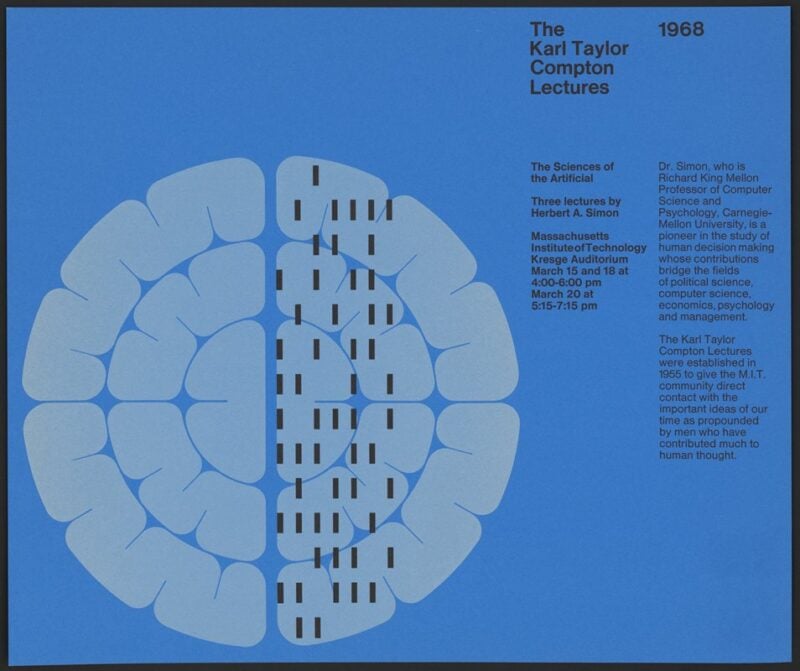
This “Swiss Modern identity” mentioned here is a very striking, famous style of design, associated with Ralph Coburn, Jacqueline Casey, Muriel Cooper, and Dietmar Winkler. In fact, the MIT Museum has an exhibition about the MIT Moderns. I found a selection of fascinating posters from Winkler and a post on Cooper’s timeless MIT Press logo.
The “office” mentioned here is the Office of Design Services, which I’ve also seen called the Office of Publications. The Office existed since at least the 1950s. To track exactly when it ended, I went to the Reports to the President. The Office of Publications was mentioned in the 1970 report, and then the Office of Design Services was mentioned in the 1980 and 1990 reports, and no mention was found in the 2000 report. This means that it ended some time in the 90s.
But this is not a post about that. I was already getting sidetracked enough. I had a question about the MIT logo, and the current MIT graphic identity. I wish I had the time to look into the whole history, but I really wanted to focus in the last thirty years or so.
Interlude: what’s a graphic identity?
As is probably already clear, I really like looking into history. It is one of the lots of things I can nerd about, and part of that list includes typography, branding, and just design in general.
I keep talking about this thing called a “graphic identity”. What does that mean? Put simply, a graphic identity is built of several elements that identify a particular place. The MIT graphic identity, for example, is composed of things like the logo, the seal, colors, fonts, and even Tim the Beaver. It’s the combination of these things put together that make an MIT publication “feel” like an MIT publication.
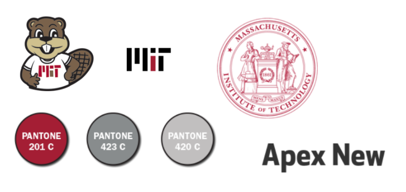
the font is apex new, which is the closest to a font used in the graphic identity, but there isn’t really a standard standard one
So, we already talked about how I was surprised that MIT didn’t get a cohesive graphic identity until 2003. Sure, it had a seal, and it had official colors, but they weren’t very well-defined, and there wasn’t even a logo. In this case, I wouldn’t consider a graphic identity having existed until 2003. But is 2003 really that recent? If MIT was a company like Pepsi, then yes, 2003 would be really recent for a logo update.
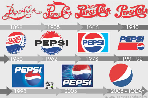
from https://www.boredpanda.com/21-logo-evolutions-pepsi-cola-apple-nike-nokia/
But MIT isn’t Pepsi. MIT’s a university, so maybe the concept of a graphic identity for a university is something that’s relatively recent. As part of the research for this post, I decided to look into the graphic identities of other universities, and see if I could find anything about their history from a cursory glance.01 That is, a single Google search. Come on, this is the <em>MIT</em> Admissions blogs. Some results, sorted as “chronologically” as I can get them:
- Harvard definitely has a graphic identity, but I found nothing about its history. There’s no dedicated website or page or anything, at least, not publicly. Harvard still sticks to the same Veritas shield they’ve used since the 1850s, which accumulated some small changes over time, but has been mostly the same.
- Brown’s graphic identity is also built on its seal, getting progressively simpler over time. A PDF with identity guidelines mentions that the current visual identity was adopted in 2003.
- Stanford has had an identity website since 2003, about the same time that MIT got its logo. I couldn’t find anything else about the history.
- Cornell is interesting. Yes, they have a brand website. There’s a blog post complaining about the 1999 logo, and praising the current logo, which orignates from 2004. This logo was made by Chermayeff & Geismar & Haviv, as part of, presumably, an identity rebranding.
- Princeton has a small bit on their Office of Communications website about the graphic identity. Princetoniana mentions the current logo and identity are from 2007.
- Columbia has a shiny graphic identity website. I was most interested in the crown that they use as a logo, but someone already made a great write-up) about its history! It seems like the current iteration of the logo is from 2006, with the graphic identity guidelines from 2009.
- Caltech has a graphic identity website, and establishes that the Caltech logo is just the logotype “Caltech”. The website’s FAQ mentions that this is a “new identity”, despite the website existing since at least 2014. The logo itself probably started existing in the late 2000s. There was an informal Caltech icon for a brief time, but recent guidelines have now dropped it in favor of a white “C” on an orange field. Before even that, Caltech seemed to use its seal with the torch in it. No, not the redrawn one, the old one on the bottom of this page.
- UChicago has identity guidelines. I couldn’t find anything about the history, but my best guess is that the guidelines probably existed since 2012, because that’s when the document claims the logo was redrawn.
- Yale has a dedicate identity page. There’s some brief historical notes that make my best guess for the graphic identity as originating from 2014. Also, it’s drawn by Matthew Carter—a name we’ll see again later.
- Dartmouth has a page under their Office of Communications. The latest logo they use, a D with a pine tree in the middle, comes from 2018 to some amount of pushback. This was part of a comprehensive identity redesign. Before this, Dartmouth used a crest that seems to originate from the 1940s.
- UPenn’s latest style guide is as recent as 2019, although the logo they use is a redrawn version of the shield they’ve been using since 1933.
Relative to this sample of universities, MIT’s 2003 logo doesn’t seem so recent anymore. It’s even more interesting, to me at least, that most of this sample has stuck with redrawn versions of their seal or unadorned wordmarks, the exceptions being Stanford, Columbia, and Dartmouth.
Digging into archives
Back from scratch, then. Here were my questions: what were we doing before 2003, in the late 90s and early 2000s? What prompted establishing the graphic identity, and how exactly was it created? And there was also the general question of, what else could I find out about the MIT logo’s history?
My email chain with Douglas and Van Zante was not in vain, because it gave me a lead: the Office of Design Services. What happened to them? Again, the Reports to the President give an answer, in the 1997 report:
Following in-depth reviews of changing publishing needs and of the savings that could be obtained through supplier consolidation, it was announced at the beginning of the fiscal year that the Office of Design Services, as well as the offset printing, photographic, and illustration operations in the Graphic Arts Department, would be closed and that a new Publishing Services Bureau (PSB) would be established to coordinate the design and production of the Institute’s publications.
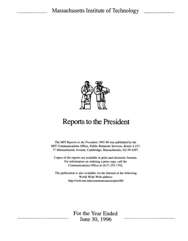
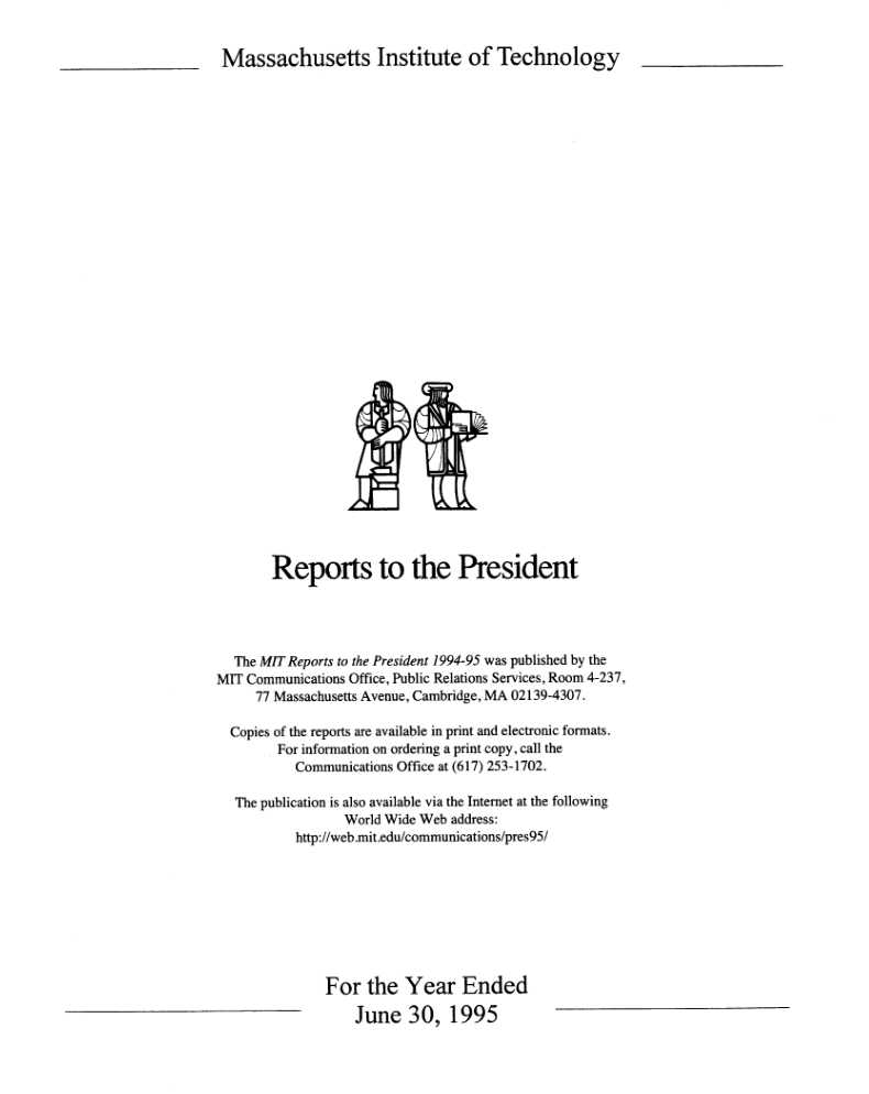
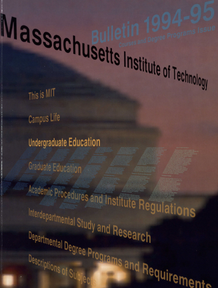
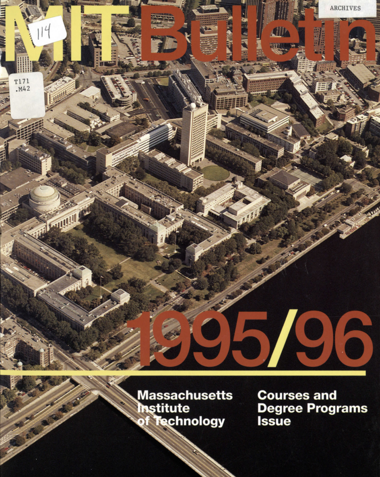
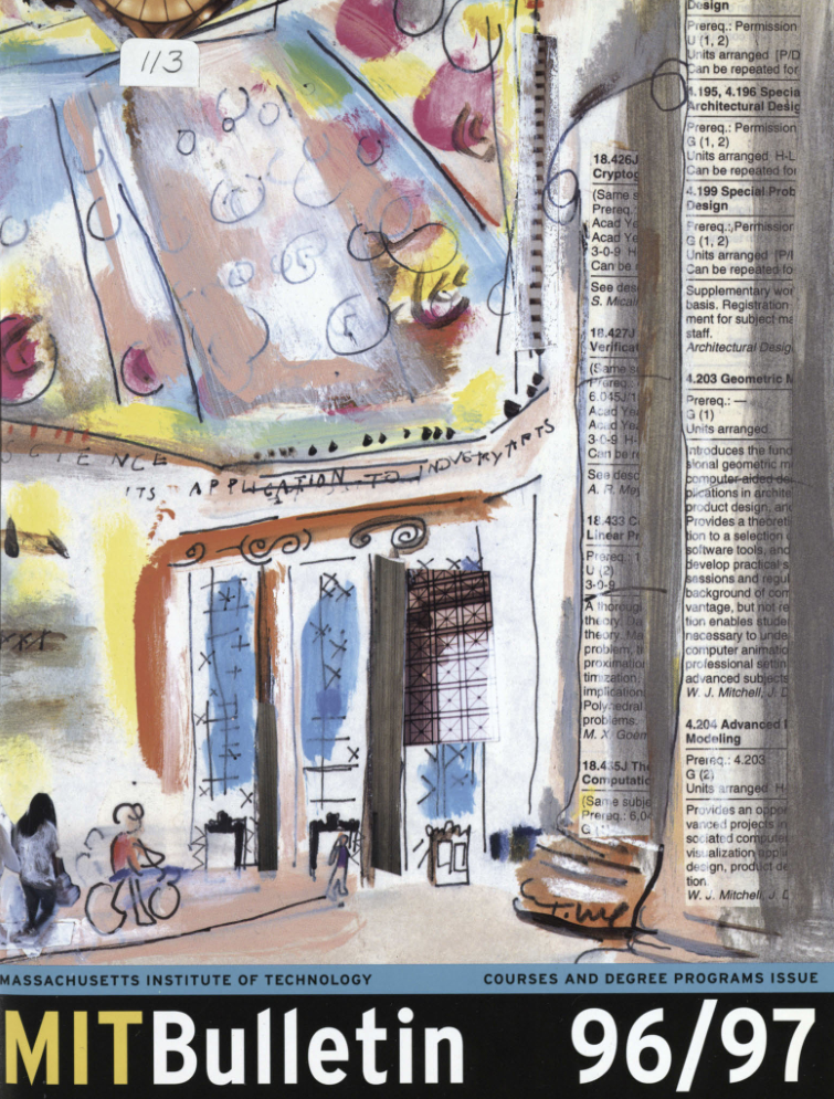
So this gives us another office to track: the Publishing Services Bureau, or the PSB. It mentions the beginning of the fiscal year, so that meant the PSB started in 1997. And indeed, there was a shift of publication design that happened around that time. Below, we can compare the covers for the Reports to the President from 1995, 1996, 1997, and 1998. We also compare the covers for the course catalogs in that time.
The old Reports had a simplified version of the two people on the seal, which was replaced with this sans-serif, bold, condensed “MIT”. Similarly, the old course catalogs had MITs of all sorts, which got replaced with a similar sans-serif, bold, condensed “MIT”. So PSB was beginning to consolidate the way that “MIT” was typeset, and I guessed they were the candidate office to have spearheaded the process of making MIT’s current graphic identity.
Some more Google searching about the PSB brought up an article from 1998. This about the work that PSB did over their first year. Here’s a relevant excerpt:
Blackburn also is working with Bernstein on an identity system for the Institute that captures MIT attributes such as innovation and enterprise. In addition to reviewing all publications, PSB staff are researching archives to see how MIT has represented itself historically.
The current “placeholder” for a new MIT logo is a squarish configuration of the letters “MIT” in an adapted Universe typeface. It is simple and straightforward enough to work well with other logos and headings developed by other centers and entities, Bernstein says, yet it clearly identifies each piece as coming from the Institute. Some department publications have lacked any indication that they were affiliated with MIT, he said.
Aside from scouring the Reports and the catalogs, another great source is looking at the Wayback for old webpages. My first attempt was a straightforward one: we take the current graphic identity site, and then plug it in the Wayback. This works:
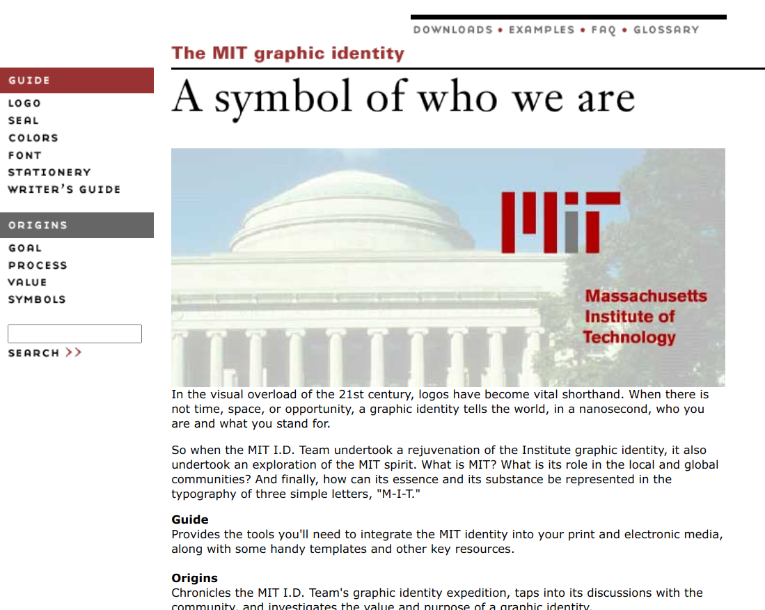
the internet archive is great
The archived version is nice, and it gives us some insight into the process that the current website doesn’t have. There’s this excellent page that explained how they conducted charrettes to figure out what people think of MIT, and then translated those to design aspects.
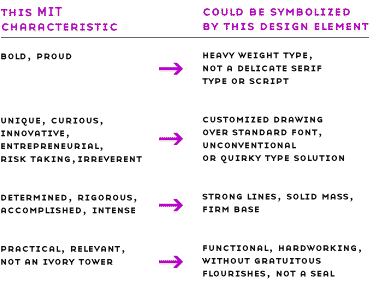
truly “not a seal” is a very very important quality of the mit logo
Unfortunately, the archived version is incomplete. There’s a page with a list of staff, but clicking the pictures to enlarge them gives pictures that haven’t been archived. This is sad, but at least it’s a good source into the process.
The Wayback also allows us to visibly see how the MIT logo was adopted in websites. Compare the 2001 version of the PSB site and the 2003 version: the only visible difference is the logo at the bottom. Also compare a 2002 homepage with a 2003 homepage: another big difference is the logo at the bottom.
Searching around again about how MIT’s new logo was adopted is somewhat fruitful. There’s this Tech Talk article02 Tech Talk was the Institute's official newspaper until 2009. Not to be confused with the Tech, which is a student paper. from 2003 talking about the new design and the new logo. Looking at the Reports to the President, the Vice President 2004 report has a mention of the new identity:
In spring 2003, PSB launched two significant initiatives for the MIT community: the MIT graphic identity program and the MIT online business paper ordering system. These systems received widespread use this past year, allowing MIT publishers to communicate with greater clarity and to reduce costs significantly. […]
The MIT graphic identity style guide site provides word processing templates for MIT letterhead and envelopes in addition to electronic logo files and guidelines for use. Enhancements to the site this year include the addition of LaTeX templates, requested by Athena users. The logo continues to see increased use across the campus in print and electronic communications, receiving favorable reviews from prospective students, who comment that it is “cool” and “techie.”
Okay, sorry, but this is hilarious to me. Who looks at the MIT logo and thinks “techie”? Prospective MIT students from 2004, apparently. I too, want to be “cool” and “techie”.
Of course, the response wasn’t all positive. Another great source for MIT history are the Tech archives. We pick Volume 123, and then on the side we have a “Search Volume 123” where we can search just for this volume. Looking up words like “logo” gives a few useful hits.
The earliest interesting mention is an article about the 2003 Steer Roast. Steer Roast is an annual tradition run by Senior House, a former undergraduate dorm, in which there’s titular roasting of steer, but a bunch of other events too. The article gives us a picture of what Steer Roast looks like, and the relevant part is:
[…W]ith the crowd lusting for the ancient rites to be consummated, the genial emcee called all to order, and a flag with MIT’s new logo was brought forward and placed below the huge mass of meat to be roasted. Large quantities of flammable liquid were poured on the flag and, to the sound of “The Ride of the Valkyries” and a great roar of approval, the totemic flaming toilet paper roll was launched on its path over the heads of the crowd. It reached its destination, sending up a huge ball of fire engulfing the meat. The MIT logo disintegrated in flames to a wild yell of “MIT BURN!” surely no less ecstatic than the pleasure enjoyed by a stadium of Romans upon the throwing of Christians to the lions.
The context for this is that it’s traditional in Steer Roast to burn toilet paper as kindling, as it’s “detestable”, but apparently the new MIT logo was even more detestable than the toilet paper. There’s pictures in the issue scan showing a flag with the logo burning in a pit underneath some roasting meat.
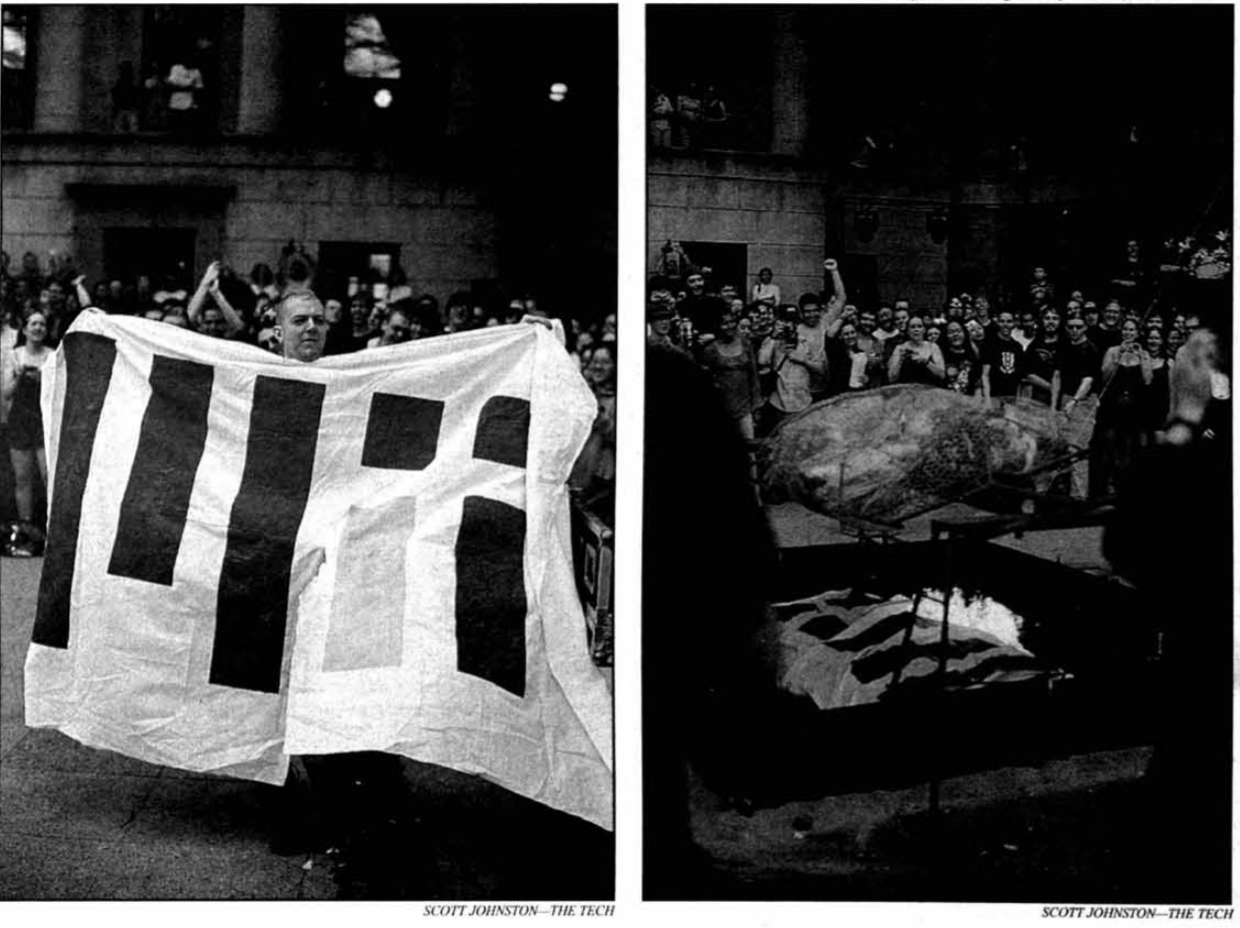
burn the mit logo
The next interesting Tech mention comes later that year, in an article about the Ugliest Manifestation on Campus. UMOC was a contest run by Alpha Phi Omega as a charity event. The Random Hall Milk won that UMOC, but the new MIT logo was second.
Colorful answers
I’ve found that one of the best sources for history is always asking other people. Remember from way, way earlier, how I sent a request to Distinctive Collections to view some faculty minutes? Well, a very kind staff member named Myles Crowley went above and beyond that request, including not only the source I asked for, but several other sources too. Goes to show how awesome MIT Libraries is.03 I feel like I've underutilized MIT Libraries. They've been extremely helpful every single time I've turned to them. They're great and amazing and wonderful and I will not <em>stop</em> gushing about how much I love them.
The Faculty Records from April 14, 1876 are written in this beautiful cursive script, which is perhaps less legible to modern eyes. But it reads
A communication signed by a committee of each of the classes of the Institute, and enclosing the approval of the Executive Committee of the Alumni Association in relation to a combination of colors signifying connection with the Institute was read.
Voted to approve the combination of colors selected, viz: “Cardinal red and silver gray.”
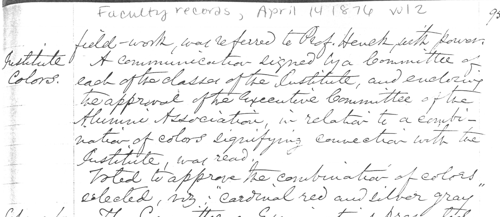
beautiful beautiful script
Now “each of the classes of the Institute” sounds like a lot, but keep in mind that MIT’s first classes were held in 1865. There was less than a decade’s worth of MIT students, so it wasn’t too unreasonable to get a representative from each in the same room.
There’s also a selection of articles from the Technology Review. Now, I’ve never really considered the Technology Review as a historical source, given what it looks like today. But in fact, it used to be the case that the Review was published by the Alumni Association, and was much more MIT-focused in the past. I still haven’t found a good way to view the archives—I know they’re on the Internet Archive, but I’ve never considered searching there before. From the April 1905 issue:
At a meeting of the class of ’79, held early in 1876, the question of a college color came up, and a committee, of which I was chairman, was appointed to consider the matter. All the single colors having been adopted by other colleges, the committee turned to combinations of shades. Each member submitted one or more, and these were passed upon by the whole committee. These combinations, I well remember, provoked much merriment[…] Other offerings, such as purple and green, blue and green, purple and yellow, and other inharmonious combinations, were eliminated; and finally the chairman’s combination of cardinal red and silver gray was selected. The class voted to accept the committee’s choice, and to ask the other classes to adopt cardinal red and silver gray as the Institute colors; and, although this was a move on the part of the first-year men, the upper classes acquiesced.
Imagine what the logo would look like if we selected purple and green!

my eyes
Another issue from the Review, from January 1917, elaborates on symbolism:
We all desired the cardinal red; it makes one-half of the stripes of our American flag; it always has stirred the heart and mind of man, it stands for ‘red blood’ and all that ‘red blood’ stands for in life. But we were not unanimous for the grey; some wanted blue, I recall. But it (the grey) seemed to me to stand for those quiet virtues of modesty and persistency and gentleness, which appealed to my mind as powerful; and I have come to believe, from observation and experience, to really be the most lasting influences in life and history. And as grey was so long my ancestral color, of which somehow from youth I was especially fond, I quietly pressed its merits; and as it stood for iron and steel, and ‘steel’ (Bessemer steel) was only recently invented, the boys assented to it, and we recommended ‘cardinal red and steel grey.’
Of course, if only the story was that clean. The truth is that the question of which class decided the colors first—whether it was 1876, 1877, 1878, or 1879—was hotly debated between their alumni. The November 1917 issue of the Review has a long series of correspondence from alumni, all arguing about what the right story was. Either way, the symbolism of the colors is at least unanimous: red for blood, gray for faith, stability, and confidence.
Interlude: Tim the Beaver
Very tangentially related to all of this is Tim the Beaver, and only because they04 I choose to believe that Tim uses <a href="https://twitter.com/fili_bean/status/1440440875889221638">he/they pronouns</a>. are mentioned on the graphic identity site. I have vowed to include some choice illustrations from this site about how not to use Tim the Beaver:
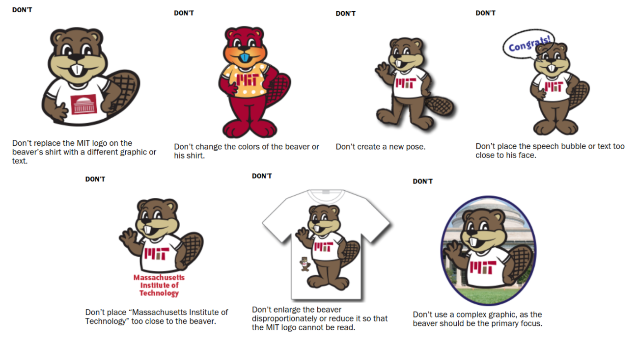
my favorite is the “Congrats!” bubble slowly encroaching on tim’s head
Tim the Beaver’s history is comparably easier to look up. The Division of Student Life devotes a page to it, and an MIT News article interviews Tim himself. The beaver was officially chosen as the mascot in January 1914, but the name Tim actually came much later.
Slice: Who named you Tim?
Tim: Great question — beavers don’t actually have first names. No one started calling me Tim until the late ’90s. Before that, I was called Bucky, Chipper, and Eager. I’m not particular. Tim works just fine.
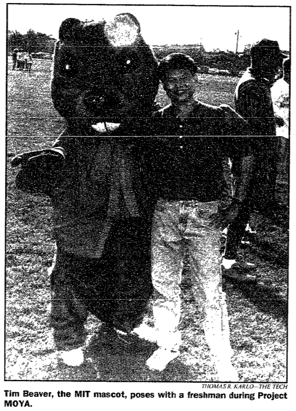
Tim the Beaver did not always look the way we know Tim today. The interview I mentioned links to a 2000 news article about the new “Beaver mascot” costume,05 Note the MIT placeholder logo on Tim's shirt. which means that there was an older one. The older costume was… uh, not as appealing. We can see them, named “Tim Beaver”, on a 1994 Tech issue and a 1995 Tech issue. Quote from a friend: “Great, now that’ll haunt me in my dreams.”
An article from a 1999 Tech issue provides some history, and some more insight as to what the MIT mascot could’ve been. (Tim the Elephant? Tim the Kangaroo?) There’s also mention of the aforementioned redesign that was released the next year.
According to brass rat lore, Gardner’s argument for choosing a beaver follows: “We first thought of the kangaroo, which, like Tech, goes forward by leaps and bounds. Then we considered the elephant. He is wise, patient, strong, hard working, and like all those who graduate from Tech, has a good tough hide. But neither of these were American animals. We turned to [William Temple] Hornaday’s book on the animals of North America and instantly chose the beaver. The beaver not only typifies the Tech [student], but his habits are peculiarly our own. The beaver is noted for his engineering, mechanical skills, and industry. His habits are nocturnal. He does his best work in the dark.”
[…] The first beaver costume design was created for the Class of 1927’s 50th reunion and unveiled at the Alumni Day luncheon. It was rented from the costume designer until the early 80’s when it was bought for $1,500. […] Due to the wear of the costume, Ted E. Johnson, assistant director for programs at the Campus Activities Complex, is working with the CAC advisory board and the
Undergraduate Association to develop a new design for the beaver mascot costume.
Again, no mention that the beaver’s name is Tim. Just “beaver mascot”. Even in 2000, the Tech mentions that the mascot is “usually named T.I.M.”. By 2006, it seems pretty established that their name is Tim the Beaver, and a quote from a Tech article makes it clear: Tim is not an MIT student.
Tim the Beaver is “just a fun-loving guy,” Ciborowski said, who is “definitely not an MIT student because he’s never sad and always has a smile.” Ciborowski said that it is obvious that Tim does not complete problem sets each week.
In 2014, Tim the Beaver celebrated his 100th birthday, to CAC posters featuring Tim in a blue tropical shirt. Certainly disallowed by the graphic identity, but this is the Tim the Beaver costume, so that follows different rules, right?

craft a souvenir for your dorm room! have your photo taken with tim the beaver!!!
Today, Tim is an even bigger part of the collective MIT cultural consciousness. They are ever-growing in their influence, and he is truly widening his reach.
Recollections
Back to asking other people. If I wanted to learn about the MIT logo, why not ask the designers themselves? I was pleasantly surprised when Matt McGann agreed to an interview for my CPW history post, and I found that extremely useful. So why not just, as the kids say these days, “shoot my shot”, and cold email people asking to interview them?
And so I did. I emailed several people, and those who replied included Tim Blackburn and Matthew Carter. The graphic identity site credits Carter as the creator, but Blackburn was also one of the designers on the team, and often the logo is credited to both of them.
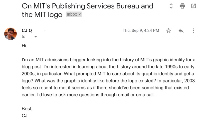
please ignore the date of the email, thanks
Blackburn sent me some responses to some of the questions I asked. Also, remember the old graphic design page I mentioned? Blackburn sent me his archived copy, which had all the assets of the site, including the ones that didn’t get archived. I spent some time going through it, and I’ll share some pictures from it later.
Carter replied to me after Blackburn did, and we had a short email exchange, but he mostly referred me to Blackburn. So then I asked Blackburn for an interview, and to my pleasant surprise, he said yes. He proposed a few times, and I gave a time which worked, and sent him a Zoom link.
I was thinking about what questions to ask him beforehand. What questions did I have that he didn’t already answer by email, and what answers are likely to be more helpful hearing from Blackburn himself, rather than digging on my own? These kinds of questions tend to involve motivations and anecdotes. So I wanted to ask about the PSB, and why it was formed. I also wanted more details about the actual design process: how did they think of a logo that consisted of “MIT”, how did it get two colors, and in general, what was the process like? I prepared a few questions and came into the interview ready to ask any additional questions I get curious about.
So our interview happened. I generally dislike recording interviews, and prefer taking notes; I’m a fast enough typer to take down most of what was said. Like with any interview, I wanted to give Blackburn as much room to speak as possible. Anyway, here’s an edited interview transcript, along with my thoughts along the way. I start with some greetings.
CJ: Good morning. Thanks for coming.
Blackburn: Of course. Did you get my email with the website?
CJ: Yeah, I did. I managed to open it.
Blackburn: There’s a reason [the website] was structured in that way. We wanted to have the tools come first, in terms of what was useful, but it was really important to tell the story of how we came to working on it.
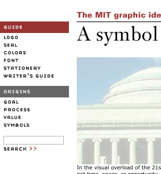
look at that menu. “guide” then “origins”. the origins was apparently important enough to get its own section
Blackburn: MIT had never had a graphic identity before… which is surprising to hear, probably. Other schools had very rigorous graphic identities, rules, for applying a seal, or a logo. MIT never did. I started working on it in 1998, when I was the manager at MIT PSB, and it launched in 2003, that website. The logo was probably designed by the end of 2002.
Hearing Blackburn mention his relationship to MIT PSB, I decided to ask about it.
CJ: So PSB formed in 1997. Why? What prompted it?
Blackburn: They have this term in MIT called “reengineering”. They were breaking down [the Office of Design Services], by calling it “reengineering”. It’s a friendly way of MIT to say we’re getting rid of the old structure, bringing some things up to the date. The web had already started in ’97, but [the Office of Design Services] wasn’t really doing web design, it was all print. It wasn’t a group that was working on messaging or communication for different groups, like MIT Admissions, or any of the other big communicators in MIT.
That term, “reengineering”, is an actual term. A quick Google search brings up a page, which looks like it’s from Tech Talk, and a Faculty Newsletter article. Interestingly, it’s the same Reenginering Project that renamed Physical Plant to Facilities.
Blackburn: Part of the mission for PSB […] was also to come up with a graphic identity for MIT. MIT had a seal, […] but it’s problematic, it doesn’t read well small, it was also the wrong message with two white men, etc. Every department, school, program, had its own way of signing out the letters “MIT”.
One fascinating fact I learned about the seal here. The “simpler” seal used in documents up until the late 90s, the one that consisted of the two people in the seal, was actually designed for Howard Johnson’s 1966 inauguration; see this page.
Blackburn: We did a ton of focus groups, with students, with administrators, faculty. But we also did focus groups with high school students, and with colleges outside of the East Coast. We went to LA, talked to Caltech, WashU. We were surprised at how smart and aware college students were about branding[…] we learned it was actually important for them, in terms of identifying and feeling good about the publications coming from the school.
This is interesting. The process page on the old site mentions they talked to students, high school students, alumni, faculty, and staff, but nothing about students from other universities.
Blackburn: We had to have a client. It was composed of the Executive Vice President, John Curry at the time. Kathryn Willmore, who’s the Vice President of the Corporation. Ultimately President Vest. The Dean of Architecture, William Mitchell. They were very nervous about putting any kind of logo [on MIT]. It was their job as the client, but they were also scared. We bring people to MIT because of their individual thinking, no one’s gonna want to follow rules!

this is a very intense design conversation
The client here is known as the “MIT I.D. sponsor team” in the website’s goals page. He then talks about some of the other people involved in the design:
Blackburn: I brought in some top graphic designers from Boston. Alice Hecht, Kathleen Forsythe, and my favorite, Matthew Carter. Have you heard of Matthew Carter?
CJ: Oh yeah, definitely. Georgia, Verdana are the big ones. Also helped with the Yale logo.
As an interviewer, I had to do my research. I was already a big fan of Matthew Carter before the interview, but it didn’t hurt to learn some more. It was actually doing research for this interview that I learned that Carter worked on the Yale logo, and that Carter also currently resides in Cambridge.
How did Carter get involved with the project? He explained to me over email:
I knew Tim Blackburn because he had been a student in a class I teach at Yale. That may have led to him contacting me (plus the fact that I live in Cambridge not far from MIT). I may also have been suggested by one of the designers who was involved in the early stages of the project, perhaps Kathy Forsythe.
Anyway, back to the interview:
Blackburn: Matthew Carter is very open-minded. Loves exploring and adding to ideas. We had these design charrettes, and it was really fun, it was like being back in school with your best professor. We had three or four [of them], with big pin-ups on the wall. We went through each proposed design, with Matthew guiding and curating.
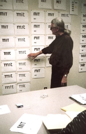
“mr. carter, can you stand in front of the wall and point to a random logo? thanks”
Blackburn: He did the final drawing of the logo. He says he wouldn’t claim to have designed it, because maybe it was something Alice had done, I then did something else to it, and then he picked up on that and did something else to it… I look at the sketches and I see some of that in this one, some of that in this. I certainly give Matthew the credit for making it a refined design, but it was really a collaborative experience.
Blackburn then goes into the pushback that people had about the logo. Again, I’d done my research, so I tried to engage a little here:
Blackburn: There was some pushback in the beginning. That was good, because people were engaging with it. If you’re making fun of something, you’re acknowledging it. That was helpful.
CJ: Like people putting the logo on a flag and burning it?
Blackburn: Yeah. Even if it was derogatory, in that fun kind of student way, it would be much worse if it was ignored. Better to get some attention.
This conversation point seemed to be running out, so I move to another topic.
CJ: I see these pictures on the website, and they all show “MIT” in letters. Why was it a logotype?
Blackburn: Everyone refers to MIT as MIT. It already had a verbal brand. Rather than adding an extra symbol, like a Nike swoosh, that you’d then have to explain, working from letters gave it meaning. We also realized in focus groups, that since MIT is engaged with the entire world, a lot of people in the world don’t know what the three letters in MIT are. It was important that it be a logotype, to work with communication. […W]e were always advocating always spelling out along with the three letters. That gave us a little more leeway with the abstraction of the letters.
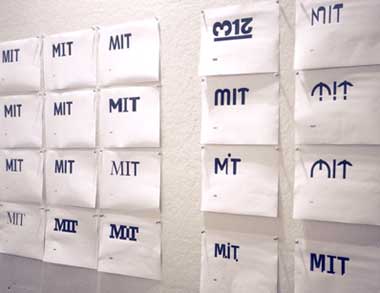
my favorite is the 3, 1, 2 rotated in various angles
If you look up the current logo guidelines, you’ll see that it’s still a guideline to pair the MIT logo with the spelled out name. “While our logo has gained much currency since it was adopted in 2003, some people may not instantly connect our mark to our name—and some may not know what ‘MIT’ means. Therefore, the words ‘Massachusetts Institute of Technology’ should appear on any surface that bears the logo, either with the logo itself or elsewhere.”
Blackburn: Some people felt the letters were too abstract. At one time it was all one color. Right now the bar underneath the I is a different color than the rest. It was funny, I really preferred it all in one color, because I liked the abstraction for that. We were at the eleventh hour trying to get this approved by the client team, and they were fearful and worried about the readability. At the last minute I changed the color of that one bar. Did I ruin the logo or did I save it?
At this point I noticed we were approaching one hour, so I decided to ask my last question.
CJ: Okay, cool. Last question, then. What was the actual process of designing like? As in, how did the process begin, how were these logos drawn?
Blackburn: I’m going to try to find the page for the attributes. Part of the focus group was talking about MIT’s identity, and not just graphic identity. We looked for adjectives, nouns, that described what MIT was like.
CJ: Yeah, I have the page up. Uncompromising devotion to excellence, problem-solving ability…
Blackburn: It’s possible to say, okay, I got these attributes, let me start drawing this attribute or that attribute. The way I design a logo, the way we did it as a group, we just tried to go for a broad spectrum. We wanted to see everything that was possible for representing MIT. We tried part serif, part sans-serif, with curves, etc. How do we make these three letters interesting, bold, weird, unusual? And then we bring back these attributes, as sort of our checklist. This might be quirky or risk embracing or weird, but it’s not bold, it doesn’t feel like MIT. Some of the things were just completely formal like, oh, this letter really does not work, this I does not work with the T next to it, they don’t share space the same way.
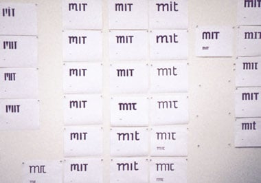
i know this image is small but the mit logo has to work in small sizes so… okay i guess?
Blackburn: We just tried to make it so that in the brainstorming, we weren’t eliminating anything to pin up. But then the stacks would come down, and then people would say, this one isn’t quite working, it could use more of this. We put that in the possible pile. This one just needs some tweaking, that gets into another pile. It was like, calling some of them a possibility, eliminating the ones that were just too absurd. But we also wanted to show focus groups the ones that were absurd, so that they realized we were exploring possibilities, and they could feel better about shooting some down. Had to have some sacrificial logos going into these things.
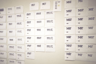
this could’ve been our logo. any one of these
Blackburn: Matthew Carter. I really looked up to him during this process, because, he’s such an incredible designer. It’s unusual to actually have a type designer working on a logo. Usually it’s a graphic designer’s job, as opposed to a type designer. We took Carter because we knew we were just working with three letters, “MIT”.
Of this, Carter had the following to say:
By the way, I should say that as a type designer it’s unusual for me to get involved in the design of logos. When I do, it’s generally because somebody has had a logo designed that doesn’t work at small sizes and I’m asked to make a version of it that will remain legible on a business card. So it’s likely that my involvement in the MIT logo came from a personal contact rather than because I have any reputation for doing logos from scratch.
Our interview was over, so I wrapped up.
CJ: Alright. Looks like we’re about out of time, but thanks so much for coming.
Conclusions
Haha, did you expect an actual conclusion? Look, this post has been in my draft for months now, I just wanted to get it out. Next time in historyposting: maybe the history behind campus buildings, or student activism, or stress culture? We’ll see, once I’m, like, unhosed.
- That is, a single Google search. Come on, this is the MIT Admissions blogs. back to text ↑
- Tech Talk was the Institute's official newspaper until 2009. Not to be confused with the Tech, which is a student paper. back to text ↑
- I feel like I've underutilized MIT Libraries. They've been extremely helpful every single time I've turned to them. They're great and amazing and wonderful and I will not stop gushing about how much I love them. back to text ↑
- I choose to believe that Tim uses he/they pronouns. back to text ↑
- Note the MIT placeholder logo on Tim's shirt. back to text ↑
