
Welcome Back! by Chris Peterson SM '13
a fresh coat of paint, and a fresh batch of bloggers
I hope you like what we’ve done with the place.
Seven years ago, I welcomed people to the “new” MITAdmissions.org, the one you would have seen had you come here an hour ago, or indeed at any point since July of 2011. It seems odd, reading that post, to do it again, and for much the same reason, and with many of the the same goals. And times have changed, and so have we. Let me explain how.
How (and why) we redesigned
In 2016, we met up with folks from MIT Comms, who were leading the redesign of MIT.edu. As I blogged here, the data showed we had a large overlapping audience, and so we decided to share the same design agency (which ended up being Upstatement), and embark upon a shared research, design, and engineering effort together. That process, which has now been ongoing for literally years, culminates today, in the launch of the MITAdmissions redesign.
Why did we decide to redesign? As I explained here, we were proud of our old website, and the positive impact it, especially (but not only) the blogs, have had on so many readers. However, as is always the case in web design, ever since we launched the old site we’ve wanted to change it, especially to expand experiments that worked and cancel those that didn’t. Plus, our blogging platform was showing its age, and we wanted a better foundation on which to build better bad ideas. But there is always a lot going on in admissions, and we never set aside the time, or the money, to make these changes, until now.
So, we convened a core team of staff (including me, Karen S., Kris, Stu, Elizabeth, Matt, Mikey), current and former student advisors (including Yuliya, Selam, Ceri, rfong, Danny, Allan, Lydia, Elena, and Edward), the rest of the admissions commteam, and of course the bloggers + admissions staff more broadly, and set to work identifying priorities, developing content, playtesting ideas, and giving raw conceptual and emotional materials to Upstatement to help design and build what you’re looking at today.
Wayfinding and features
If this is your first time visiting MITAdmissions.org: congratulations! You’ve chosen an auspicious day to visit, and, like tiny baby, know nothing else than this design you now gaze upon, presumably with thumb implanted firmly in mouth and eyes wide as saucers.
For those of you wizened crones who were familiar with our old site, here’s what you basically need to know:
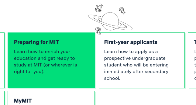
- most of the sections stayed the same, except we expanded the “stepthrough” navigation from Apply to every section. It worked really well there, is now best-practices in most help center software, and now we have more places to talk about stuff like history that we didn’t on the old site (but did on the old-old site, which had too much content, so this feels like the right balance)
- we took the old ask.mitadmissions.org, which used to be an external help center, and moved it within the “main” site located at https://mitadmissions.org/help
- on the homepage, we kept the blogs and the admissions “touts” but rearranged them slightly; we also added a new “from the community” section, internally nicknamed “the firehose,” to curate content generated by the MIT community (and potentially the wider web)
- we kept the rainbow color palette and gradient(s) that has long characterized our homepage (and MIT’s homepage), as well as our core print mailings, but made them a little more dynamic and scattered them across the site
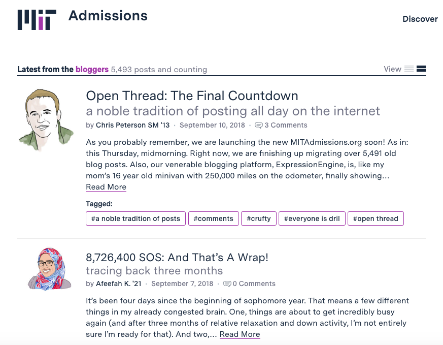
We also put even more emphasis on the blogs as the core distinguishing content of our site. This is visually evident on the homepage (in terms of it from going from about 25% of screen space to 75% of screen space), but it also strings throughout the site, with “Related blogs” features at the bottom of nearly every “static page.”
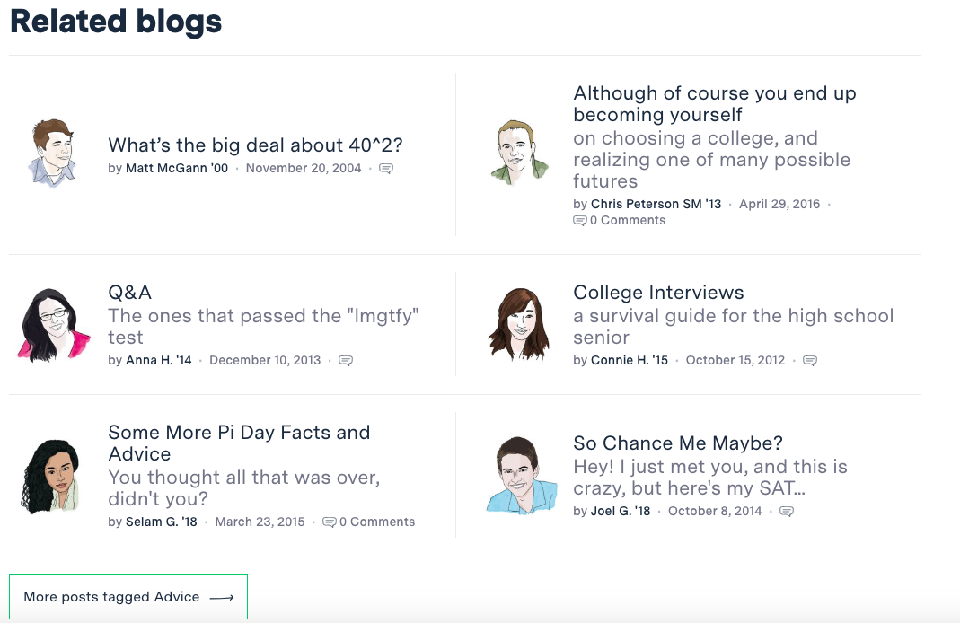
This wouldn’t have been possible without Yuliya, who spent her summer reading every blog post ever, and (re)categorizing them into a schema that she inductively developed based on her own long experience reading, and writing for, the blogs. These categories, and tags, enable a tremendous amount of serendipitous discovery that we hope will happen, and will be invaluable for bloggers (and readers) moving forward.
Here are some things that are genuinely new to the site to the visitor:
- we added annotations, inspired by Feynman’s margin notes, to many of the “static pages,” so that we could add historical background, additional complexity or qualifications, or just weird nerd jokes as a dialogic aside, visually sotto voce

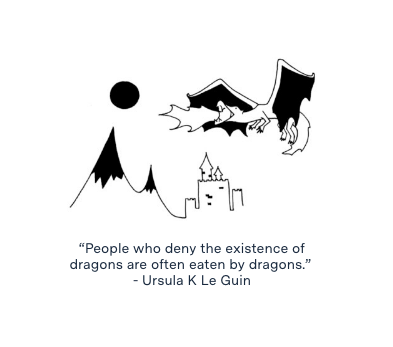
- we added doodles and illustrations, drawn by Lydia (and interactively inspired in part by Glossier) all over the place
- we added an expanded “card view,” inspired by new reddit, to the homepage blogroll so you can trigger an expanded preview of blog posts if you want
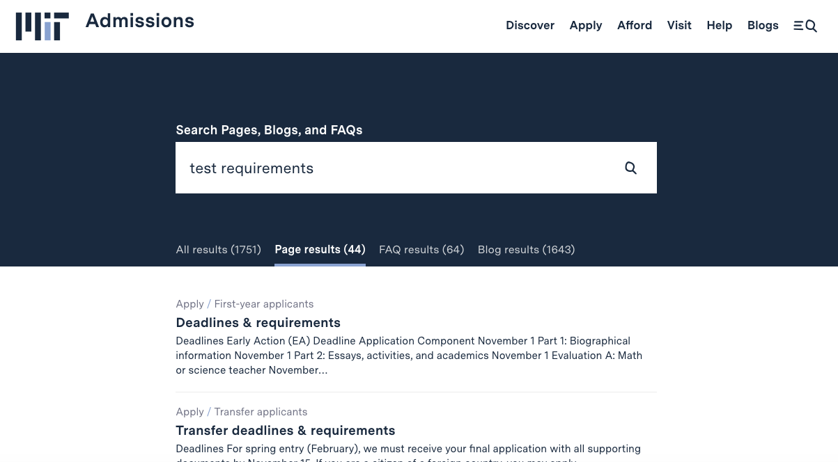
- a much more sophisticated search, powered by Solr, that will help people not only find what they’re looking for fast but easily distinguish between institutionally authoritative and temporally current answers on our static pages and FAQs and our culturally useful but sometimes factually deprecated backlog of blog posts
- we designed and built the site to be more accessible, particularly to the visually impaired, from the ground up. For some of our users, this won’t change anything; for other users, this will change everything.
Probably the most significant changes, however, are under the hood. Upstatement is a first-rate web design and engineering firm whose staff have made major contributions to WordPress and other open-source technologies. They’ve done a lot to make our site speedy and stable; bring images, which had since 2004 been scattered across a billion different hosts (athena lockers, chevereto, imgur, etc) within a single image gallery; implement better security like https by default and SSO with Touchstone, and make it much easier to blog. We think that these improvements will help us continue to do what we’ve long tried to do: be honest, authentic, helpful, and responsive to our community, including not only prospective students but anyone who might find their way to our website.
I really want to thank the team at Upstatement, especially Nathan, Keri, Emily, Emma, Burns, and Rayna, for their hard work, patience, and creativity throughout this process. We did a lot of work across admissions and SFS in very little time and under pretty significant constraints. This is the first time in decades we have worked with an external agency on admissions, and it was hard/scary, at least for me, to countenance that. But I’m so glad we did, and specifically with/for this team, because they’re great. ![]()
Another big change, both operationally and philosophically, is that we intend to keep this website evolving. Unlike the last redesign, where we designed it all up front, implemented it, and then basically didn’t change it for seven years, this site was designed and built using Scrum, and we intend to keep making tweaks and improvements going forward. So what you’re seeing today is our MVP foundation, and based on what works and what doesn’t, we’ll continue to tweak, change, and continuously make MITAdmissions.org better.
New bloggers!
In addition to our new website, I also want to introduce our new bloggers! We hired them in late August but waited for the new website to let them loose on the Internet. They are:

Veronica M. ’22, from Kenya, is the queen of cheesy science puns and long-suffering cat-mom to feline drama queen. She loves wild berries and hates boba pearls, which, in my view, means that she has excellent judgment and high integrity.

Kathleen E. ’22, from New York, lives near the beach, but does not go to it because she doesn’t like driving on narrow 17th century roads. Nevertheless, she would like you to know the oceanic fact that schools of fish use ‘phase transitions,’ analogous to those experienced by matter, to change between different behavioral patterns. If trapped on a desert island, she wouldn’t wish for her favorite food, but would adapt by enthusiastically eating bugs.

Shuli J. ’22, from Toronto, and wants you to know that in Canada, people really are more polite, and also they get their milk in bags instead of cartons. She once went through a childhood phase of calling her mom “mumsie,” not because she was Canadian, but because she was reading too many books about British boarding schools. If trapped on a desert island, she would die missing pad thai.

Mimi S. ’22, from Maine, is a metalhead with a cat named Oreo. Her favorite food is flan, and if she could be the last emperor of a dying corporate chain, it would be Blockbuster so she could gorge on free movies. Out of all the things on the Internet, she would like you to know that this exists.

Jamie C. ’19, from California, grew up in a town where the high school was used as the set of Fast Times at Ridgemont High. She would like you to know that ants have a designated graveyard area in their colony, and when an ant dies, the other ants carry the dead ant to the graveyard; in fact, if a live ant is treated with formic acid, which is secreted by dead ants, it will allow itself to be carried there because it thinks it itself is dead. She loves Twilight and hates Dadrock.
You’ll hear more from them over the next couple of days as they begin their blogging adventures.
Please say hi to our new website and our new bloggers! We hope you’ll stick around for a long time.